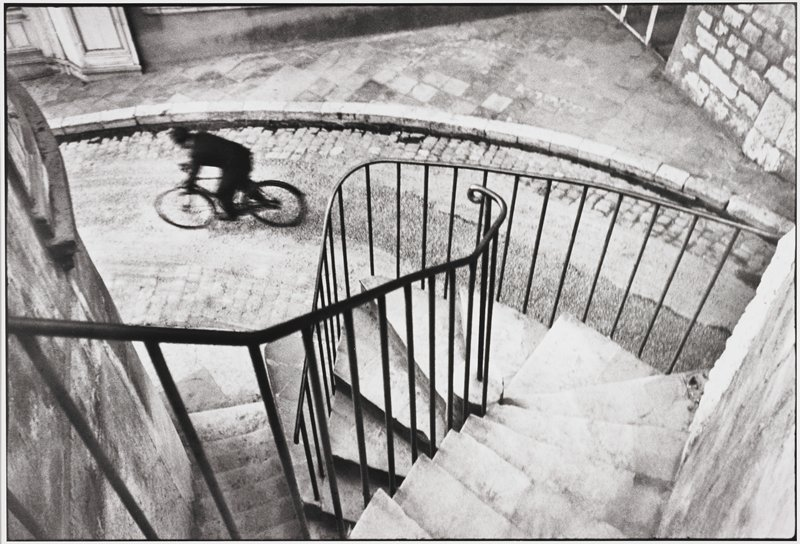
For this workshop, we all worked on our analysis skills by practicing with them. We were given a picture of a cyclist riding on a stone brick road with a spiral staircase in front of the camera leading down to the cyclist.

Here are all the things everyone came up with as a group about the photo.
The main points we made were:
- Higher perspective looking down at the cyclist.
- Focal point being either the cyclist or the staircase.
- Good use of Line and Texture.
- Grunge feeling.
- Black and white, making it look old.
- Static effect since the cyclist is moving.
- Rule of 3rds being used.


