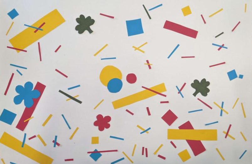
For this workshop, we created motifs by using paper and scissors. We cut out pieces of coloured paper into different shapes and placed them on top of a piece of white paper. Once we had the pieces in a placement that we liked, we glued down the shapes onto the paper.
Here is how this turned out.

For the design, I decided to add rectangles and squares since they remind me of confetti. Once I realised that I had too much space, I added even smaller rectangles around from scrap paper. I added in flowers and clovers since I thought those would look nice in this, plus I wanted to include my research into flowers in this. Even though I included flowers and clovers, my main inspiration for this came from my pattern art research into Memphis Design. I was told throughout this workshop by people that it reminded them of 80’s art, which shows that it was noticable.
I thought this turned out well and cutting out paper and organizing it that way to get a design helped me figure out the layout of this since I had no clue how I wanted this design to go before this. I think I might do that again if I’m struggling with how I want things to look in the future.