One Pencil
For this workshop we had to use a single pencil to create something relating to out Project. I snapped this pencil in 3 different pieces and painted them in my country Flags colours. I think i could’ve done better for this since it didn’t end up looking that good.
Line

Digital Art
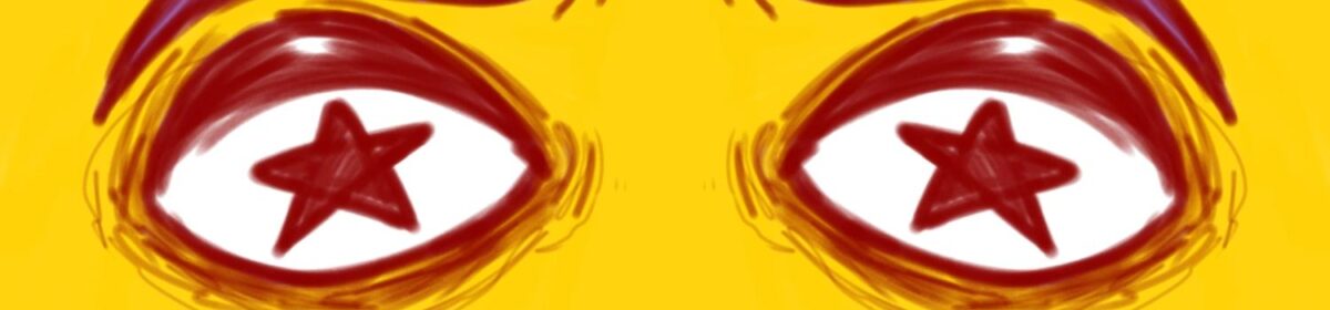
For digital art, I made a animation, however I decided to colour in the first frame to see if it would look okay. I think it turned out good, but I’m not too sure about how I could move forward for this. I’ve noticed it lose motivation once something doesn’t work out.
Animation/GIF
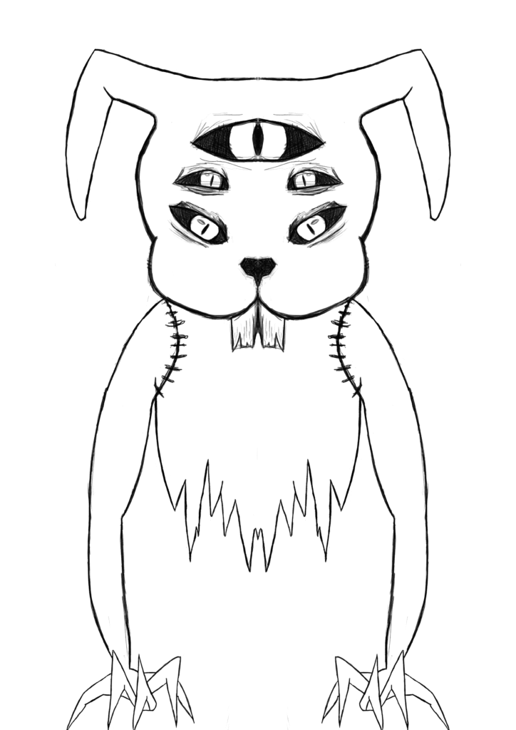
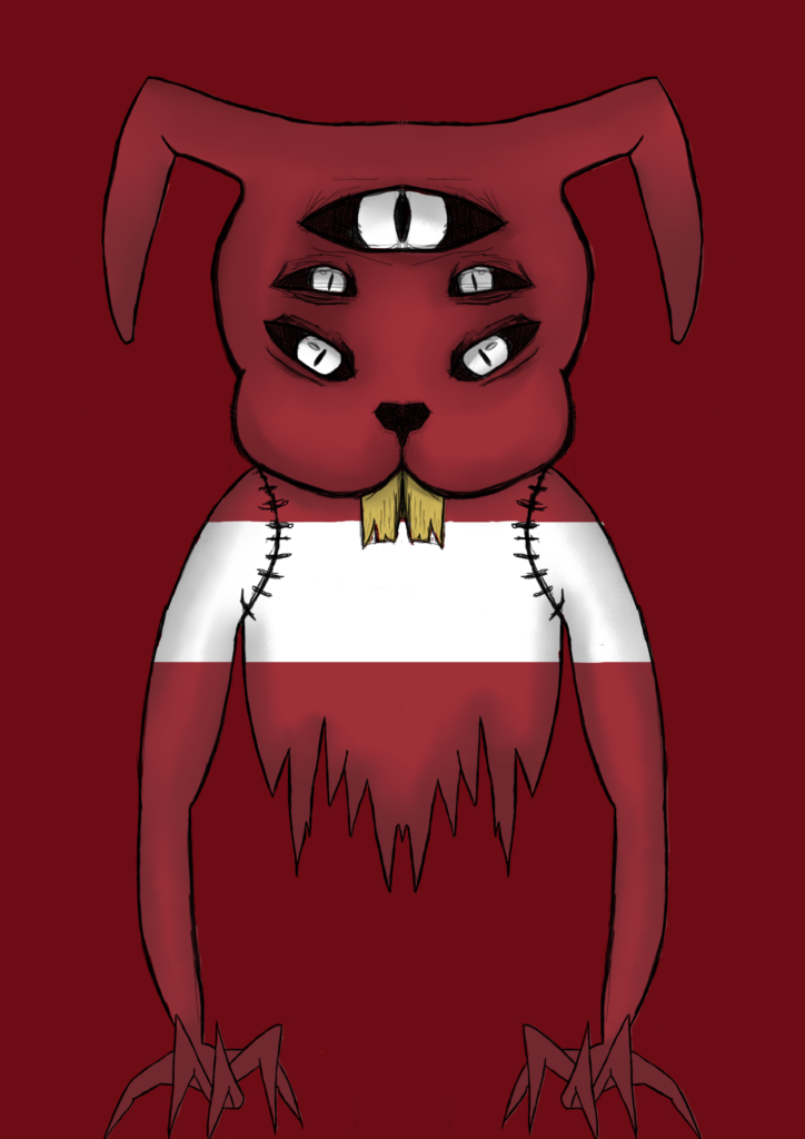
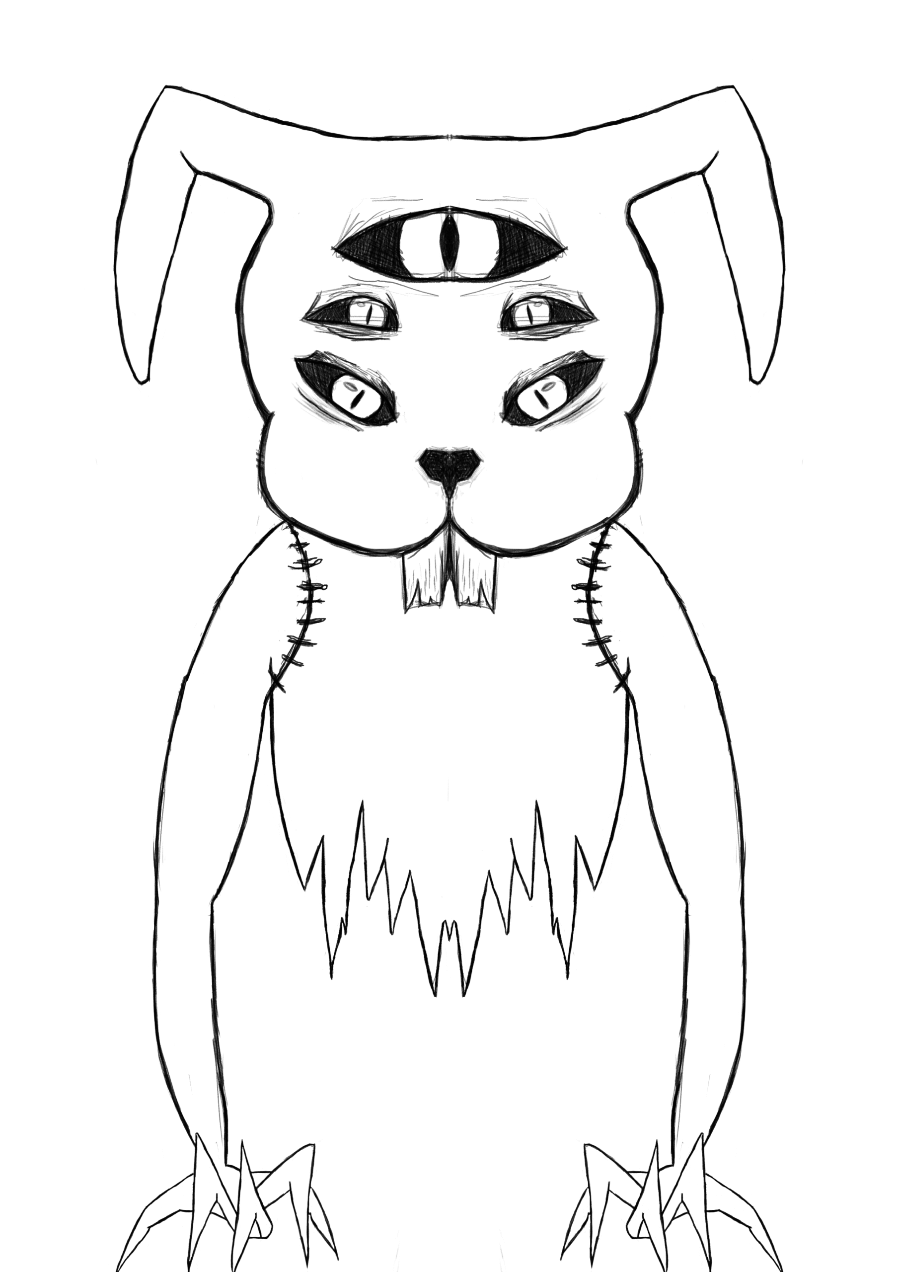
For the first animation/GIF test i did a bunny animation of the same digital piece i did above this. For the animation i made its ears grow bigger and made him blink. The reason i did a bunny is because many of Latvian folklore has stories about animals, especially rabbits and bunnies. I used photoshop t animate it using layers as frames. The outcome came out choppier than i would’ve liked.
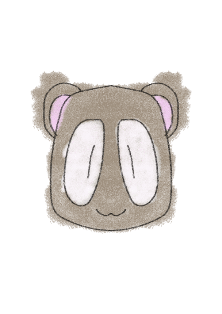
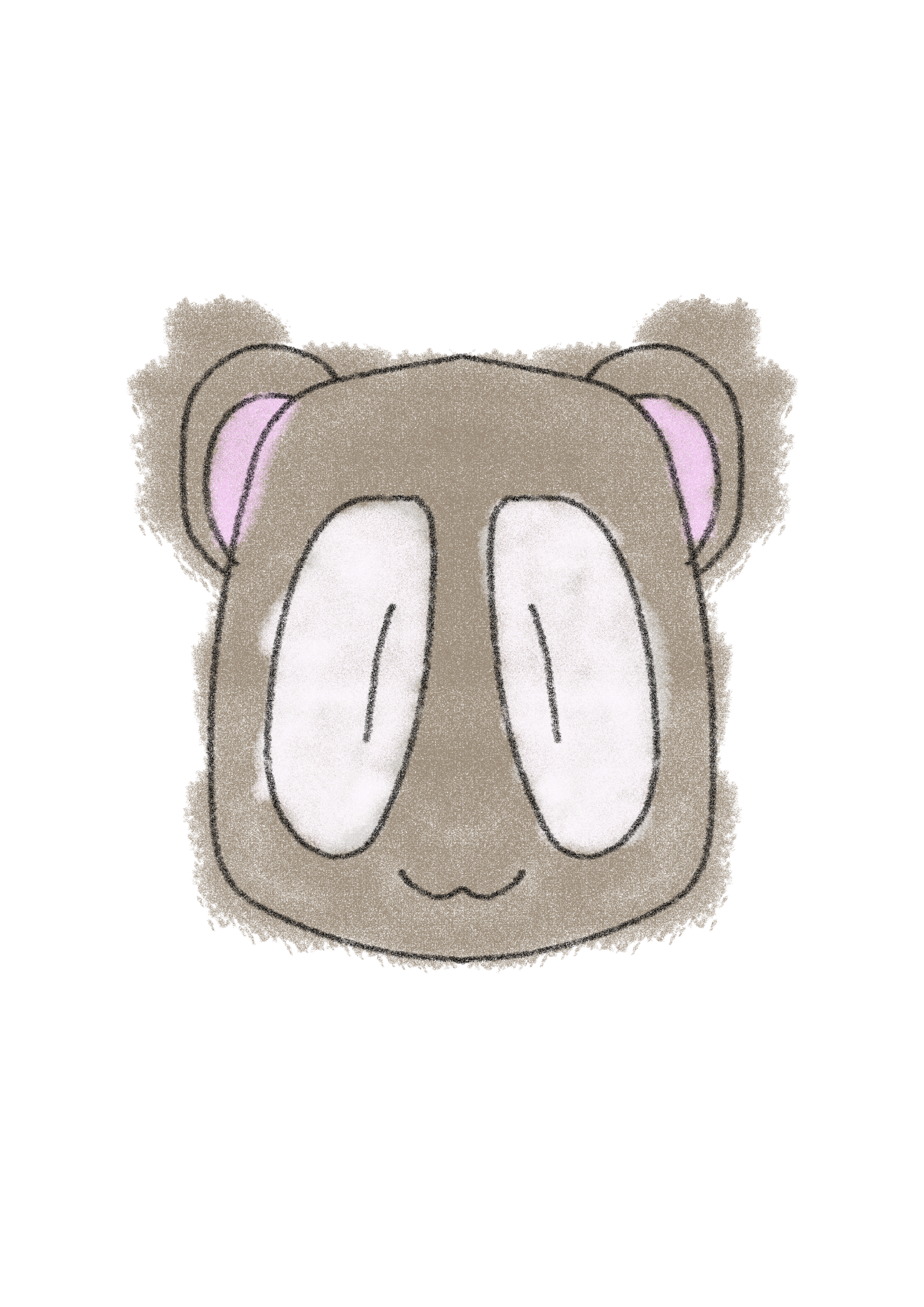
For the second animation/gif, i did a quick bear blinking animation. It was a rushed piece, therefore it came out much worse. I spent about 10-15 minutes on it. It was like a warm up design to remember best ways to use photoshop for gifs.

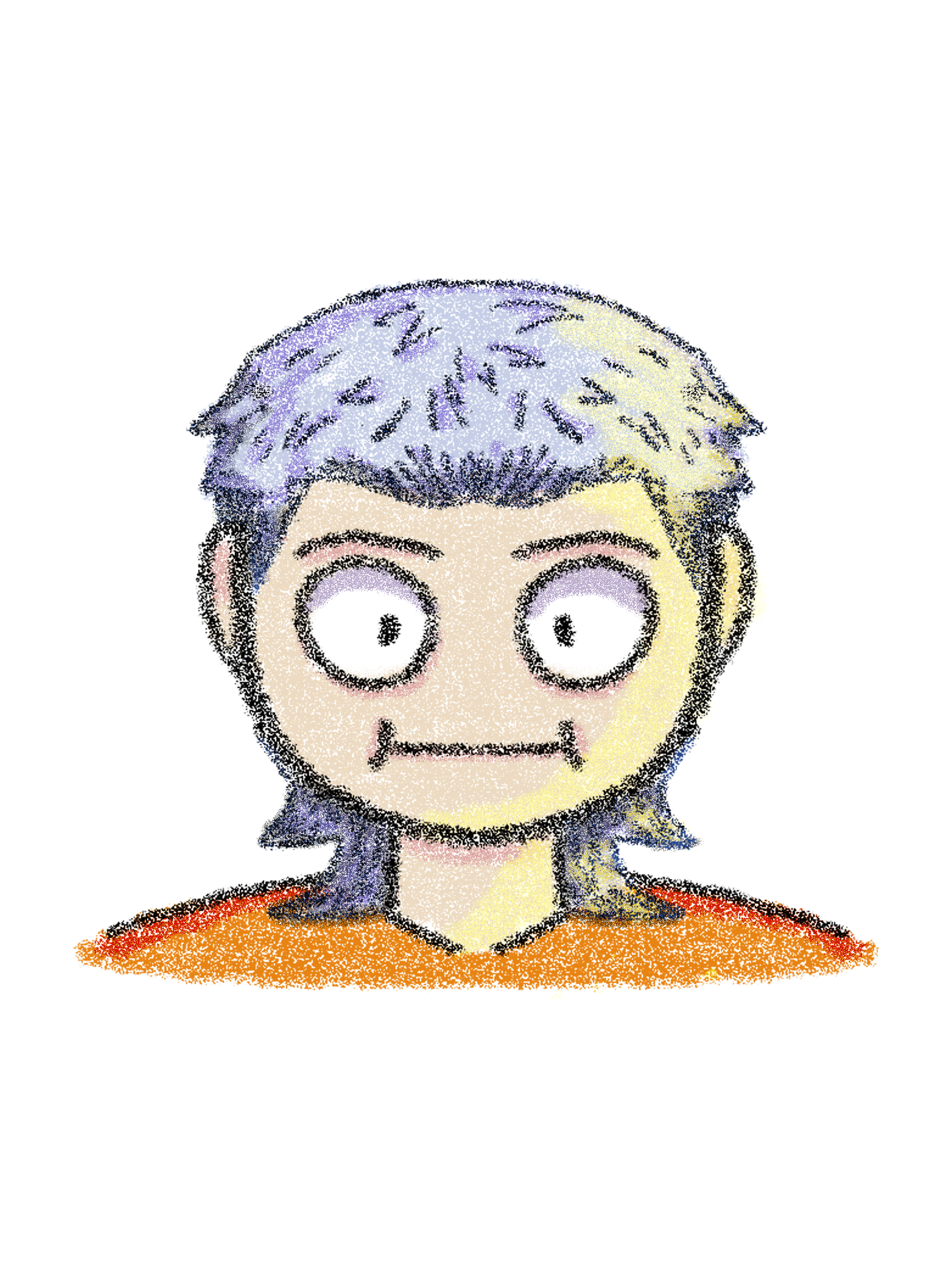
The third animation was also more of a test animation than it was related to the theme. i experimented with colours, shadows and lighting of the piece because my first animation lacked all of the mentioned things. i used brushes that looked more like crayons, i preferred them over the basic photoshop brushes. I found them online for free and imported them into the brush library. I loved this outcome the most. It allowed me to practice on more human designs. I did use the mirror tool to help me keep it symmetric.
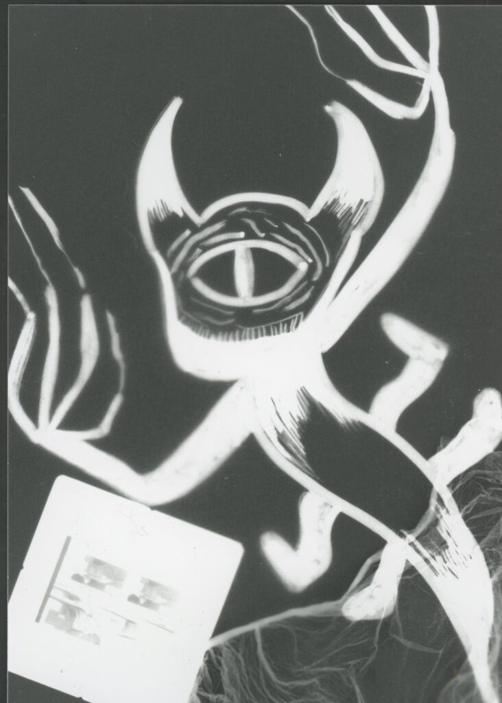
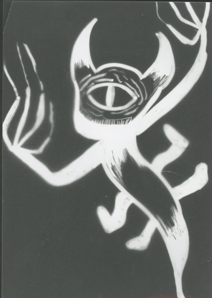
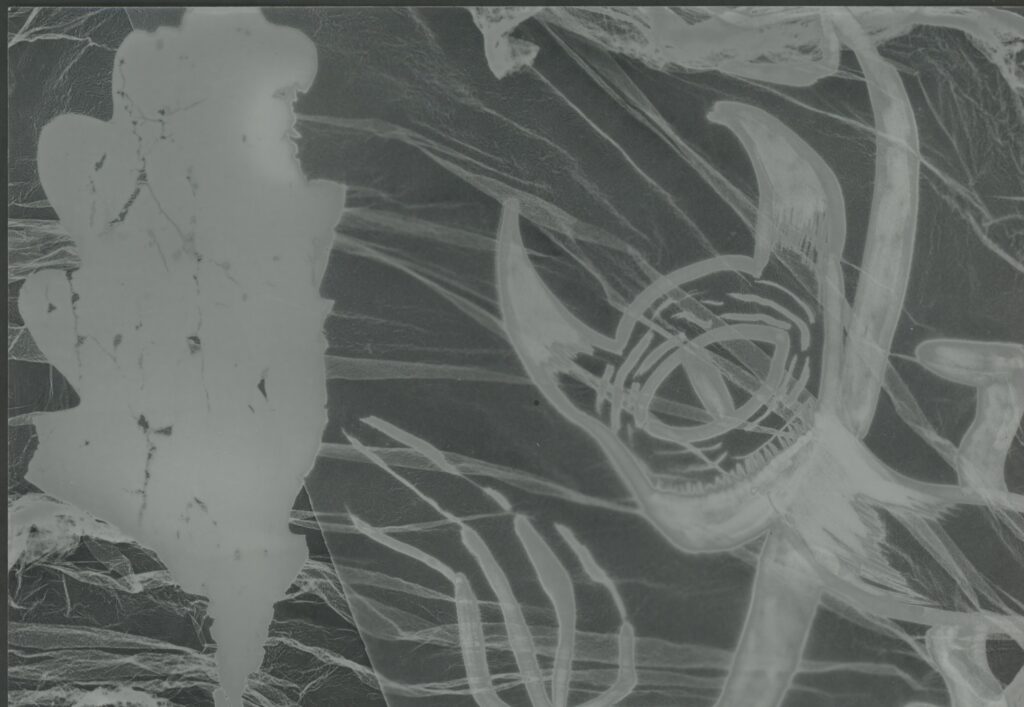
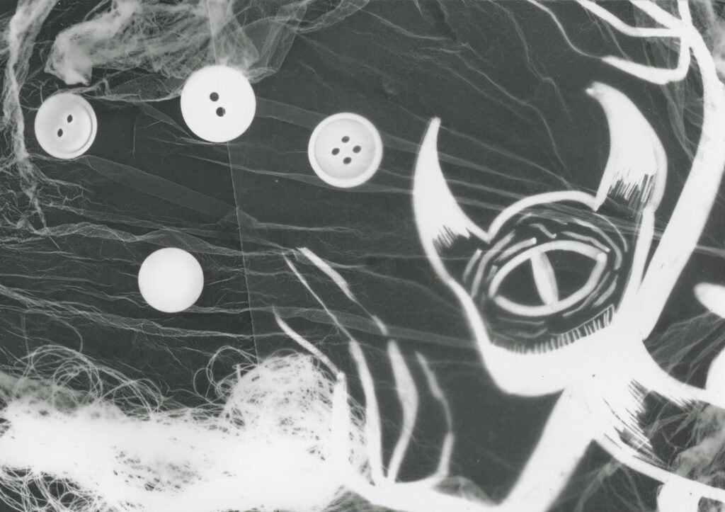
Dark Room
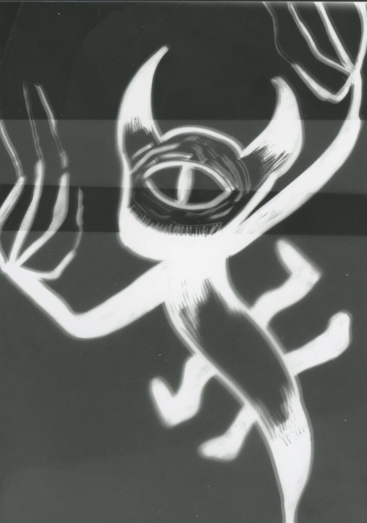
This was my test print for dark room, which turned out horrible. I messed up on the test sample, but the other prints turned out better. I did not do my culture completely, i made up a character to try out dark room. this showed me that it doesn’t work that well, it was also tiring.
I will add the other outcomes below this block.
Textile print
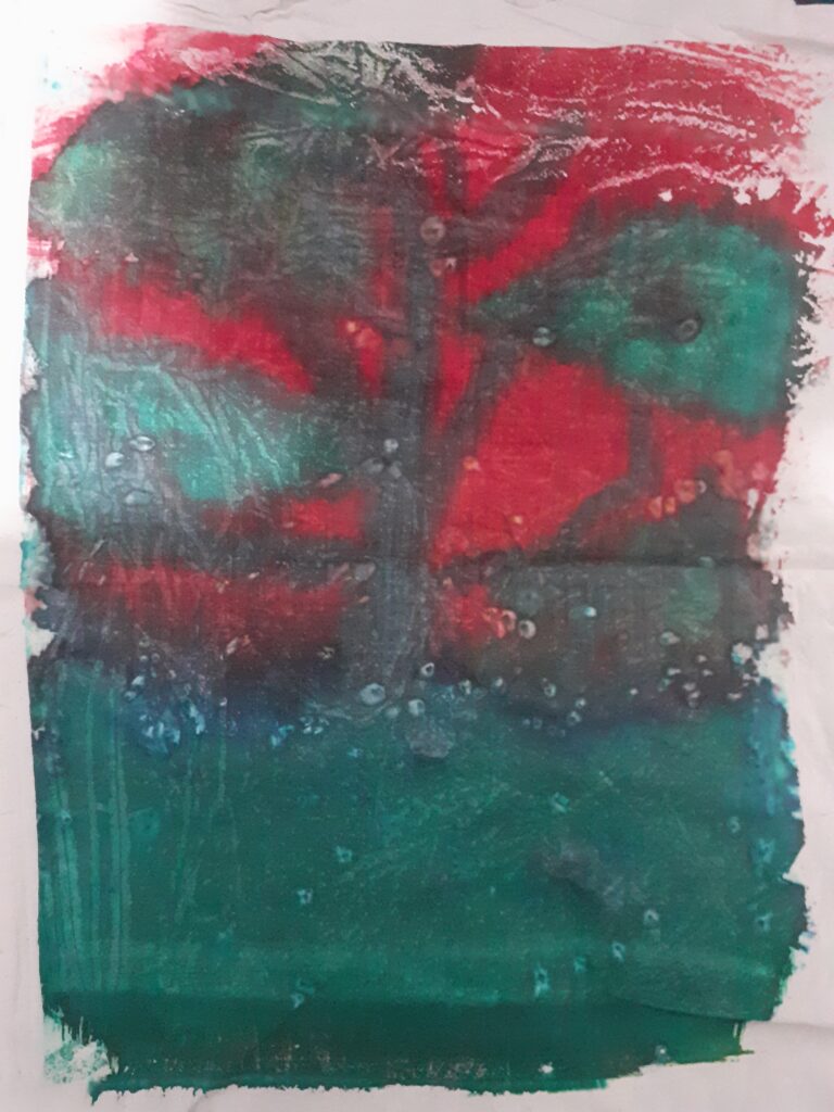
In this workshop, the first print i made was involving liquid dye. I made a creepy type of background, blending red for the sky and blue for the ground to make a gradient between them. Once these two colours were somewhat dried, i added black for a tree without leaves. To try and add texture i sprinkled some rock salt on top of the dye which made white blotches wherever it touched.
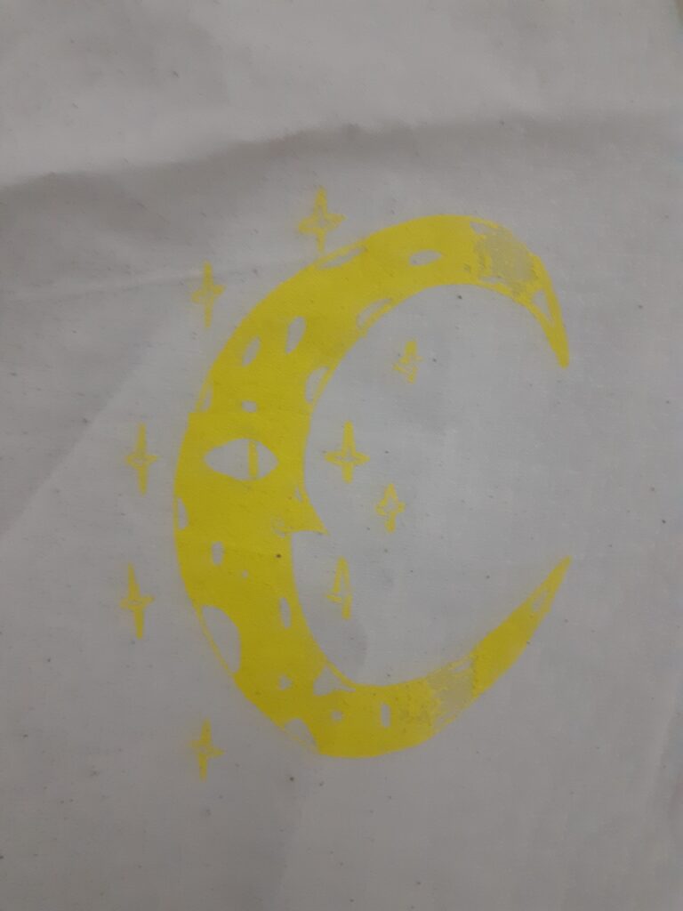
For the second one, we had a design that we prepared on tracing paper. This design then went up on a canvas like frame, which we could then use for screen-printing. We added dyes that were the consistency of acrylic paint and used a squeegee to run them over the designs so it would print on the fabric. This part of the workshop was my favourite, but i wouldn’t do it again.
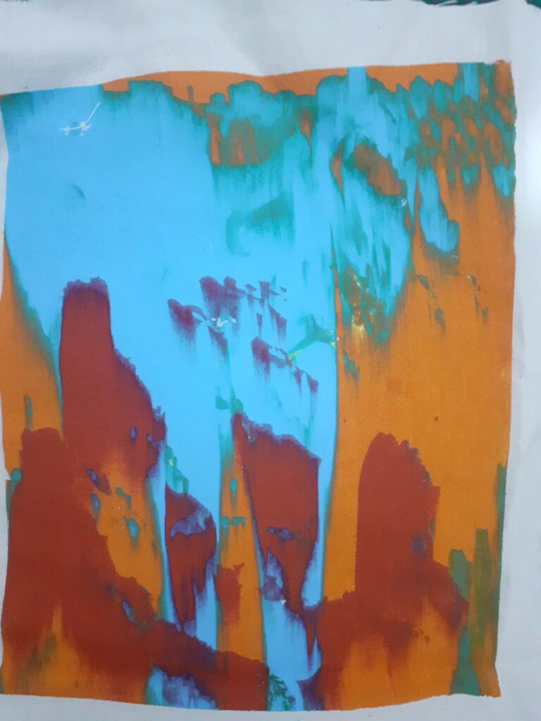
For the last one, we were allowed to do any colour we wanted and put it on different patterns. Once it printed on the fabric, we ran the dye over with the squeegee, making an interesting pattern.