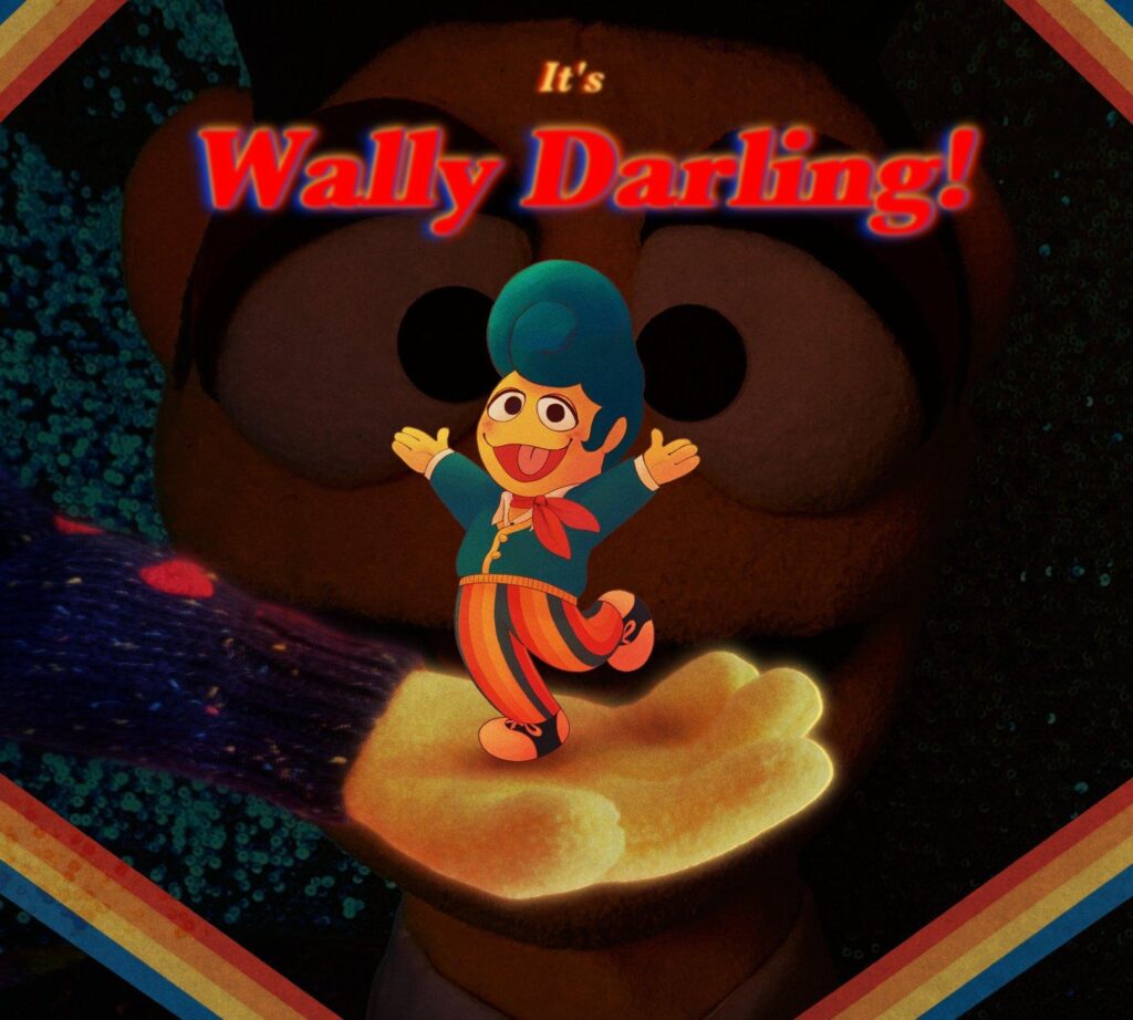
FMP (Memories)
Client Research
The hospice opened in 1930 by Prime Minister Stanley Baldwin. The international Memorial was established on 6 July 1948, shortly after becoming the Marie Curie Memorial Foundation.
Their priorities were establishing special residential homes to care for cancer patients, provide home nursing, provide help with practical needs and give the public advice about cancer and help available.
From the early 1980’s, Marie Curie Homes moved away from providing long-term nursing care to cancer patients, instead becoming increasingly focused on hospice care. Marie Curie hospice developed a wide range of day services. they pioneered new ways of providing care of terminally ill people.
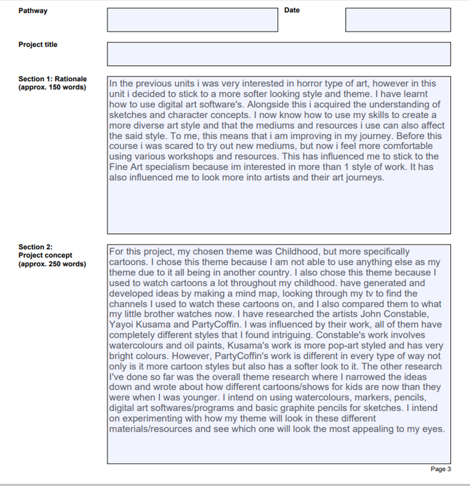
Since Marie Curie hospice is my client, it will greatly affect my normal work. This is because I’m used to horror like styles and that wouldn’t be suitable for the client. It could cause a lot of problems for them. Therefore I have changed my style to a softer look. It will be rather difficult to change styles, but I will push through and make a suitable piece. As my client, I think they deserve to get what they ask for even if its something I haven’t done as much before.
MindMap
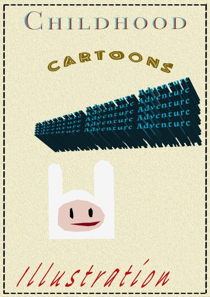
Mood-board
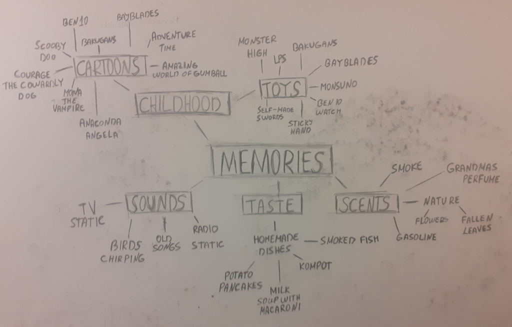
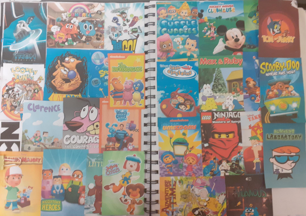
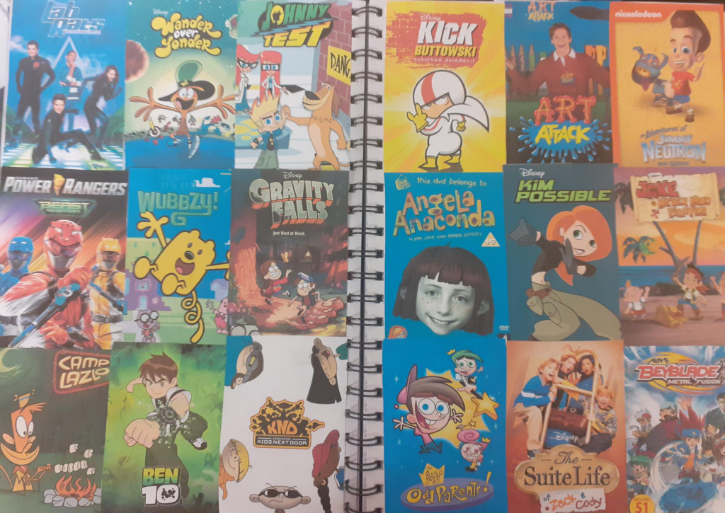
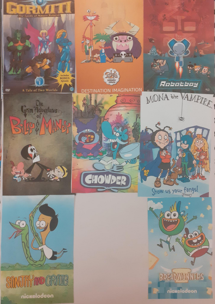
This is a mood-board of shows and cartoons i used to watch. I used it to generate ideas and to show that my theme is Cartoons and TV shows.
Theme Research
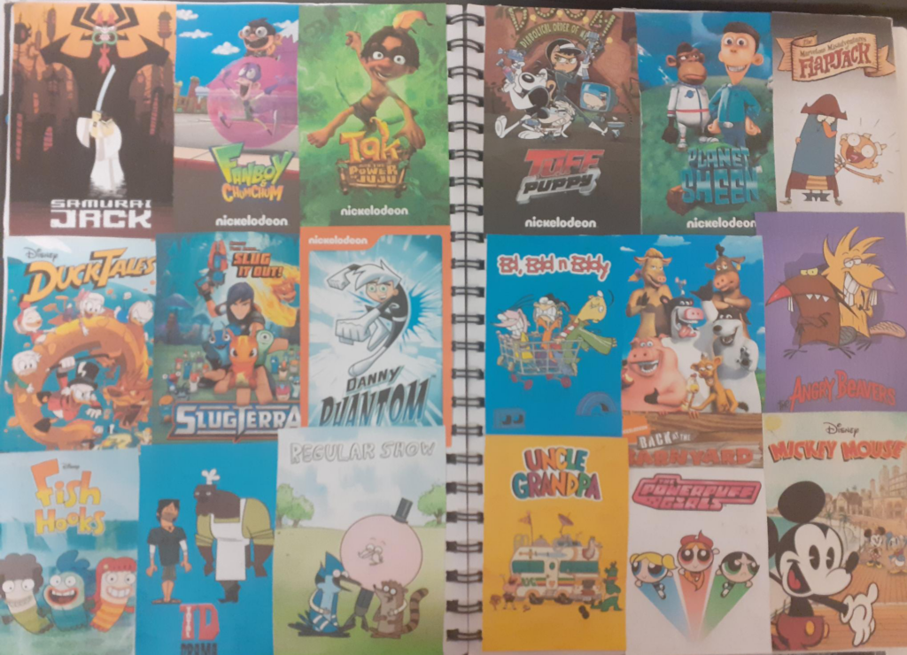
To find my theme, I made a mind map that helps me list out everything that brought me memories of the past. I ended up with choosing the Childhood memories, more specifically Cartoons that I used to love. But I will experiment with adding other parts of the mind map. For example adding scents, but making them as landscapes instead. I might even combine these two ideas.
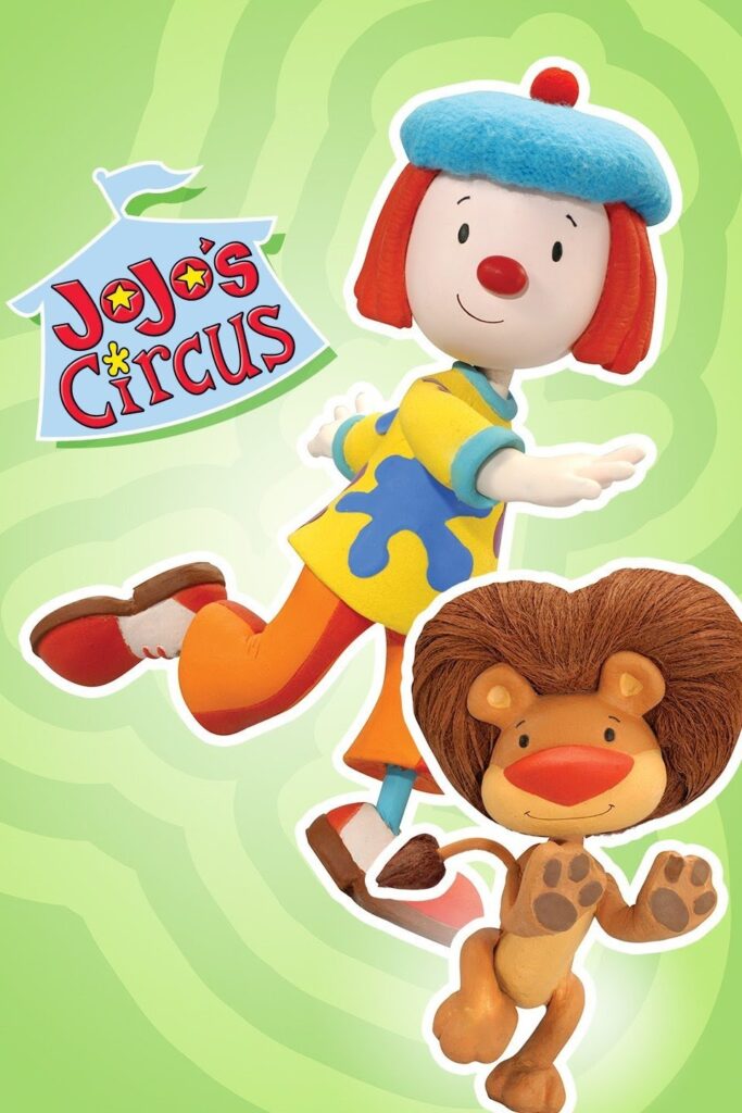
By looking through the kids channels on our TV, I noticed that the shows are much more tame and “Dumbed” down. By “dumbed” down, I mean that the shows have gotten more childish, even for their age range. Some 8+ shows seem like they were made for kids much younger than that. There are some shows that aired when i was the same age, but channels like Cartoon Network have either closed down or merged with other channels. There are also some cartoons that have ended as of me writing this.
For the other research however, I cant conduct any photo based primary research as I didn’t grow up here but instead in a different country. Therefore I cannot take photos of for example the toys I used to play with or the scents of places that gave me memories like the forests around my town. I can mainly do sketches for the primary research.
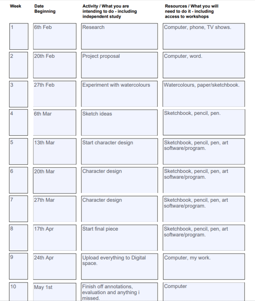
Project Proposal and Action Plan
Artist Research
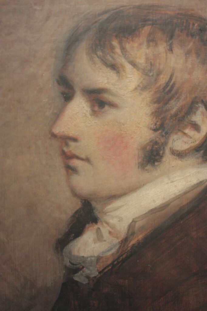
John Constable (1776-1837)
Constable is famous for is landscapes, which are mostly of the Suffolk countryside, where he had lived since birth. He was born in East Bergholt, Suffolk. This artist was largely self-taught, and developed slowly. His work was not particularly well received in England during his lifetime, however in modern times his work has gathered a lot of attention.
He exhibited from 1802 at the Royal Academy in London, and later at the Paris Salon. He was influenced by Dutch artists such as Jacob van Ruisdael. The works of Peter Paul Rubens and Claude also inspired this artist by being his colouristic and compositional models.
He worked with oil paints until after the year 1829, when he instead preferred working with watercolours.
I chose this artist because his watercolour landscapes interested me. I loved the way Constable used grey and some blue tones to build up rock textures in some of his paintings. This gave me inspiration to experiment with watercolours and see how it could work with my theme.
Constables Work
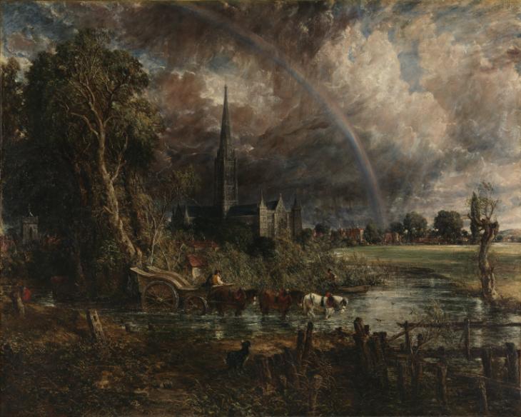
From what I can see, this appears to be one of Constables oil paintings. I think this is an oil painting because of how saturated the colours are. I love the use of the browns, dark greens and blues. these colours and layout are more appealing to the eyes. In my opinion, he used the colours well to capture his surroundings. To some this painting or the way this was painted might seem glum and somewhat dark, but this type of colour usage is appealing to my eyes. From knowing how this artist used his hometowns surroundings as his painting subjects, I’m not surprised with the amount of detail they contain. However, the rainbow or what I presume to be the rainbow, seems to be very blended in the sky. It appears more dull than what it would actually look like, unless the clouds and the dullness of the sky made it look like that from the artists angle.
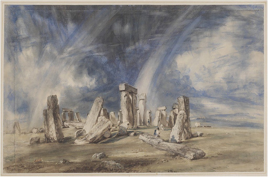
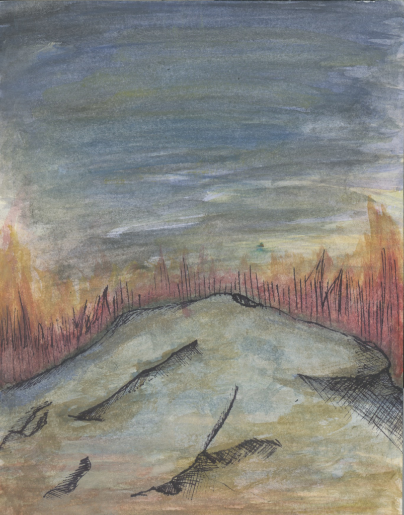
First things I’ve noticed about this painting is that its less saturated and you can also see the brush strokes in the sky. This painting was made by watercolours unlike the other painting which was an oil painting. I love how the artist painted the rock texture here. The use of browns and greys really helps the rocks stand out. The grass looks muddy, whereas the sky is a mic of blues and blacks. In my opinion, it seems like Constable tried using the same techniques he used for oil painting when he did the sky. The brush strokes seem like they were made while the watercolours were still wet, or it could’ve happened if he added more water than needed to the colour he put on top of the smudged one.
Transcription
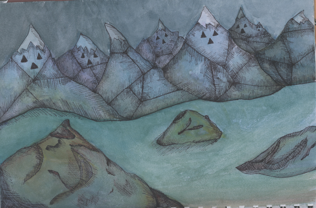
In this work i made an artist transcription based on my theme. However, i also used a line art pen, unlike Constables watercolour paintings. This painting is based off of the landscapes in a cartoon called “Adventure Time”. The mountains are based off of the “Ice Kingdom” in the show. These mountains are purely made of ice and snow. I think it turned out okay, i could’ve done better when it came to glazing techniques and given it more depth using watercolours instead of a pen. Although it looks like i just used blues and greens, i did glaze some parts with reds, yellows and purples.
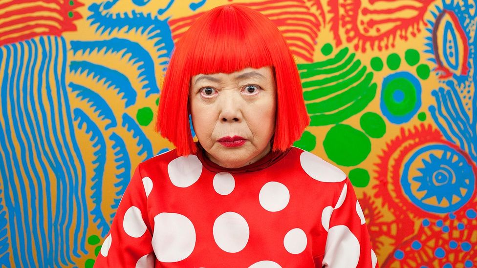
Yayoi Kusama (1929-Now)
Kusama is a Japanese contemporary artist who mostly works in sculpture and installation. All of her work include polka dots, which has earned her the name “the princess of polka dots”.
Her hallucinations influenced her work. She adds these dots and all-over marks to her work to make the work (and herself) feel as if they are melting into, and becoming part of the bigger universe.
She uses all and every material she can to make her work. Kusama has done this since childhood, especially when her parents would take away her drawing supplies or her family wouldn’t have the money for the supplies, so she would draw with mud instead.
I chose this artist because I was intrigued by her pop art styled work and her Inclusion of shapes. This type of style would work great with my theme. I will experiment with polka dots and other shapes in my work.
Kusamas work
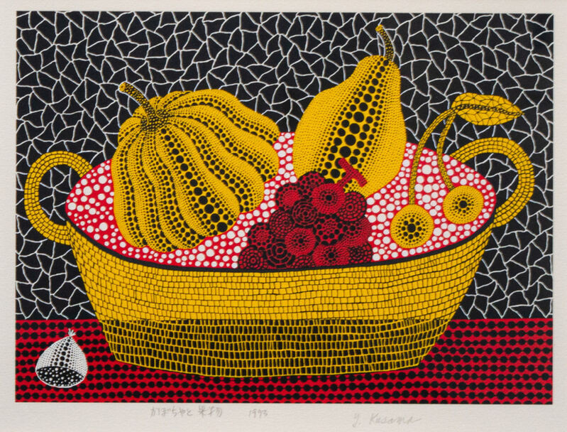
In this piece of work, the first thing I notice are the use of shapes. These shapes appear to consist of squares/rectangles, triangles and of course polka dots. The use of Black on top of yellow gives it quite a nice field of depth, especially for the fruit in the pot. I love how the black dots make the ridges on the pumpkin seem like they are actually there. Its almost third dimensional. However, it can also be hard to look at. First time I saw this piece of work, my eyes somewhat hurt. It was almost too much to look at, but I do see the appeal in it. The colour black as the background works well to mute the brighter colours. If the background was blue or something brighter, it would make the colours blend much more. This would not be good, because then ones eyes wouldn’t know where to look at or what they are looking at, which could result in their eyes hurting much more.
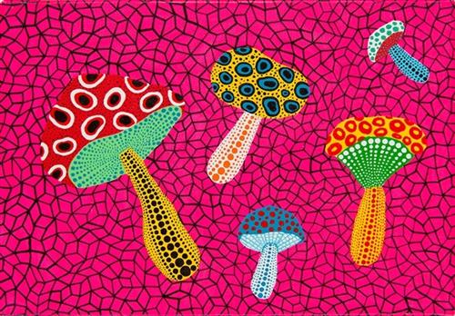
The first thing that I don’t like about this work is the bright pink background. I think it hurts the eyes too much. I do love the mushroom design, however I think that not all colours go together. The yellow and blue seem to stand out too much, whereas the yellow, red and green somehow work together. This work once again includes various different shapes and or lines, but of course most of it made with polka dots. These polka dots give the stem of each mushroom the small amount of depth. But at the same time, this piece of work seems to be weaker in that field of depth category unlike the other piece of work. These mushrooms also appear to be floating through in the air, the only indication of space being the once again bright pink background. Compared to the previous black background, I think that this background does not suit the black lined shapes. It just isn’t the type of art I like. In my opinion it would look better if the colours weren’t as bright, however her work also represent her hallucinations, therefore the colour choices make sense in this situation.
PartyCoffin (Clown/Dylan)
PartyCoffin or Clown is an American artist. They specialise in Illustration and Character design. They create and sew puppets, Like to create structures and anything thats makes a story.
Ive noticed how much their work is inspired by shows such as the Muppets, Sesame Street and possibly Barney + Tweenies. Could also be inspired by any 70’s cartoons and shows.
Im interested in this artists work because of their story driven website/ARG(Alternative Reality Game) project. i loved how they created and used original puppets and made them innocent, yet creepy if dug deep enough in the website. I was interested in their work because of how charming this type of genre of art is. I also loved how passionate they were about their projects. I want to do something similar and create a story i can show through characters i create.
PartyCoffins work
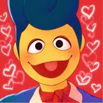
In this piece of work, the first thing my eyes are drawn to are the various bright colours. These colours appear to work well together and it suits the character a lot. When looking closer, you can notice the almost dreamy effect from how the colours and lines are textured. This piece also appears to have a warm tone on it which makes the colours pop out more. I also love the character design and how they have included various different expressions despite them seeming to be very similar. I have noticed that their lines are coloured in colours that correspond to the actual coloured in parts of that character. This can be seen in the characters hands, where despite their skin being yellow, the line art is slightly more brown in colour. This makes it seem like the line art isn’t even there int he first place. However, i can see why some people wouldn’t like this art style and colouring methods. The bright and warm colours might hurt their eyes or just be too bright for their liking.
First thing i’ve noticed about this artwork is that there are multiple different styles. You can see in the background that there is an actual puppet the artist has made, this is also the hand that we can see the other version of him stand on. The colours are still in a warm tone, but some of these colours seem to be less saturated. You can see some Typography too, which shows us the name of this character. One thing i do not like about this piece, is how difficult it is for me to focus on just one thing in it. My eyes seem to want to look all over the place despite it looking simple to others.
Transcription
This is my transcription using the character design and line art from Clown’s art style. i drew a muppet character of my own that i later on decided to use for my final piece. This is an old design and it went through quite a lot of changes ever since i made this. I made it using my phone, it was rather challenging to do. In my opinion it turned out quite good despite drawing bodies isn’t something I’m confident in.
Workshops
Darkroom
In this workshop I used a character design for my dark room prints. It was a character i made as an experiment in the last project, but since it was cartoony, i decided it would be good to use it for dark room prints. I could not find my prints from the darkroom session but i have put the design i did for it.
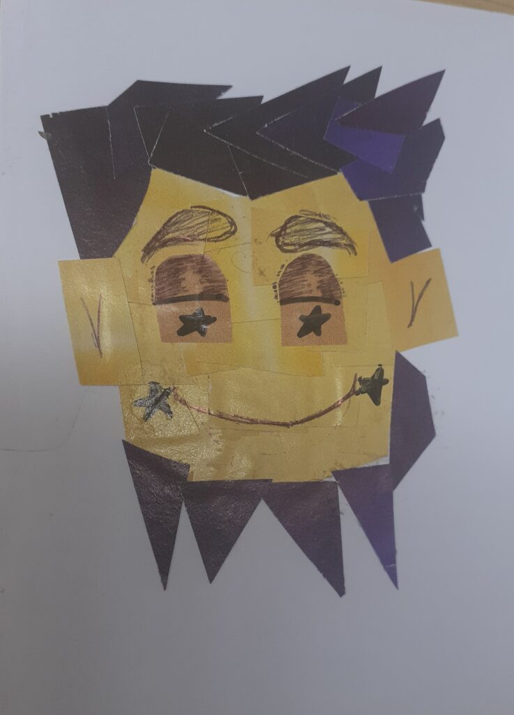
Typography
For the typography workshop i used words that matched my theme and made them into different styles. I also made one of the characters from my favorite cartoon using the polygon lasso tool.
Postcard based on initial ideas
In this workshop i did a postcard. I used watercolours to go out of my comfort zone. I used a mix of blues, reds, browns, purples, yellows and greens. To add depth and texture, i used a black line art pen. The techniques that were used for this piece are called Glazing and Crosshatching for the line art pen.
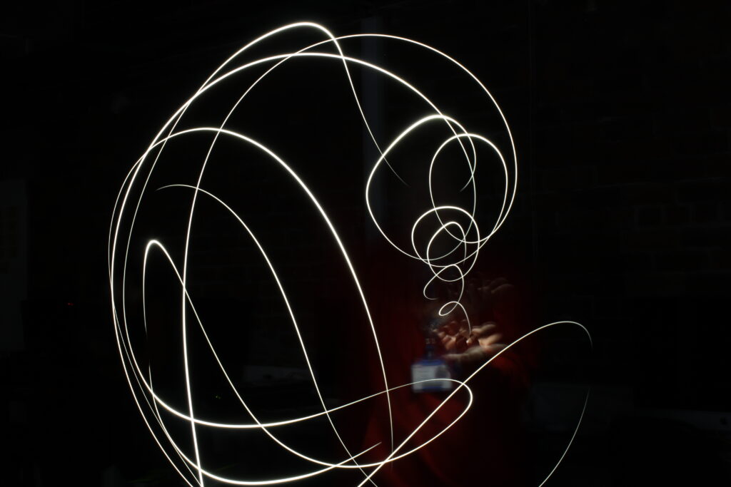
Painting with Light
While doing the Painting with light workshop, we had to be in a really dark room so that the camera could capture the actual light. I decided to do a light coming from my hand as an experiment. It wasn’t something i could imagine doing with my theme, but it was a fun workshop. Since i couldn’t picture my theme being done by this workshop, i mainly stood behind the camera and took photos for other people in my group.
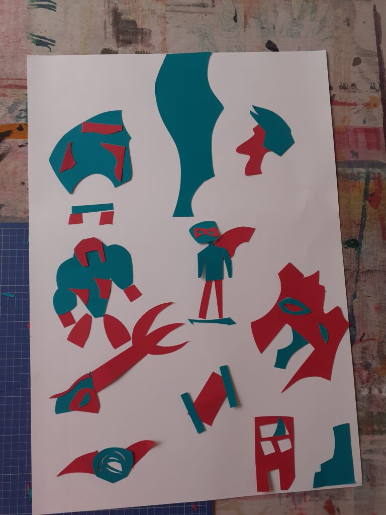
Creating Motifs
For this workshop, we had to cut shapes without thinking. I did use a craft knife to make more precise shapes and i did think about what i will make ahead of time. This was made way before i had a final character idea, so i instead based it off of adventure and superhero cartoons. In my opinion, i did pretty good with this and i think it tells a story.
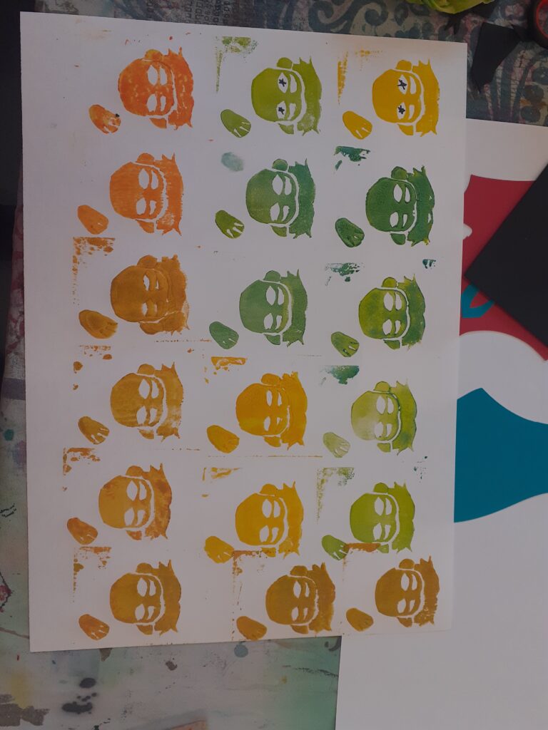
Block printing
For block printing, we had to make a design out of foam and stick it to a block of wood. We used water based ink to print on a A3 sheet of paper with it. This made a repeat pattern in a way. For this i did my character design and experimented with different colours. I did draw the pupils in some of them but i think the ones without them look much better.
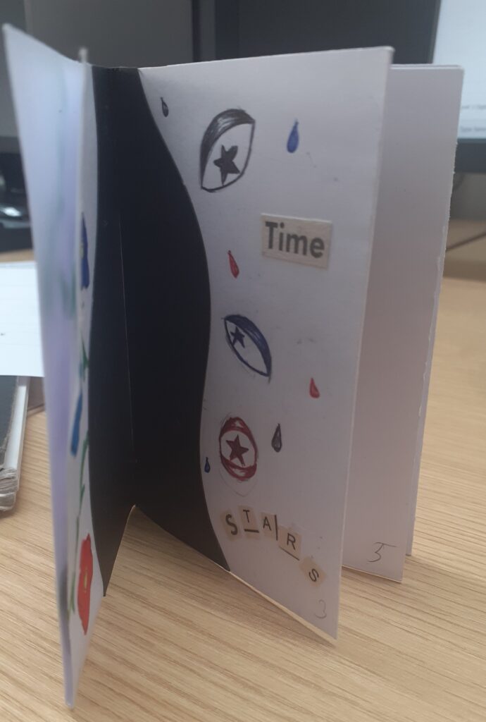
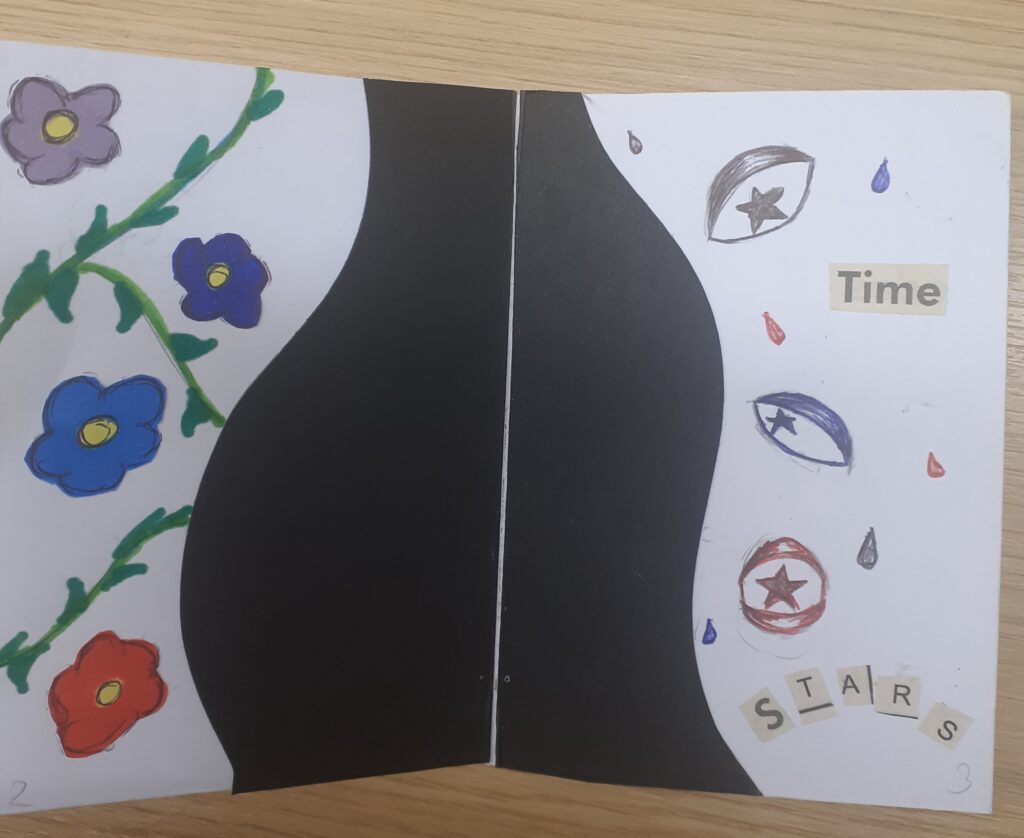
Zine making
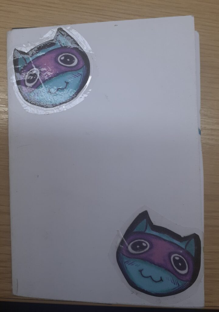
When it came to making zines, i had trouble deciding on what to do for it. In the end i settled on my main character “Sal” the yellow muppet i had created. I included him in various ways. From just pencil drawings to making him out of pieces of a magazine. It was very fun to do. I also added a fun little cat character which i made into custom stickers, mainly because i wanted to add more than just the yellow character to the zine.
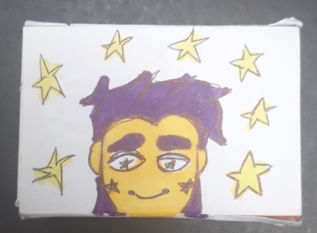
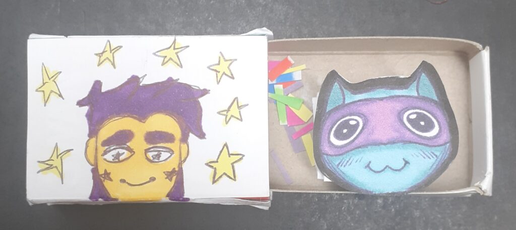
Matchbox project
Just like the zine, i added my muppet character and the character in this. However, i put the muppet on the outside and i added some onomatopoeias to give it a somewhat playful tone. On the inside i glued the cat on a paper spring and added some pieces of paper as confetti. I liked this workshop, however it also seemed a little pointless as it was just decorating a box and had nothing to do with my project.
Dry point
In this workshop we etched our designs into plastic sheets, which made a difficult to see design when the ink wasn’t applies. Later on, we covered it in oil paint/ink to fill the lines with colour. Using cloth and Qtips, I cleaned my design up so that it could look much cleaner. This did not get rid of the oil in the creases. I then wet the paper, placed it above the print and rolled it through a press so that it would print onto the paper. It took about 3 days to dry and the final outcome looked like it was sketched with a graphite pencil.
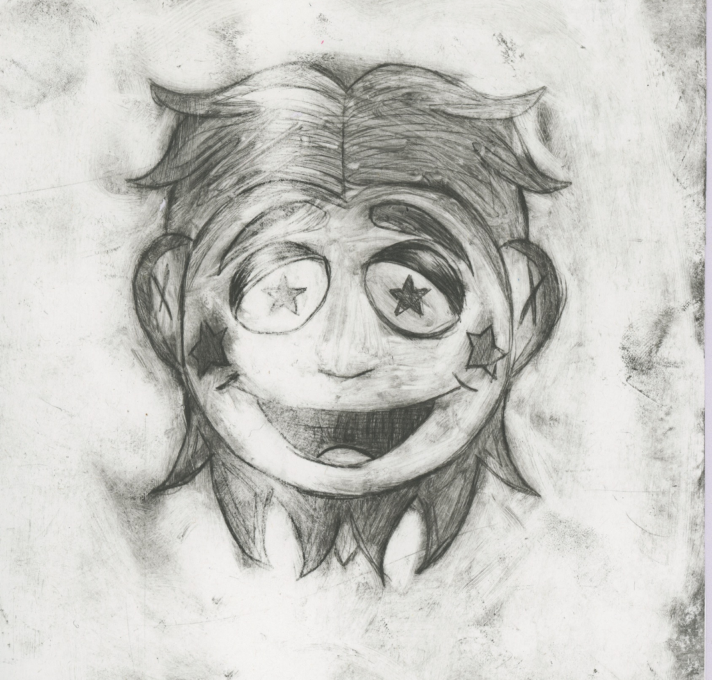
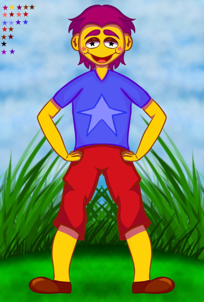
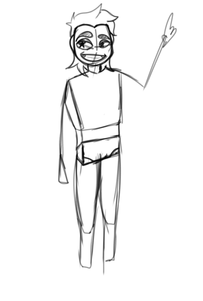
Character design progress
First ever character design for this project. It didn’t turn out as i liked and i was also still planning out the whole design. Therefore it went through massive changes.
This is the show that inspired this character design. I loved the simple style it had, but also the actual story it told. As you can see, i tried to make my a helmet for my character. I did not like the end result as it was way to plain and boring. It also looked horrible compared to what i did later on.
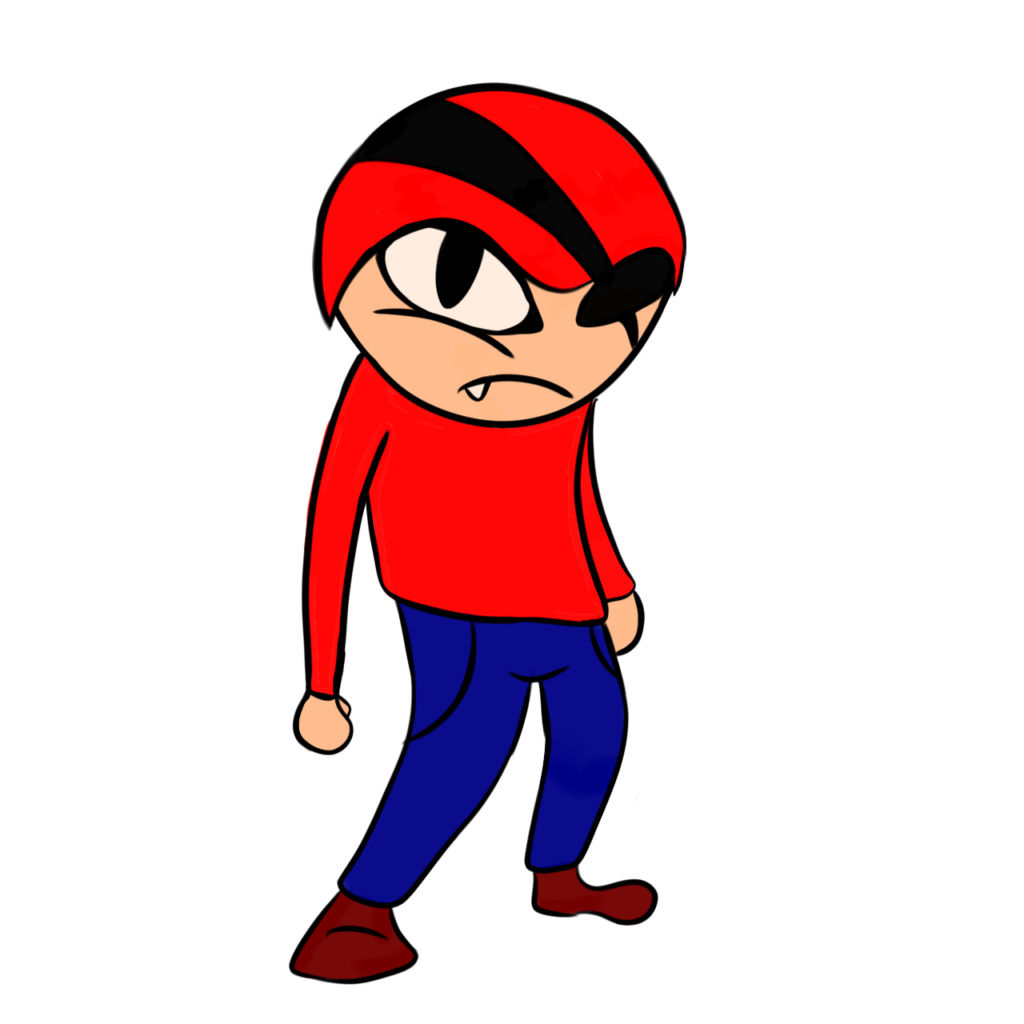
Character’s second design. I think it turned out better than the other one, but it still didn’t fit my plans. I made it more human, but puppet like. This was an easier way to get away with anatomy and other things a human character would need.
This was the show that i somewhat based the character on. I wanted to create a more soft looking design, but i only took some aspects from this shows design. I took the simple colours and the nose design to suit the atmosphere.
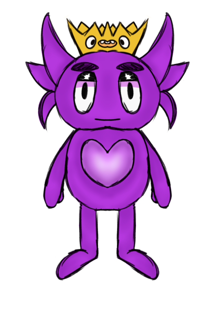
Third Design was completely different because i wanted to experiment more design wise. I didn’t want my character to be restricted to a human like figure. Thats why i made a small and cute monster like creature. But i wasn’t yet satisfied with it so i made way more deigns for what my final character would be. This character wasnt really based off of any cartoons. I tried to make a character from my imagination to see if i could come up with a unique style.
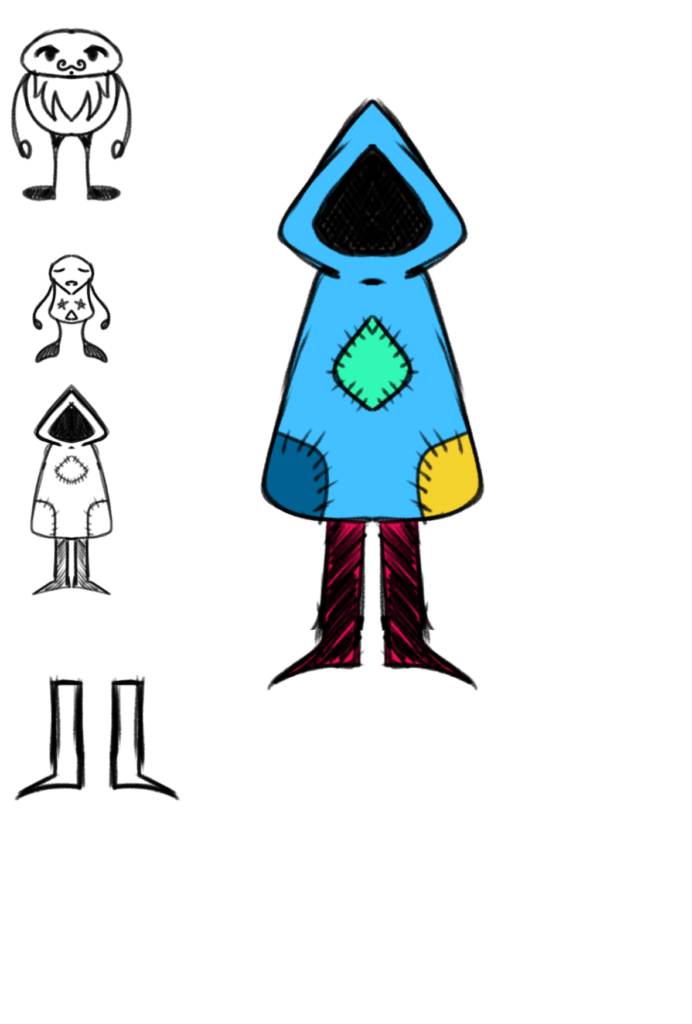
The fourth design however was based around a character i made in High school. It was accompanied by 5 other characters that i at the time, made for animation and comic ideas. I didn’t go forward with it because of how creepy it might’ve looked and it didn’t really fit the overall theme and client. This design also came off as mysterious and would be suited for an audience that loves the mystery. I also couldn’t picture it being on a wall. Despite being simple to draw, i wanted to challenge myself.
For the fifth design, i tried to do a design that kind of related to one of the cartoons i used to watch. it used to have a candy landscape and therefore this design was based around that. This was a jellybean type of character. This was also the creation of my imagination and wasnt really based off of any shows. I tried to come up with more original characters and wanted to see if this could work for what i envisioned at the time.
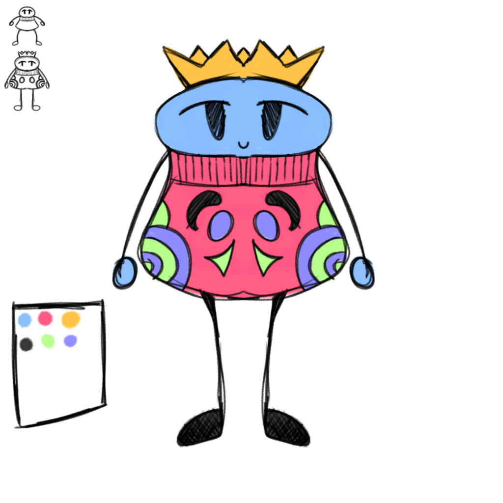
The sixth design, it was a combination of the triangle hooded person and a muppet type of characters. This is where my current design had started to take place. It was a quick doodle and i tried my best to make it cuter and fit the cartoon theme.
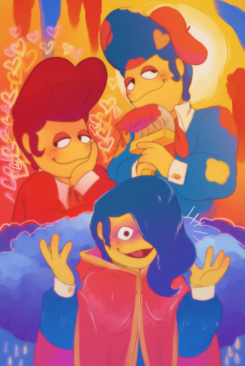
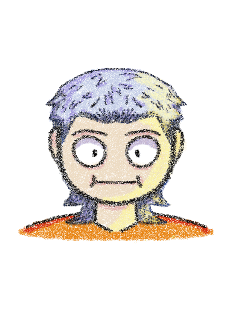
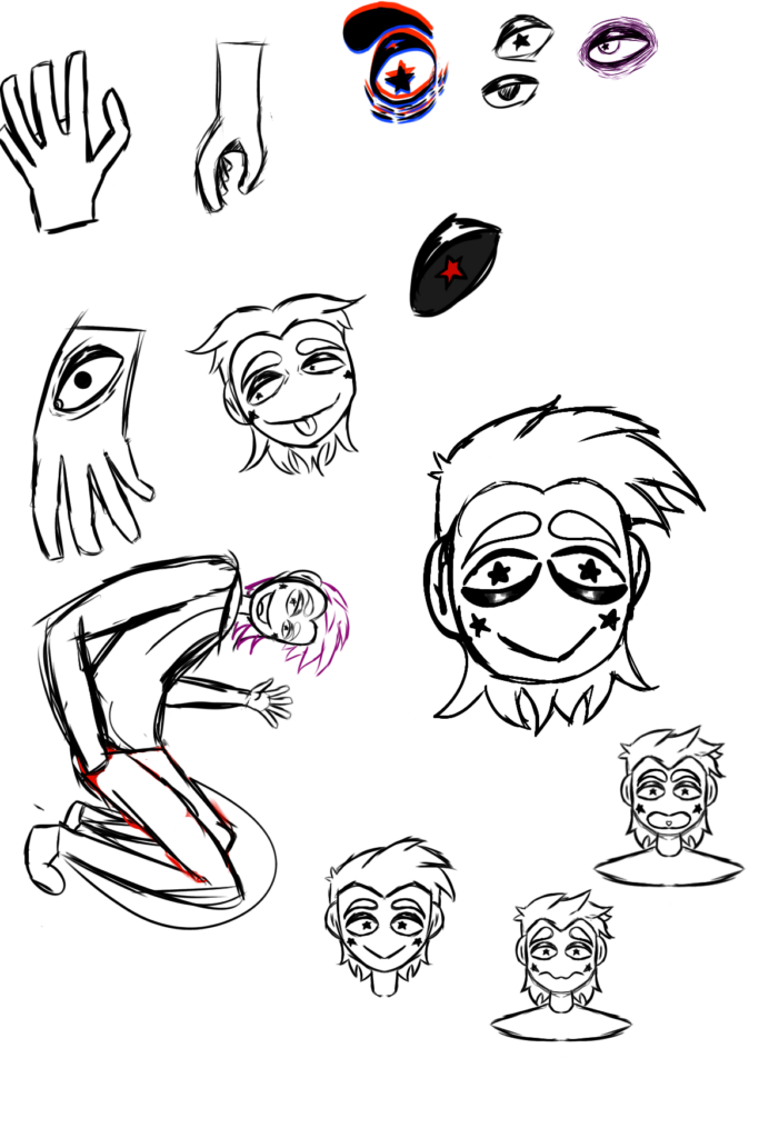
Despite being much different, This sketch i made came from that puppet/muppet idea. This idea came and stuck to me due to an artist (PartyCoffin) i found and got intrigued by their work. This was the first ever design of my current character. The designs below were made on the same day, it was the same type of design that i experimented with. I dont have much to add to them as they were just sketches and i was mindlessly trying to find a style i liked.
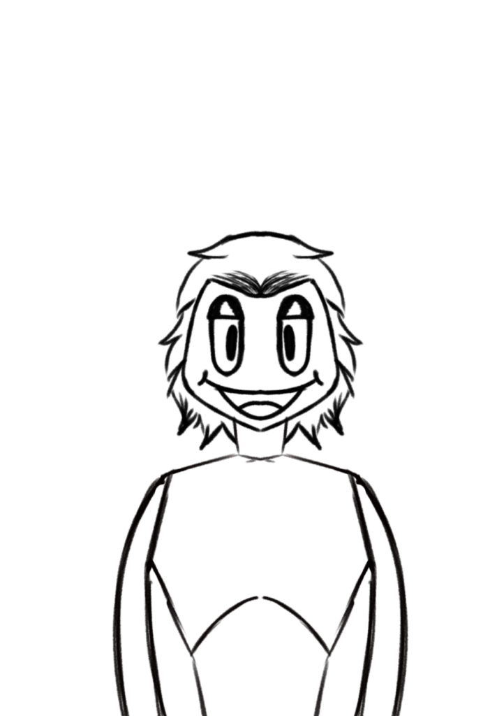
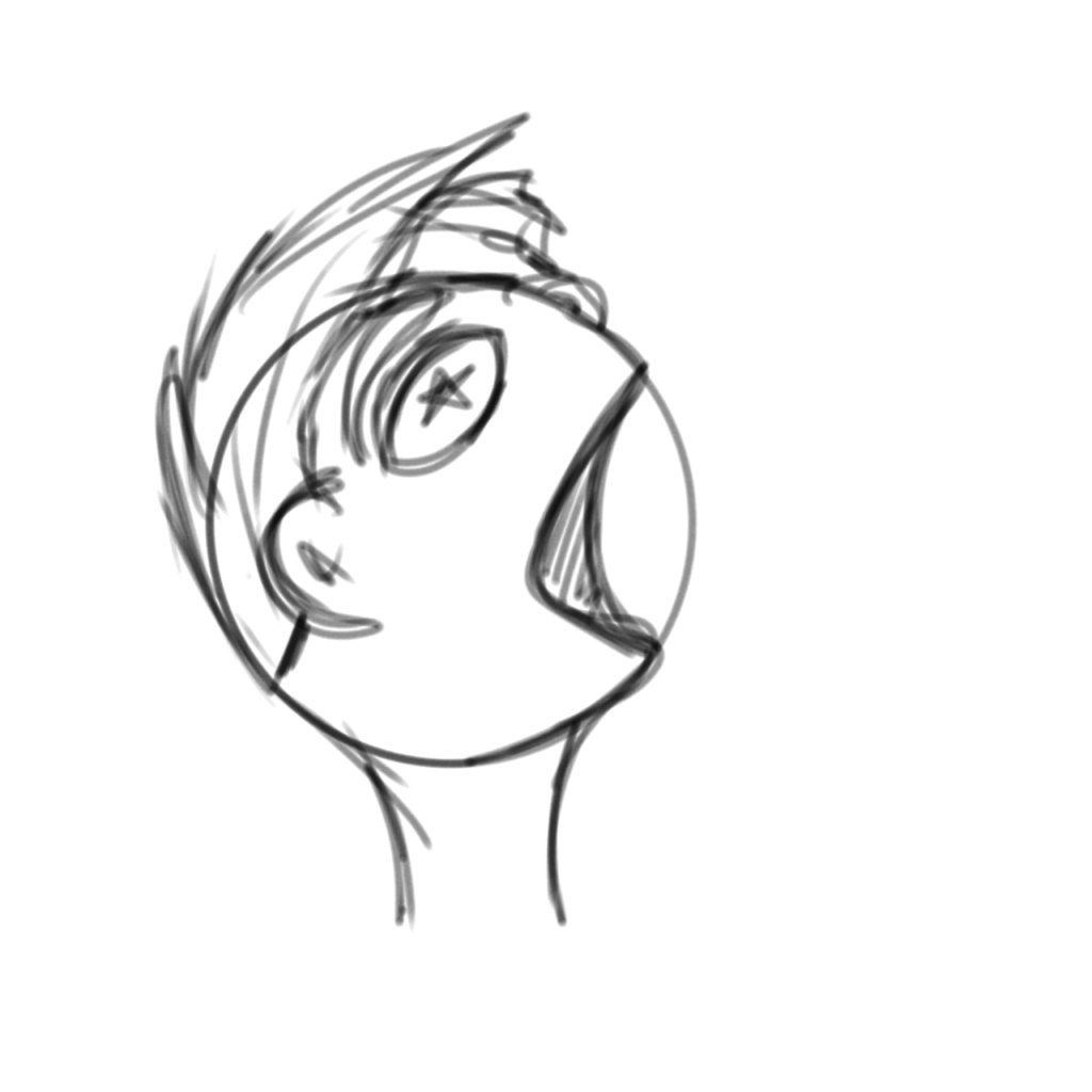
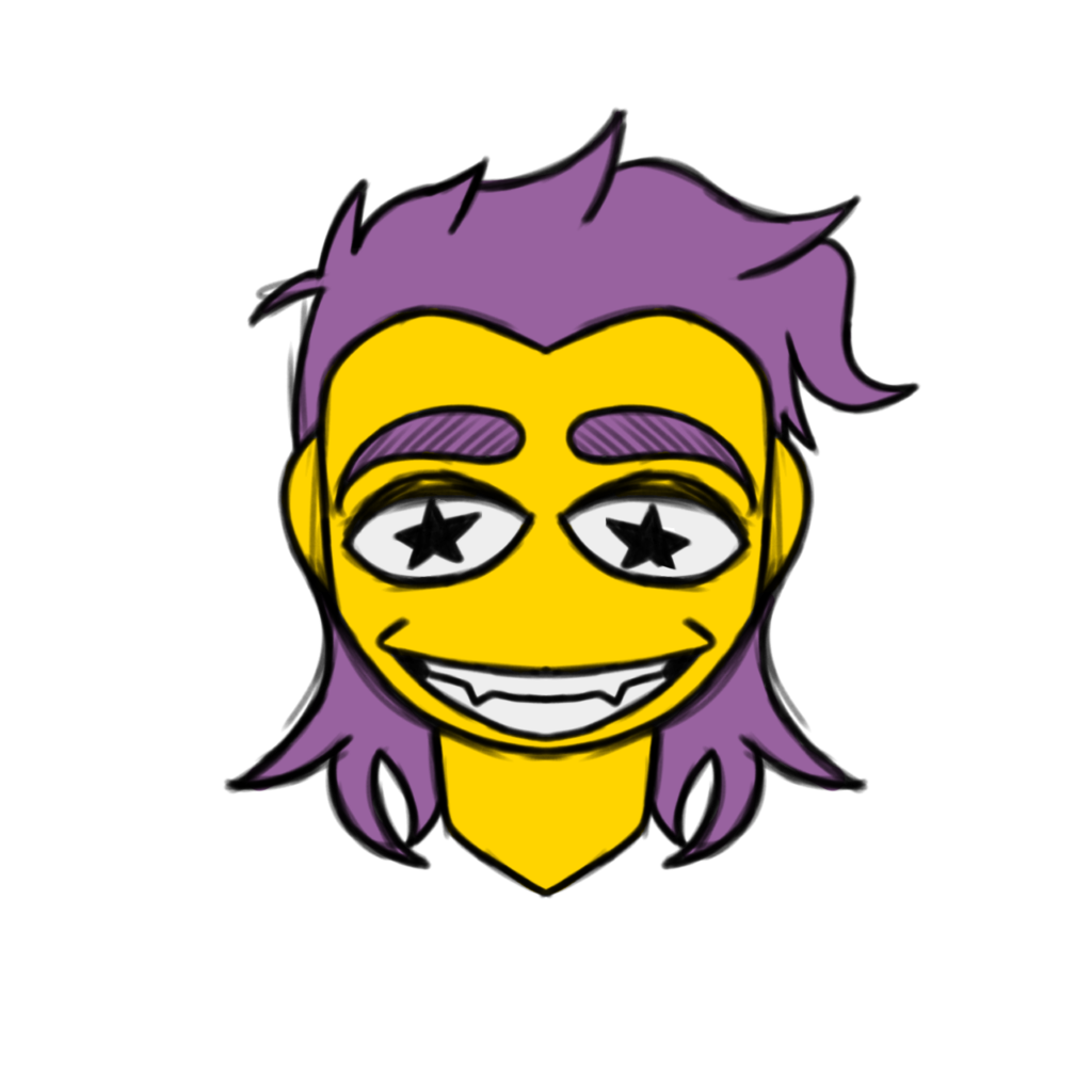
Here you can see how much the design improved. I also tested out drawing a full body for it. I was still unsure about the hair and face, but i was satisfied enough with it at the time. This is where i started to love the character more and more. From this point on, mist of my time was dedicated to polishing this characters design. You can see this more as you scroll down, I loved the design of his eyes a lot. There were also a lot of things i scrapped like the star shaped cheeks.
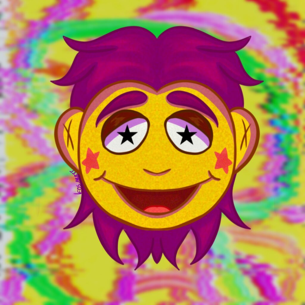
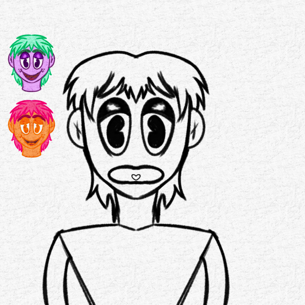
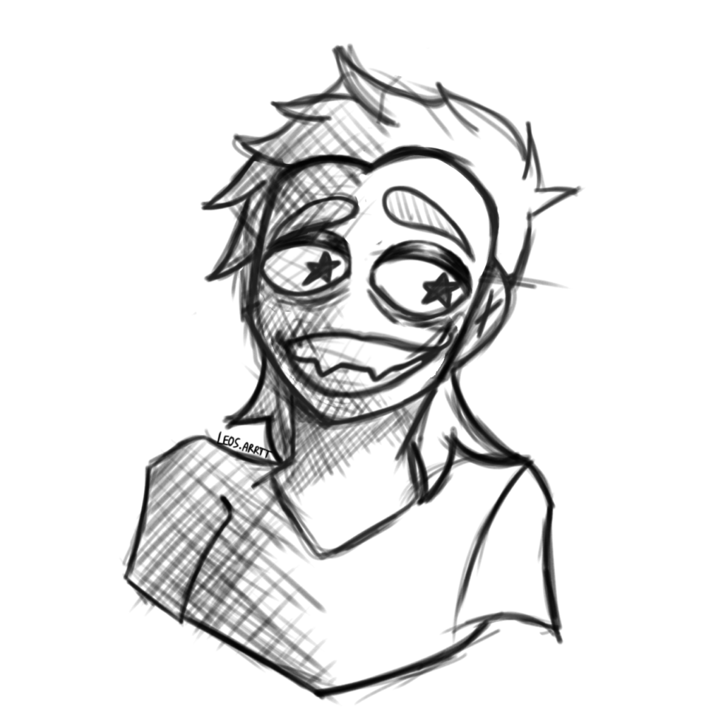
From here onwards, i changed his hair design to be more simple and spike like. I also started to sketch him more and more, i experimented with colouring the lines more so that the black outlines wouldnt stand out. This was something i got inspired to do by one of my artists which was why i started to draw this design to begin with. All the photos below this one were made in a similar span of time and were purely practices for facial expressions, poses, colour schemes and of course designs in both the charatcers appearence and also the use of colour. You can also see in one of the sketches, i tried to draw him more as a hand puppet which he was based off of to begin with. However i didnt like this idea as it was slightly awkward to draw.
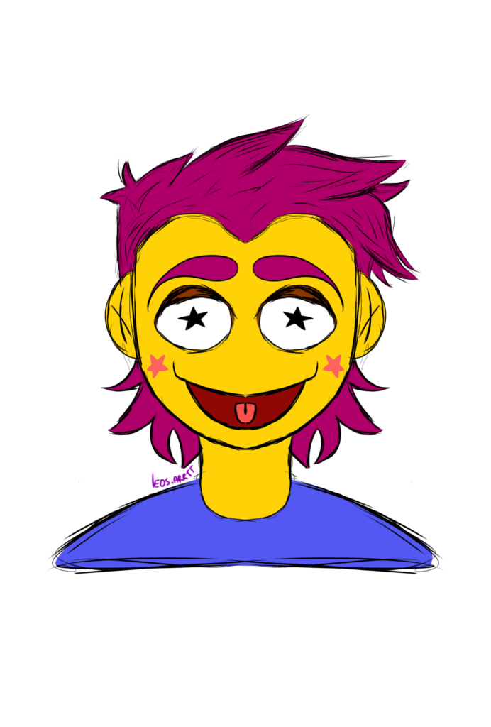
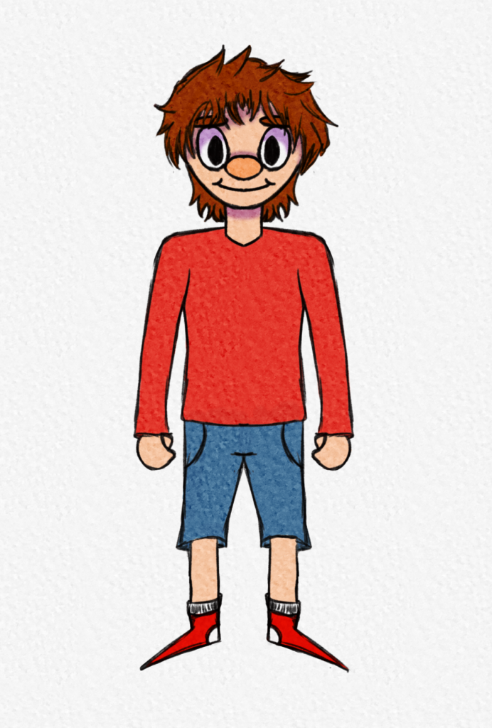
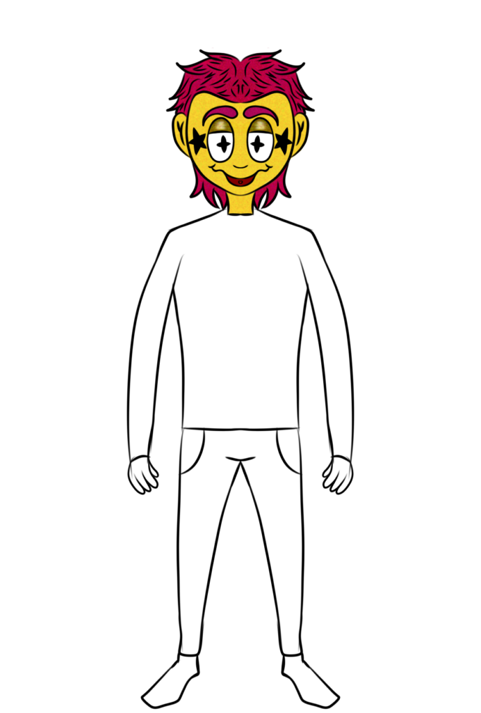
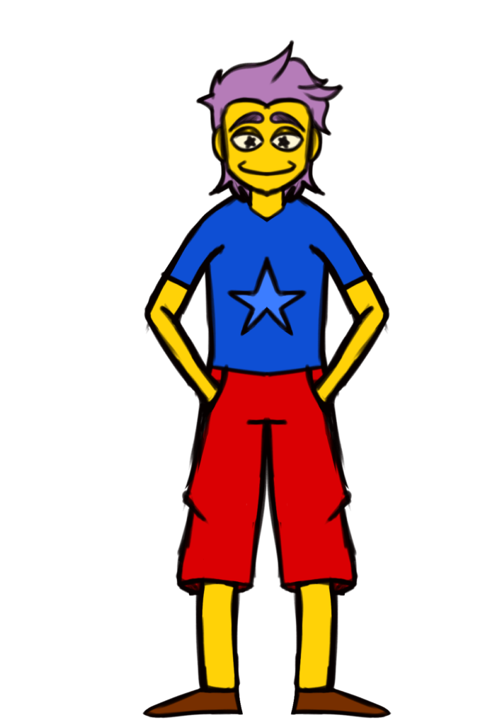
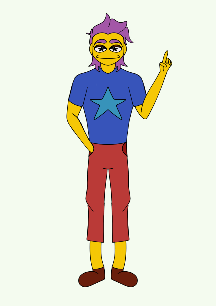
I did some minor changes, like using a more lavender colour for The characters hair. In the next photos you can see i experimented with full body drawings. I started to get more comfortable drawing full body shots for this charatcer. These designs however did not end up being my final piece. I sticked with the colours, but not the full body shots. I didnt end up picking these as i thought the style seemed too mature in a way. I ended up going to a much more simple design.
Final piece
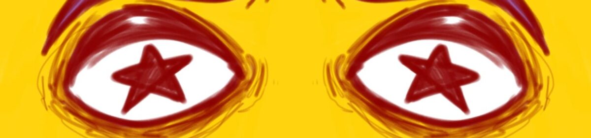
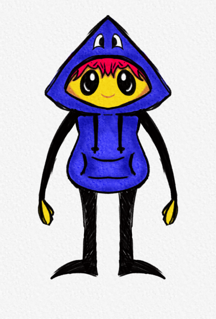
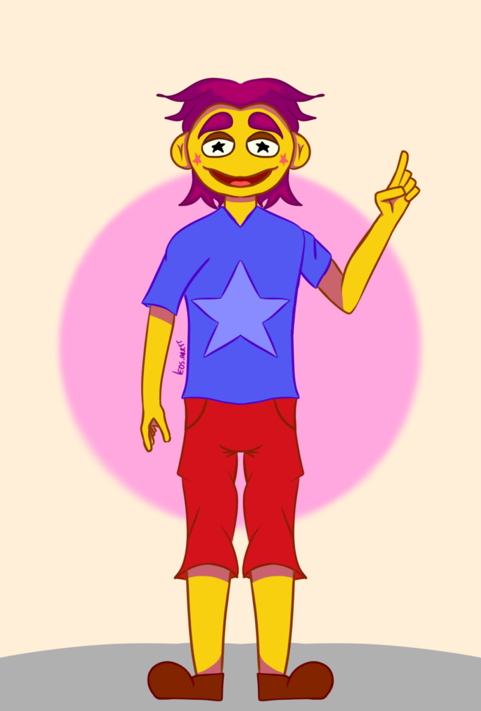
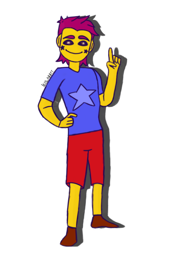
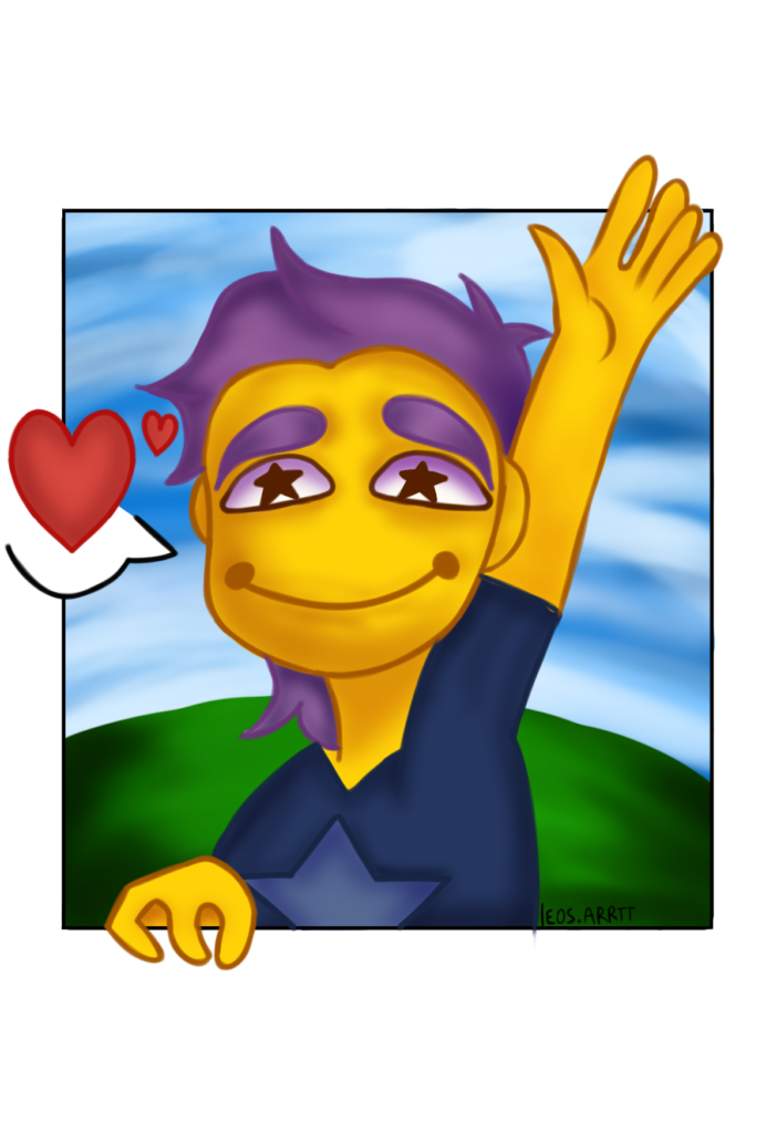
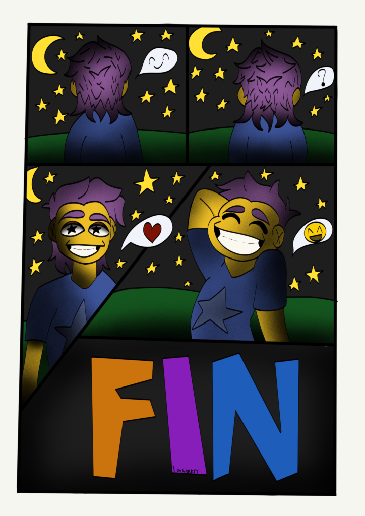
For my final piece, i decided to do 2 A1 pieces. These consist of My charatcer “Sal”, however one of these pieces is a comic. I think these turned out good, especially the one where hes waving. But, i think i couldve done better for the comics shading. This was my first official comic, in which i decided to not use words, but instead use symbols to show emotion or “speech”. I thought this would be easier to understand for a wider audience and for the client too. Both of these pieces were made digitally.
In my opinion what went the best was the shading on the first piece. I also love the way the lines were coloured coampring to the comic piece where the outlines stand out due to them being very dark.
Final evaluation
Bibliography/referencing
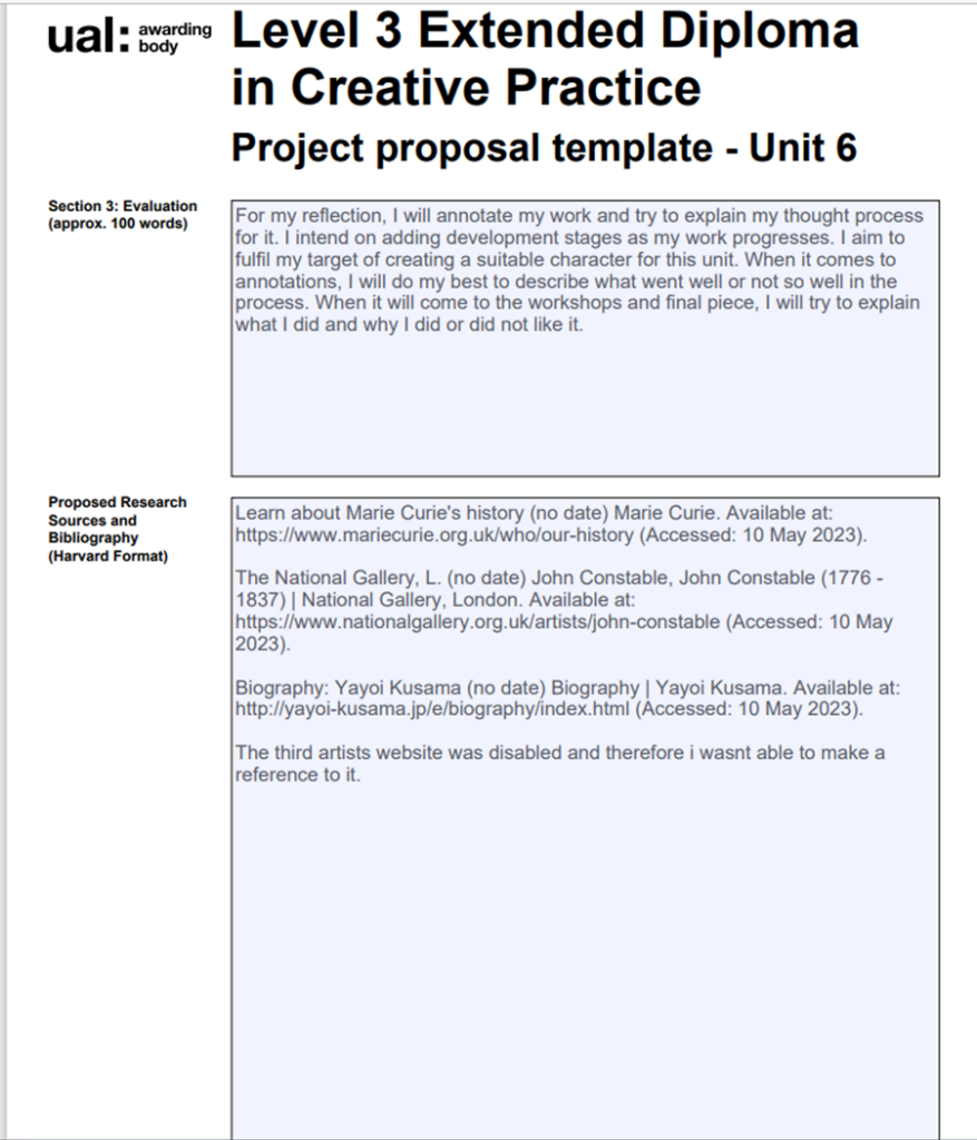
Learn about Marie Curie’s history (no date) Marie Curie. Available at: https://www.mariecurie.org.uk/who/our-history (Accessed: 10 May 2023).
The National Gallery, L. (no date) John Constable, John Constable (1776 – 1837) | National Gallery, London. Available at: https://www.nationalgallery.org.uk/artists/john-constable (Accessed: 10 May 2023).
Biography: Yayoi Kusama (no date) Biography | Yayoi Kusama. Available at: http://yayoi-kusama.jp/e/biography/index.html (Accessed: 10 May 2023).
The third artists website was disabled and therefore I wasn’t able to make a reference to it.