Branding:
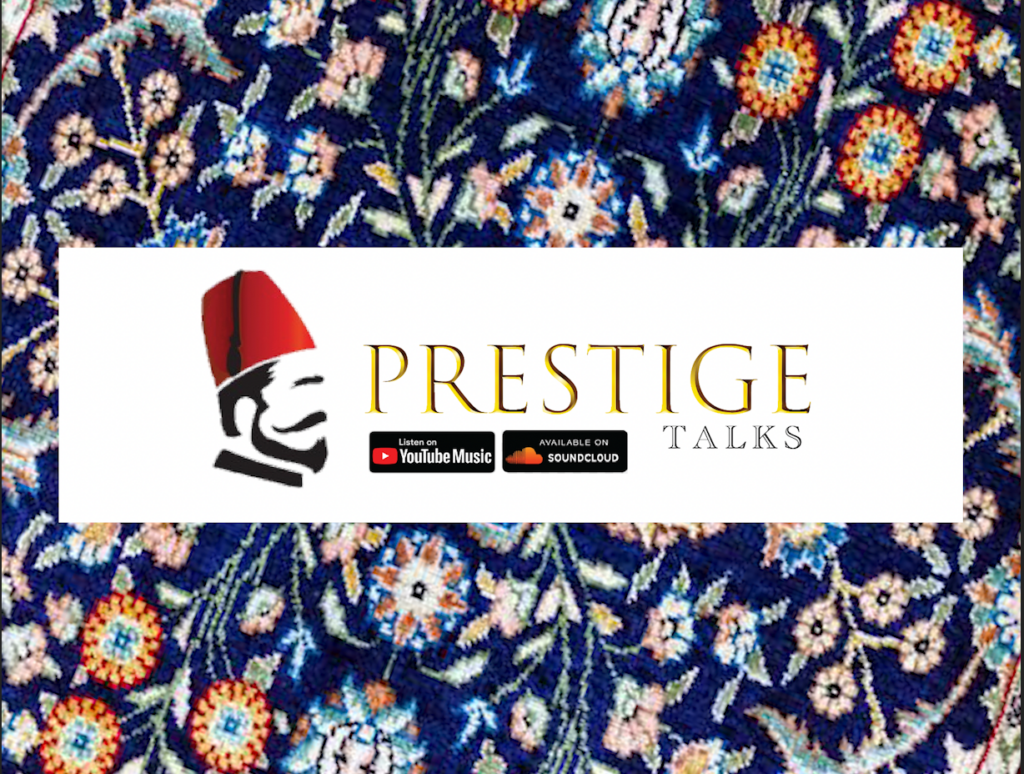
This is my Logo for my podcast for sites like Spotify and Youtube Music. Whilst Designing this Logo, I used the fonts Trajan Color for the golden lettering and for the black and white shaded lettering I used Academy Engraved LET Plain:1.0. One reason why I added the gold lettering with the Trajan font was to give my logo an elegant touch. Making my logo stand out. On the other hand, for the text below I used the Engraved font to make my logo sedate. After applying these effective techniques, the finished product had a cool and a professional finish. The reason to the blank print side view of a man wearing a fez was to set an identity to my podcast, Including the branding “Listen on Youtube Music” “Available on SOUNDCLOUD” making it obvious to the viewer where they could access my podcast. Last but not least the background, a picture on The Ottoman Architectural patterning. This was to make the logo stand out and bring a welcoming feel. Overall my motive was to design a logo open but compact. Making it attractive but useful for me as a podcaster.
App Icon logo:
I designed this logo for sites like sound-cloud that have size limits of 1:1 and also as an extra logo. I used the same fonts except adding the font Bodoni 72 Small caps Book to the letter R. With the same setting I wanted to keep the same elegant look and style keeping the logo looking fresh in both styles.
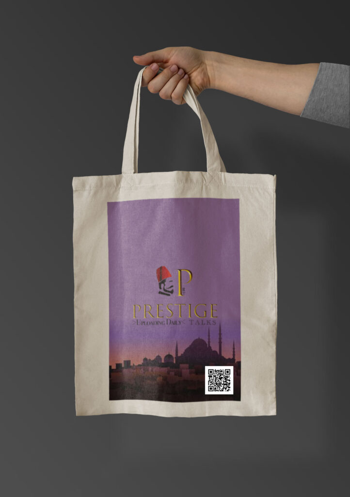
With Designing this bag, I used my second app icon logo and mixed my original main logo design with the text below “Uploading Daily”. My Motive was to bring a welcoming but a distinct feel to this item. I believe if this bag would to be distributed in stores like Morrisons, Tesco, Asda and Sainsburys . This would grab attention as in my research I found: ” The main retailers (Asda, Marks and Spencer, Morrisons, Sainsbury’s, The Co-operative Group, Tesco and Waitrose) sold 226 million single use plastic carrier bags in England in 2019 to 2020” Using the information I found, I used my idea of keeping an elegant and a distinct look for people to look at this bag and also use the active QR Code and listen to my podcast. The best part of the bag is the logo and the background. They both match and bring a distinguished vibe.
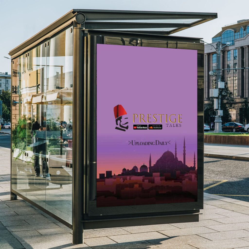
The reason to why I decided to design my template like this is because I wanted to keep my poster look simple. Making my poster look simple would be easier for the public to read my poster. For example the background is not so flashy and distracting but fitting and good looking, The motive with this is the viewer to know of the podcast and search this up. And not disregard the whole text and look at the beauty of the background picture, On the other hand the background is set to make the viewer aware of what this podcast is about, what the podcast could be based on, For Example this background is Istanbul Mosque view, And also the logo being a fez. Some can become aware with the fez itself that the podcast is based on The Ottoman Empire or may mention of the Ottoman Empire frequently, Where As the background may indicate the podcast could be on Turkish Culture or History or maybe on Religion. At the end the viewer will look up the podcast to know what this podcast is on.
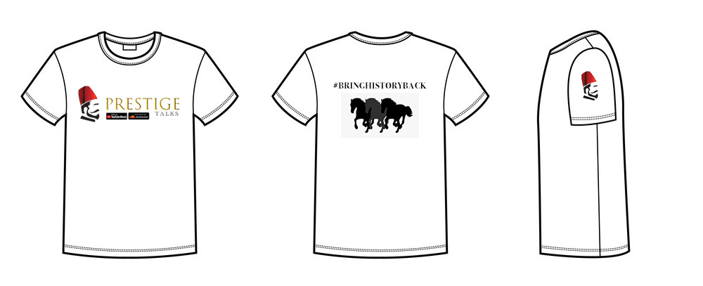
Above is the Design I made for my T-Shirts. Starting of from the front, I added my original logo to attract viewers. I believe if this T-Shirt would to be worn it would make someone stand out in crowds as not only the front but the back is designed with a engraving #BRINGHISTORYBACK giving it attention. The reason I included the hashtag was for someone to feel part of a cause, A motive. A reason to wear this T-Shirt. Also on the other hand, Below the lettering I included a black layout of3 horses galloping to bring a extra touch to fill the gap and space in. Finally the logo on the side. After using my imagination I thought if someone had to sponsor my podcast or either way. Football, Cricket or Rugby teams could represent the podcast comfortably with the a shirt like this but also if it would to be sponsored the design would need to be updated for the teams. What I like about this design is that this design is more noticeable and open, Where As if this would have been published as a real T-Shirt, The problem of multiple designs and colours would up rise.
Interactive Functionality:
My podcast is set to be viewed publicly. Meaning people may comment. With the comments that may come I plan to take it on board and use them for my personal YouTube Channel and not only that, But my future projects that may involve with audio editing. With the features on YouTube, For example the like and subscribe button and also the video analytics and the comments section. I plan to also consider them for any future projects as for example The audience retention. How many people view the Podcast. If my audience retention rises i will know that many people are interested into my podcast. And if people like my podcast i will understand they enjoyed. On the other hand, Soundcloud. Soundcloud has maybe a few more features for example, Repost, follow and also the normal features like comment, share and like. With these I will use these for the same purpose as maybe I require these tips for future work or for personal usage on my YouTube Channel.