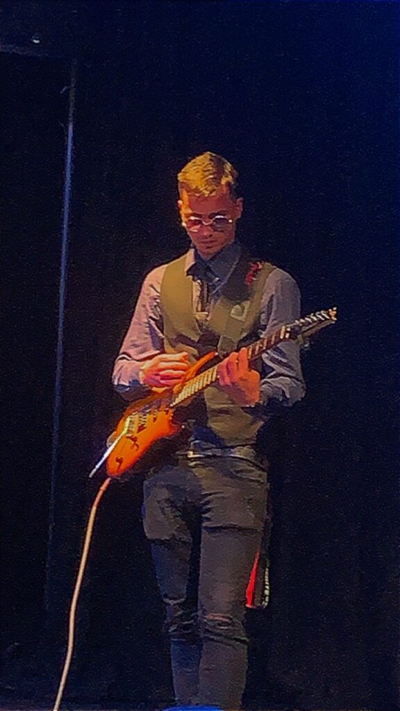
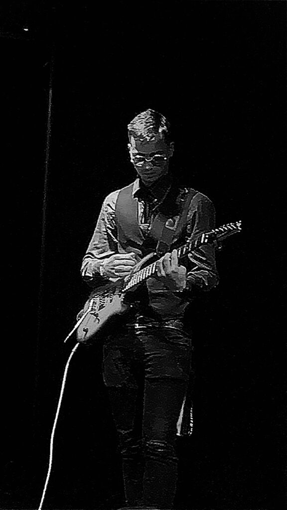
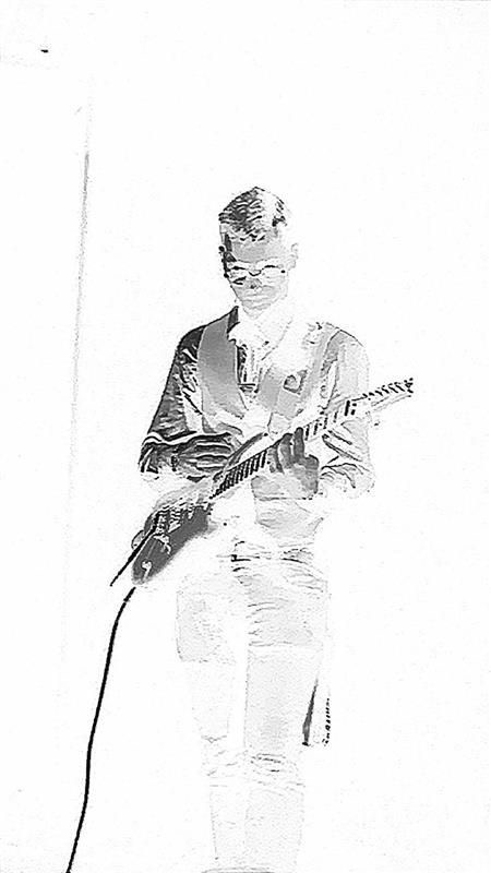
For the images above, I used my phone settings to create a black and white image, before using photoshop to invert the colors. I turned the shadows and contrast up and turned the highlights down on the image to add a darker effect so when I inverted it the image would come out lighter and the highlights wouldn’t be as harsh.
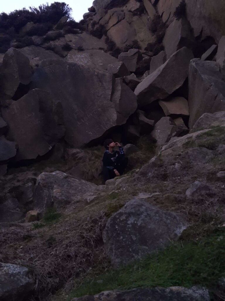
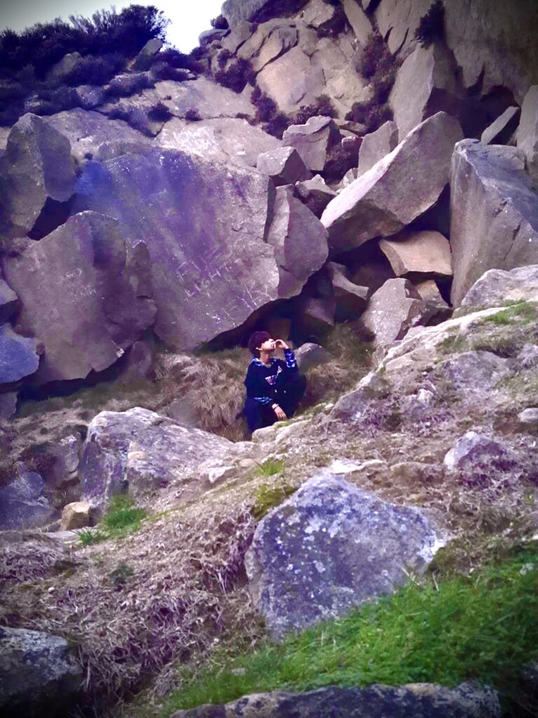
For these images, I turned up the saturation and lowered the warmth on the image. In the top picture, the picture is a lot darker and you can’t really see the model in the middle, but after editing the picture, the focus is mostly on the model rather than the dark rocks. I think by brightening the image, I took away an affect of character but it still looks somewhat good with photoshop.