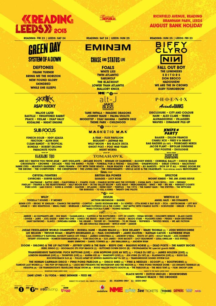
Leeds fest is always a very text heavy poster which is good for the viewer, as you can clearly see who will be playing, and where and when they’ll be on, but the major down side it theres no eye catching graphics, which some could consider boring, as the Leeds fest poster looks almost the same year after year.
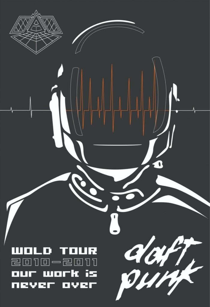
Here’s a more minimalist poster for daft punk showing a simple drawing of one of the duo and few text, the down side of this, is there’s no extensive information for the viewer and isn’t to eye catching. I personally like it the design but may be overlooked by other people due to lack of colour and
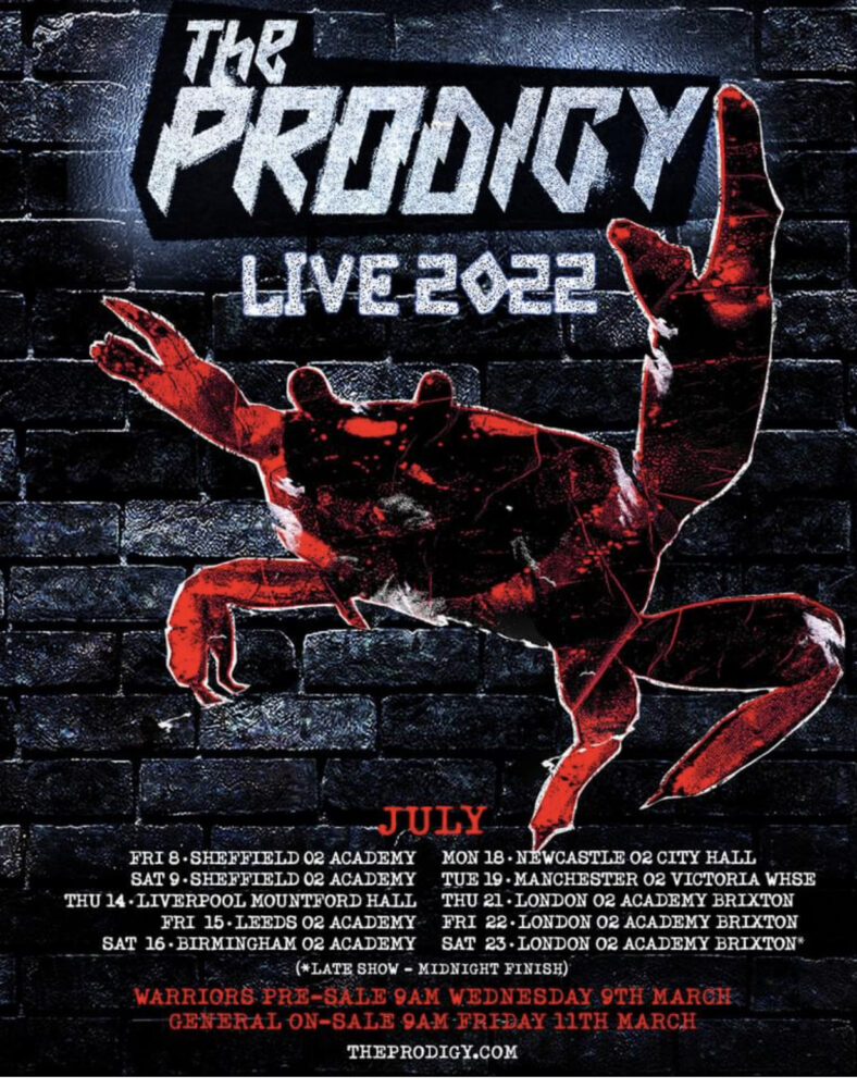
Here is one of my favourite due to me actually attending one of the gigs, its use of the iconic crab from the fat of the land album commemorates the 25th anniversary which is good for the fans.
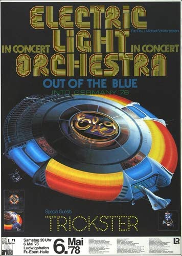
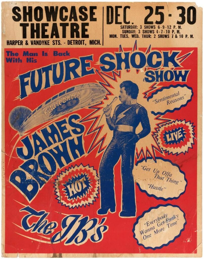
And heres a couple of very old posters for the 60s and 70s , and as you can see the quality of text, fonts and colours has come a long way, the way its presented has changed with the times, as well as they used to reflect the genre with funky fonts and imagery.