Graphics Research –
Here are some examples of different funk albums
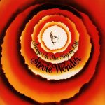
I really like this Stevie Wonder album cover for the colour choice, orange and black are some of my favourite colours, so I like the way its being faded into each other towards the centre. it’s some what simple, but eye catching.
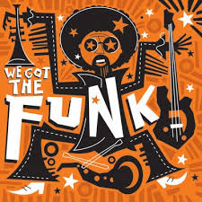
This is another album, black and orange again, but the graphic is the main focus for this one, I really like the funky line work of the man, and the way it fills the full piece. this made me think that I might create a graphic to cover the entire piece, or at least create something bold.
And finally for this cover, I love the typography, the fragmented letters give a really good bold look, but I’m not sure yet if I want to include typography myself.
Since changing direction of the track, I’ve decided to look at albums closer to the the new genre I’ve adopted.
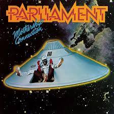
This has always been one of my favourites, it used to freak me as a kid when looking ad my dads CDs. The protruding face creates a disturbing image, which quite obviously conveys an array of emotions, as well as that its bold and eye catching, but has a simple colour scheme, showing I don’t particularly need many colours for it to be good.
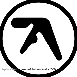
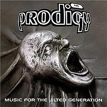
I feel like I’m enticed to simple art works, there’s not really much to this cover, no colour, no bold graphics, just a simple logo, yet I really like it still. Its simple and minimalist.
My art ideas –
One of my ideas is I’m thinking of making a hand drawn skull and scanning it into photo shop, and further editing it.
I could make a logo, and just have that on the front, but its a bit boring and simple.
I could maybe have a drum kit as the cover since that’s one of the main focuses of the project.
–
I’ve decided to create a logo, my idea so far is to just include my initials but maybe morph them into one.

- And here’s what I came up with, I’m quite happy with how it turned out, its only a simple use of my initials but nice design. All I did was merged the letters B and K together, and filled in the gaps to make it look solid.
And what I want to do now is to use my skull idea and incorporate the logo in my design.
This is my first attempt at creating a cover art, and although its my first proper attempt, I think I’m going to keep it. In this design, I’ve incorporated both a skull, and the logo I made. I quite like what I’ve done, because of the subtle colours, and slight rescaling of the logo with each colour, It gives a little more depth to the image, which is something a like. This has almost absolute zero correlation to the track, but I really like it and I think I’m going to use it.