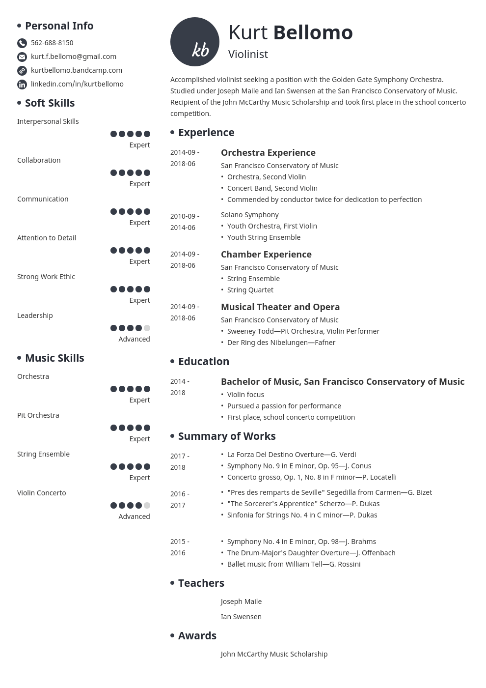
This CV is good because its a minimalist but cohesive design with plenty of detail, its my favourite because of its simplicity. I like the way the music skills are presented with levels of how good they are.

This CV kind of improves with colour and a photo of the person. Colour could show personality which is good for a CV, especially for a subject such as music, personality is important, so to show it in a CV is a good thing to do.

this CV then adds a colourful graphic. Yet again graphics presents your personality, it shows what you like and how you want to present yourself.

This CV is full off smalls graphics and different colours, personally it isn’t my favourite, but I can see why people could be drawn to it, the black background makes the writing pop and the boxed design of each segment makes it easy to read and follow.

This last one shows a combination of all of them. The black background again makes it pop, and it includes a picture of the person, it’s easy to read, and is in chronological order, so overall its good.
Business cards

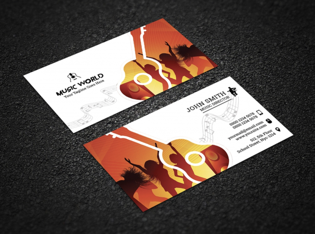
this here is probably whats gonna be most common too see in a business card. This option is a lot cheaper cheaper since Its a simple design with text, a graphic, and a bit of colour on a piece of thin card. I personally think I’ts not the most creative but it gets the job done.

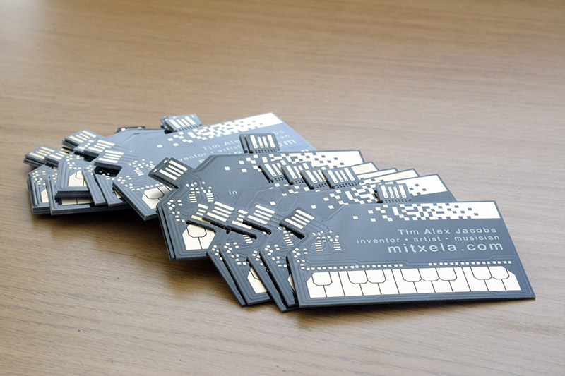
Yet this business card takes it a whole step further. this card introduces electronics, this already makes it quite expensive, but the end result is very good, the card is really itself a musical instrument.