Treatment
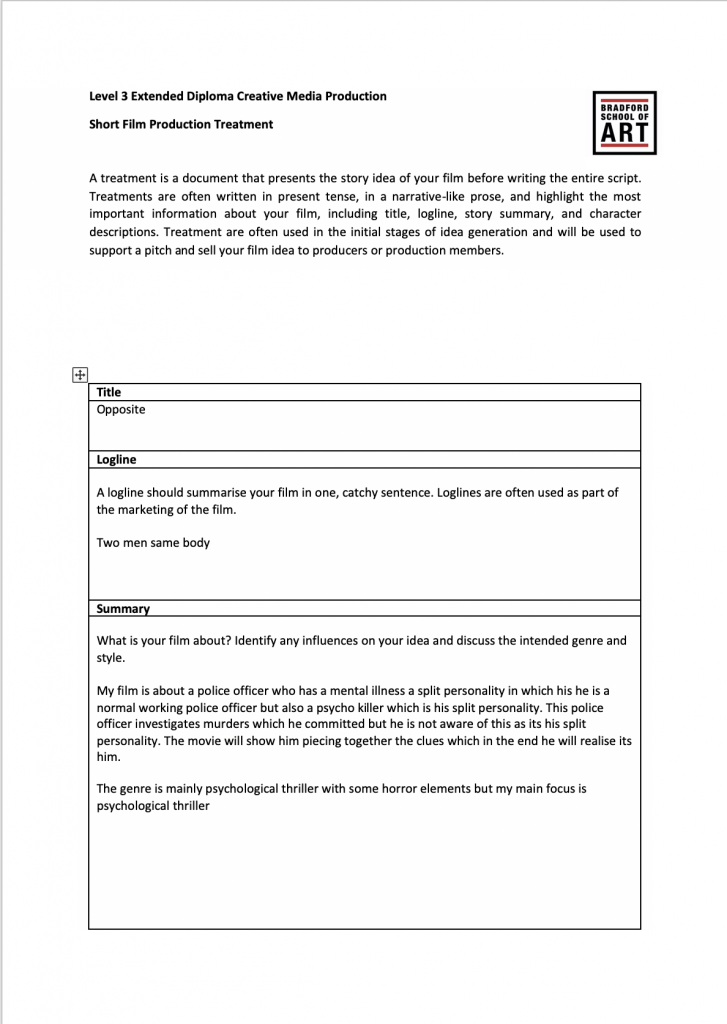
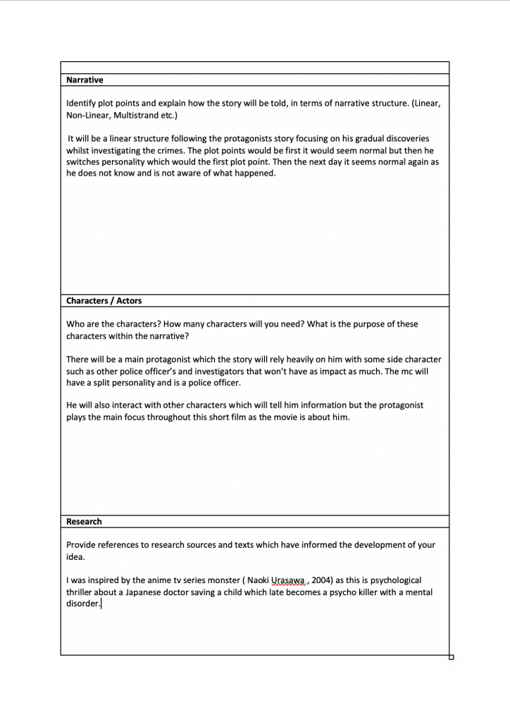
Narrative:
Linear – Toy story is a linear narrative as it follows woody and buzzes adventure in a linear way and has a start and conclusion
Non-linear – Batman begins is non linear as it has flashbacks to the main characters’ past and childhood which shows how he became a superhero and why.
Open – squid game is a open narrative as it has many mysteries which makes the audience question and want to know more about what will happen next or what the main character may do next as it ends on cliffhanger.
Closed – Free guy follows a closed narrative as it shows the main characters journey from being a NPC (non playable character) to a person with feelings and being free and the end which is a happy ending and conclusion.
Multi Strand – pulp fiction has a multi strand narrative as it follows multiple different characters and their lifestyles for example a boxer and a gangster.
Restricted/unrestricted – us is a unrestricted narrative as the audience are aware of where the clones are located and where they came from and their goal but the characters in the movie don’t know where they came from and what their goal is.
Batman dark knight (2008, Christopher Nolan)
Hero – Batman
Villain – Joker
Donor – Alfred
Dispatcher – Gordon
False hero – joker
Helper – Alfred
Princess – Mobs money
Father – Gordon/gotham city
Kingsman the secret service :
Director: Matthew Vaughn Link: https://www.youtube.com/watch?v=44-HB0RD6M8
Underwater scene:
The scene starts of with a long shot showing the room and the people sleeping in their beds. The scene then shifts to a mid shot showing the protagonist panicking because the room is filling up of water. Mid shots and long shots are uses quite frequently to show the panic in the room of the other characters to. The long shot is also used to show the full room when full of water as the other characters try to escape. The scene then goes back to a mid shot and close up of the characters and the protagonist showing the panic and expressions , desperately trying to not drown and figuring out a way to escape. Mid shots are often used as there are multiple characters figuring out a way to not drown which is shown the mid shot which you also can see the protagonist swimming as you can see their bodies as it switches to a long shot to a mid shot. There is also a close up of the protagonist to show he is thinking and how to solve the situation as quick as possible.
Furthermore, the protagonist sees a two way mirror which he then proceeds to break, here a close up shot and mid shot is used to show him trying to break the mirror and escape. The protagonist succeeds with this idea and all the water in the room drains out and the other characters escape with him. Mid shots were mainly used in this scene as there is multiple characters which mid shots are great for capturing multiple expressions and reactions at once.
There were also some low camera angles when the room was filling up. This gives the audience a sense of suspense as it shows how quickly the room is filling up as the characters are touching the roof. This was mainly used as the room was full of water which the characters is shown swimming.
The technical codes used were the sound when the camera went underwater with the characters the sound changed which allows the audience to feel like they also are in the water as you can hear them swim and the volume and pitch lowers when it enters the water. Also the lighting changes when the room fills with water as its blue and becomes darker with the light bulbs shinning from the top which shows the scenery change from normal room to a flooded room.
Pitch
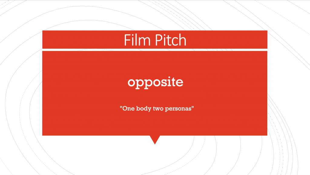
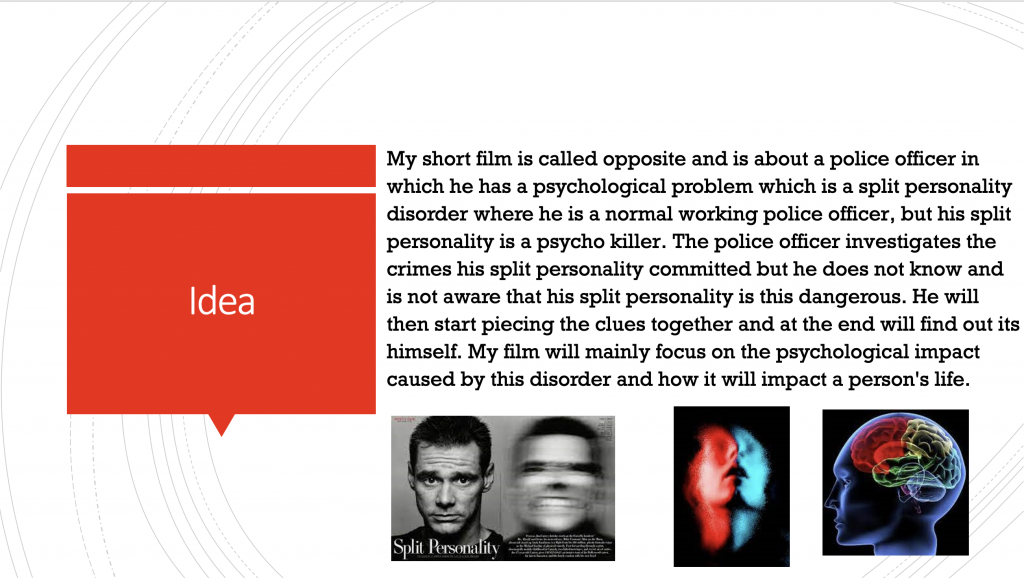
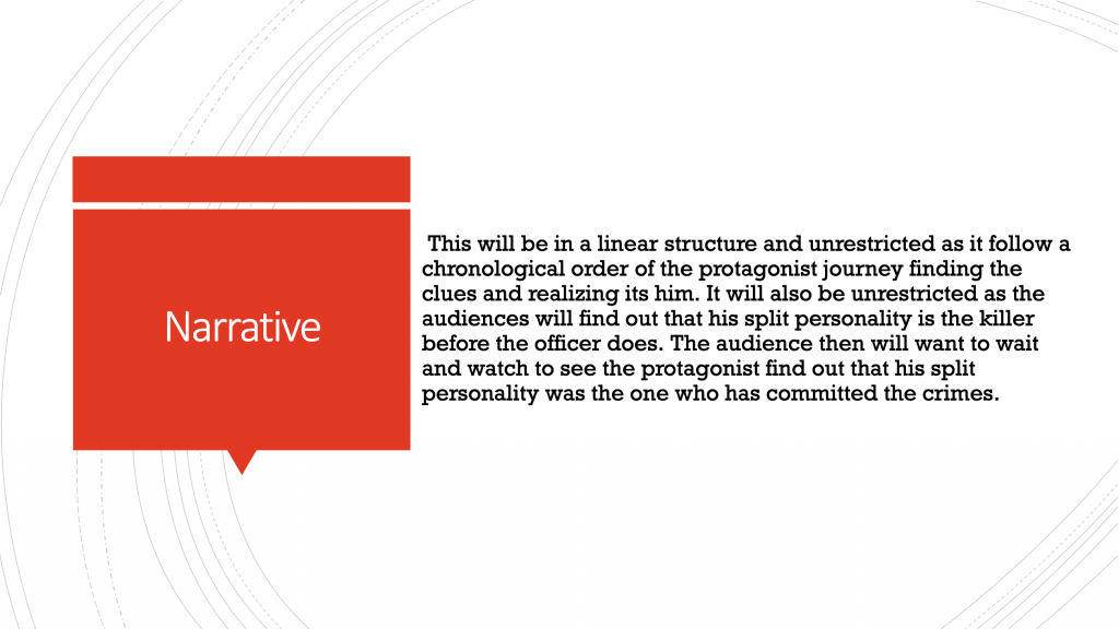
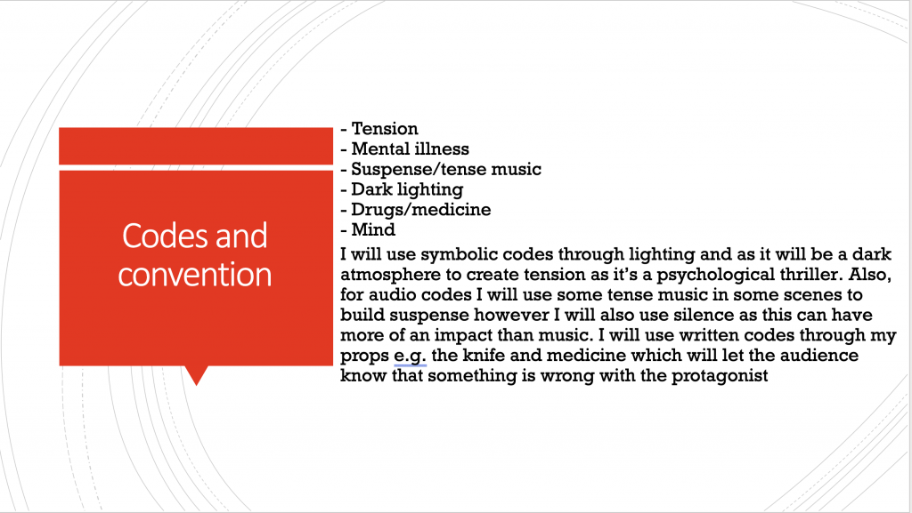
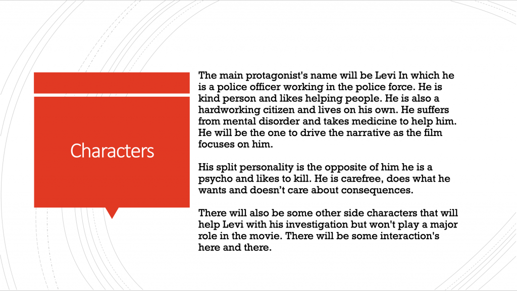
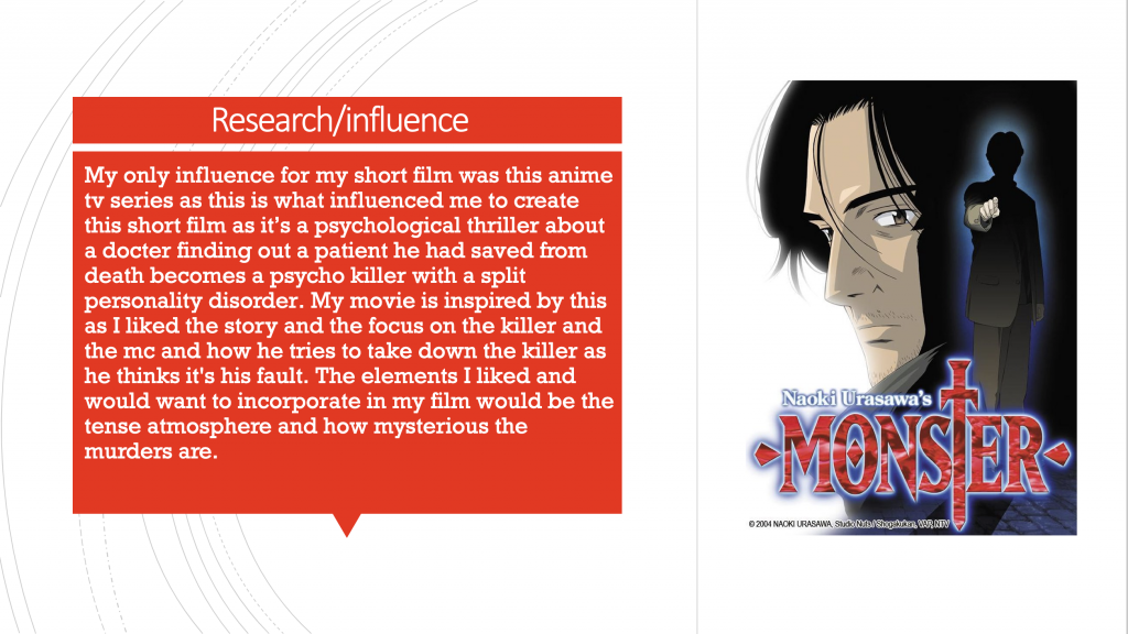
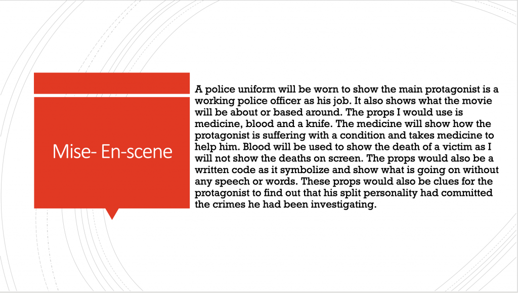
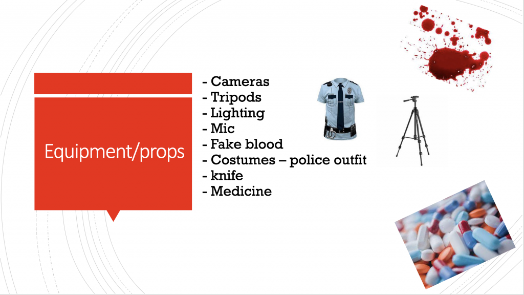
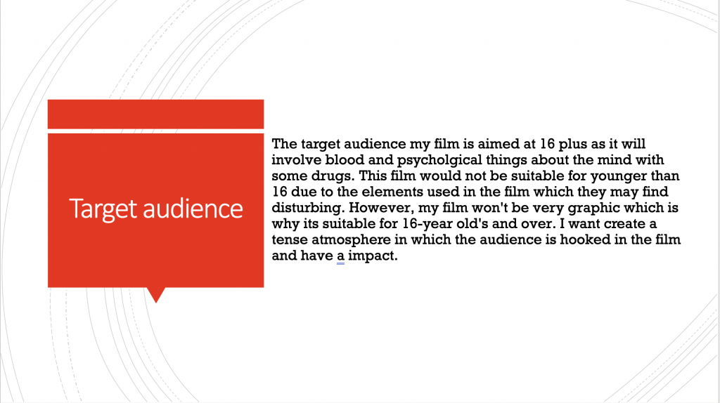
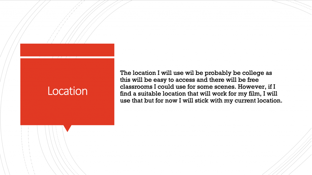
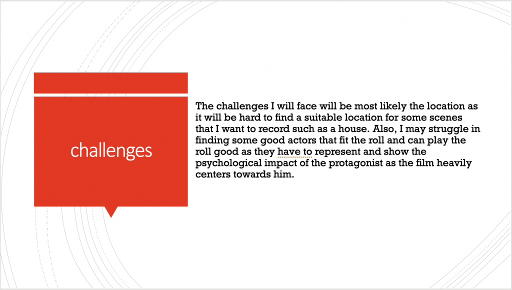
Overall i thought my pitch went well as i talked all about the slides in my powerpoint and described the plot to my film and tried to show the audience what i am aiming for in my film. However if i had done it again i could improve on the different codes will affect the movie in the different scenes and i could throughly explain my plot points so the audience know what im going for.
Movie poster analysis
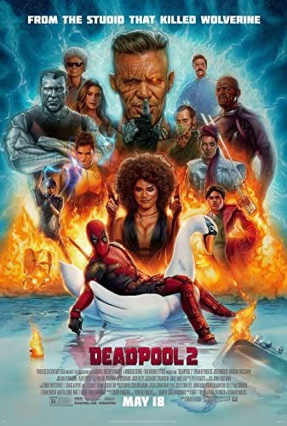
The main character Dead-pool is placed at the front as he is the main protagonist and is the main focus. He is placed on a swan and relaxing as if nothing is going as there is a huge explosion behind him which makes it chaotic behind him. This perfectly describes his character as he doesn’t seem to care about the chaos. Also, the big bad of the movie is bigger than the other character to show the audience who is the antagonist. The side characters are also shown in the poster showing they play a roll into the movie.
The type for this movie says Dead-pool in text which matches his suit and the color and is not too big and not take up much room of the poster. Also, its placed right under Dead-pool which he is the main focus. In addition, the text tells the audience information such the studio that created it and more info under the Dead-pool title.
The colors used in the poster are mainly blue and orange. The blue is mainly shows to represent the main antagonist Cable which his power involves time travel and has blue aura when doing so. The fire is shown to represent the chaos the movie will have as Deadpool is a chaotic character. Also, it’s a power which is used by one of the characters which further shows the chaos that will occur. The main idea for this movie poster is to show chaos and action as there is a lot going on which also shows the characters.
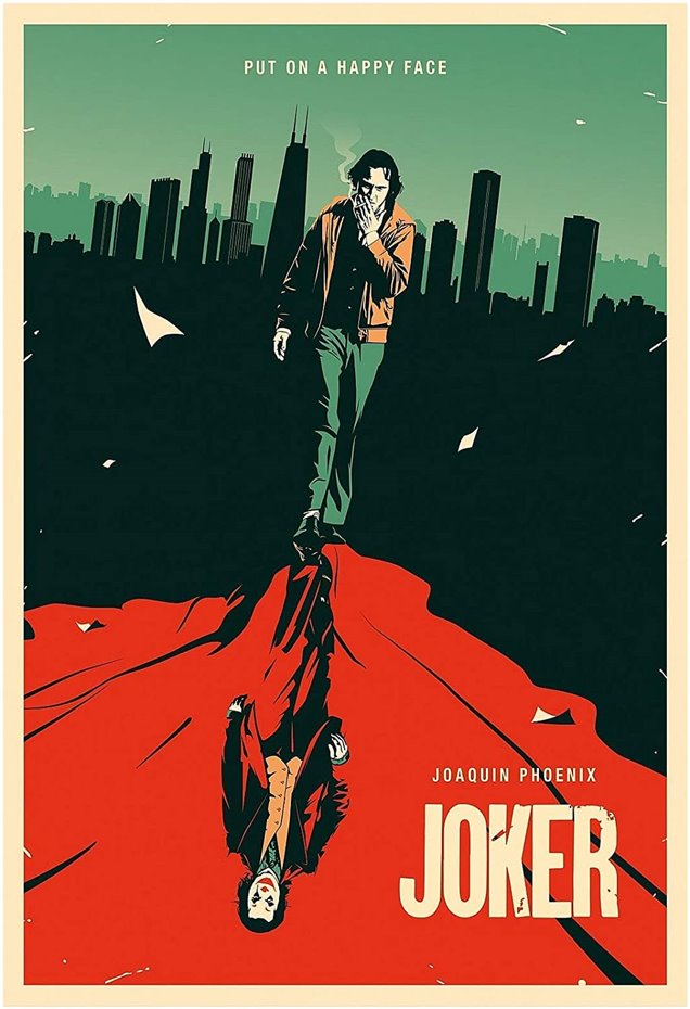
This image mainly focus on the main protagonist joker which shows the contrast
Of his normal side and his joker side like he has a personality disorder which is shown on the image. It’s a reflection of what he will become the “joker”. The contrast shows his two sides of the same character showing the audience that he is the same person. The image is very simple but very impactful as it shows the joker smiling in the reflection whereas the normal joker Arthur looking serious. This shows the audience the contrast between the two further showing of what he will become.
The text is kept minimalistic and does not take much room up of the poster further showing what the focus is which is the Joker. The title is placed at the bottom corner which is bigger than the other text showing the audience the focus ”Joker”. It also says “put on a happy face” at the top of the poster which reflects jokers’ personality as he has a smiles constantly and wants others to smile which he preaches.
The main colour which is used, and I think is the most important is the color red which symbolises death and blood which shows that the movie gory and very serious. The main idea is to show the joker as it’s his story and shows how he became the infamous villain.
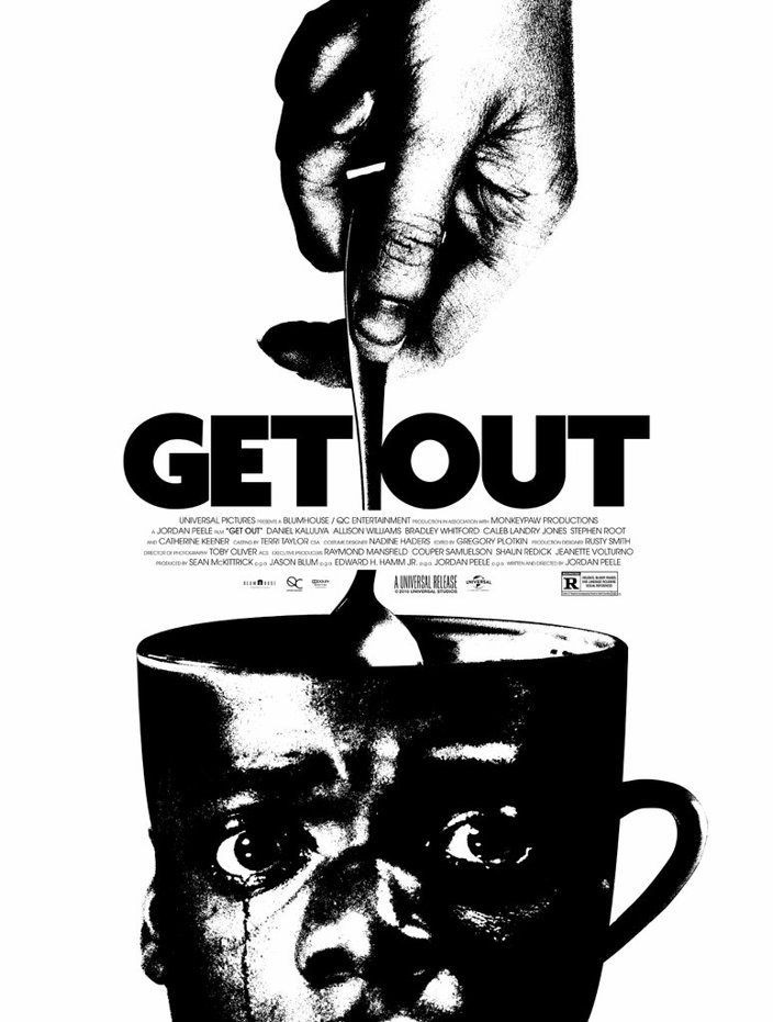
This poster shows the main character on the cup of tea which symbolises how he is hypnotised and stuck in one place not being able to move which is also backed up by his facial expression and emotion as he distraught and crying. The hand shown stirring the tea is shown as it’s a hypnosis method used to hypnotise people which is also done in the movie. This movie is a horror/thriller which is clearly shown in the movie poster. The main protagonists face is placed on cup whilst someone is stirring the cup which can symbolise his mind being controlled.
The text is very simple and is placed in the middle showing the name clearly to the audience. This is used to draw the audience’s attention to the title then the rest of the poster allowing them to consume most of the poster right away having an idea what the movie is about.
The main colors that are used is black and white as the main premises of the movie is about both white and black races which the white family uses black people as their slave as they are athletic and strong. The main idea is to show the audience the focus of the movie is that it’s very phycological and involves thriller and horror which they could figure out easily by looking at the poster.
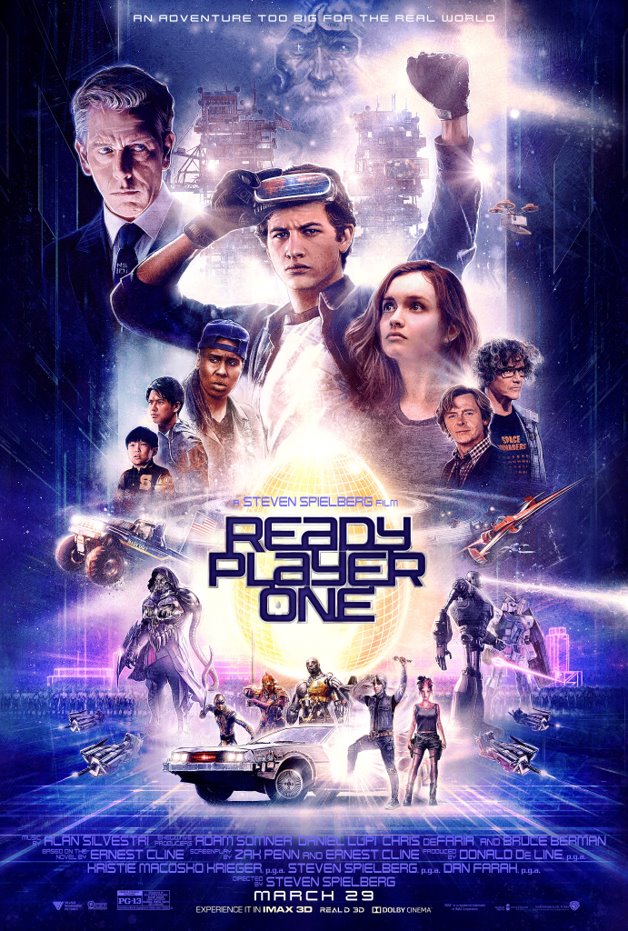
This poster is very bright vivid which shows the main protagonist at the front with his vr headset which allows him to go inside a virtual world called the oasis that allows him to move and feel stuff inside the game. It also shows the side characters from side which shows who plays a big role starting from the main character being the biggest. An egg is placed behind the title which represents an easter egg. A easter egg in video games a very hard puzzle that can be found with very little hints it mostly takes a long time to find and can give rewards when found.
The text is placed at the middle revealing the title of the movie which shows the audience that the movie is about video games and focuses their attention on the title after seeing the main character as it shifts their focus throughout the poster.
The colours are very bright and are mainly purple as the place they enter which is the oasis uses these colours mostly. Also, the golden egg is shown as the colour gold symbolises something important and precious which may play an important role in the movie. The idea mainly is the characters as they are the main part of the movie trying to solve the easter egg.
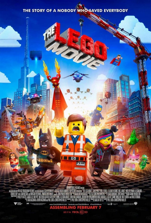
This poster shows multiple characters which the middle one is the main protagonist, and the rest may be side characters. The movie is about Legos which is why everything looks made with Legos such as the title being supported by a crane. There is a lot going on which suggest a lot chaos may happen in the movie which is easily shown to the audience by the explosion in the background and everyone running away with panic.
The main title of the text is placed at the top which is made by Legos. This them focuses the audience’s attention on the title from the characters. The text is also shown smaller than the title at the top which is the slogan further giving more information on the movie o the audience.
The poster is very colourful and bright showing it could be aimed at kids as the colours pop even the characters. The main idea of this poster is showing the different characters and their expression further showing what the movie is about.
Typography poster design
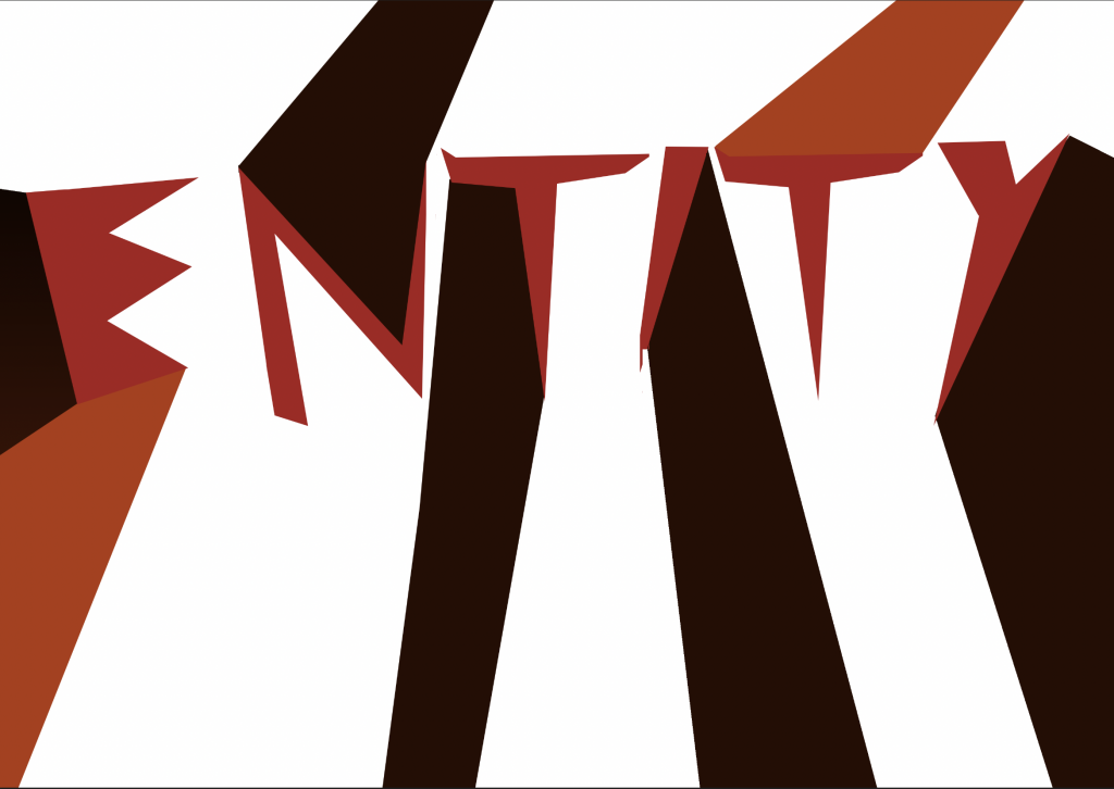
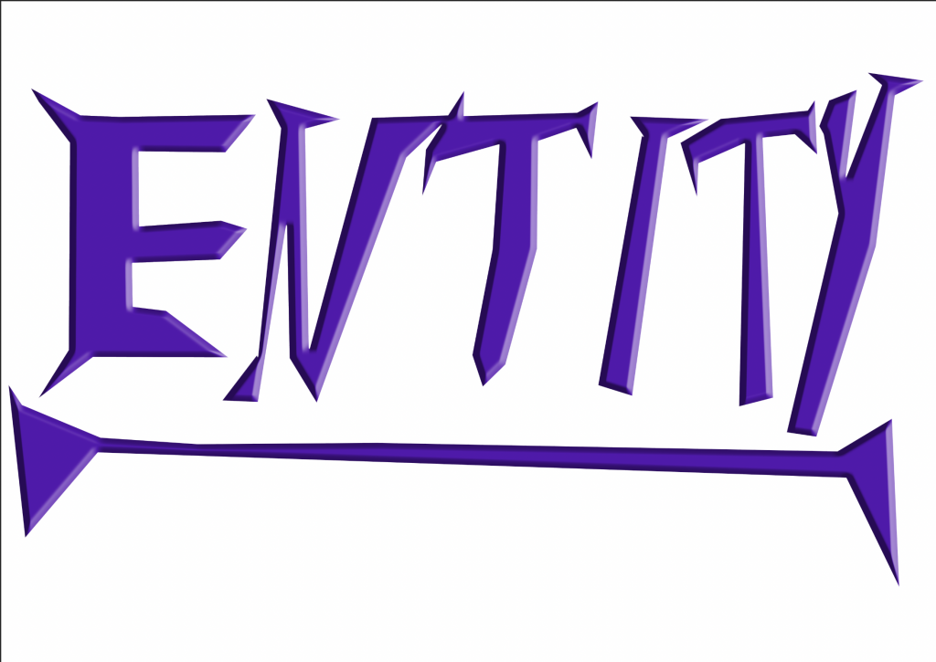
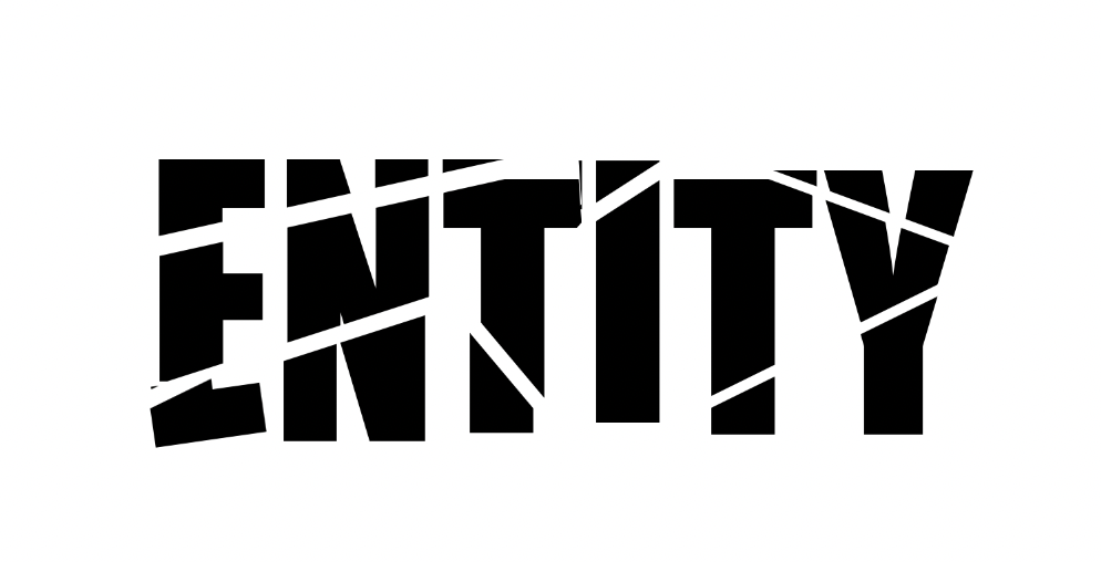
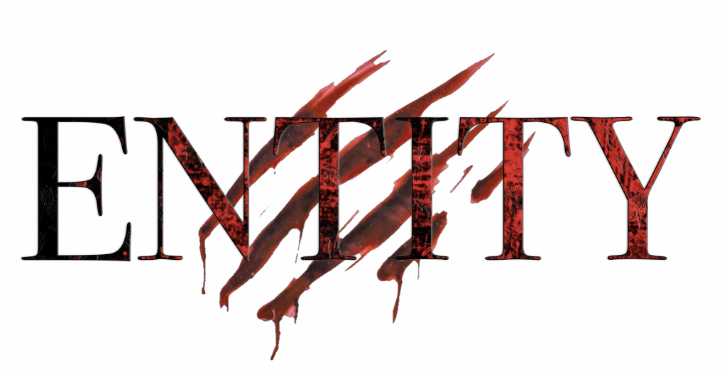
The techniques i used in this session was mainly the polygon lasso tool too create my own typography for a poster. i created the text and design like my own font as i created a creepy typography to represent my film as its a horror.
This session helped me understand typography and how to easily create my own in the way like for my poster. I will use this technique when designing typography for my poster as i know how to do it as i am familiar.
My experiments were successful as i created many different variants of my typography which shows i understood and learnt what to do. This gave me a better understanding of photoshop and become more familiar with the software which i will be able to use the techniques i learnt in the future.

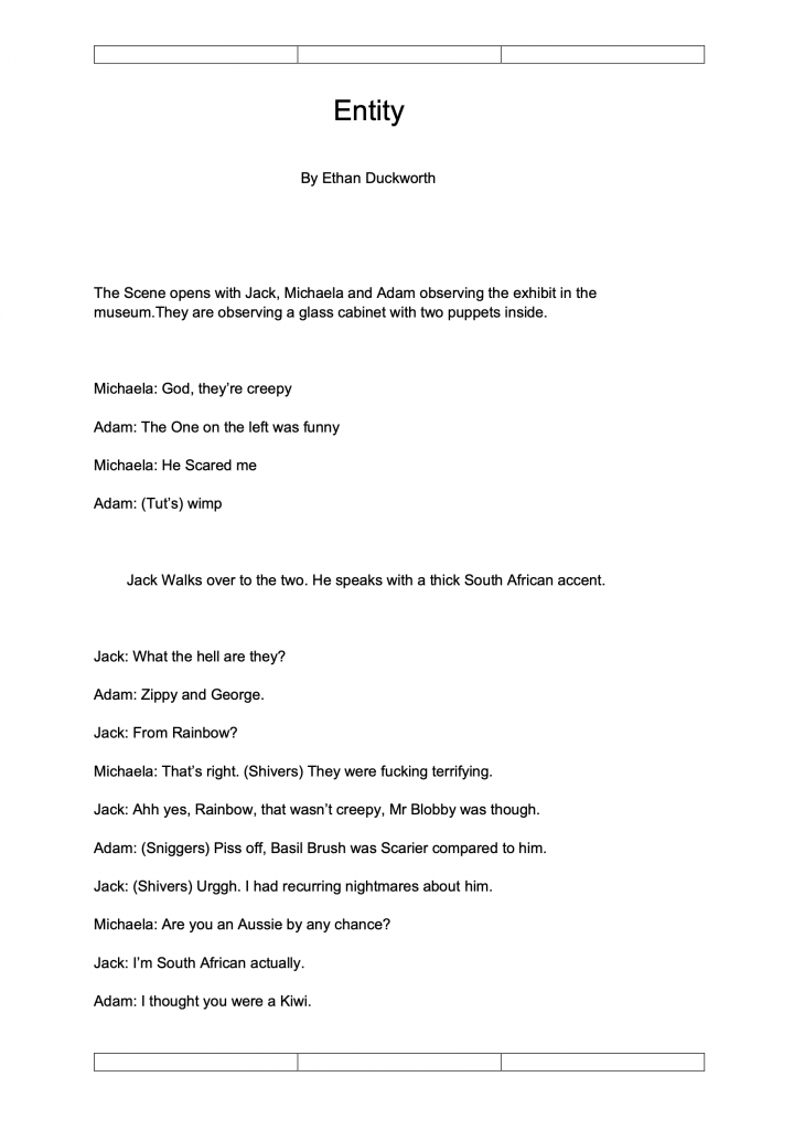
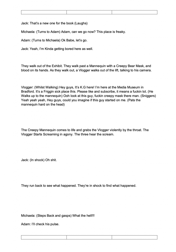
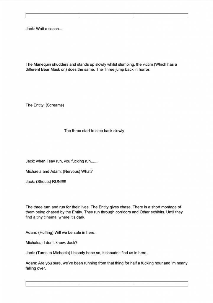
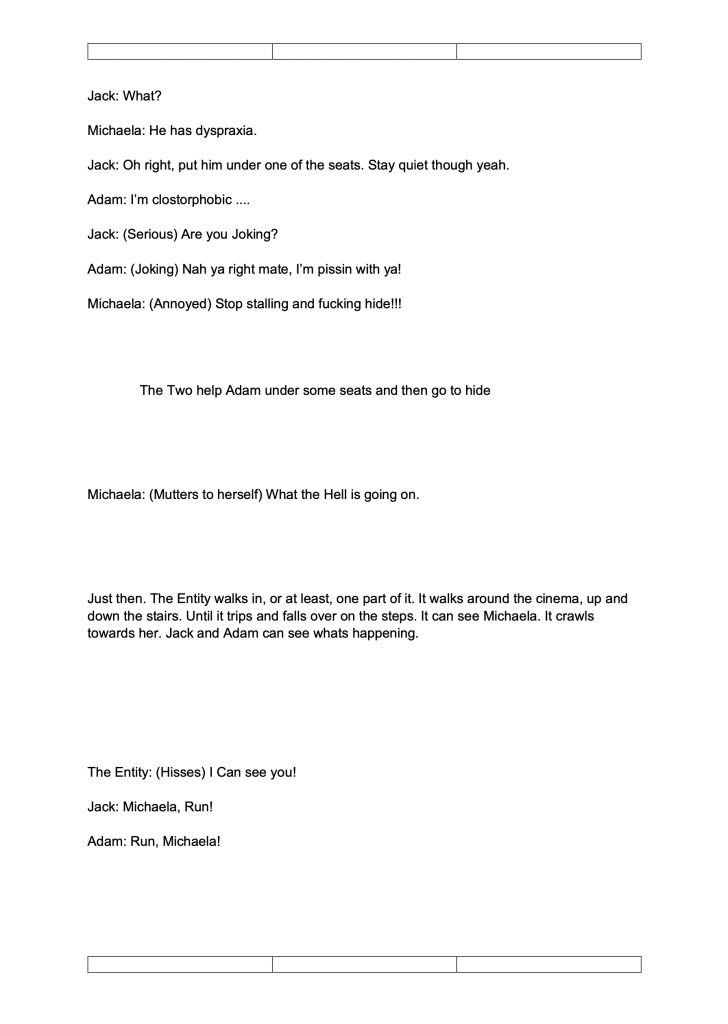
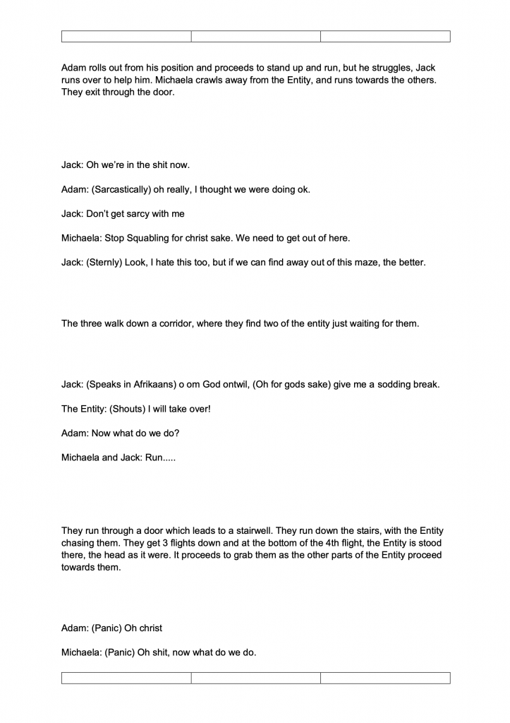
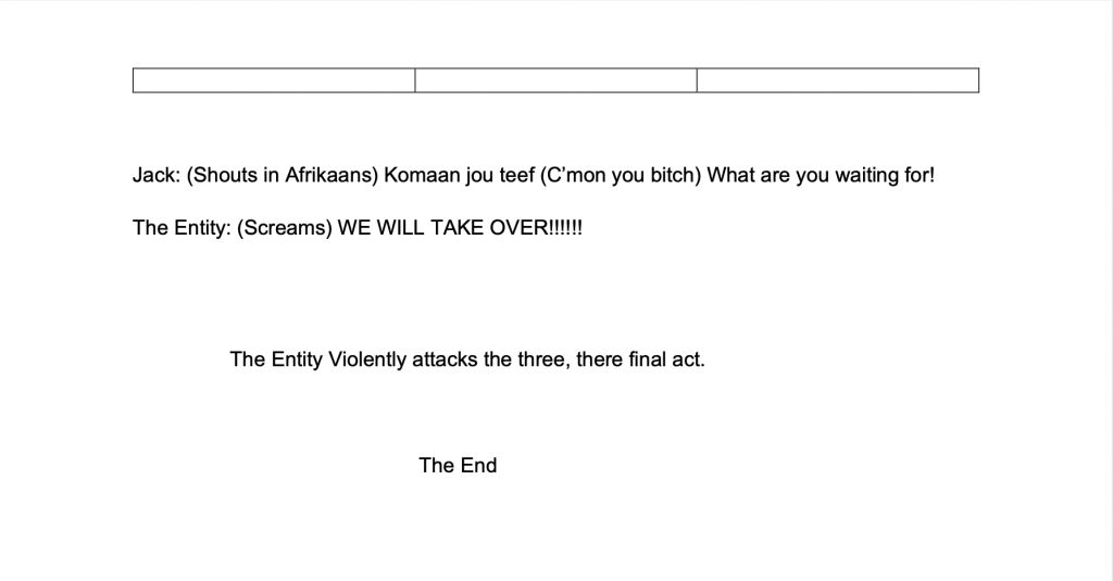
Entity short film script
Evaluation
overall we did what we could as our plan for film was to have actors and use the location which was best for our film. This meant we had to use what we have so me and the director and couple friends had to act in the film and change the the plan and film but stick with the same idea and premises. Also the script that we had planned was not used so we had to change some of it and improvise but used some elements.
