When i was editing my advert I had to make a few changes and that was cutting the clips to make it shorter and more effective. Cutting the clips and placing them in places where it would make a big change , made the advert stand out more. Some clips were way too long so i had to cut them, and sometimes i had to experiment by moving the clips around and moving them to areas in the video to see if it made a difference and looked clean.
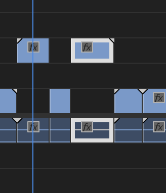

With one clip i had to do the zoom in effect, but it wasn’t zooming into the place i wanted it to zoom in on , so i had to double click the footage and play about with the position and scale until i found the correct position , and that correct position was directly into the lens.
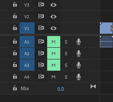
I had to mute some channels to block out the background noise. I had put a separate audio in the back of the video which meant i had to mute all the other channels included.

I got a background from google images and joined them together to make the final background. I used a childish font to attract the audience. I used the blur effect on photoshop to make the font stand out. I enlarged the text so it looks more clear. This is my outro of the advert and I feel like this sort of outro is simple but very effective. This design I did was to attract the children audience , I chose a bright colour scheme to go with this design for example the light blue colour which was to represent the sky.
Then I also added the green trees to design . this was to add another colour which will look even more attractive with the blue colour.
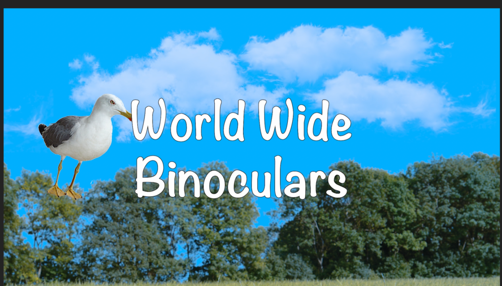
My intro was done on adobe , I had to go on google and get an image of a bird and put it into photoshop to get rid of the white background behind the actual image. when that was done i saved the image and put it into the background image on adobe preimer pro and then eventually I went into the scale and rotation keys and increased the numbers and gradually made it move forward across the screen. Then i added the text into the middle of it. I had done the into
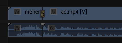
Furthermore over here I have used 2 effects here one for the audio and one effect for the video . The effect for the video clip that i have used is named the strobe effect and the effect for the audio is called the balance effect. These 2 effects made the advert more unique and clear to the audience.
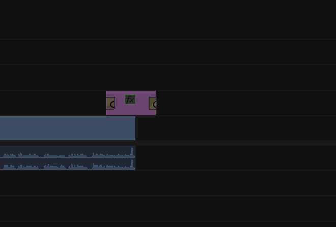
I Downloaded some bird noise audio from google and converted it into an mp3 audio . After i did that I got that piece of audio and put it in the advert , but I had put it at the start for my intro because of the bird image that I had moving across the screen. I put an effect on the audio to make it more clear and louder.
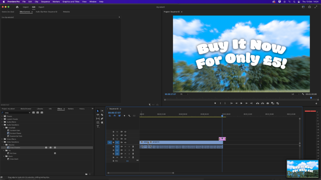
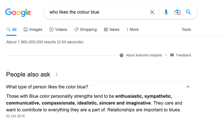
I used the colour blue as my theme. Because this colour brings positivity and energy. My advert was aimed towards children and young generation , this colour represents that sort of audience. Using the colour blue has given my advert more clarity and energy as a whole.
I watched other adverts to get a clear idea on what I was going to create and produce , I watched other binocular adverts and Nike adverts to see how they did it this gave me an inspiration on how I was going to record and narrate my advert. In my social media research I had shown examples of different adverts , these adverts were linked to the advert I wanted to do.