Dandelions (Deershed band):
Solo EP:
StoryBoards:

Canvas Designs:
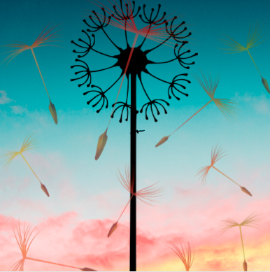
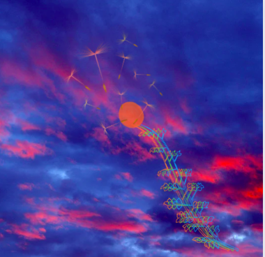
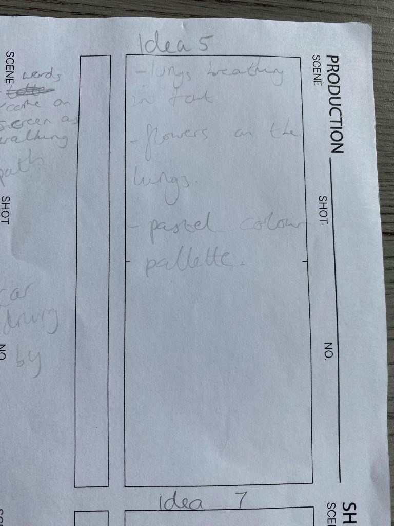
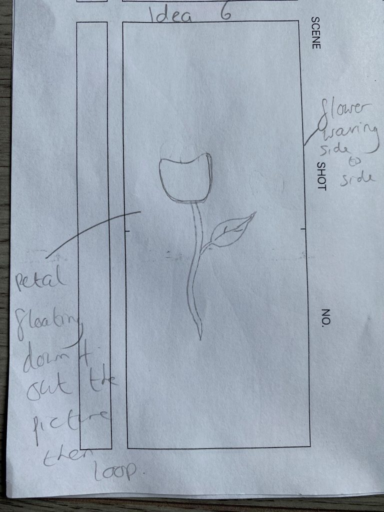
Initial Idea – Videos and photos of nature. This idea didn’t really work because I couldn’t express the meanings that the song had within a real video or photo. I chose to do animations because they’re easier to be creative with and they work better when they’re looping.
Canvas Idea 2.
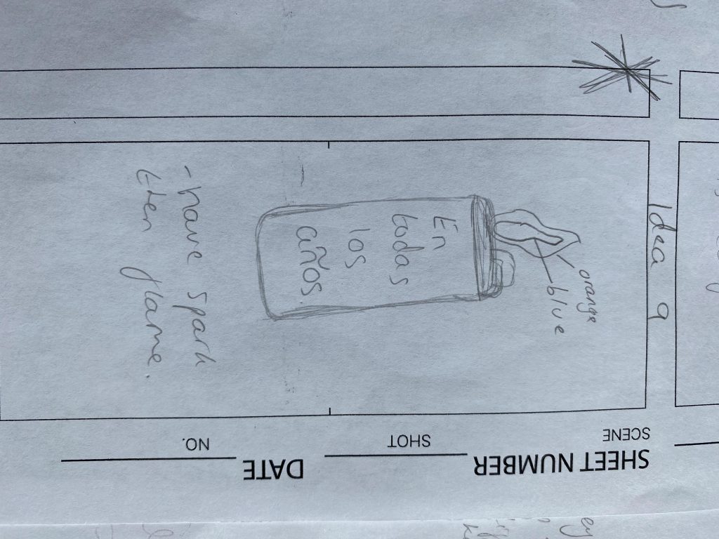
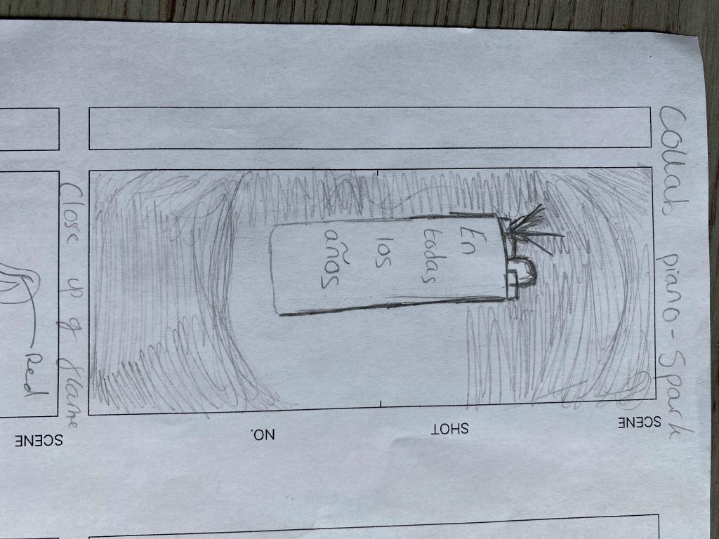
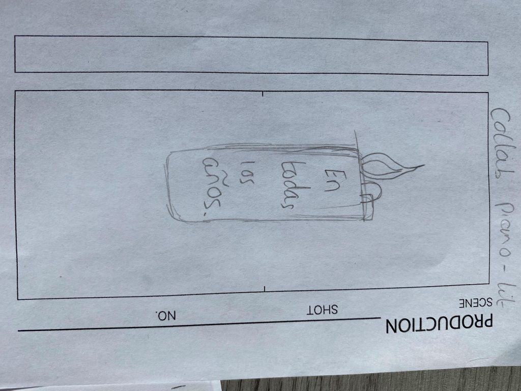
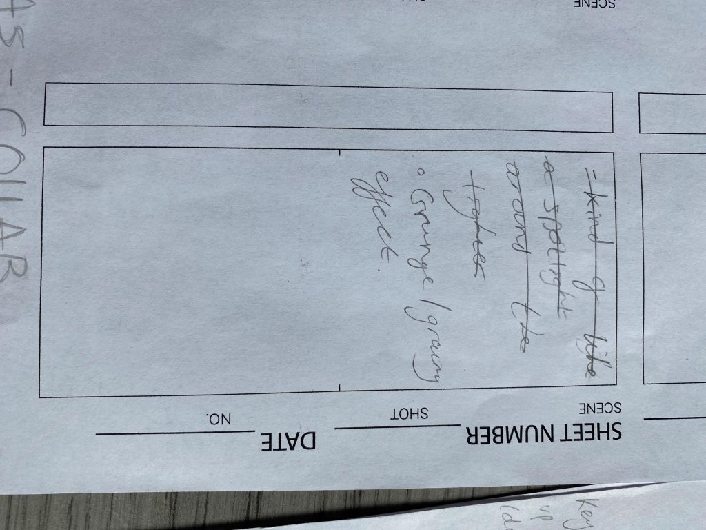
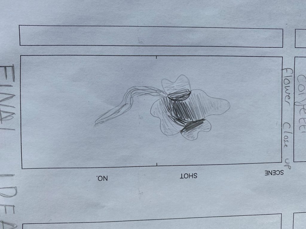
This design is for track 2, the collaborative piece. I felt like fire really complimented this piece because the piece itself feels very warm. I was contemplating the idea of a fire place but I thought a lighter represented the power that the piece had. “En Today Los Anos” is Spanish for “In all the years”, which I think compliments the piece because the song is basically like a loop of the same chords but expressed differently so it’s like telling the story of over the years and showing the little developments and changes over the years.
I still want the lighter to be lit sooner, so I need to speed it up a little.
Canvas idea trial 1.
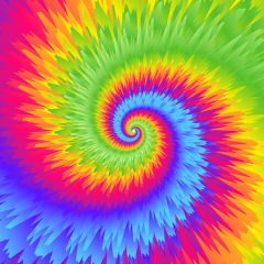
This was originally an idea for my Latin inspired piece but when I saw the colours, I changed my mind and thought it would suit the solo piece better. I love all three ideas, they all merge into different colours and I ended up using the for my promotional footage instead, which worked really well. However, I don’t think I’m going to use the for my final Canvas’ as I developed better ideas and they’re not projecting the story I wanted to tell with the piece.
Canvas idea trial 1
Canvas idea trial 1
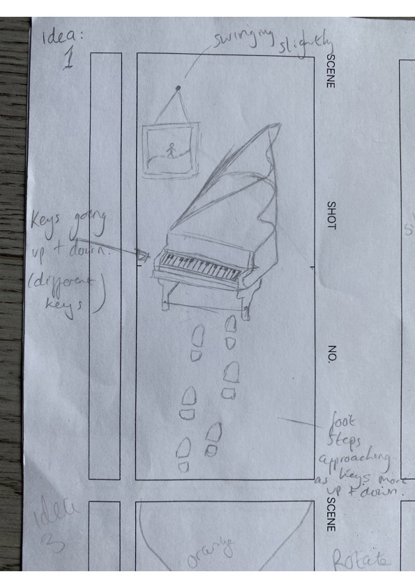
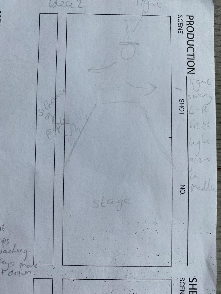
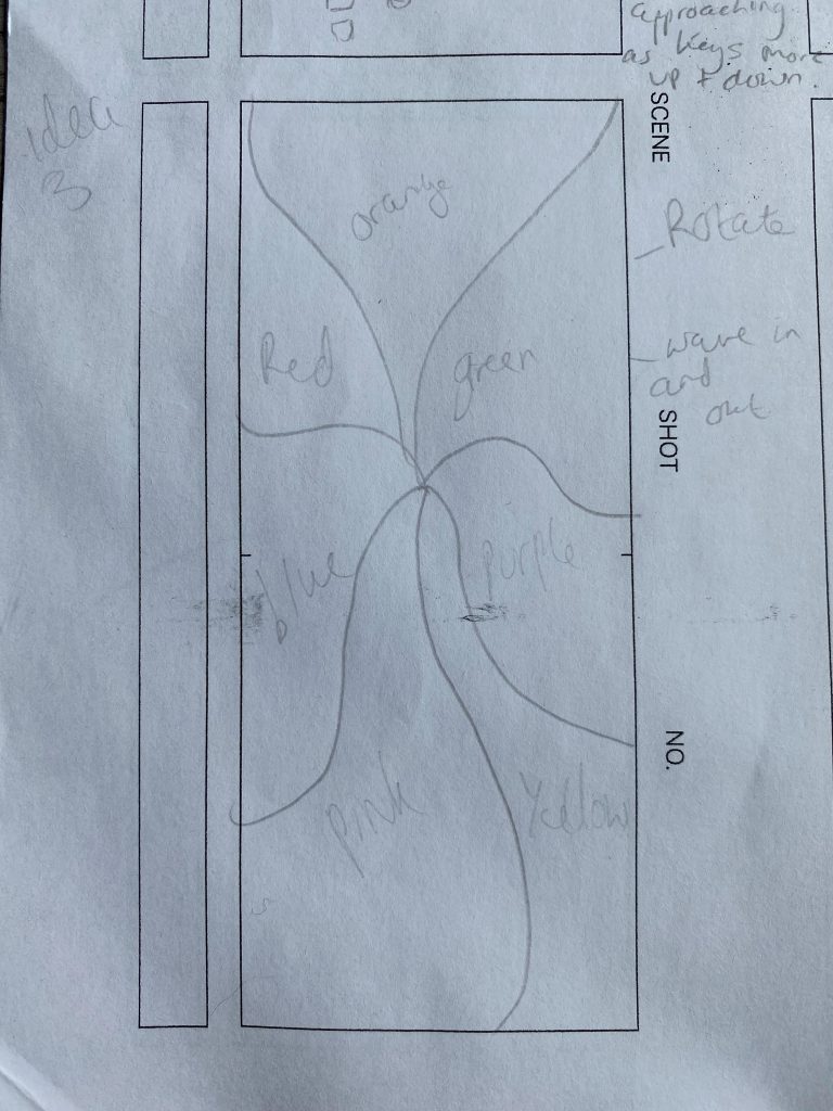
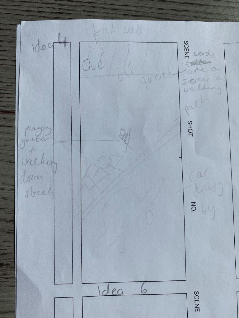
STORYBOARD
COVER ART
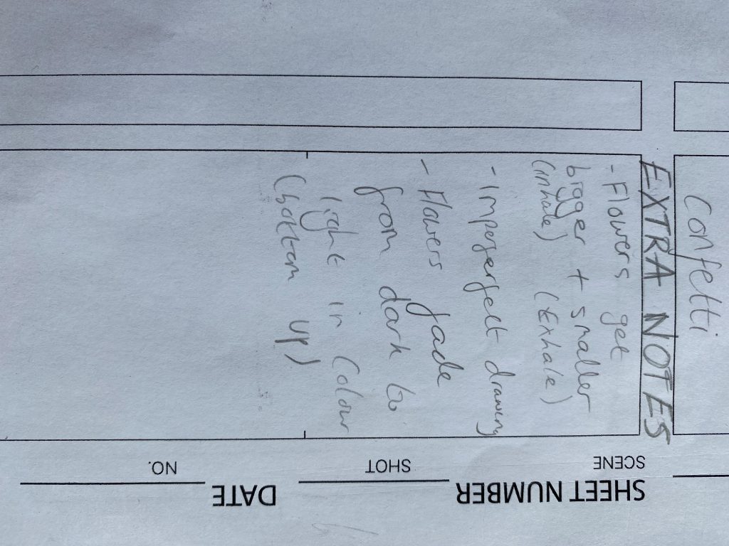
I made this on Canvas so it’s just a reference. I want it to be darker and have the face swirl into smoke.
Cover Art Process:

First, I found a picture from google images of the women that I wanted in the smoke.
I then went into word and played around with different track fonts until I found the one I liked the most. The colours in brackets are tying the tracks to what colour smoke each cover art will have.

Cover art for track 2. The women blends into the red smoke. This one was a little challenging because the colours kept bleeding green for some reason so we have to colour the smoke in on her hair. I think red compliments this track the most because, to me, the track is quite deep and emotional and red brings that deepness.
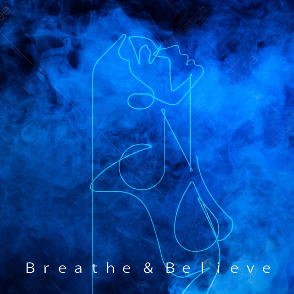
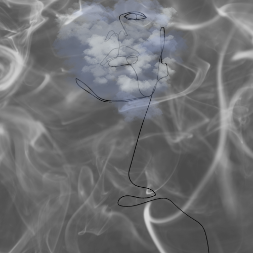
Cover art for track 1. I think blue compliments this track because I always associate blue with breathing. Blue is really calm and I think this track is very calm. First we put in the background, the smoke, then we added in the women and blended her in so that she turned blue.
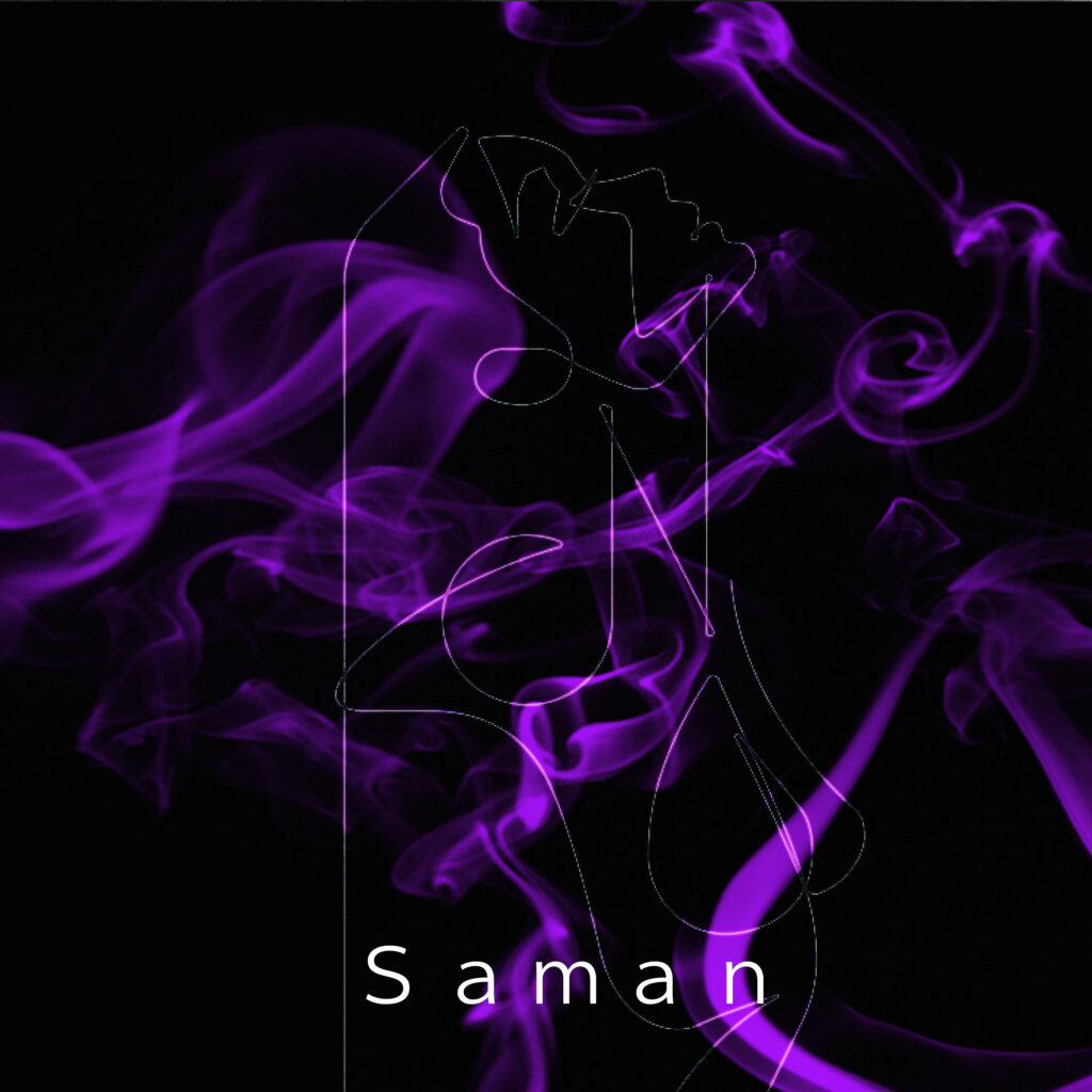
Cover art for track 3. I think purple matches this piece the most because it’s deep but it’s not a sad kind of deep. I think purple is more of a freeing colour and the song feels very free.
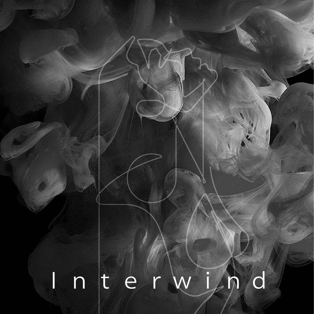
Cover art for the EP. All of the track cover arts are like the EP cover but with different colours so that it’s clear that they all belong to one project but still portray the different emotions. I think the cover art really resembles “Interwind” because it’s like she, herself, is interwinding with the smoke.