
Have a clear and precise message. Be genuine and don’t try to just copy what you like, thinking others will like it. Be consistent! Push your comfort zone. Keep a positive attitude and help others. Look at other successful people. Live your brand and be authentic.
Websites to use:
The average size of a business care: 85mm by 55mm.

The simple colour palette makes it really aesthetically pleasing, and because they’re bold colours, it’ll stand out more. It’s clear about what they play, jazz and I’m assuming guitar because of the picture. However, I might’ve put exactly what I play down, just incase if they played more than just guitar. There isn’t any name of the musician either.
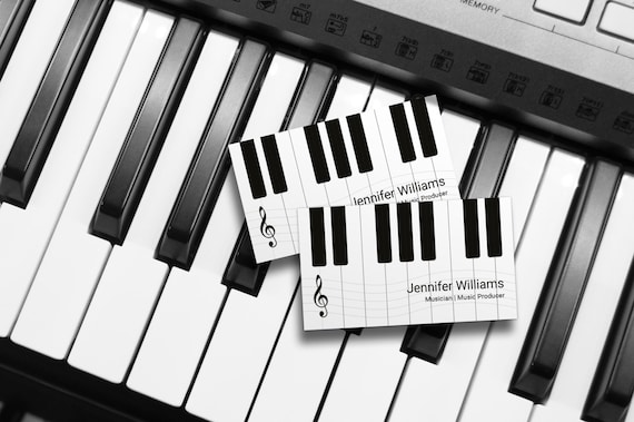
Again, a black and white theme, which this matches the instrument they play. It’s clear who’s business card this is and what they play. However, there doesn’t seem to be any contact details on there, no phone number or email etc.
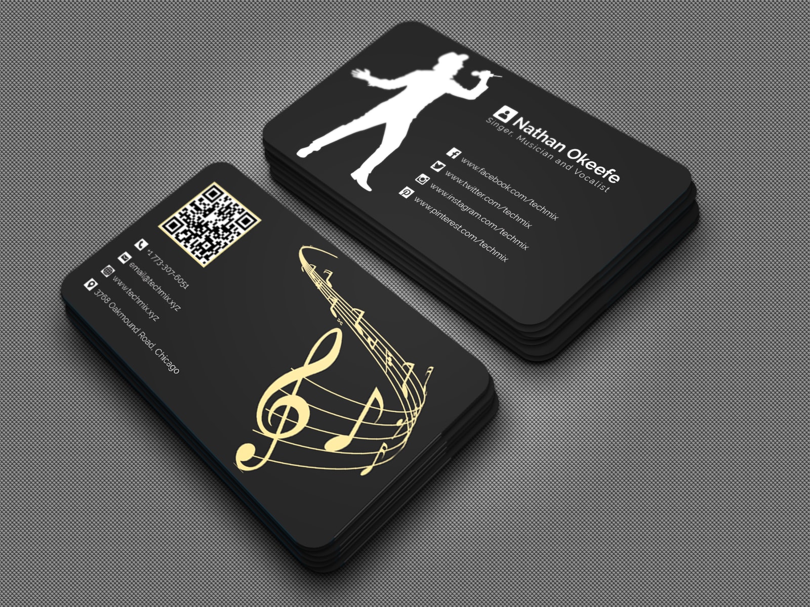
It’s clear who the card is promoting, and what they do. I like how they linked everything but also put a QR code to scan, so it just takes you straight to a link tree, I presume, and it’s easier for people who don’t want to type things in.

I like how this card is interactive and it kind of gives a gift to the person who has the business card, because what guitarist doesn’t need more picks? It’s plastic so it’ll last long and won’t look shabby over time. It has all his contact details on, and it’s on the pick too! It tells you everything he does too.
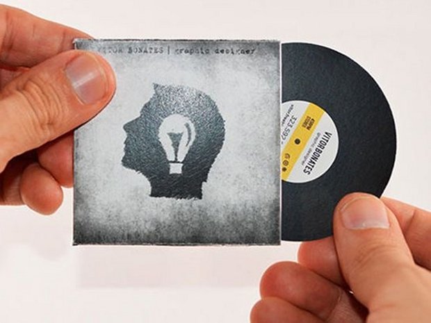
I can’t see much of the writing but the look of the card is just intriguing from the offset. This’ll really stand out on a table with loads of other cards on.
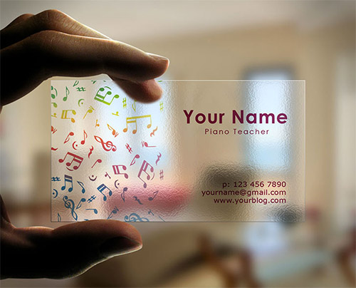
I like the transparency of this card, it’s very different but subtle. It’s all quite clear, where you in put your name etc, but it is a little bit basic so I would’ve probably spread the notes to fall all over the card and not just in that corner.
My Business Card:

The colour palette is quite simplistic but it kind of catches your eye because of the bluish greyish background. All the colours compliment each other really well and I’m really happy with the colour palette. I put the piano down the side because my main instrument is the keys. It’s very eye catching and it’s in your face so it’ll stand out on a table of other business cards. I put my name on a record because I do a lot of different music stuff so it’s kind of like a broader symbolism of a musician than just an instrument. I should have used the same fonts for my first and second name though because it does look a little weird. However, I wanted my first name to be more noticeable that’s why I used slightly different fonts. I’ve put all the instruments I play and my phone number for the information and contacts. I like how simple it is but if I were to do it again, I’d probably get the names to curve around the vinyl. If I were to make it double sided, I’d link my website and my social medias on the back.
My Website: