I am doing some self branding to have a brand as a musician. This is another sign of my professional development. As I am nearing the end of college, I am thinking about what comes next, and one of the next steps in becoming a successful musician is having a brand. A business card is a great way of easily having a successful brand. This is due to the fact that they are easily given out, can be very aesthetically pleasing and can have anything you want on it. You can have your contact details, name, profession, socials or anything you can think of that can add to your brand. By the end of this I will hopefully have a good business and start my own brand as a musician.
Research
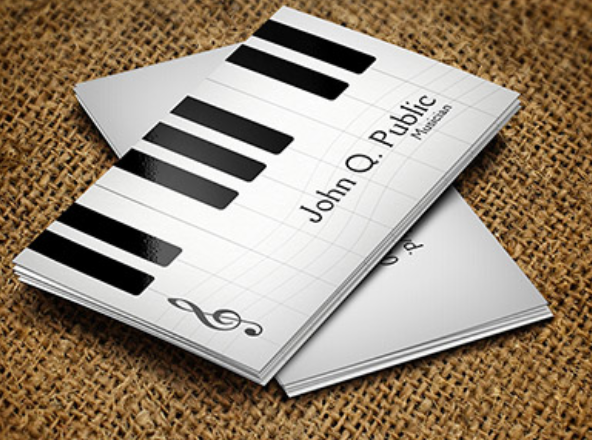
This business card is very aesthetically pleasing to me. The design is quite complex however it doesn’t overshadow the text. It also looks professional as black and white is usually the colour for business cards. The typography isn’t my favourite as it is a bland. Also this doesn’t fit my brand as I am a drummer.
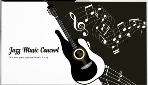
This card is again very nice, black and white are really nice. This one isn’t as professional with the weird design for the guitar. The typography is also nice in the one as it looks sort of musical.
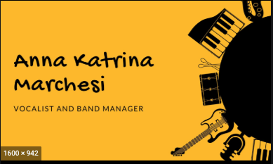
The shade of yellow in this business card is quite ugly, and personally wouldn’t use it myself. The text is easily visible and it also has quite a nice font. The images of the instruments are nice however the big visible circle is an eye sore.
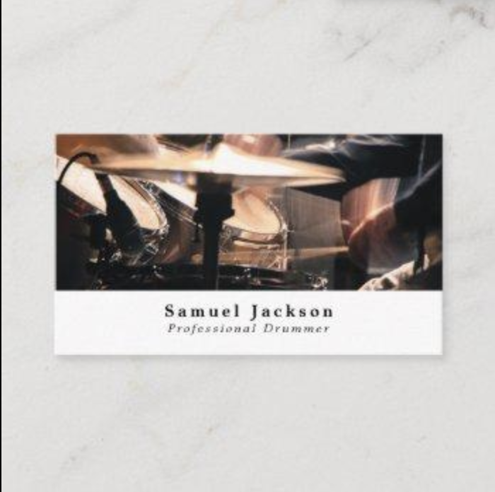
This business card is nice, as it uses an image instead of a drawing, which gives it a sense of realism and more professional. The layout is nice as the image grabs your attention and you instantly know that they’re a drummer. The font is also nice.
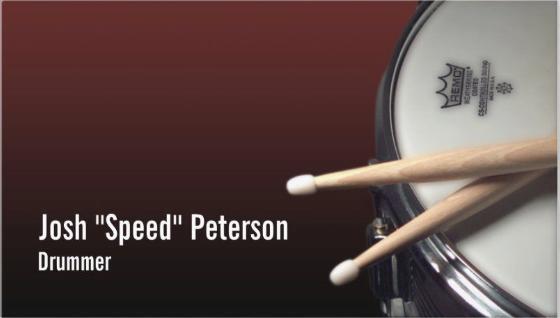
This design is also very aesthetically pleasing to me. The image is nice despite being simple. This also applies to the design itself as all it is an image in the corner and some text. The font is quite bland to me however the mix of the red, black, white and brown looks very nice.
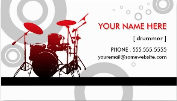
The drum kit on the card is nice, I like the 3D look to it. However the background isn’t my favourite as the design isn’t pleasing to me and it has nothing to do with music. The layout is quite nice, however the drum kit is quite small and the text grabs your attention first, not the nice image.
My Business Card
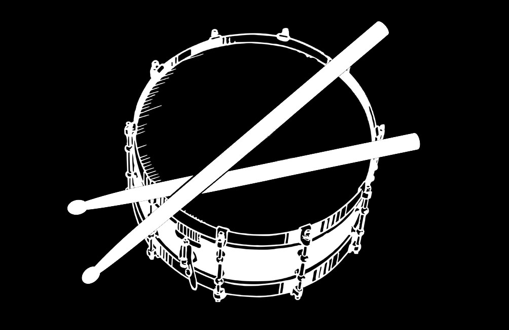
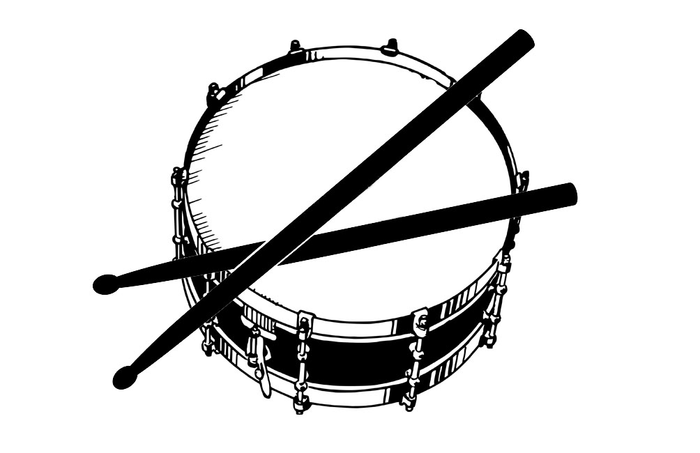
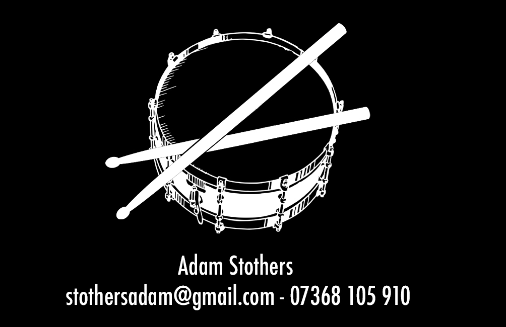
This is my favourite design out of the business cards I have come up with, with the help of my tutor Paul. We used photoshop to get this design. I got my inspiration from a lot of the business cards I researched. The vector of the drum sticks we added to a vector of a snare drum. The colours were also inverted. I also decided to have a double sided business card and have my details on the back and the image on the front. I also decided to have both the text and the image centred as I think it looks better. I also like the font, which is called Futura. There were a couple other ideas that I toyed with, such as having the colours the other way round (so not inverted), as well as using a different font and having the text on the same side as the image instead of it being double sided. This is probably going to be a prototype of the business card that I’m going to use later in life, as the design is really simple yet effective.
