
A good use of an abstract image with their logo on it, the iconic lemon on the logo came from Ian Brown always carrying round a lemon with him due to the riots in Paris.The cover was designed by John Squire
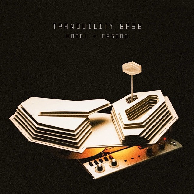
This cover was designed by Alex Turner, and he used cardboard cut outs and a tape machine.

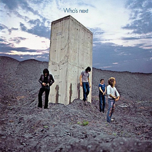
Inspired by Stanley Kubrick’s 2001: A Space Oddesey. They decided to show them urinating on a spoil tip that looked like a monolith. Fits the “Look & Feel” of the band. It was photographed by Ethan Russel.

This cover perfectly fit all the themes of this album, with Kendrick Lamar getting his “Home Town Crew” onto the White House Lawn. Perfectly fit the themes about racial injustice and a weaponised justice system.
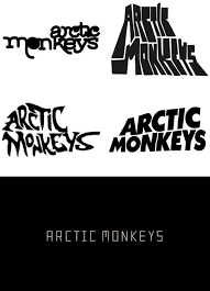
The Arctic Monkeys’ logo has changed for nearly every new album. But as you can see it is always just very simple with their name and text. All of them are as iconic as the others.

This is one of the most iconic logos of all time. With the letters forming into other letters. Also the meaning of Eminem’s name is very smart, it stands for his actual name, M & M, Marshall Mathers. It also stands for, “Every Mother is Nice Except Mine”, which links in with his early music.
This is a very simple logo, just text and not a basic font, but very effective.

The logo has quite an illustrative font, with a star as the dot on the I, which links to his song Star Shopping.
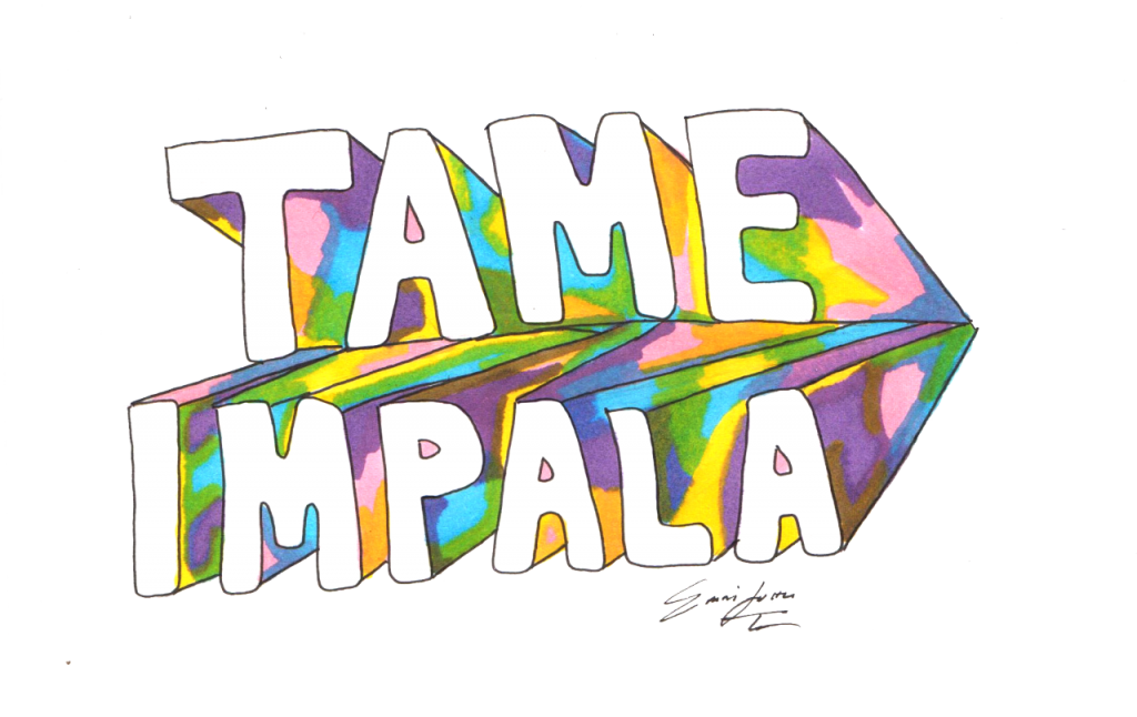
A very nice logo, quite psychedelic but also links in with his music as it has this kind of vibe to it.
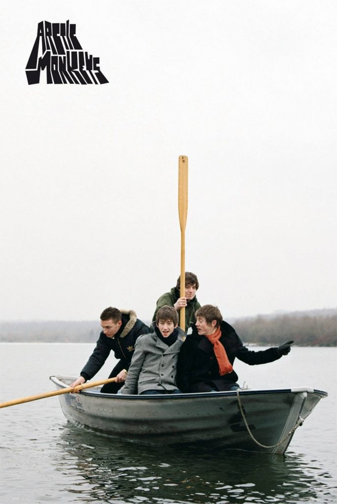
This poster is a very famous poster of the Arctic Monkeys, and it fits the feel of the young whimsical music they created at this point in time. Every Arctic Monkey’s fan has this poster.
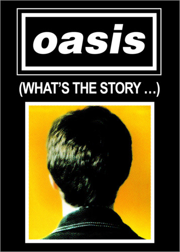
This is a very minimalist poster only using the logo, the name of the album and the back of a members head. Very simple but fits the band and works.

This is a poster for a tour, and I think it is a very weird and nice design. It fits the music he creates and just looks nice.

Probably the most iconic posters of all time. The design is everywhere, and for good reason. Simple yet effective.

This is a poster designed for a tour, and this time it is for Guns N’ Roses. It is quite a detailed poster, with a lot of different things going on.