SuicideBoys have a very distinct artistic vision. As they make quite dark, scary and horror rap, they have the name, images and artistic style for it.
This is their logo, the font has changed slightly over the years but it is usually something similar to this. The dollar signs as the S in their names is a small but distinct change that makes their logo stand out. Their name is enough to get people’s interests, so they don’t need an extravagant logo.
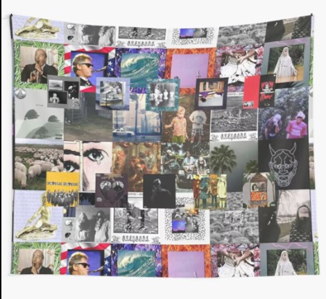
Their album and single covers are very distinct. Their early work was part of the “Kill Yourself Saga”, which are all the covers that have a border on them, but with a different image each time, and the border correlating to the image. This was a way to make the listener know what they were listening to just by looking at the cover. All the images they use match their style, as they look dark and evil. As their career has gone on, they haven’t necessarily changed their style of imagery, but it has evolved with their covers being more personal and detailed.
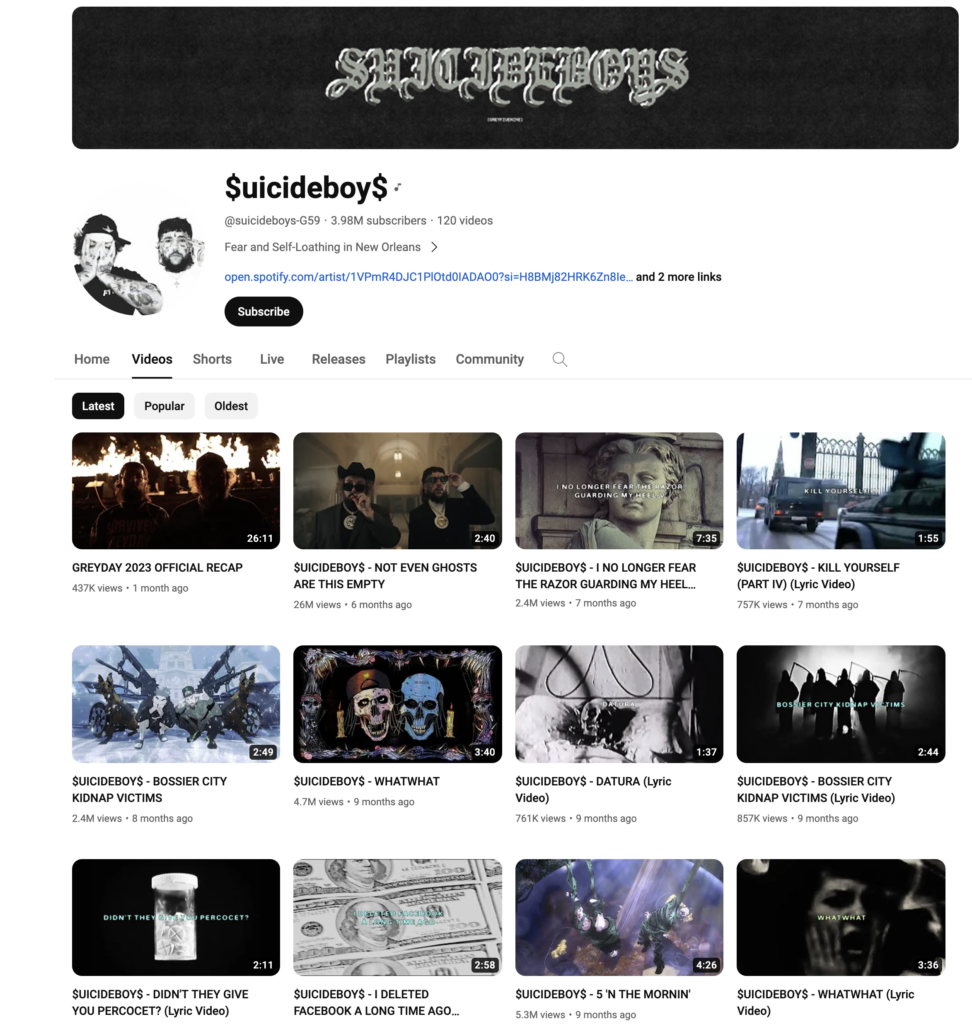
Their YouTube is also consistent with the rest of their branding, with the imagery on the videos being similar to their covers. They have a music video for every track they release, most of these are simple lyric videos with images playing in the back. It is a good way of making the YouTube content appealing. They also have links to their Spotify, SoundCloud and Apple Music.
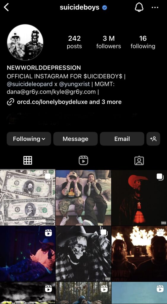
Their Instagram also uses similar imagery, and conveys the same thing that the rest of their branding has. This page is used to promote their upcoming music, merchandise or shows/tours. All of the most recent posts are about upcoming music or music videos. Their posts are usually just an image of the song or the event poster, or a snippet of the music video. As they are already established, they don’t need to make any creative and interesting social media posts like upcoming artists do. They have the links to their personal instagram account, as they release solo music as well which the links to their music is them instead of the $uicideboy$, as that is what they are pushing at the minute. They have their emails on there as well.
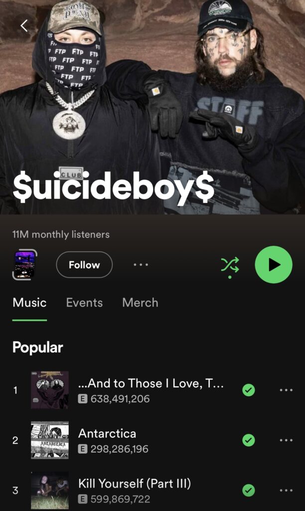
Their Spotify page is also consistent with the rest of their branding. The cover image is quite clever, as they are wearing their own merchandise in the image. This is a smart way of reminding people about your merchandise, especially with their Spotify page having a link to their merch so once they see it they can go straight to it. There is also a link to their events, which is quite a recent spotify feature. A short 7 second visual, which is next to the follow button, is like a preview of their most popular songs. Spotify calls them canvases. All of their songs have these, as they are taken from their lyric videos that I mentioned earlier. I think it’s a really nice touch having one for every song, as most artists don’t.
Easy Life are an alternative pop group. Their music is quite light and happy, with quite relatable and oxymoronic lyrics. Their name is easy life, yet they usually talk about how life isn’t so easy.

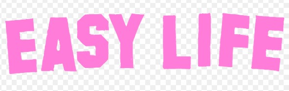
They have changed their logo for the two different albums they have released. The only differences are the fonts and the layout, the idea is still the same. Their name is usually all in lowercase, so their logo being uppercase make them stand out. The colours they use also help represent their artistic vision.
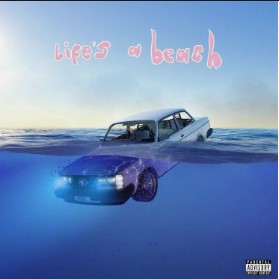

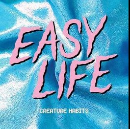
These are their album covers, with both being completely different images and different styles. However, they are similar enough in style to be recognised as the same band. Blue and pink are the two colours that pop out to you in both covers, these colours keep the idea of their artistic vision as blue is representing sadness as well as serenity, and pink representing love. Keeping colours consistent throughout your work helps the recognisability of your brand.

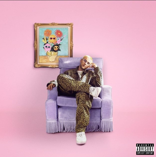
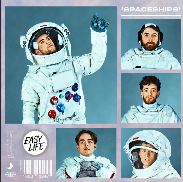
These are some of their other covers, for singles and EPs. The colours of blue and pink remain consistent. Three of them include pictures of the band members, which is another good way to make people recognise your covers as yours. The imagery is also similar, it consistently looks like their covers but different enough from project to project.
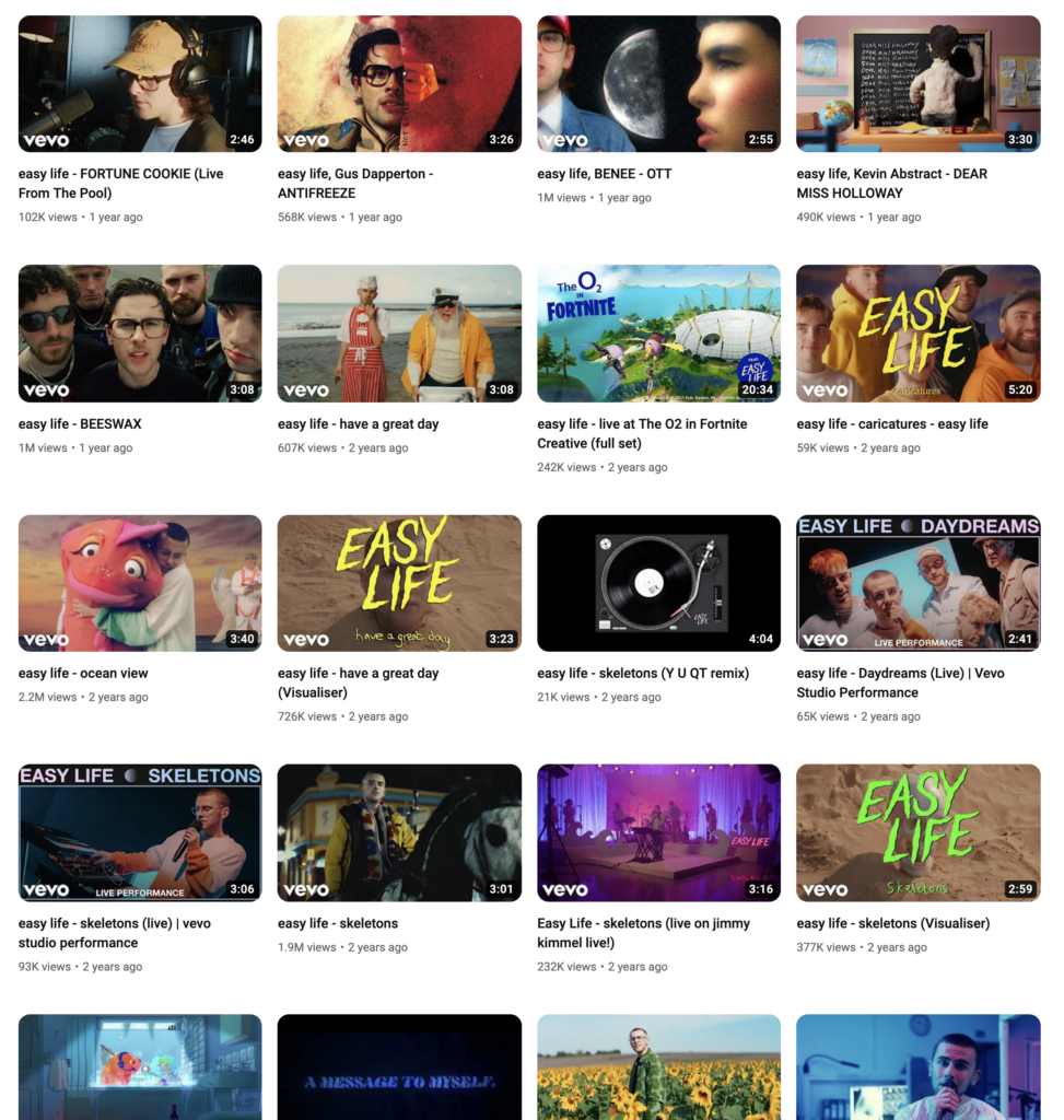
Their YouTube is consistent with their branding, as the imagery in the music videos and the images is similar to what I’ve talked about. Their music videos look eye catching with the visuals that are on the thumbnail, as well as live videos. They have links to their newest album, which then takes you to a page that links to their Spotify and other streaming services. There are also more links to their website, and to their Facebook, X and Instagram.
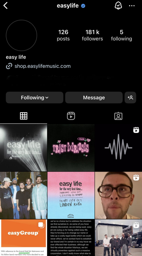
Their instagram isn’t as consistent with their branding, as they use it as a way to grow their audience. This means posting consistently and making your content fun and original. There are a lot of silly and comedic posts as well as videos of them playing in public and at one of their shows. With the most common being images from the last show that they played. This is especially prominent if you scroll down to when their last tour was. Compared to other more established artists, this is used more as a normal social media account and there are a lot more posts on it.
If you look to their recent posts, it looks like the band has come to an end. This is due to them being sued by the easyGroup. They got sued due to their name being similar to “easyJet” and they once imitated the easyJet logo for comedic purposes in one of their promotional campaigns. The company has labelled them as “brand thieves.”(Muir) The outcome of this is that Easy Life will have to change their name, as financial reasons and the fact that it would take more than two years to resolve, meant they couldn’t fight this case. This is just another case of corporate greed, and companies trying to make as much money as possible without thinking or caring how it affects other people’s lives. easyGroup are known for their lawsuits against these “brand thieves.” This will have an impact on their branding, as they could see it as a way to start again, have a completely new name and sound, or they could continue with the same plan under a different name. They will lose their brand recognition, as they will have a different name. It has already changed their branding, as the profile picture is now black. Only the band knows what they are going to do, but it seems like it will do them more harm than good.
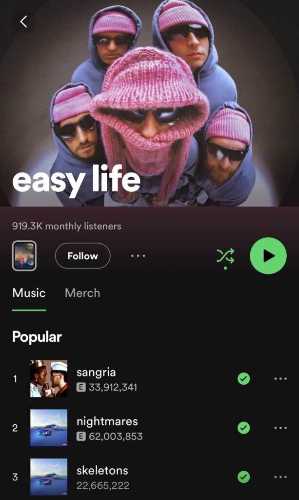
This is their Spotify, and it is quite consistent with the rest of their branding. Especially the cover image, as it is the same as their YouTube and what their Instagram was, until they got sued. They have a link to their merchandise as well. They used to have a link to all their events, however at the minute they are in a transitional period so they don’t have any upcoming shows. Their canvases aren’t as interesting as the other artist I looked at. They are all album specific, with each album having a different canvas, and all their work before that has a different canvas, and some being different if they have a music video. They are still quite interesting though.
Muir, Ellie. “Pop Group Easy Life Forced to Change Name after EasyJet Brand Owner Files Lawsuit.” The Independent, 11 Oct. 2023, www.independent.co.uk/arts-entertainment/music/news/easy-life-name-change-easyjet-lawsuit-b2427726.html. Accessed 13 Mar. 2024.