Skip to content
Jessica Faradoon
Category:
Uncategorised
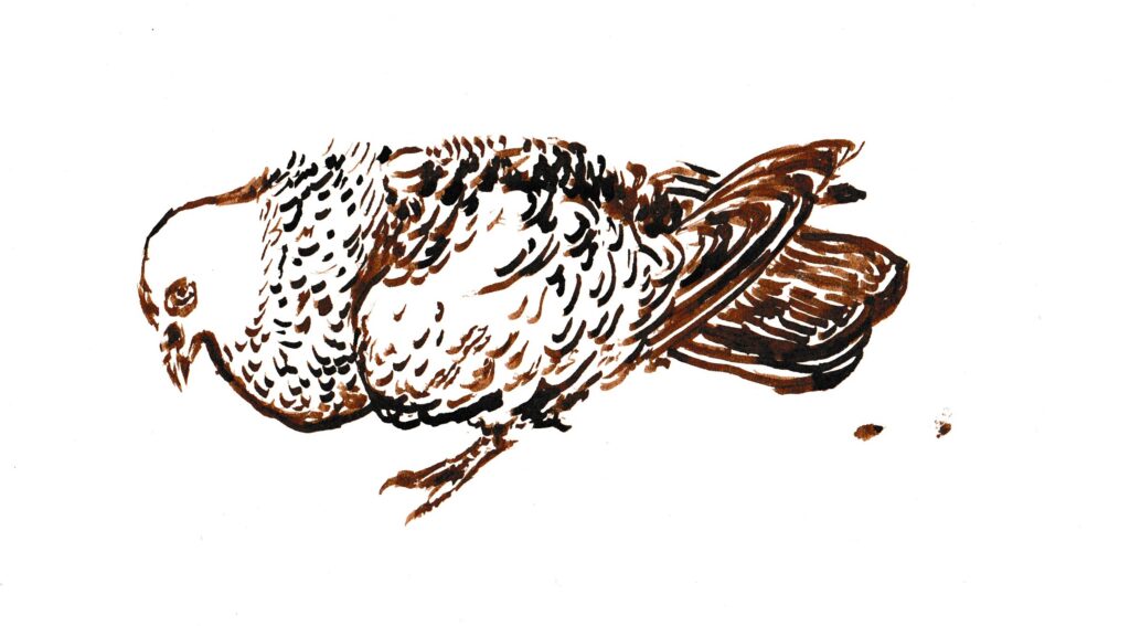
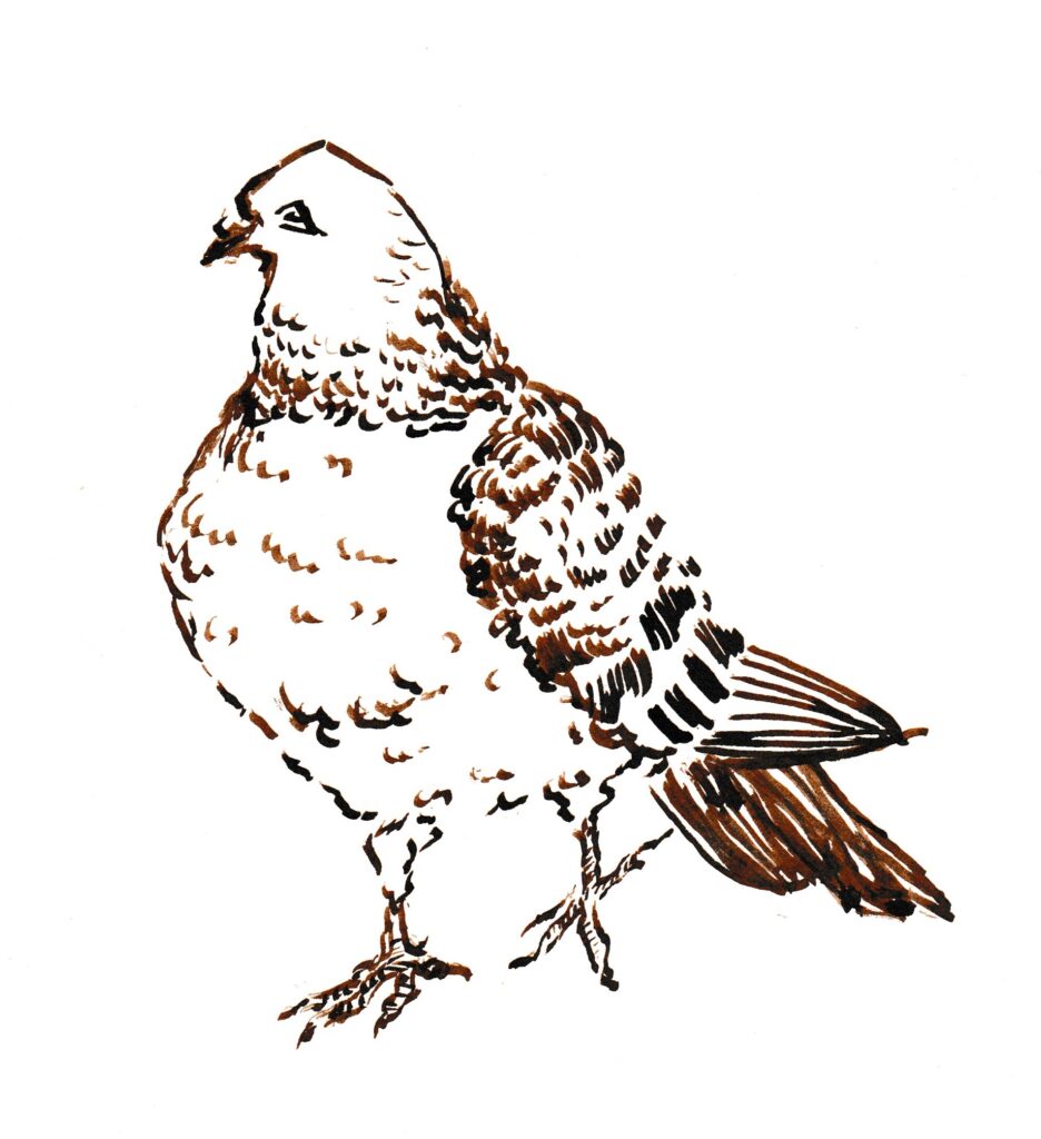
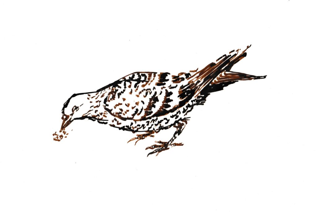
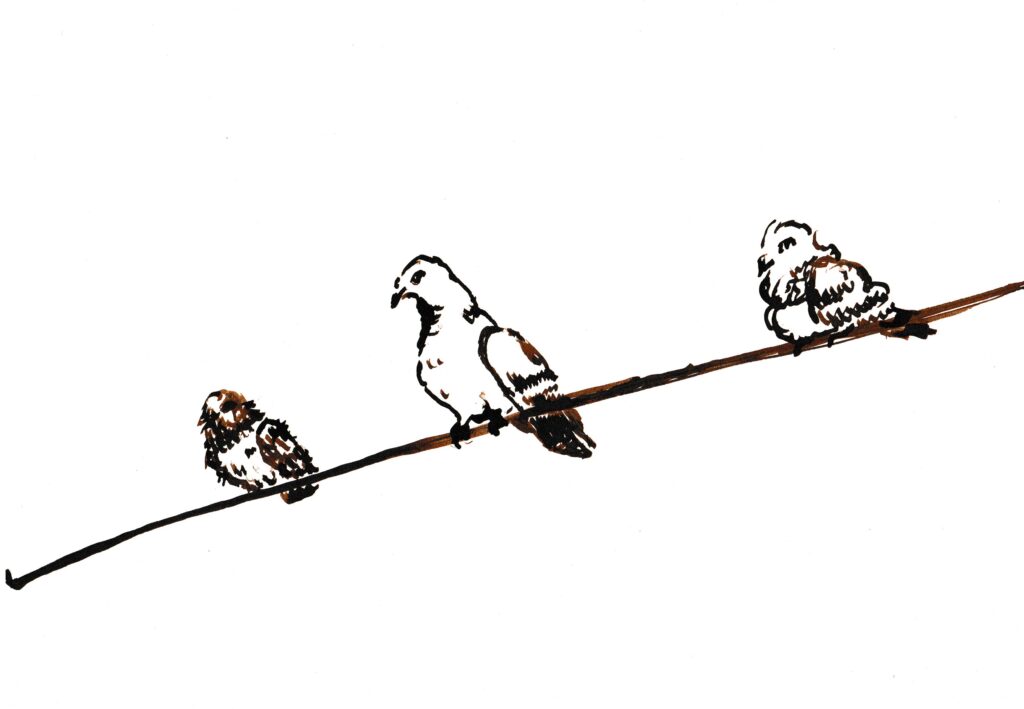
Inky Pigeons
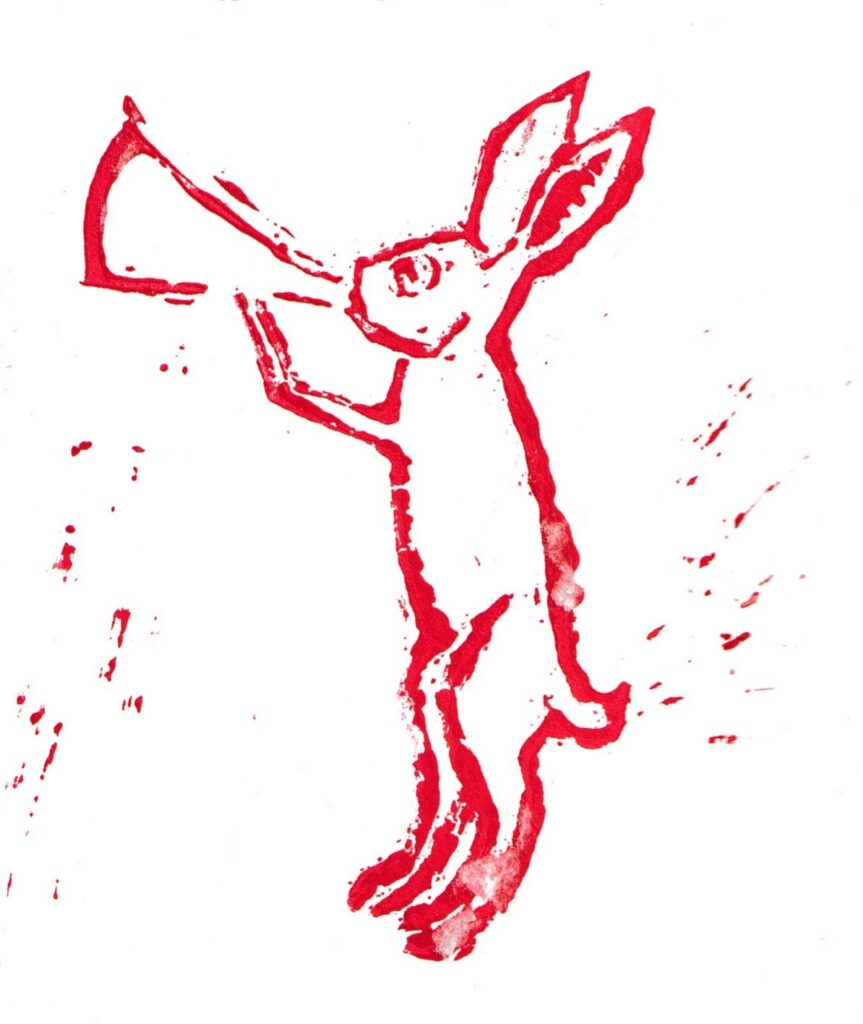
Medieval Rabbit
lino print rendition of the horn blower
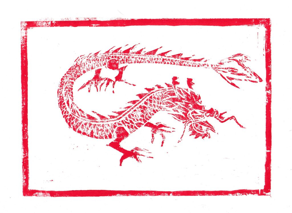
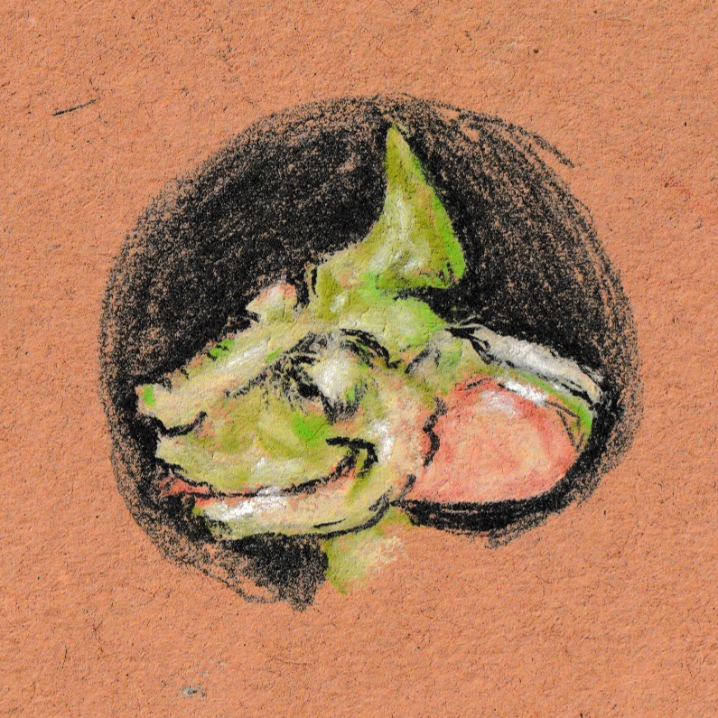
Dragon -lino cutting
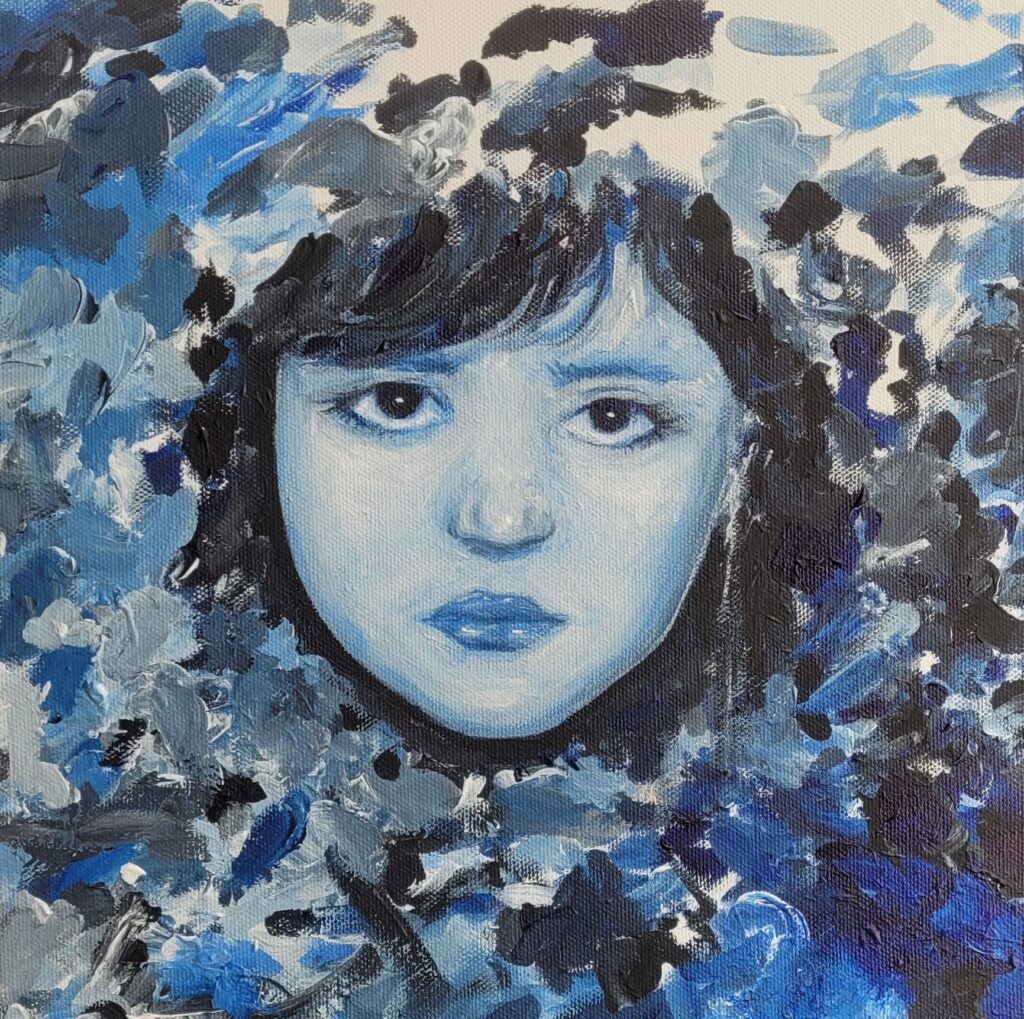
Childhood portrait
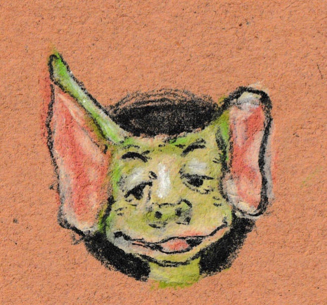
Soft Pastels
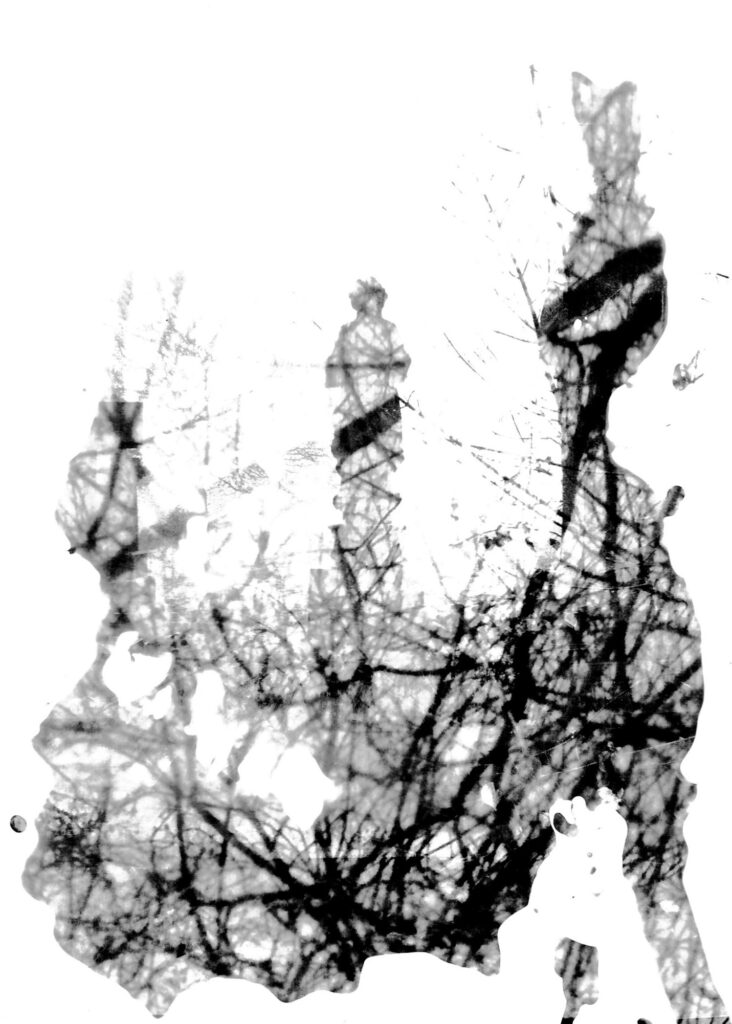
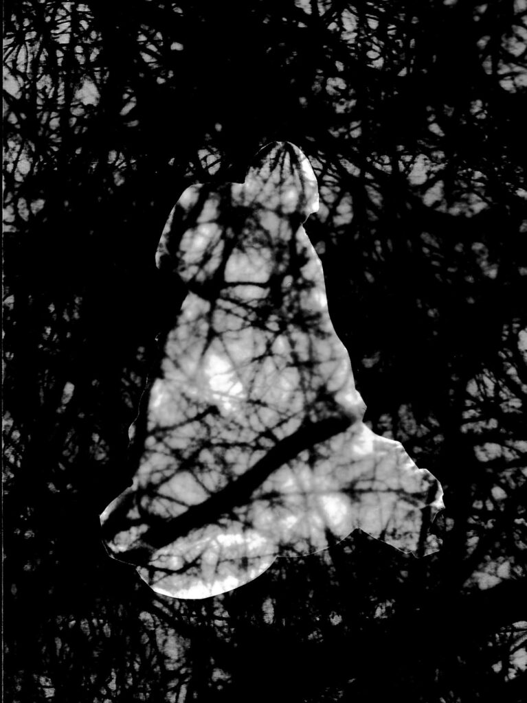
Darkroom
cathedral window
.
Posts pagination
Previous page
Page
1
Page
2