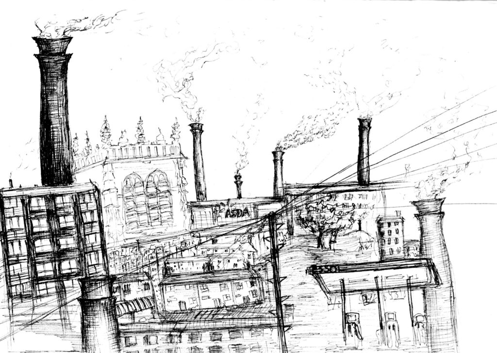
For my final piece I wanted to focus on the juxtaposition between Bradford’s historical architecture, such as the mills and cathedral, and the newer purpose made architecture.
To do this I crammed lots of different buildings on top of each other, while also
exaggerating the size of some. I altered the size of some due to my belief that the modern design of large cities aspires to make you feel small. With the ever increasing size of buildings, the beauty is lost, and all that is left is for you to look up and see how much they tower over you.
I wanted to include a lot of tall mill chimneys, as I think they stand out a lot amongst the other buildings when you look over Bradford. I also felt it was important to include them as they were a major part in the development of the city as a whole. The number of chimneys also somewhat links to how polluted the city air is.
I stacked a lot of the flats atop each other, as they are plentiful, and identical, throughout the city.
I decided to go for a more messy and illustrative approach in this piece, which I think has some pros and cons. I do like how everything is able to connect through overlapping, but I do think there are some weaker areas that needed more buildings, however the messy style would’ve made it hard to add more while keeping them illegible. I did like playing around with the line weight, and I think it adds to the characteristics of certain buildings- such as the flats having darker, heavy lines, opposed to the cathedral having lighter, more detailed ones.