I first started looking into different mythological creatures with the 3 posters in mind. I thought in my head what do I want each poster to exude. I then thought I should make one poster with creatures that bring out fear, another that exudes prideful and powerful atmosphere and the last portraying majestic creatures. With these in mind I looked through some creatures what stood out to me were the Oni, Golem and Cyclops for the first poster. I thought having 3 creatures for this would be more fitting and planned to have the cyclops in the middle with the other 2 on the sides. For my second poster I thought what would be good for something that is prideful and powerful, which led me to a Hydra and a Dragon as these two are the most prideful and powerful creatures now to stick with this powerfulness and pride I decided it would be better to have two creatures challenging each others and these two seemed to be the right creatures just for that as they are huge, prideful and powerful. For my third and final poster I would like it to have a majestic atmosphere. Phoenix and a Pegasus are both known to be majestic so I thought why not have the two of them in one flying high with a clear view of the background making it heaven like to bring out the atmosphere more. The background for each of these will be important as it can either bring the atmosphere I want from them out more or out less.
I decided a Golem wouldn’t fit with an Oni to bring out terror so I decided to change it into a wendigo as this creature is more terrifying then a Golem and will bring out the atmosphere I want more. I have also decided to get rid of the Cyclops as a Banshee would be a more terrifying and fitting thing more so than a cyclops it also fits in with the creatures I have chosen more so then a Cyclops. I have planned to make the setting in a dark and gloomy place for my first poster. I will be giving each of the creatures eyes glowing in the dark atmosphere as it will have more of an effect and make the atmosphere feel more real. For my second poster the atmosphere and colours will be more red and yellow as these colours are associated with powerfulness and pride. For my last poster the colours I will mainly be using are light colours like white and blue for the background as it will bring out the calm and majestic like look I want for the Pegasus and Phoenix to shine.
I have planned out my posters so that I know what I will be doing. For my first poster I will place a Wendigo in the middle, an Oni on the right side with a banshee on the left. The background will be dark and foggy to add to the mysteriousness and creepiness of the monsters. I will also add a glow to their eyes so that it stands out in the darkness and gives more of a terrifying effect. This will add to the creepy theme I am going for. For my second poster I will go with the theme of power. I will have the Hydra on the left and the Dragon on the right. I will have the both standing on mountains challenging each other with a roar showcasing their pride and power. I will be using orange and red colours as these are most associated with power and pride. The background will be thundering to add to this powerful atmosphere. For my last poster I will go with the theme being majestic. I will have the Pegasus and Phoenix in the sky showing its feathers with a fantasy background using mainly blue and white colours. As these colours are most associated with majestic.
I then decided for my first poster I would like to have a glow effect for the characters eyes as it will allow them to look more cool and menacing. This will also add to the poster as the background and characters will consist of dark colours. I experimented with glow using Ibis paint x as I needed to. I imported an image to use as testing so that I do not ruin or mess with my poster. Once I imported the image I went to filter and changed the brightness to -100% and the contrast around 50%. This made the image darker and make the places i want to glow. I made a new layer and used a bright colour that would fit for that character to add to their eyes. Once this was done I made another new layer and changed the layers properties from normal to screen to add more to the glow. I changed my brush to airbrush and used it to make the eyes look more like there are glowing. I then went to filter on this layer and used gaussian blur so that it will blend better and blur more to create a more convincing glow effect on his eyes. For any Lightning type effects I would create a new layer and keep it on normal. I would use the dip pen (hard) and made it force fade. With force fade I had the option to increase the length of the start and end which I decided to do with both of them at 100%. I also changed the shape of the fade to give it a more sharp effect. I would then change the colour of my brush to white and make little lightning parts around the body of some of the characters. Once I think I have done enough I then go to filter and give it an outer colour of my choice depending what colour eyes the character has as it gives a more unique feel to them and the lightning will feel more apart of that character creating a menacing atmosphere. I then added highlights to the characters body depending where lightning was and the glowing eyes to give a more realistic look to the lighting. To do this I made another layer and made this layer into a screen layer, I then used the colour for their eyes and lightning and highlighted around the characters body in the places I think that the lighting would be at. To end it off and bring the glow out I went back to the image layer and changed the brightness decreasing it around 25% to 30% and increasing the contrast to around 50% so that the glow would stand out. This ended up amazing and I decided I want this to be used for my first poster and maybe my third poster.
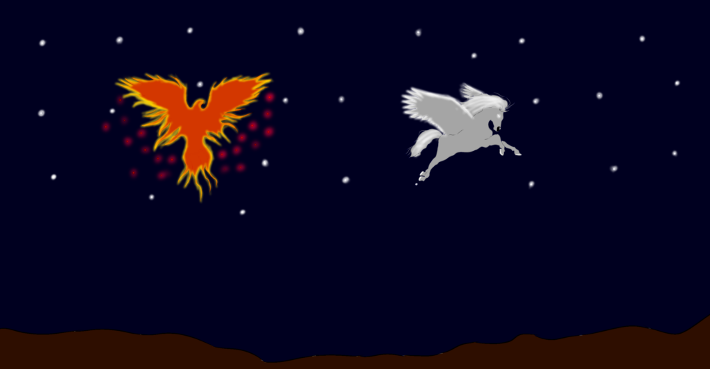
I decided that I should start off with the easier poster first by drawing the pegasus and phoenix as the both of them are simple to draw. I first drew the pegasus. I drew a horse and then added wings to it but to add more detail and seem like the wing and tail lines are not too fat I reduced the size of my brush by 1.5 pixels. This allowed me to make them more detailed. Looking back at the drawing I realised that it looked too unnatural but then I decided I could fix it with the shading and colours so I didn’t worry about it too much. I then moved on to the phoenix. To do the phoenix I drew a bird and then after I fixed it up using the colours and shading to change the bird into a Phoenix. I then had to decide what to do for the background. Because I want the atmosphere to be majestic I decided to make the background in the night sky and gave the pegasus wings a glow as well as the phoenix a glow to bring them out.
For my next poster I decided I wanted to do the dragon one as I’ve seen a lot of dragons and drawn a few before. I was thinking to myself what type of dragon I would like to draw and then what came to mind was from an anime I have watched for awhile. I thought to myself I would like to draw the dragon in that anime which is a Chinese dragon specifically the azure dragon. Then I decided that the mythical creature being a hydra should also be changed which I then changed it into a sea serpent to make it more fitting. I first drew a standard sketch of the dragon. I then decided to change the sketch slightly so that the dragon seems more lifelike and eventually came to the point of having the belly separated from the back done. I then added scales on repeatedly which took some time but it also helped me with changing the belly placement and it was well worth it in the end as it ended up looking amazing. My reasoning in changing the hydra into a sea serpent was because the azure dragon is based on a myth on a koi fish which had swam up to the tops of the waterfall. The gods recognised the koi for its determination and perseverance turning it into a dragon. So I decided that changing the hydra to a sea serpent would be more fitting as both are or once were from the seas. Now with drawing the sea serpent I had to take in consideration the background for this which I already had thought of before starting the sea serpent. I decided I want the sea of course but with that I would like to make it seem as though the sea serpent has part of its body inside the ocean as well as having it seem like the dragon has just come out the water with water droplets coming from it but this is quite hard so I would have to experiment with it once I have finished drawing my sea serpent. I drew the sea serpent by drawing tubes at first in different angles to see how I would like to have it. Once I was happy with the proportions of the sea serpent I decided to start making the little things as well as the head and scales of the sea serpent. I first started out with the head and adding it to the body. Once the head was added I had to add the fins to the serpent which I had to experiment a bit around with as they couldn’t be too long or big as well as being place on the right points as this is essentially me trying to make tubes into a sea serpent. Once I had finished that I decided to add scales on the sea serpent but I didn’t want to make it as small and intricate as I did with the dragon as I was both running out of time but I also want the sea serpent to give of a atmosphere of being huge whilst compared to the dragon which is not as big as the serpent. I decided the background I should have is of a sea storm with the waves crashing, a storm in the background with lightning strikes to give more presence to the dragon and sea serpent. I had realised that I would not have enough time to finish the background like I wanted to so I decided to give it a simple look so what I did was separate the sky and water by splitting them in two using two different colours. Once this was done I decided that I would use the same colour I chose for the sky but make it darker or brighter with the opacity changed to around 10%. What I did next is go around it making the sky look like it has clouds as well as saving as much time as I could so that I could finish all 3 posters. I then did the same for water. Once I had finished that I put my drawings in the background and decided to start colouring those in with a similar effect to how I did it with the background. Once I had finished that I had to make the water overlap over the Sea Serpent so it would look like it was coming out the water. I used the same colour that I did with the water and went over the sea serpent until I though it looked right. After doing this I looked at it and saw that something looked wrong. I then found a white grey colour and kept the opacity at 10%. I went around the sea serpent to make it seem like it is actually coming out the ocean and it worked. Sadly I could not spend as much time as I wanted to on the colouring as well as shading especially since I just started learning that type of art style if I had more time I believe I could of made it look much better.
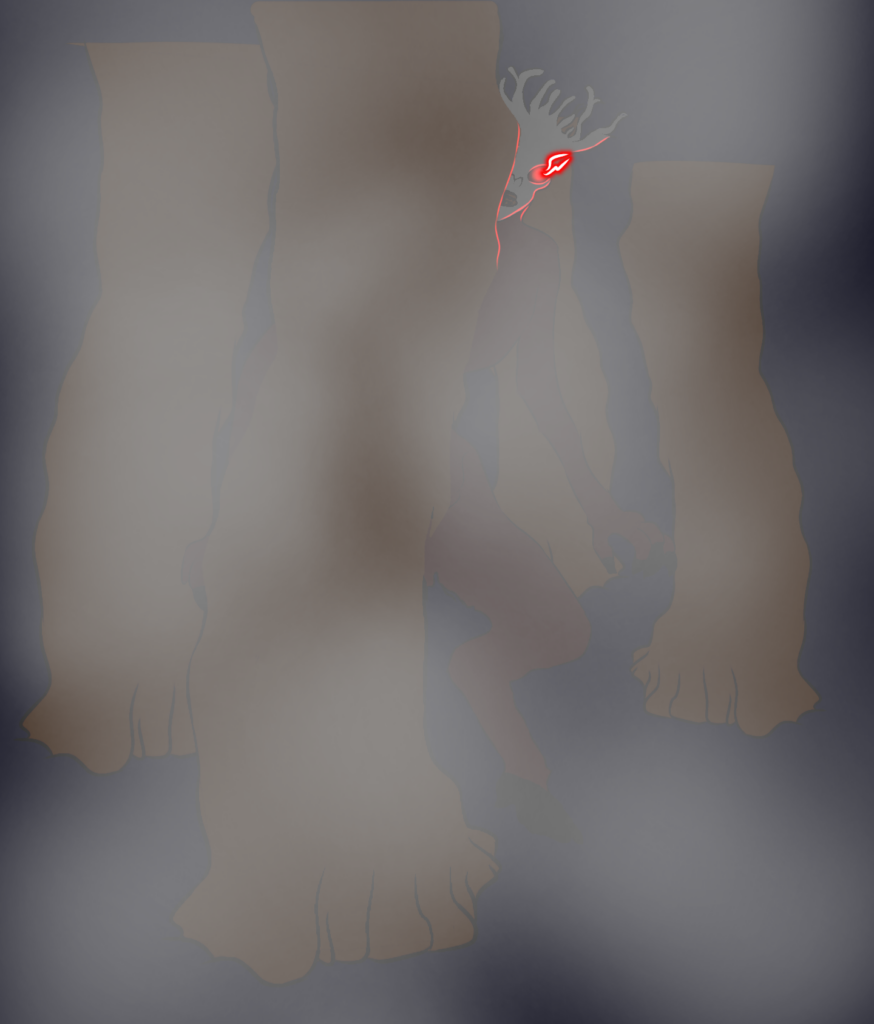
For my final poster which I realised whilst doing it I may not have time to finish all 3 posters. So I decided for the last poster I will get rid of one character and have only two but if it does take more time then expected I will have to make it a solo poster. The two creatures I have decided to do is the Wendigo and Oni. If I don’t finish it as fast as I want to I will draw only the Wendigo and it will still keep its dark atmosphere with the glowing eyes as it will give a better look and more menacing look depending on how I have done the background. I first drew the Wendigo and to save time if I do end up doing only that then I will draw it in a pose where it could be a solo and duo poster. The background I thought of doing it in a dark forest with some fog to give a mystery and more creepy vibe as when you think of most scary movies or other media that try and scare you most of it happens in the dark, in a forest and its hard to see so I combined the three for my background. I drew the Wendigo in a pose that made it seem like it was wandering around the forest looking for prey by having it in a seemingly walking state but with it facing the straight at you to give it more of a targeted feel. Some of its body may be covered by smoke to make it seem mysterious and hidden. It will make the Wendigo seem like it is stalking its prey. But this smoke will be done when i’ve finished drawing the Wendigo and Oni. Once I had finished the Wendigo I realised that I will not have enough time to do the Oni so I started on the background right away. First I added trees. Then made the background dark so it would seem like it was in the middle of night. I then added fog onto the wendigo so that it would seem a little disfigured or mysterious. I then added the glow to the wendigos eyes and it turned out looking pretty nice. After colouring the background and finishing it all up I decided to move on to the character. I started colouring and shading the wendigo making it feel like it is in the environment I put it in. The reason why I did the wendigo colour last is because depending on the environment will give me the ideas and colour for the character I will use. It will also help me not make the character look out of place. Since I was in a rush and even though I was unhappy with how the phoenix and pegasus turned out I had to still rush as I had no time left to stay on a poster fixing it up or changing it. So I rushed the wendigo poster too and to make it faster I used the airbrush in order to create a mist type effect so that I wont have to rely too much on detail but after finishing everything at the end I had realised that I had forgot to add ground and increase the length of the trees and I could not go back to change it so had to settle with it being unfinished. I take responsibility in my work turning out like this as I did not have proper time management and was not decisive enough to stick with one idea and changed them rapidly within my progress going forward.
The one poster that I am happy turned out kind of well is the dragon and sea serpent as I tried to go with a more digital painting style but with not enough time I could not learn much and had to stick with the lines being there so that people can make out what they are. The waves were hard to do and I could not do them so I decided to leave it be and move on to my other posters as to not spend too much time on one.
These are the final posters:

Sadly these did not turn out how I expected them as I was immensely rushed as I did not have enough time as I thought I would of so completing them was what was going through my head so I had to rush myself lowering my quality of work sadly.