Poster
I started to put together some ideas for the showcase poster. I had an idea for the logo, and tried to create a quick mockup in Canva to show to Paul.
Me, Harry and Blake all liked different colour schemes, therefore we all worked separately in Pauls lesson, so then we could have a number of different ideas, and different colour schemes to see which worked best. The colour scheme I chose was yellow and orange, with the poster split in half with each colour. This way there was an easy contrast on each side of the poster, and I could work with different shades within the text etc.
I also worked with Paul to create the logo. My idea was to have the event name ‘Amplified’ in the shape of a megaphone, where the letters progressively get larger, as though they are being amplified themselves. We worked with this on photoshop using the scale tool.
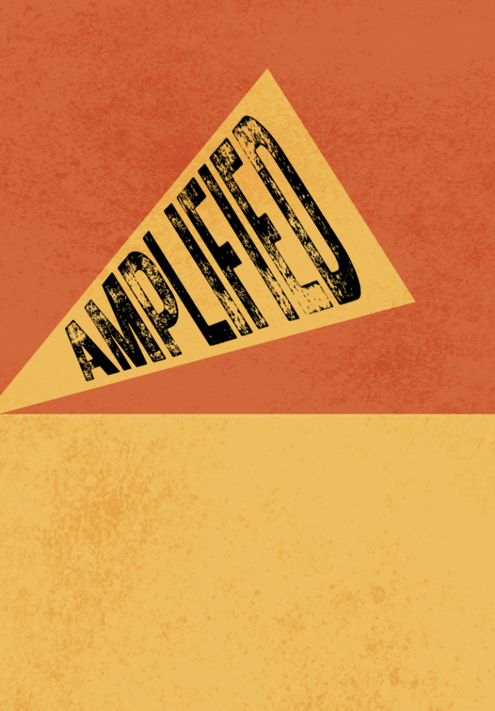
However, when it came to adding in the text etc, this didn’t really seem to work with what I was aiming for. Therefore, I chose to go with a white background, and incorporate the orange and yellow through different shapes.
I think the poster looks much better with a texture overlay rather than solid colours. The texture helps it look a lot less uniform and solid, even though it may only seem like a small change.
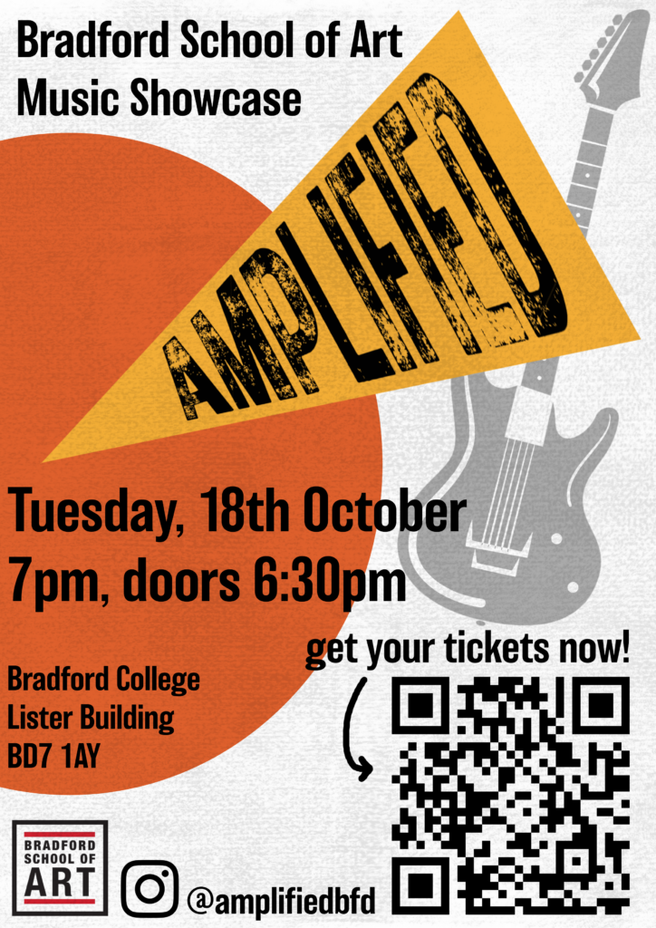
I wanted to keep the concept of the poster quite simple. The rest wasn’t really working with having the page split in two colours. Therefore, I decided to keep the background white, and layer over a texture. To ensure the colours I wanted were still incorporated into the poster I added a semi-circle. This also helps give the poster a bit of depth, and is the perfect place to add in the address and other details about the event.
After adding in the title, Bradford School of Art’s logo and the QR code, I still felt like there was something missing, and the right hand side of the poster seemed quite bare. Although I wanted to try and keep the poster minimalistic, I also wanted it to stand out. Apart from putting ‘music showcase’ on the top of the page, there wasn’t any other indication as to what the showcase was about. Therefore, I chose to add in a guitar vector to fill the empty space, and help bring the poster together. After adding in other small details such as the Instagram handle, I thought the poster looked quite good. the colours all work together very well, and there’s enough text and detail within the poster without making it look too busy. Overall, I am quite happy with the outcome.
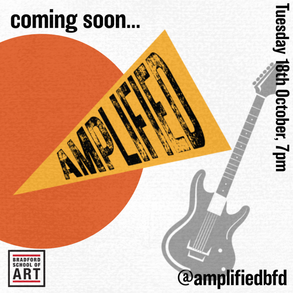
I took elements from the poster and used them to create a simplified template for some instagram posts. This can be used for announcements etc. on the instagram account, so that all of the posts coordinate with each other in terms of colour and style.
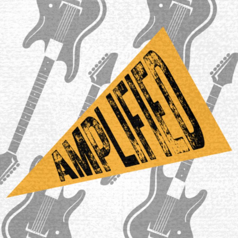
I also took some time to create a simple profile picture for the account, as we haven’t yet had any photos taken to use, and I didn’t want to stick with photos from last year’s event. It is a very simple idea, but I think it works quite well with that I wanted to achieve.
programme
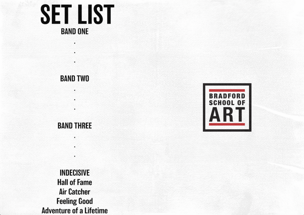
This was the initial idea I had for the programme. It isn’t awful, but it is very bright and boring, and there wasn’t much else to add onto the right side to fill the page up.
Nic then showed me some of the programmes from previous years, so I took some inspiration from them and came up with this:
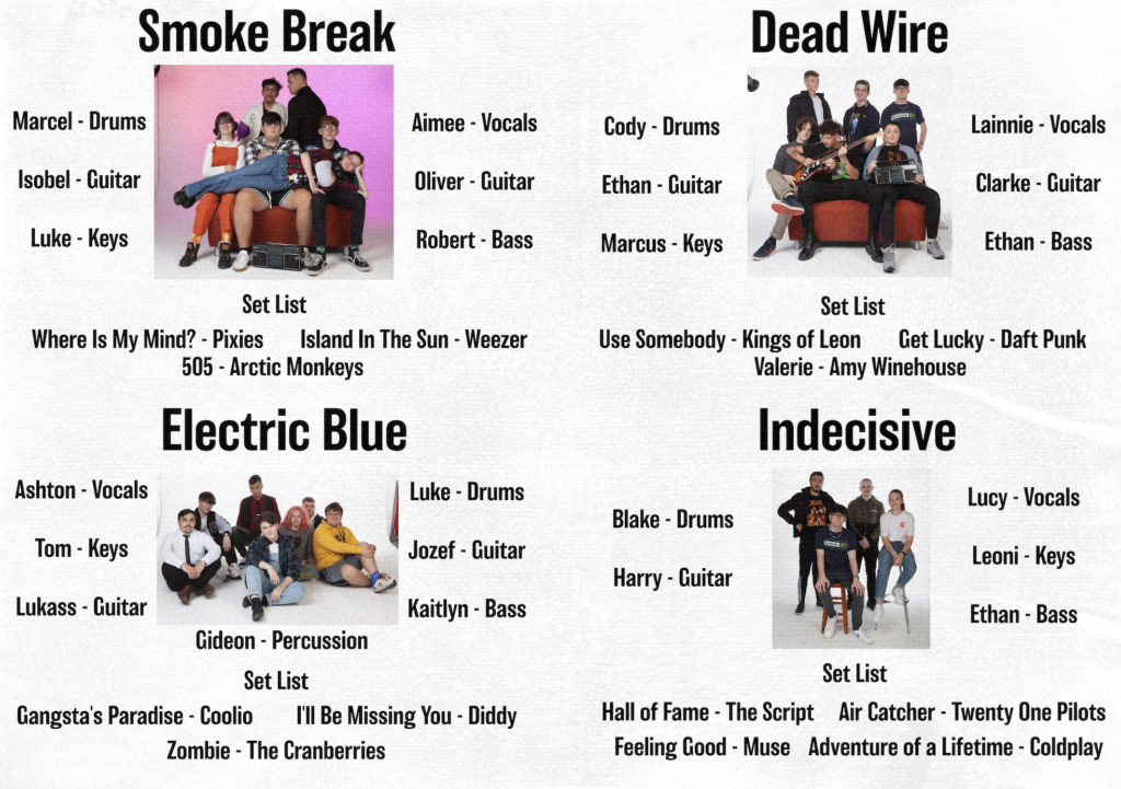
I think this one definitely looks a lot better than my initial idea. However, It was still very boring and bright, as there wasn’t much colour, just a lot of text.
I also didn’t really like how only one of the band photos had a gradient colour. Therefore, I edited the rest of them to all have a background gradient.
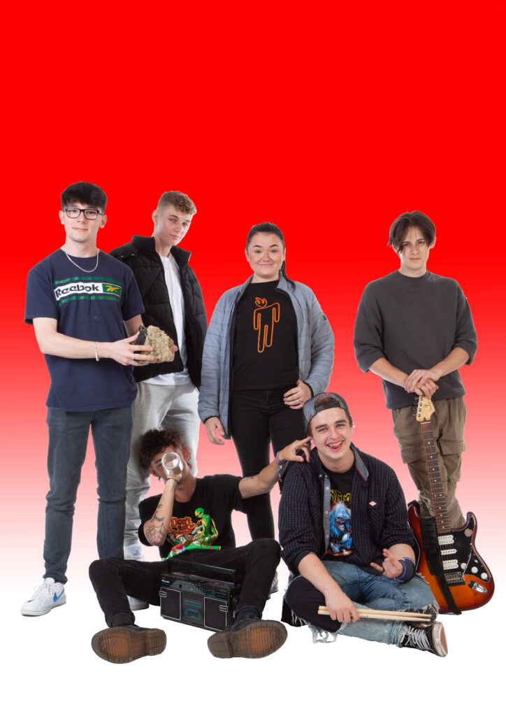
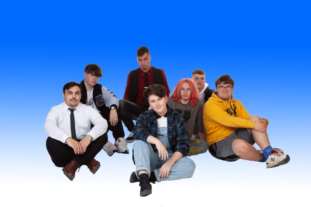
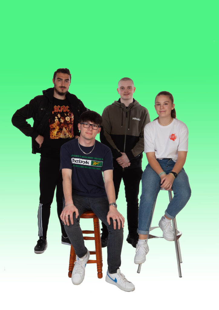
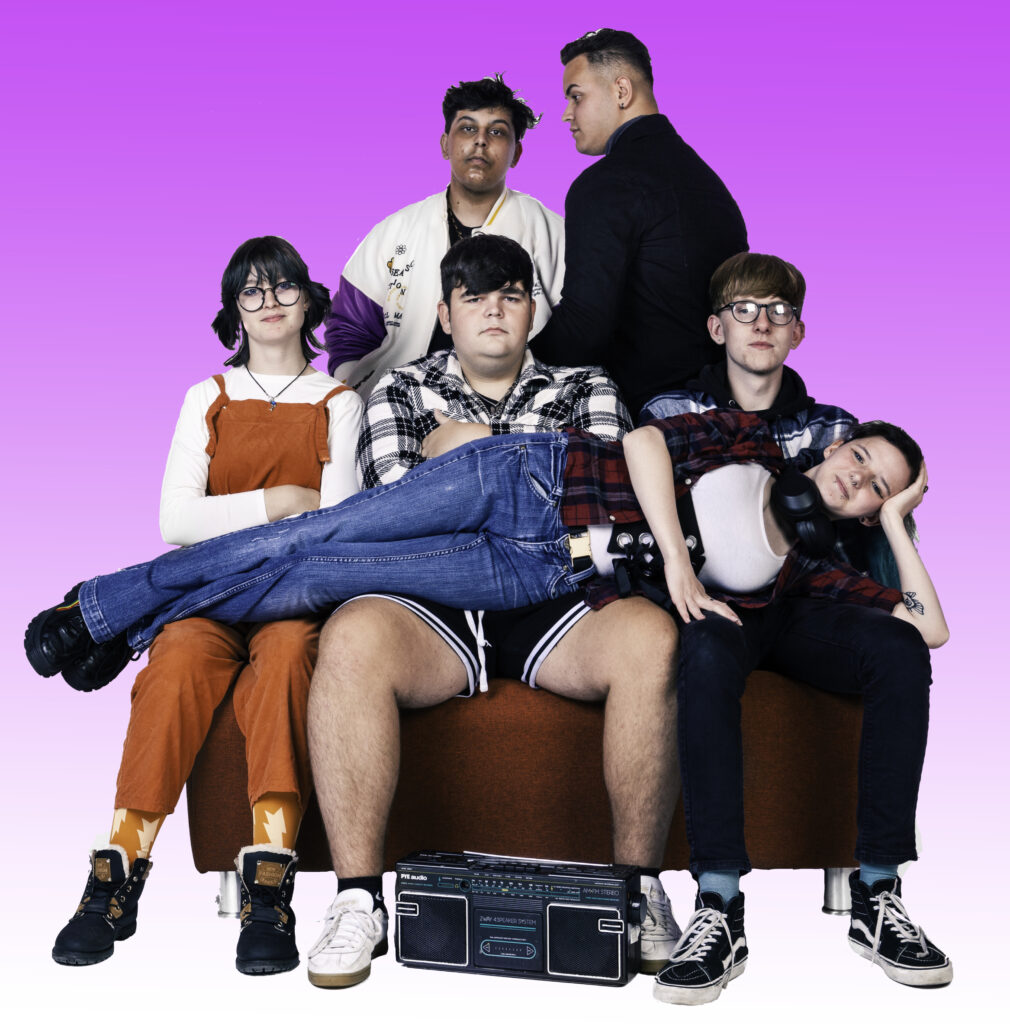
The cut outs aren’t perfect, but any imperfections are hardly noticeable when added onto the programme, so I wasn’t too worried.
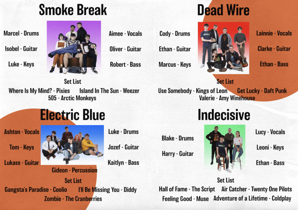
This is the final product for the inside of the programme. I think it looks a lot better with the added colour. I also like this idea much better than my initial one because it lets the audience familiarise themselves with the bands before they see them perform. I am very happy with the outcome of this, I believe it represents each band’s image in the way they would’ve liked, whilst keeping things simple.
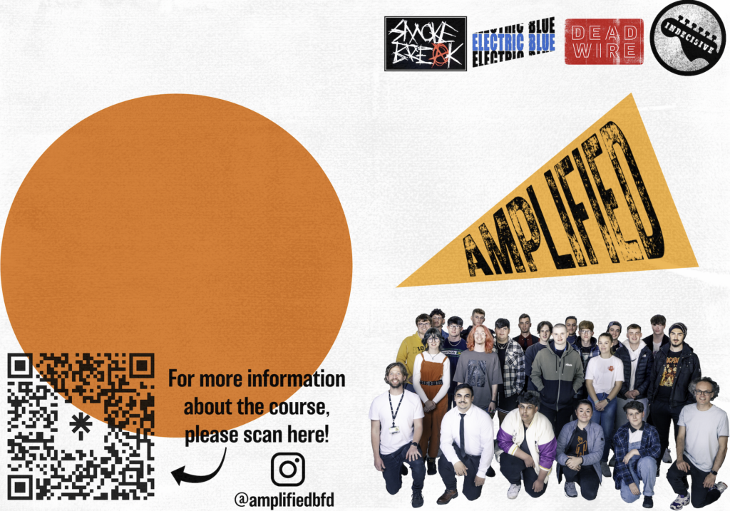
For the front and back cover of the programme, I chose to do a similar design as last year’s ‘Live Wire’ programme. I displayed all of the band’s logos, in the order they were performing in, as well as the showcase logo and a picture of all the staff and students.
I created a link tree so people could access information about the course, and also included the event’s instagram handle, to give the audience the chance to follow and see what the student’s get up to in rehearsals etc.
The design isn’t finished yet but I like how it looks so far, and I think the final product will look great.
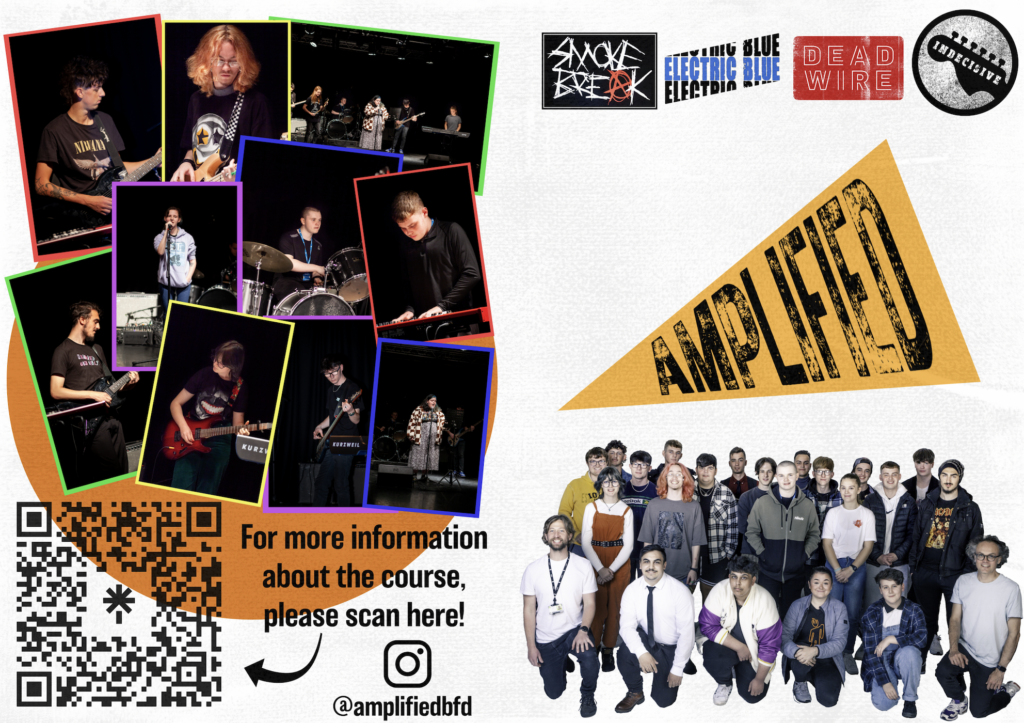
This is the final product for the front and back cover of the programme. I took the colours used within the band photos to create borders for the individual/rehearsal photos. I think it works together really well!
promotion
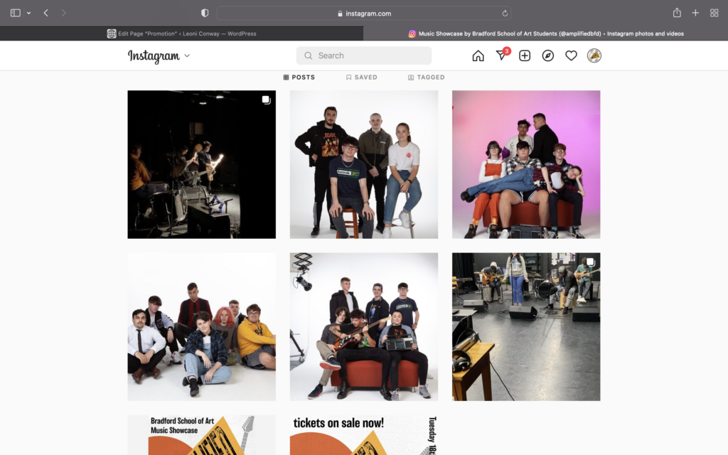
For the promotion of the showcase, I shared posts with the template I made, as well as the poster to encourage people to start reserving tickets.
For 4 consecutive days, I posted a ‘Meet The Band’ post. Each band was posted with their photo, name and a list of members.
BCB Radio
https://podcasts.canstream.co.uk/bcb/index.php?id=67388
From 43 Mins onwards.
Oliver and I went down to BCB Radio to talk about the show. We spoke about the course and what kind of things we get up to on our projects, and also what we’ll be doing for the remainder of the year. I think the show went quite well. There were a lot of things we could’ve mentioned that we didn’t, but we know for next time that we should write down a list of things we want to talk about. However, I think we came across quite confident.