design process – poster
Before beginning the process of designing posters, I brainstormed some ideas around colour scheme and text. I had two different colour schemes I was planning to work with and around. These included:
- Green, white and orange



- Blue, yellow, black


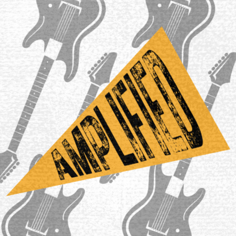
I chose to stick with the event name ‘Amplified’ as it is already established and recognised. The current logo for Amplified is black and yellow, which is something I want to be able to incorporate into the designs for the event’s promotion.
Using the colour schemes I planned to work with, I began brainstorming some ideas using different textures, photos, and overlays. I quickly realised that the green did not work with the overall design I was hoping for the poster.
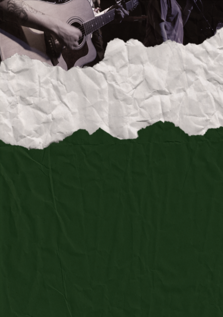
I feel as though the colour clashes with the rest of the design. Therefore, I chose to work with the blue colour scheme.
Some other ideas I brainstormed include a magazine style design. I thought this would be a great idea to try and incorporate into the programme as well as the poster. After researching different magazine fonts and textures, I couldn’t find any that I liked the look of, or that I would want to use within the design of the poster/programme. Therefore, I chose to continue working with my initial design idea.
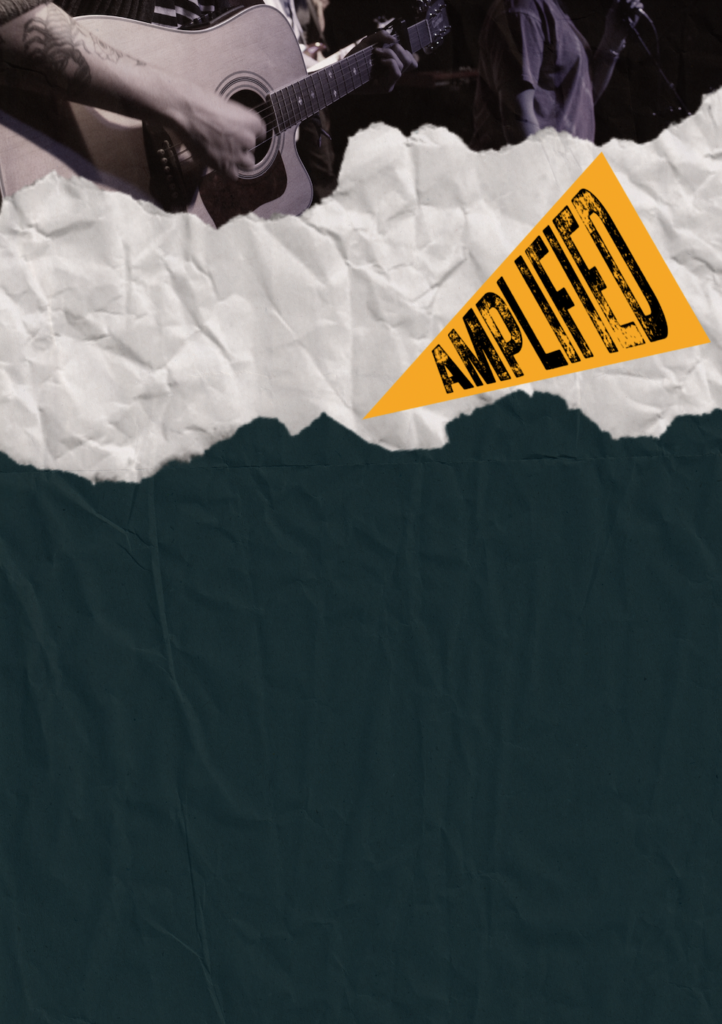
After deciding on the best colour for the poster, I started to plan out where each aspect of the poster. I wanted to keep it quite minimal in terms of text, however, I need to ensure that the important information is kept clear and understandable. The logo is also a very important part of the poster as it represents the ‘brand’ and event name for the entire showcase.
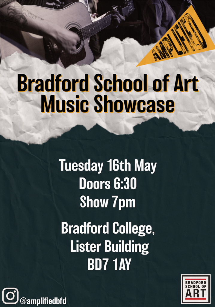
For me, the title of the poster was the hardest part to decide. While the logo is a prominent part of the promotion, I didn’t want it to be the centre of the poster like it was in the last showcase. Therefore, I chose to include the logo in the corner and work on a different name for the event. I sat with Paul and brainstormed many different ideas. However when written down on the poster, they didn’t look very enticing. I chose to title the poster ‘Bradford School of Art Music Showcase’ so that it clearly represents the department and the potential audience for the event knew what it would include.
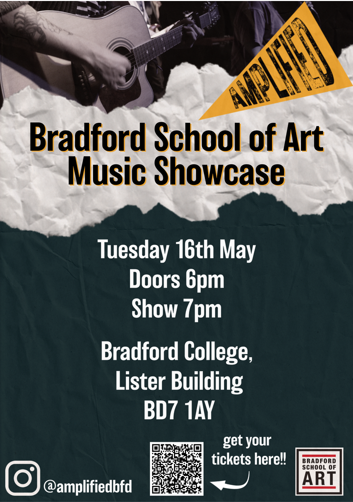
This is the final design for the poster. I like how it isn’t overcrowded with information, yet all of the important aspects are included. However, after reflecting on it in comparison to different event posters, including October’s showcase, I do feel as though I could have made it look a little bit more interesting, and improved my graphic design skills a lot more. If I had more time, I would’ve researched more into graphic design and music posters, and learned different skills to make a more interesting poster. I will try to use my time more wisely when designing other promotional content, and the showcase programme.
When designing the event’s programme, I ran into some issues trying to make it look good whilst sticking to the same fonts and ideas that have been used throughout the poster. Therefore, I decided to redesign the poster so that it would fit in well with the ideas I have for the programme.
Rather than using photoshop for this, I decided to use Canva. Since I was short on time and Canva provides some pre-made designs, it was easy to work around and redesign the poster for the event.
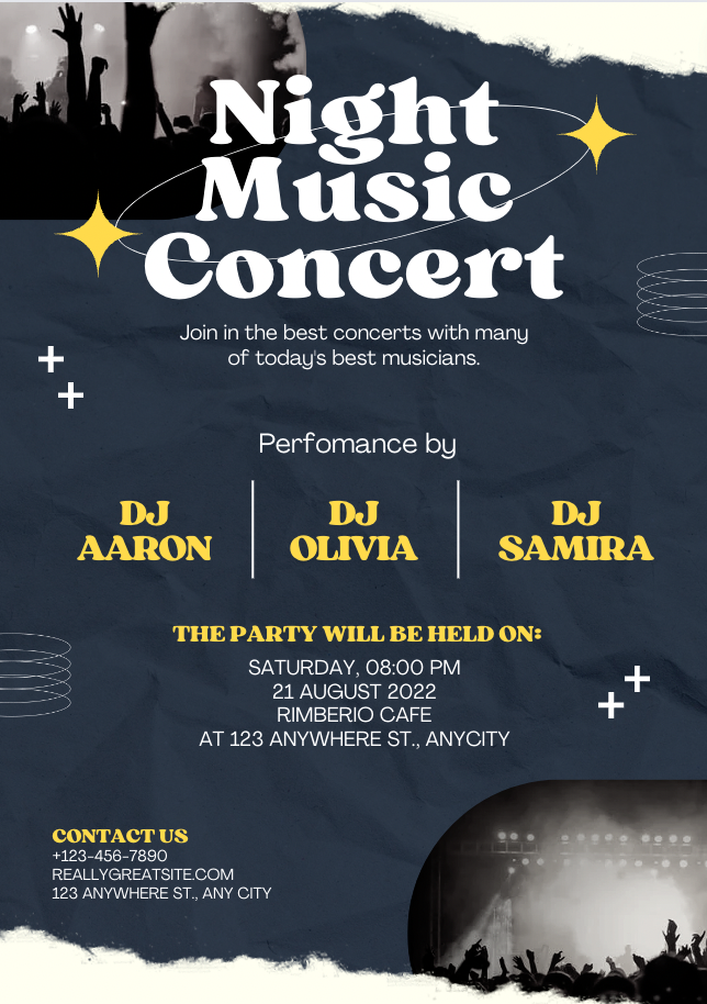
After looking through some different designs, I chose to focus mainly on this one. I liked how everything was set out and it follows a similar concept to my initial design idea. This way, I know the colour of the logo will work within the poster.
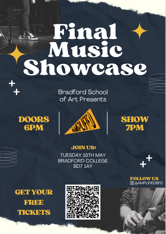
After changing the details in the poster template to fit in all of the information for the showcase, this is how the poster looked. Lewis mentioned that the small design details took away from the rest of the poster, as they stood out more than the title and important information. Therefore, I decided to remove those to see which design I prefer.
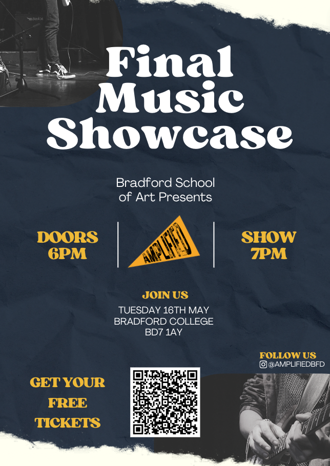
After removing the small graphics, I do agree that the design looks much more professional. Another comment was that the event logo should be the main focal point, rather than including ‘Final Music Showcase’ as the main title of the event. I took this into consideration and created a poster focused more towards the logo over a title.
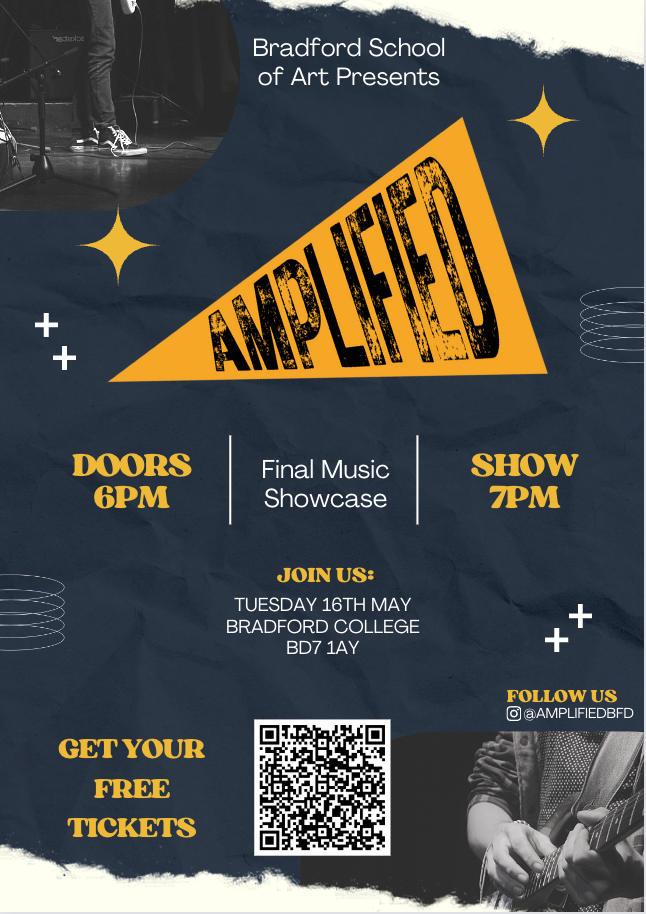
I do like the look of this poster and I believe it will look much better once some minor details are changed.
In comparison to the previous poster design, I do believe that this one looks a lot more cohesive, it isn’t overpowering and follows the minimalistic style I was aiming for. The background design of the poster is also a great base for the programme, which again will look more cohesive alongside this poster. I am glad that I took some time to create an additional poster as it will make the design process of the programme much easier.
Design Process – programme
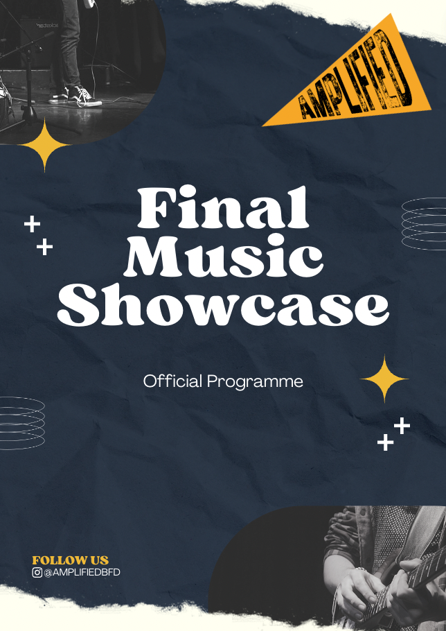
To begin the design process for the programme, I took a lot of elements from the poster, but increased the text size and took out all of the details that aren’t necessary for an event programme.
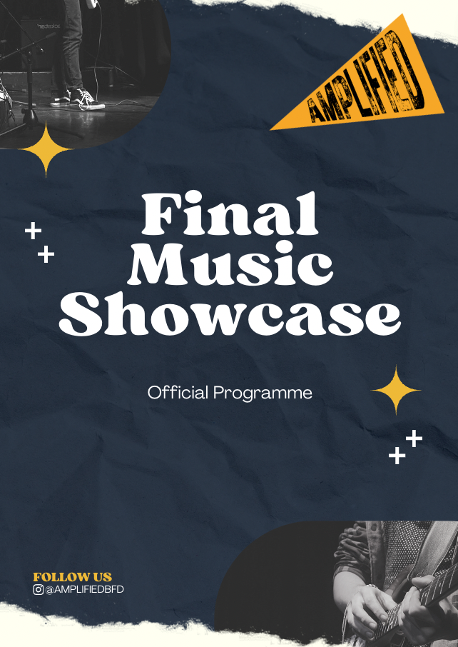
This is very similar to the picture above, minus some minor details that were removed.
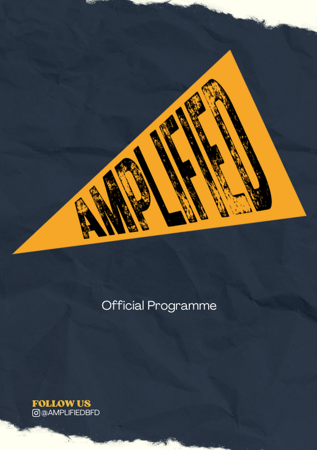
I didn’t want the front of the programme to be too busy, and therefore I removed the images and majority of the text, and replaced the title with the event logo. In my opinion, this looks much better and very professional.
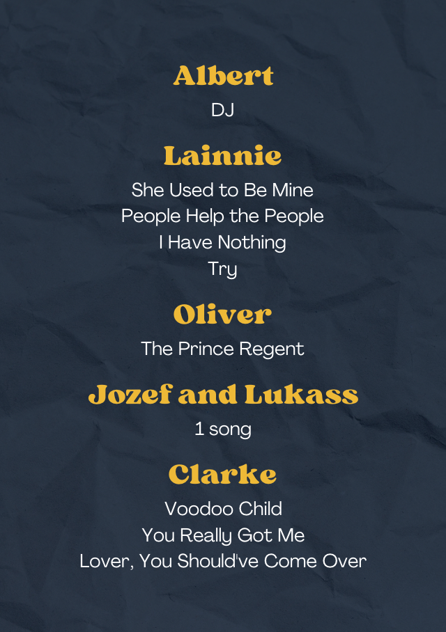
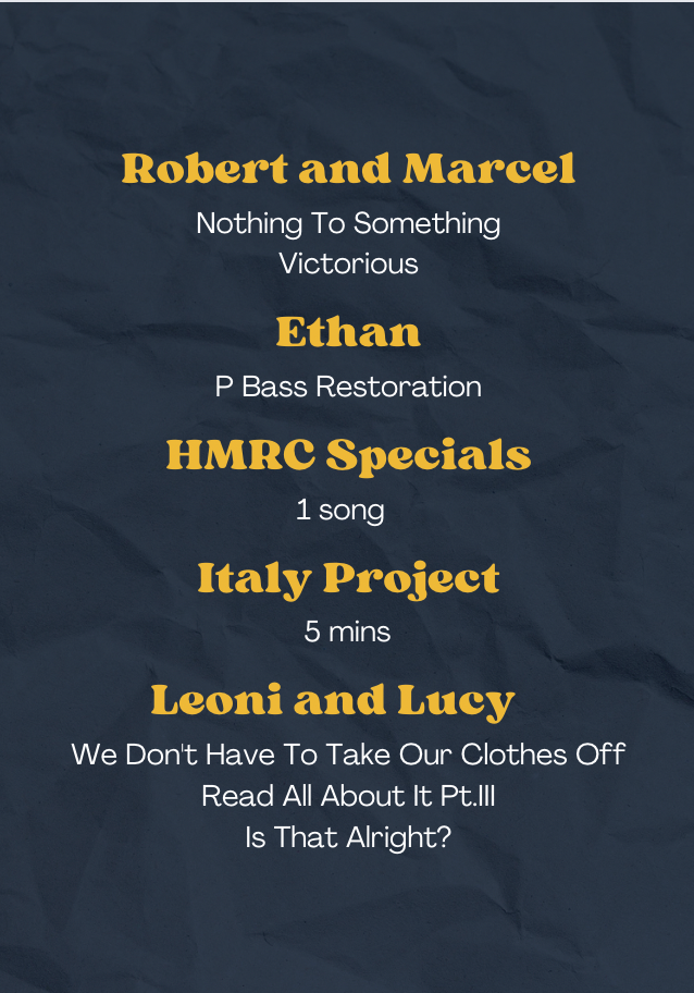
The inside of the programme is still incomplete. It is difficult to complete this straight away, since other students are still making decisions on whether they would like to perform, what their set lists are, and any group/song names they may have for their sets and performances. The middle two pages of the programme will be the last to complete, as some last minute changes are most likely going to take place.
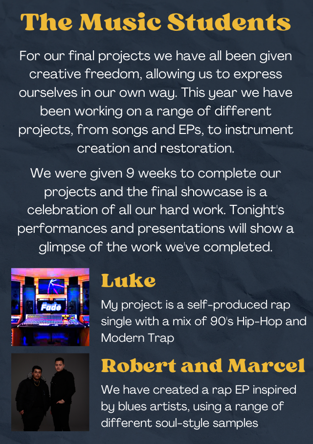
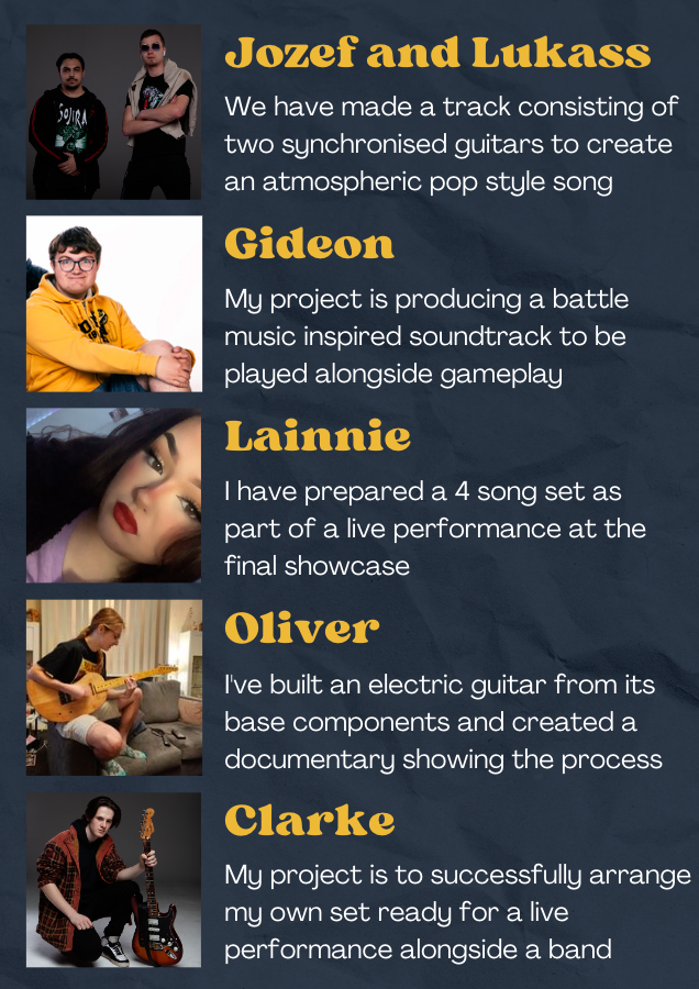
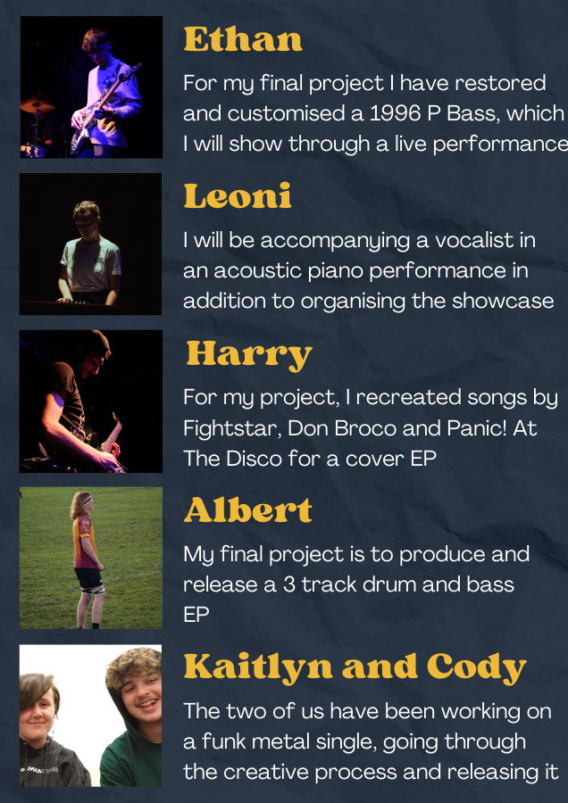
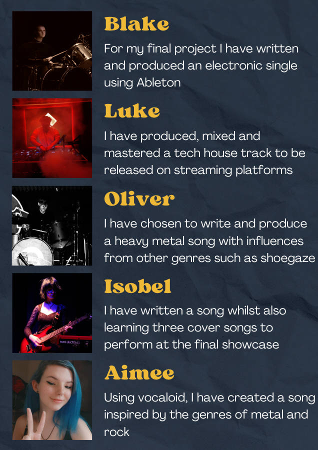
I wanted to make the programme a bit different to October’s showcase, and since a lot of students chose not to perform/present at the show I thought that including a section within the programme outlining everyone’s individual projects would be a great way to showcase all of their work.
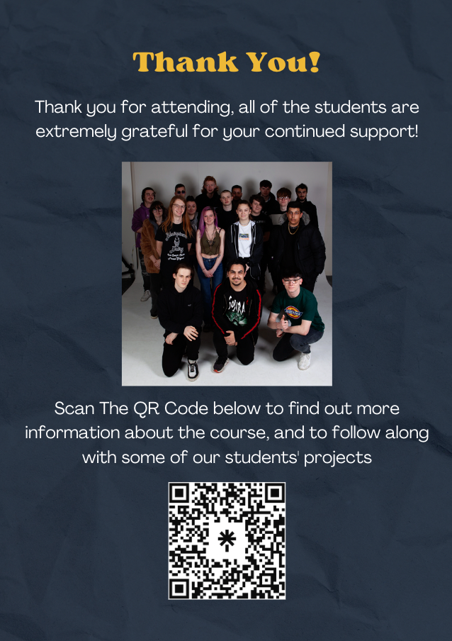
For those who had videos/music they wanted to promote, I included a QR code on the back of the programme so that people attending the showcase could access other work and projects that were either partially shown, or not presented at all. I believe this was a great addition to the programme because it adds an extra bit of marketing and promotion for some of the students.
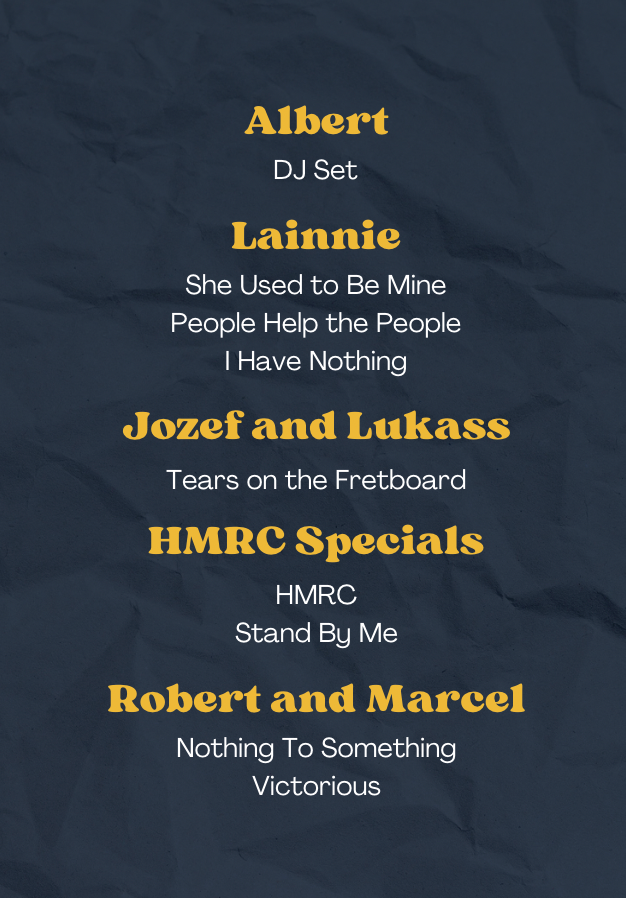
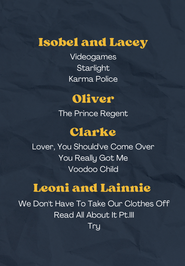
This is the final set list for the programme. Many things changed from the initial draft; some changed projects, and others chose not to perform at all.
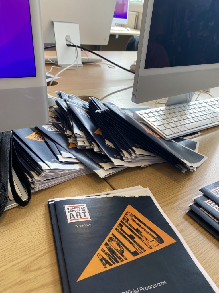
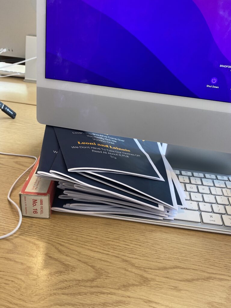
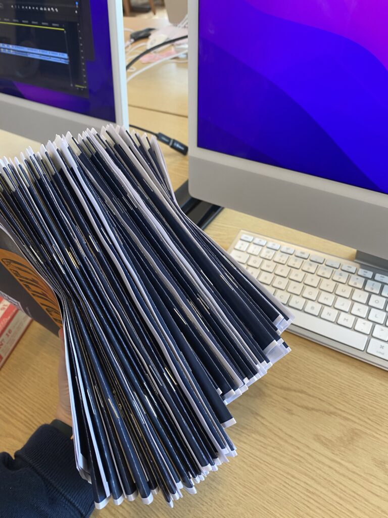
Printing, folding, and stapling all of the programmes was definitely a tedious job, yet it was very satisfying to see them complete. The final product looks great and very professional.
Overall, I am very happy with how both the posters and the programmes turned out. They all look very cohesive and fit the theme I was aiming for at the beginning of the project. Switching over to Canva was a wise choice, it was much easier to use and work around, and quicker to change text etc. than photoshop is.