There are many different styles of gig posters which can differentiate depending on the type of artist/event. Festival posters for example tend to be quite minimalistic, only including the title, location and acts who will be performing. Adding any unnecessary information on an already wordy poster will make it look extremely busy and difficult for its target audience to read.
I like the idea of a minimalist style poster. As a consumer, I prefer to see all the important information for a gig rather than be overwhelmed with text.
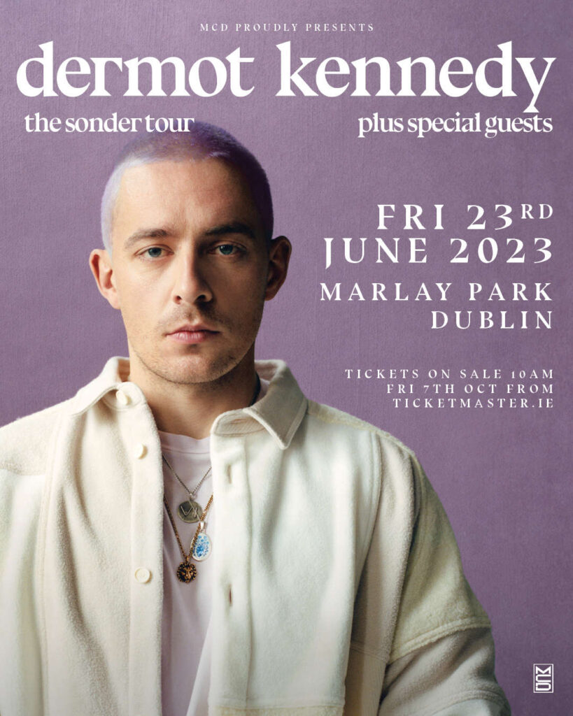
This is an example of an event poster that clearly shows all of the information needed for the audience, isn’t overpowering with text, and follows a colour scheme. However it also isn’t too dull; it includes a main image of the artist, and the colours are vibrant.
The consistency within the text is important. Using the same font throughout the poster makes it look cohesive and put together, yet using lowercase letters for the title and uppercase letters for other information forms a nice contrast.
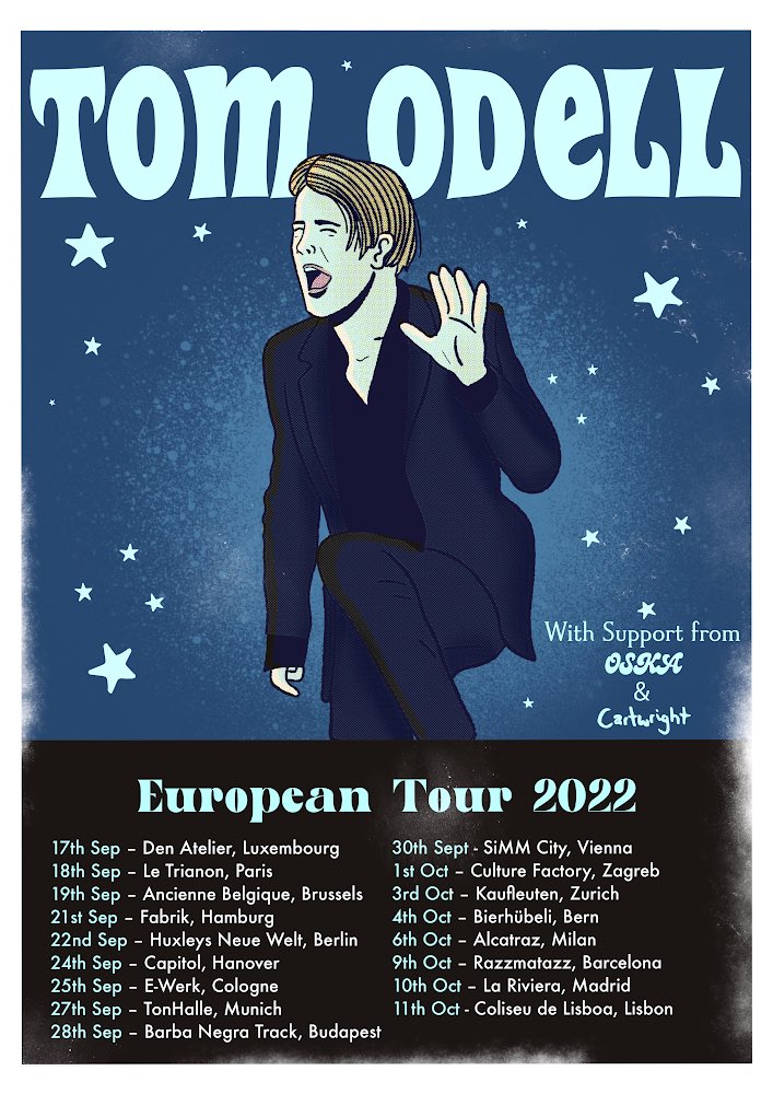
I also like posters within a similar style to the one above. I like that a cartoon style image is used with little contrast to the background behind it. The text is easily readable and all the information within the poster is useful; the name of the artist and support acts, and where they are performing, at what dates. Even though it may not look extremely minimalistic, it has the same theme and style as most event posters do.
One thing I don’t like about this poster is how the show dates etc are writing on a black background, where the page is almost split in two. It doesn’t seem to flow as well as the rest of the poster, and it would have been much nicer had it not just looked like a box at the bottom of the page.
Posters which catch the eye are much more interesting than those on a plain background with a slight bit of text. In my opinion, having a photo or element within the poster which will draw people’s attention is extremely important, as well as sticking with a bold colour scheme. If there is too much going on at once, the poster will look messy and unfinished.