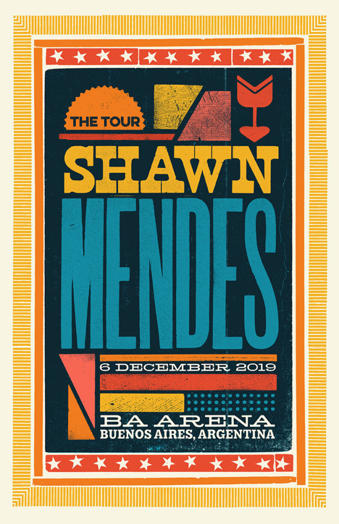
I like the colour-way of this poster. It is vibrant and eye-catching. I like the mix of different shapes within the poster. It is obvious who the artist is, the venue they are playing at, and when they will be playing there.
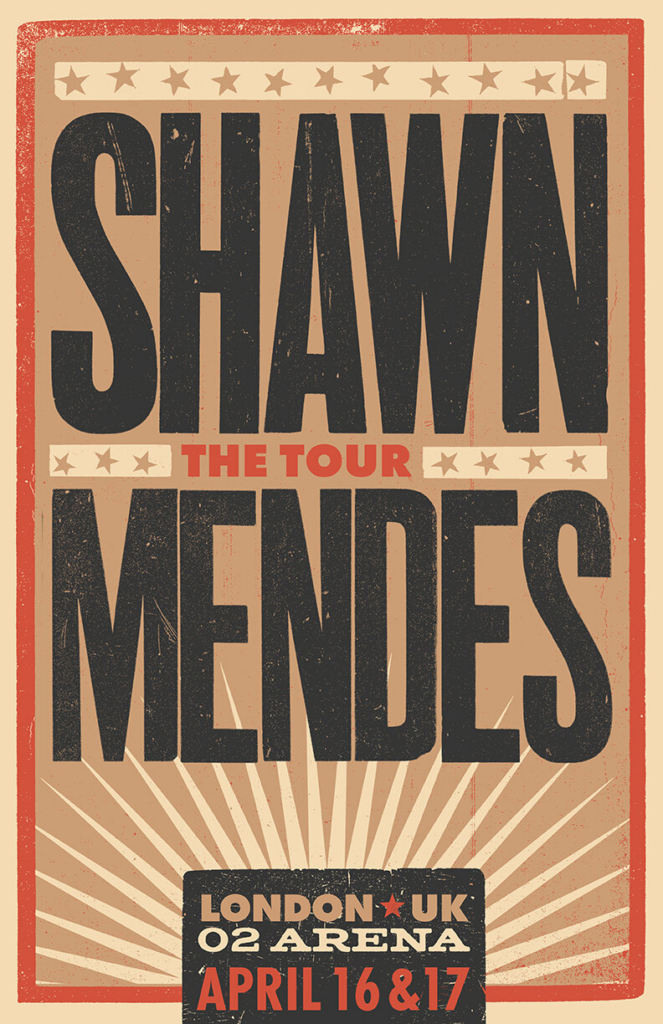
This poster is very simple. Again, it displays the important information such as; who is playing, when and where. The colour-way is a mix of browns, oranges and yellows. These colours all work very well together.
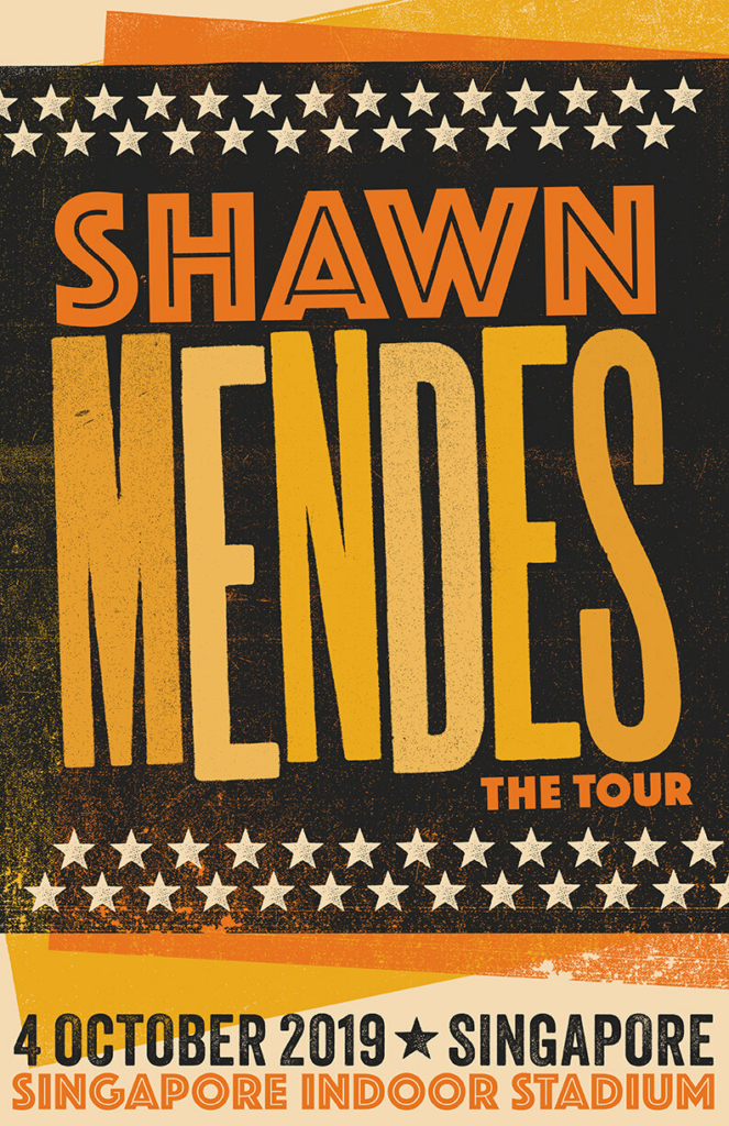
A lot of the posters have similar characteristics. They all display the same kind of information and remain very simplistic.
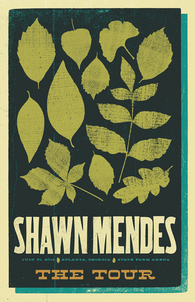
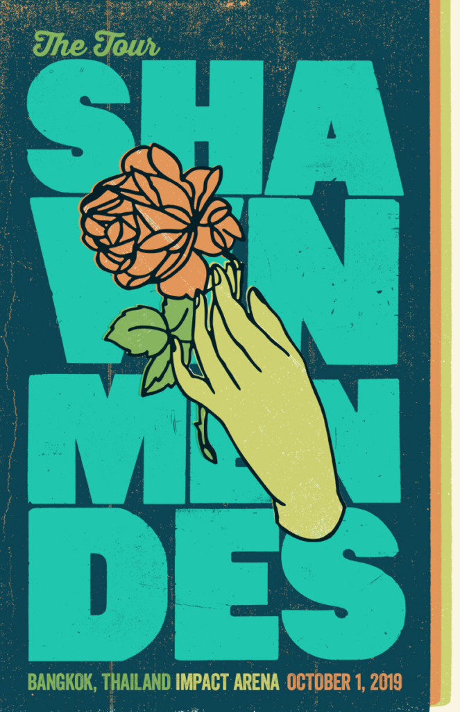
I think the colour-way of this poster is very effective. All of the colours work well together and are included in several parts of the poster. I also really like the icon in the middle of the poster. Even though it is quite a simple concept, it does work well with the whole design.
I really like the Shawn Mendes tour posters from 2019. A new poster was released for each city/show. I like how most of the posters are quite minimalistic, only displaying the important information. I think having a gig poster with minimal (but important) information on it is quite effective. If a poster has paragraphs full of writing and info on it, people tend to not want to read much, therefore they don’t pay much attention to it, and it doesn’t attract many viewers.
I also like how all of the posters look to be almost stamped together. Some of the bottom layers leak through to the top layer, and there are small specs of colour missing from the text and other layers of the poster. I think this looks great with a simple design. I don’t think it would have worked so well with a more complex and more detailed design. This idea is definitely something I would like to try and work with within the posters this year.