Within our graphics lessons, we came up with a band name and then started to brainstorm some logo ideas.

This was the original image we started off with. It’s simple, yet there’s a lot to work with.
After getting the main idea for our logo, we started looking at ‘distressed’ patterns and some different fonts.
We also tried looking at adding colour to our logo, but decided that black and white looks better.
We continued playing around with different fonts.
The font here is not as distressed as some of the others, but it can be easily read from a distance.
The font of this one looked alright, but the text was clean while the rest of the logo is distressed, so it doesn’t really fit in.
Personally, this logo was my favourite out of all the ideas we came up with. The font is bold, so it can be read easily from a distance, but it is also slightly distressed to fit in with the look of the rest of the logo. The logo as a whole is simple, yet effective.
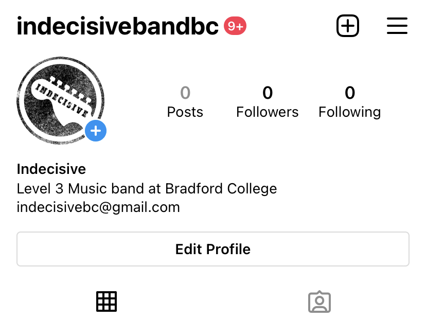
We then created an instagram account which we can start using to promote the band leading up to our performance.