concept one
Initial Idea – for my artwork I would like to have either an oil painting or a watercolour of an object (e.g. piano) framed as though it is within an art gallery.
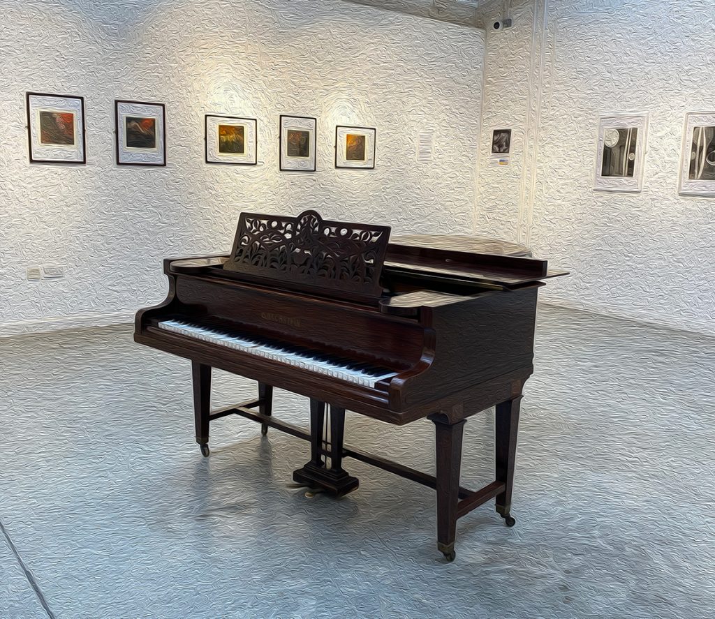
This is only a small mock-up but is an idea that I think could be worked with.
We took an image of the piano in the dye house art gallery and put it into Photoshop. I then worked with the filters to try make it look like an oil painting.
I think it needs a lot of work, and I would need to look at some different filters, but I think it is an idea which may have some potential.
concept two
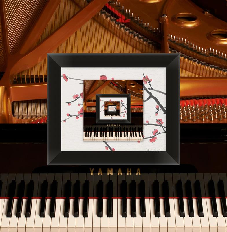
This is another artwork idea I think would possibly work. I like the idea of having cherry blossom branches within the frame. I think out of both concepts so far, this one is what I am more likely to work with for the final piece.
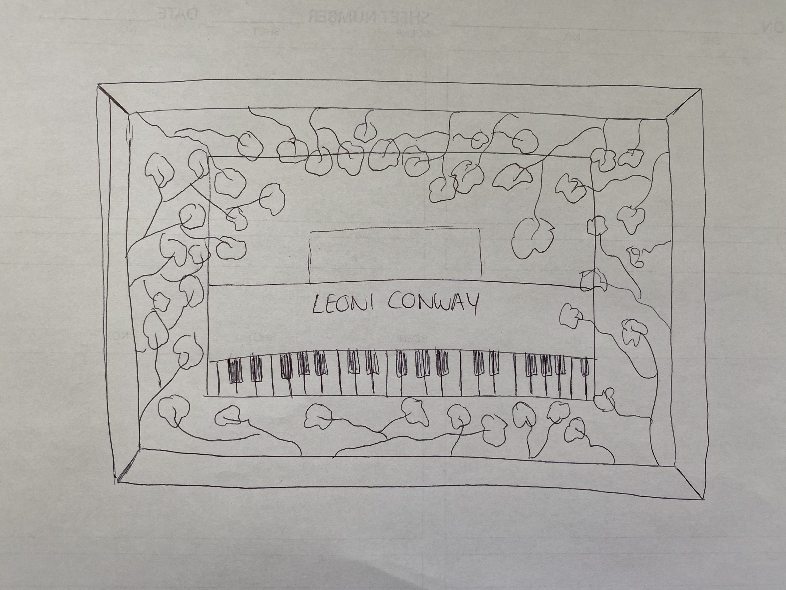
Following the idea above, I did a quick sketch of what I wanted my artwork to look like. By no means am I an artist but I thought it would give a rough idea of the concept I want to be working with. Since I plan to keep the idea of cherry blossoms within my composition, I chose to incorporate this within my artwork. I also think it would be quite cool to change the Yamaha logo on the piano image to my name.
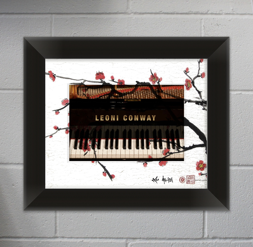
This is the artwork I think I am going to keep for the final piece. I like how it is kind of simplistic but also ties in both the names the composition, and the main instrument within the composition. I chose to put the image within a frame because I still wanted to work with my initial idea of the artwork looking like it is within an art gallery. Therefore, Paul took a photo of the brick wall in the classroom and uploaded it to photoshop, then added in the framed artwork.
Animation
To showcase my piece at the final performance, I decided to work with Paul to create an animation/video. My initial ideas for this were to loop a video of someone walking underneath a cherry blossom tree, and then have petals falling down over the screen. However, after spending a lot of time searching we couldn’t find any footage suitable for this. Therefore, I decided to use a still image and have the cherry blossoms falling over that.
For my research, I sent out a questionnaire to my peers. One of the questions was ‘How often does a music video/animation determine how much you love/hate a song?‘. Majority of the responses said that a music video/animation never determines how much they love or hate a song, as they tend to stream most of their music through Spotify or similar services, and therefore rarely watch videos. I took these responses on board and chose not to spend as much time on an animation as I initially planned.
In the first draft of the animation, we looped two layers of petals for the entire length of the song. It looked good, however the animation is how I plan to showcase my piece so having the same loop over and over does get a bit boring. Nic suggested that I add in a title sequence and/or some end credits.
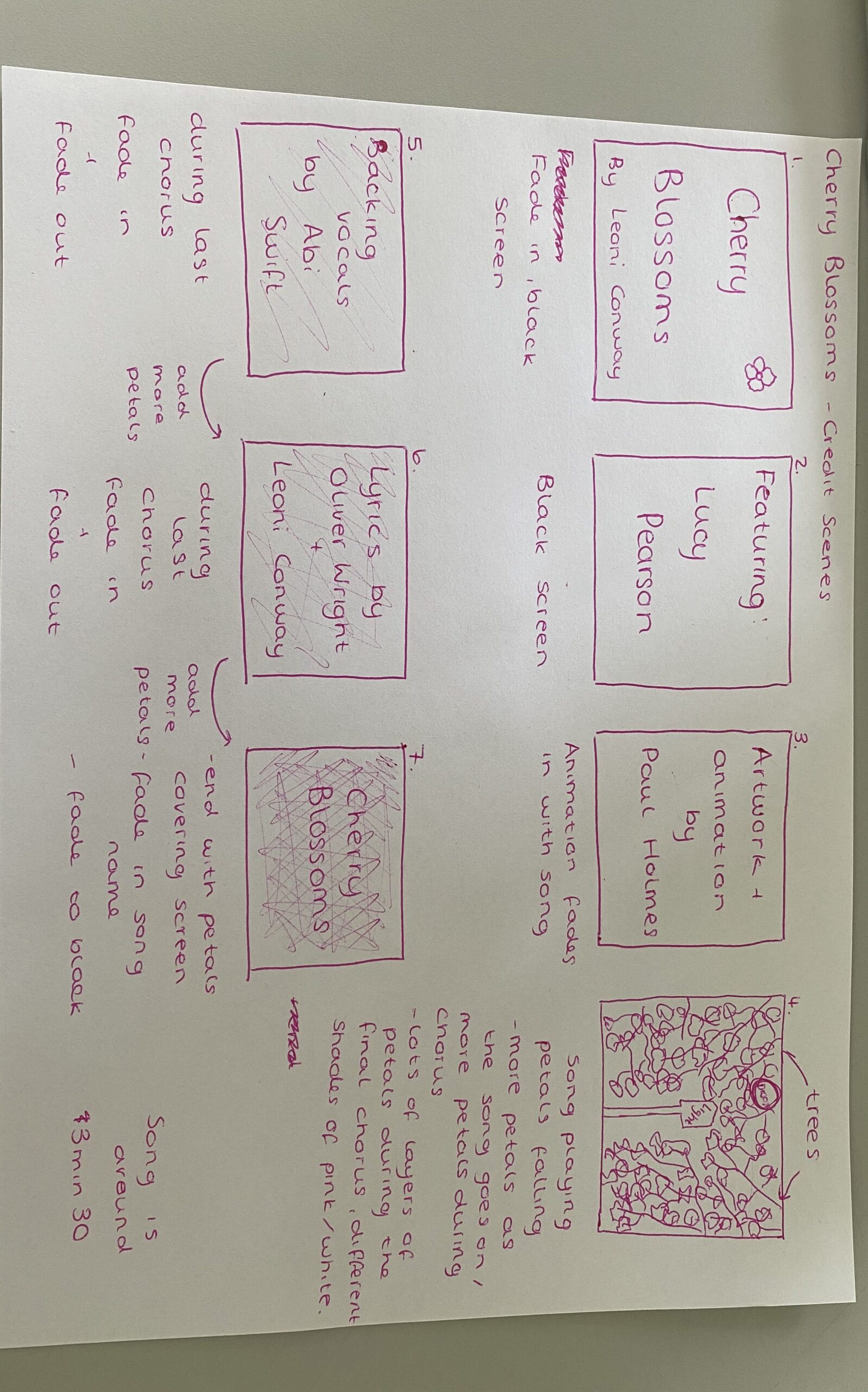
I created a storyboard to show how I wanted the opening and ending credits to look. Of course, I wanted to include all of the collaborations within the project on both the opening credits and ending credits. Therefore, I opened the animation with the name of the song, as well as the featured vocalist (Lucy). I also included Paul’s name on the opening credits as he helped a lot with the animation and the cover art for my song, and he was a big part of the collaboration within my project.
To make the animation less boring, my idea was to layer the petals during the last chorus so eventually the entire screen is full of cherry blossom petals. There wasn’t much else I could think of to change to make the animation more exciting, and I didn’t want to spend too much time on the animation by thinking of complex ways to make it more interesting as the responses from my questionnaire showed that people weren’t really going to be interested in it after the showcase, hence why I kept it quite simple.