Logo Research:
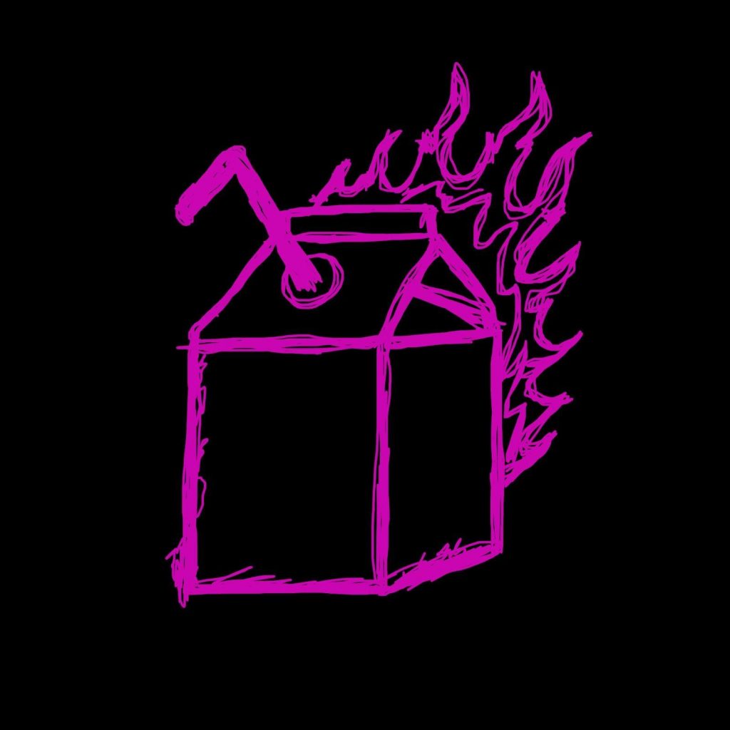
The first logo I chose is the band logo of Hot Milk. This logo is interesting to me because it is literally “hot milk”. A milk carton on fire. This to me, makes a statement about their music as it is a bit out there but is also very straight forward. Something as literal as this could be interesting to look into for our rebrand.
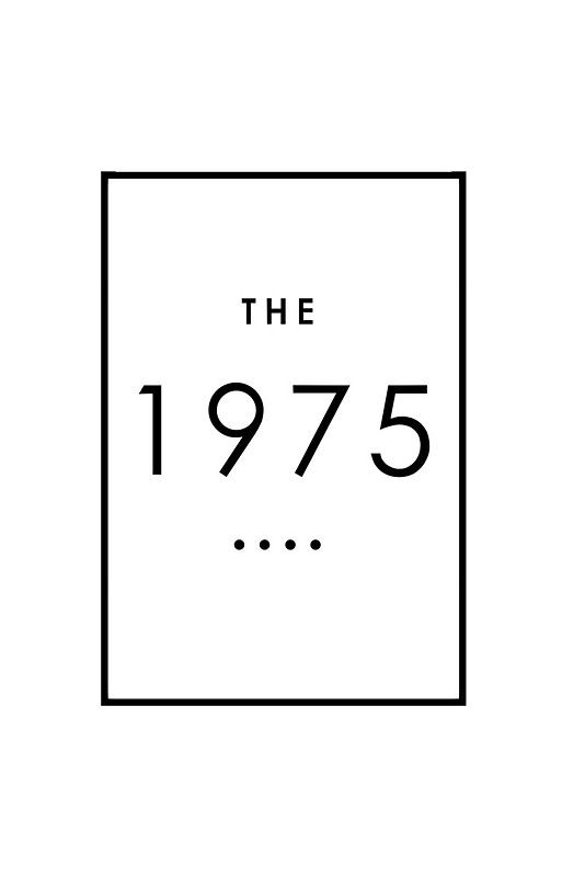
The 1975 have stuck with the box design from the very beginning of their musical career. This is now an iconic symbol linked with the band despite it’s simplicity. The font is also one they never stray from using. I feel as though shapes and singular colours may look professional and draw attention to an older audience.
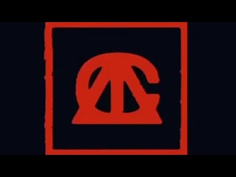
I found this logo interesting because it is a very simple logo with great use of typography. The letters A, T and C are layered on top of one another to create a dark yet eye catching effect. This could be an idea by taking the first letters of the channel name, we could recreate an interesting logo design.
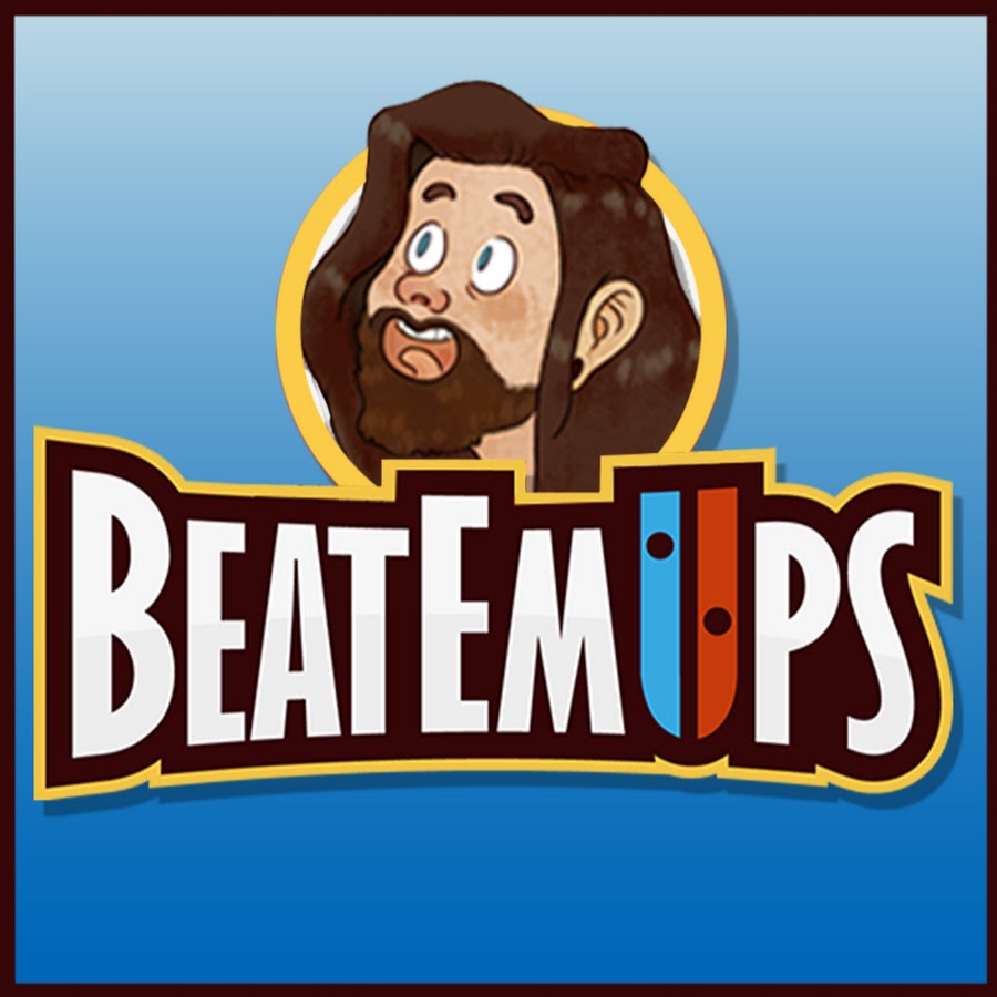
I chose to look at this logo because I thought it was a good idea to look into designs of YouTube channels as that is mainly what the branding will be for. So I decided on this one, for channel Beatemups. He is a YouTuber who posts content about video games, which mostly includes Nintendo Switch games. This is made clear in the logo as he uses the Nintendo Switch Joy-Con controller design in his lettering to make up the ‘U’. It would be interesting to attempt to add musical elements into our logo to show our viewers what our channel is about without having to read the description.


On the above 2 album covers are the letters ‘TF’. This stands for The Faim (the band name). This logo is used on almost every album/single at that the band use and is even all over their merchandise along with the colour scheme of yellow, black and grey. I like the consistent nature of this and plan to include something similar so that all of the branding ties in with each other.
Designing our logo with Paul Holmes:
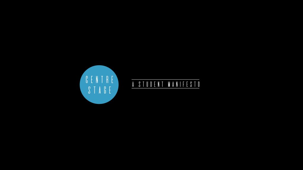
Coming into this session, I was blank in terms of ideas but I knew that I wanted to come up with a name for the showcase. To do this, we looked at the words ‘showcase’ and ‘virtual’ in a thesaurus to see if we could think of something more sophisticated. I saw the word ‘stage’ and decided that ‘Centre Stage’ was the perfect choice.
After deciding on this, I thought that the idea of a spotlight being on centre stage could be something we incorporated into the design. In order to do this, we added a circle to the middle of the logo, to highlight the text.
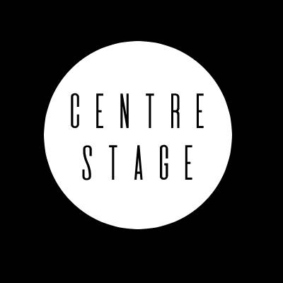
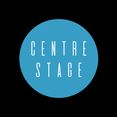
This, to me, was a great start but I felt as though the colour scheme was too dark, especially considering the colour of the posters and other types of branding used beforehand had been bright colours like pink or green. Due to this fact, I thought that it might be a good idea to match the colour of the circle to the title screen I have been using in the acoustic session videos. Once we did this, it came out like this:
Once this was central and aligned, we moved onto making the YouTube banner. This was difficult due to the sizing used on various devices. So we started out with a large scale TV-sized one, which looked great but would not fit on the YouTube banner of a smartphone or desktop.
So I looked at the minimum size and we reworked the logo and tagline to fit, meaning that no matter which device the channel is viewed on, all of the logo can bee seen.
Asking for feedback:
“Manifesto can be taken as very political.”
Lewis Blofeld
dictionary.com defines ‘Manifesto’ as, “a public declaration of intentions, opinions, objectives, or motives, as one issued by a government, sovereign, or organization.” I would say that the word actually does not fit with our brand and product. I believe that asking our team for their opinions and ideas might help us get closer to what we want.
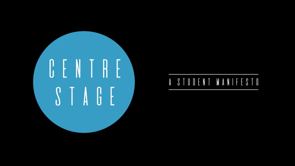
During the second session, we thought about Lewis’ advice about the strap line and decided to brainstorm a few ideas. We finally came up with, “A Creative Collective”. I like this because it link to the ‘collaborative’ element of the final project because collective is defined as “of or characteristic of a group of individuals taken together” (Definition of collective | Dictionary.com, 2021).
Here’s what it looks like with the centre stage logo:
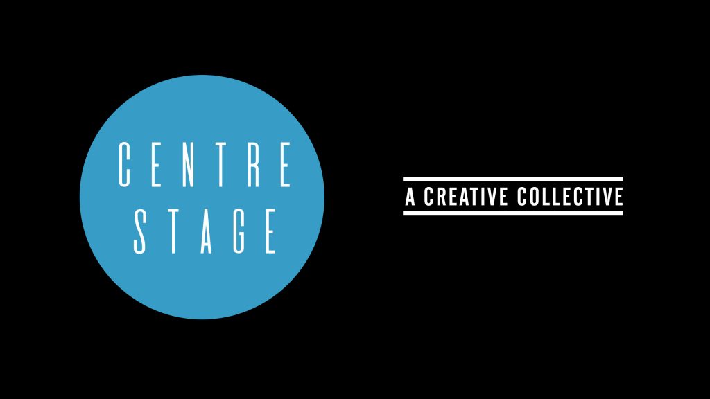
I actually prefer this because we chose to put the tag line in bold which is more eye-catching.
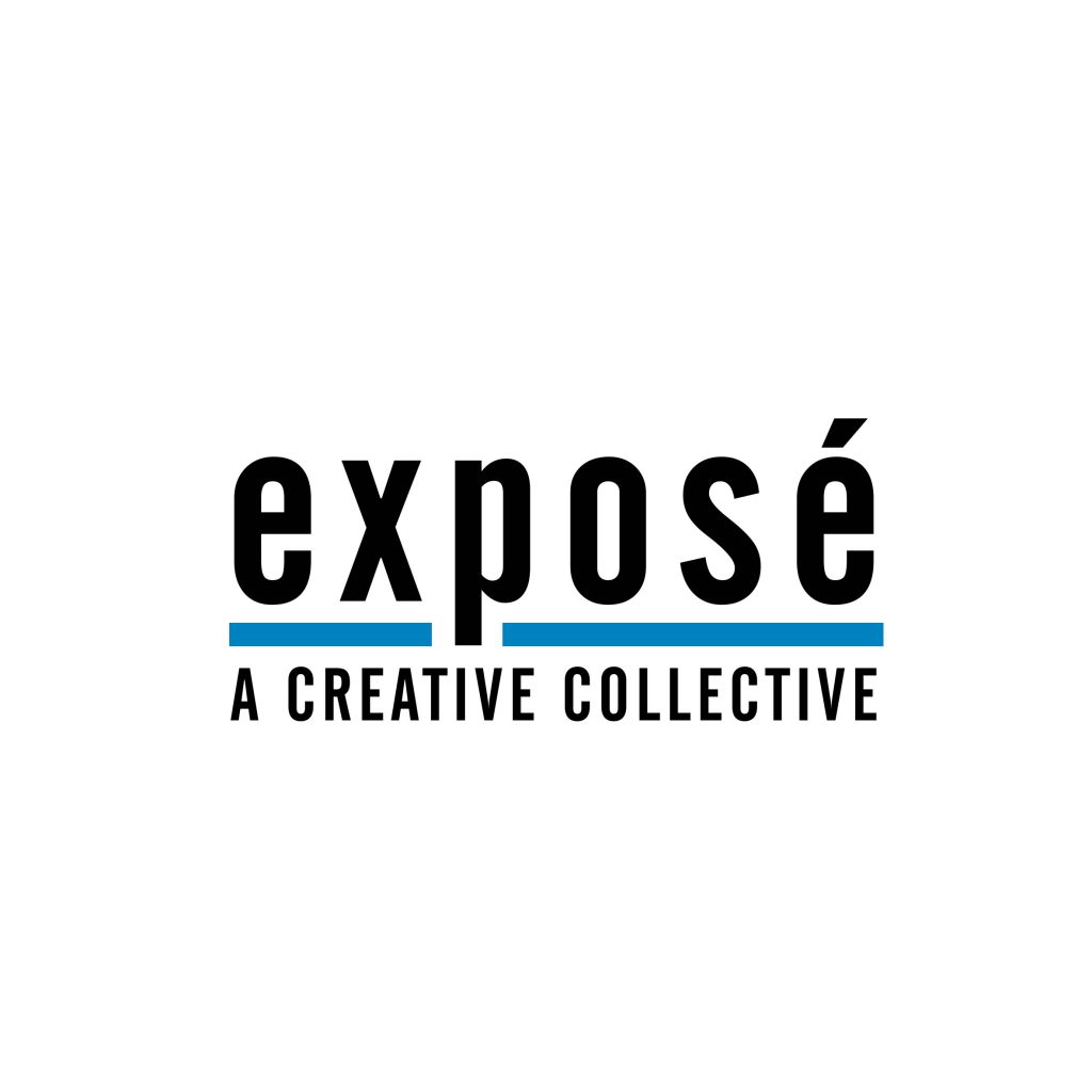
We then came up with a back up idea so that I can give our audience the opportunity to choose their favourite design. This meant going back to the drawing board and brainstorming some name ideas. We decided to remain simple and stick with the one word title: Exposé.
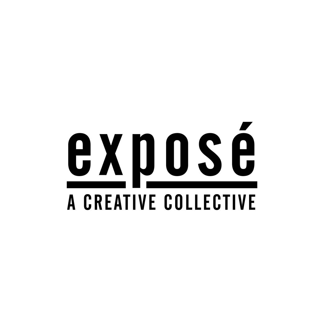
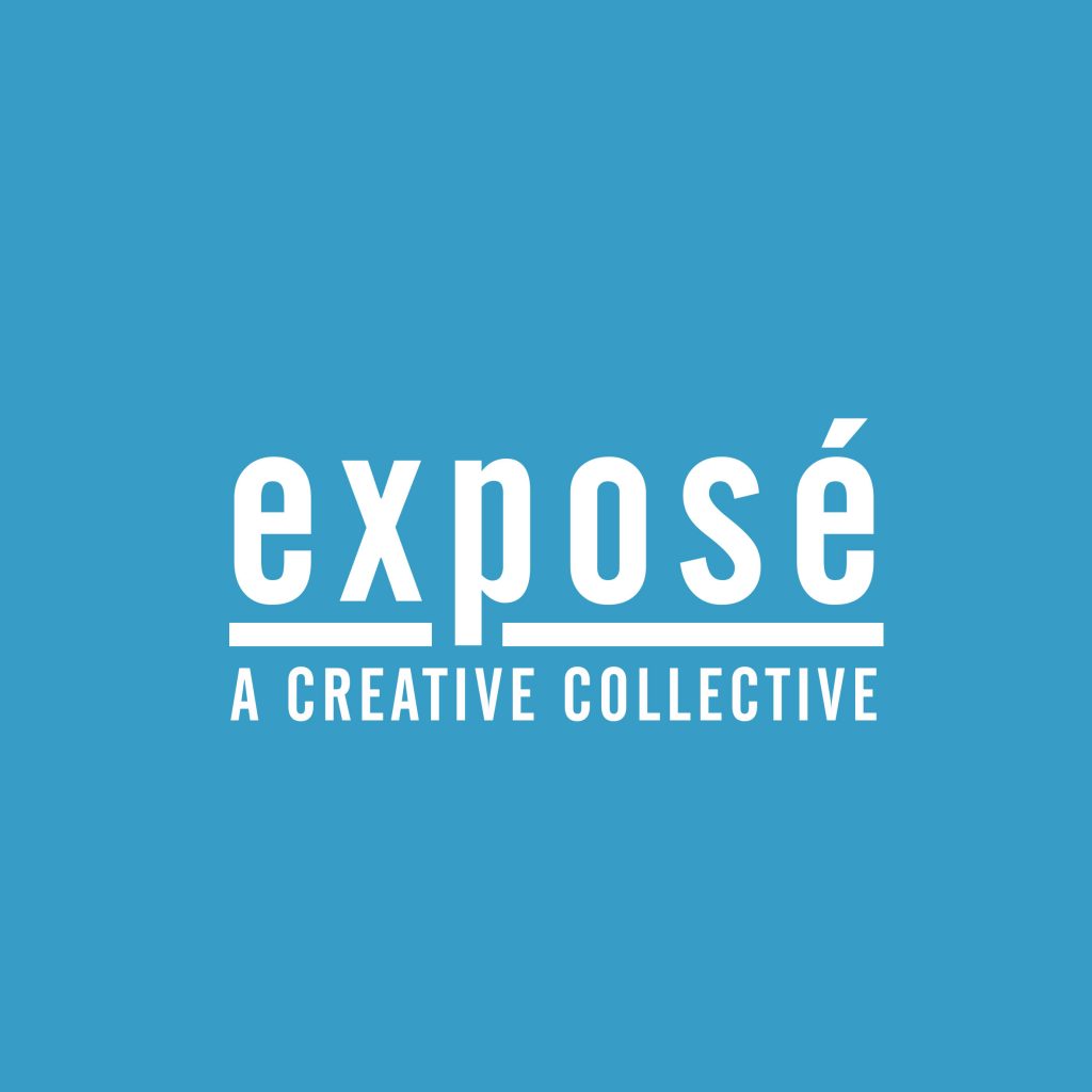
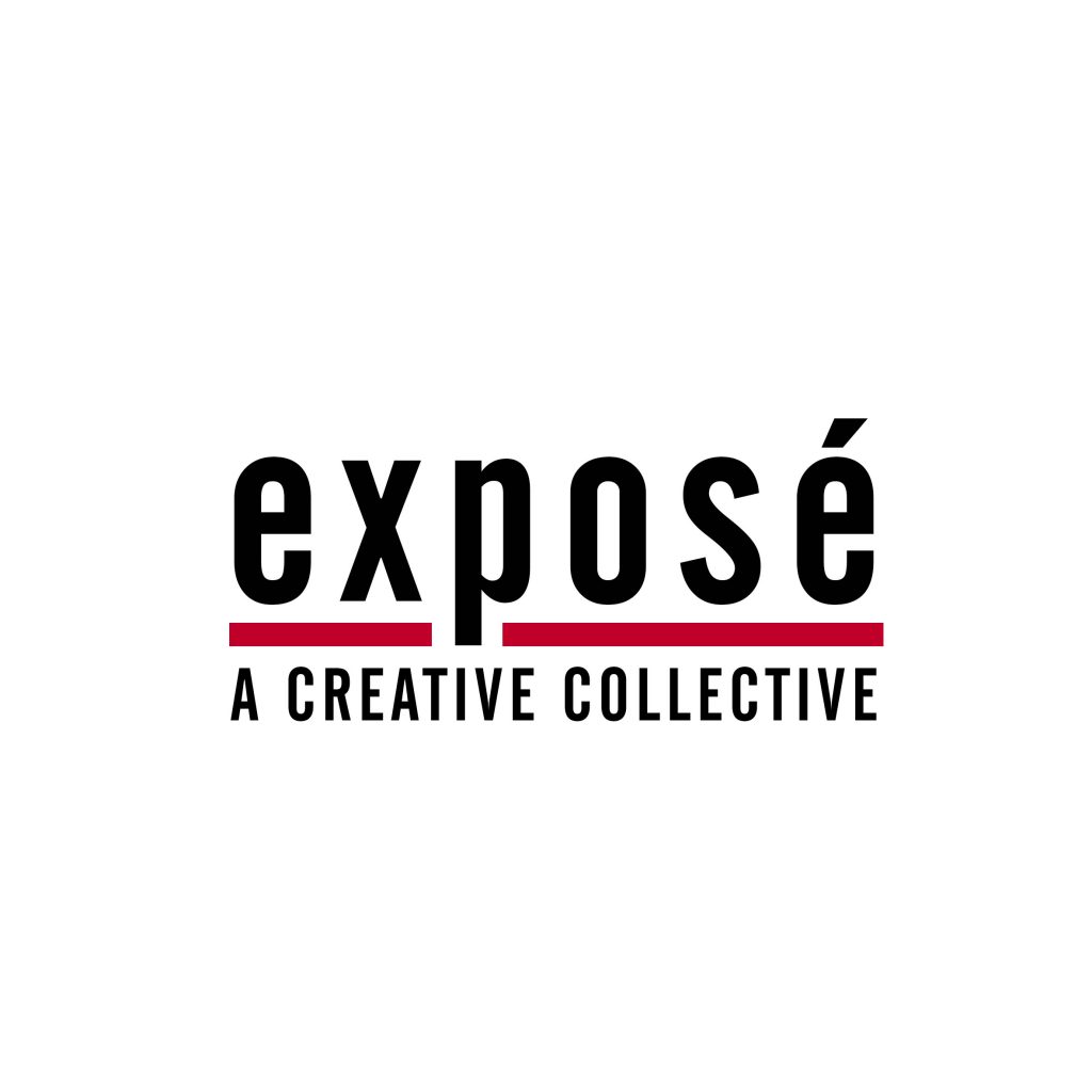
I prefer this as a plan B because I feel like it is a bit too broad. However, I will be putting into the hands of the audience very soon. I think that the original design of this is the best however the red line (Bradford School of Art’s colour scheme) looks very good too. In my next session with Paul, I would like to ask him to change this line to our blue theme that I have been using and I believe that this will look the best.
Poster:
After completing the logo design and choosing which branding to go along with, we needed to create a poster to use around college, online and in other various situations. I wanted to do something vaguely similar to that of our 2020 showcase. Which looked like this:
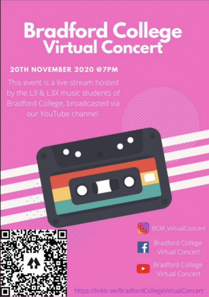
The only problem I had with this poster is that it is bright pink (which was not related in any way to the colour schemes that had been used) and doesn’t really say anything much about the showcase itself worth noting. However, I did like the way the social media accounts were set out. Taking this into account, we came up with this:
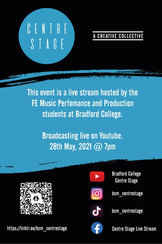
I am really happy with the way that this has turned out because it uses all of the elements of the poster above that were eye-catching and blends them with the professionalism of having our logos and branding there and key information.
Bibliography:
- Against The Current, 2020. New era logo reveal. Available at: <https://www.instagram.com/p/CGVcQXLHJ1B/> [Accessed 10 February 2021].
- www.dictionary.com. 2021. Definition of collective | Dictionary.com. [online] Available at: <https://www.dictionary.com/browse/collective?s=t> [Accessed 17 March 2021].
- www.dictionary.com. 2021. Definition of manifesto | Dictionary.com. [online] Available at: <https://www.dictionary.com/browse/manifesto?s=t> [Accessed 17 March 2021].
- Hawker, W., n.d. Beatemups Channel Logo. [image] Available at: <https://www.youtube.com/channel/UCuJyaxv7V-HK4_qQzNK_BXQ> [Accessed 10 February 2021].
- Hot Milk, 2020. Hot Milk Logo. [image] Available at: <https://www.facebook.com/youlikehotmilk/photos/a.209109306637900/504732727075555> [Accessed 10 February 2021].
- n.d. The 1975 Logo. [image] Available at: <https://www.pinterest.co.uk/pin/341147740506984208/> [Accessed 10 February 2021].
- The Faim, 2018. Saints of the Sinners Album Cover. [image] Available at: <https://open.spotify.com/album/6UARS7hsHtwdXPeNg9KGYe?si=p4ZT-OhJR2ax5AGAQOrNkQ> [Accessed 10 February 2021].
- The Faim, 2020. State Of Mind Album Cover. [image] Available at: <http://thefaim.com/> [Accessed 10 February 2021].