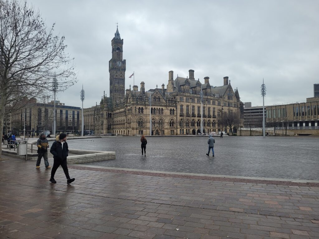
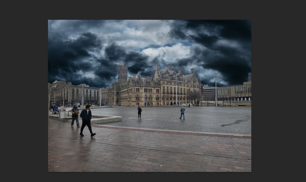
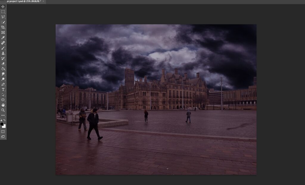
Production of my project started with me going into city park and taking a simple photograph which included not only the fountains but also the town hall, this was so I could hopefully bring to life the effect of Bradford being abandoned/dilapidated, I chose the town hall as the main subject of my image because it is a large canvas to edit on but also because of the clock tower, one of the main things I was hoping to achieve with the clock tower is to have the effect of the top being either destroyed or missing, below is the original, unedited image that I am using for my project:
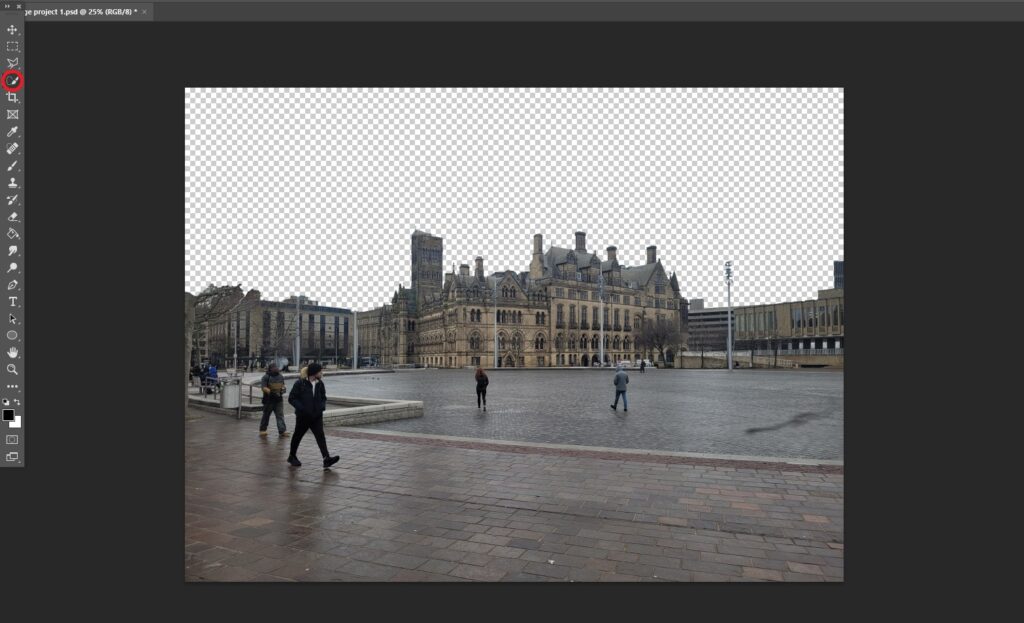
To start my production, I loaded up Photoshop and immediately decided to use the quick selection tool to remove the sky, this was due to the fact that the sky in the original image did not present the concept of a dystopia well enough in my opinion, I also believed doing this would be a good base for my work in general and would help set the tone for the rest of the project:
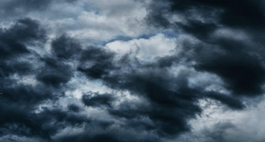
Once I had cut out the sky, it was time for me to go and look for a suitable one to take its place, I decided that I wanted my sky to be not only dark and gloomy but also stormy which in my mind would create a sense of unease and thus further the dystopian narrative that I was trying to create, after looking around google images for a while I found what I was looking for, a dark sky with a clear storm brewing:
Next, it was time to paste the sky into Photoshop behind the buildings, this would give me extra context as to what colour balancing/brightness adjusting needed to be done in order to set the mood and make the sky almost seamless:
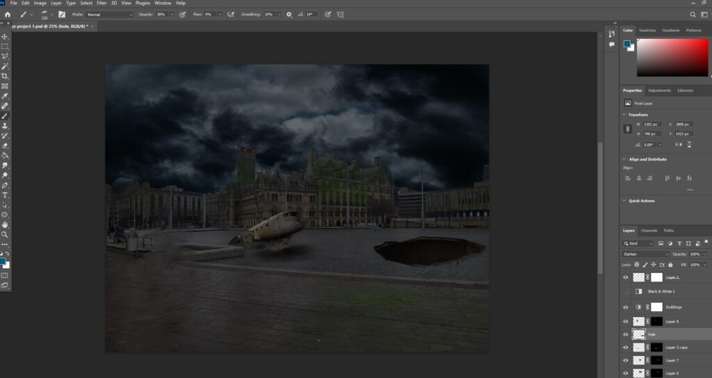
once the sky was added, I could clearly see that there was a lot of balancing that needed to be done with the colours as the sky does not look at all connected to the rest of the image, the adjustment panel in Photoshop was then used to fix the differing contrast/brightness, here is what the result of that looks like:
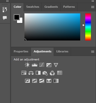
Here is the panel that I used in Photoshop to improve the colours/brightness, I chose to use these as they are the most effective way to recolour an image or adjust the brightness in Photoshop:
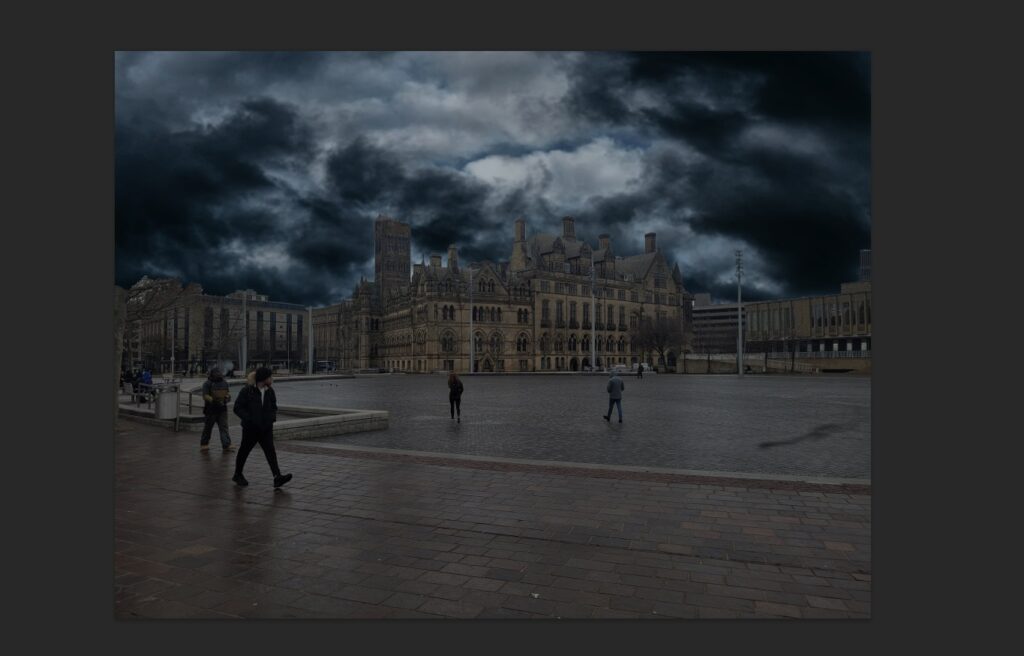
I then added yet another colour adjustment, this time it was changing the image to a slightly more brown/purple which was inspired by the colour scheme of The Last of Us TV show/game, here is how that turned out:
As you can see, the image is slightly more purple/brown and now fits with the stormy sky slightly better, I also think doing this added slightly more depth/detail to the image as a whole and makes it pop a little bit more.
Next, I added a hole into the fountains, this was me starting to create the effect/narrative that Bradford has been partly abandoned and is now a dystopia, the reason a sinkhole in the ground creates this effect in my opinion is because it shows that the city is not being maintained and has been left to rot, I will also be adding extra visuals that evoke this in the future:
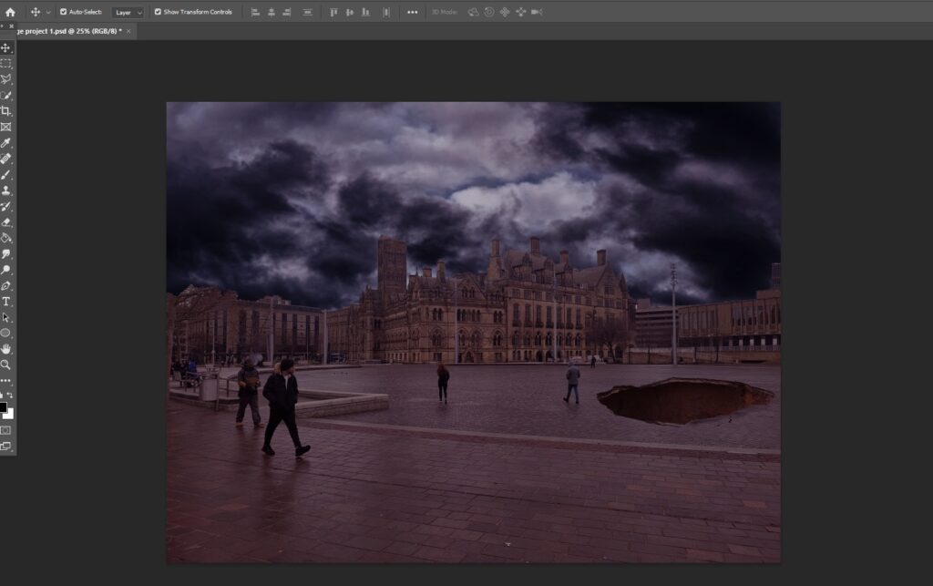
The way that I added this effect is actually quite simple, I sourced an image of a sinkhole that I thought would fit well, I then cut the rest of the image out and placed the hole itself on to the ground in my image, I then re-positioned the hole and added some small shadows using a slightly opaque brush that was at 100% softness, thus giving the effect that the hole was in fact real.
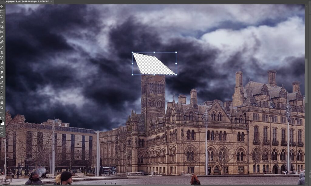
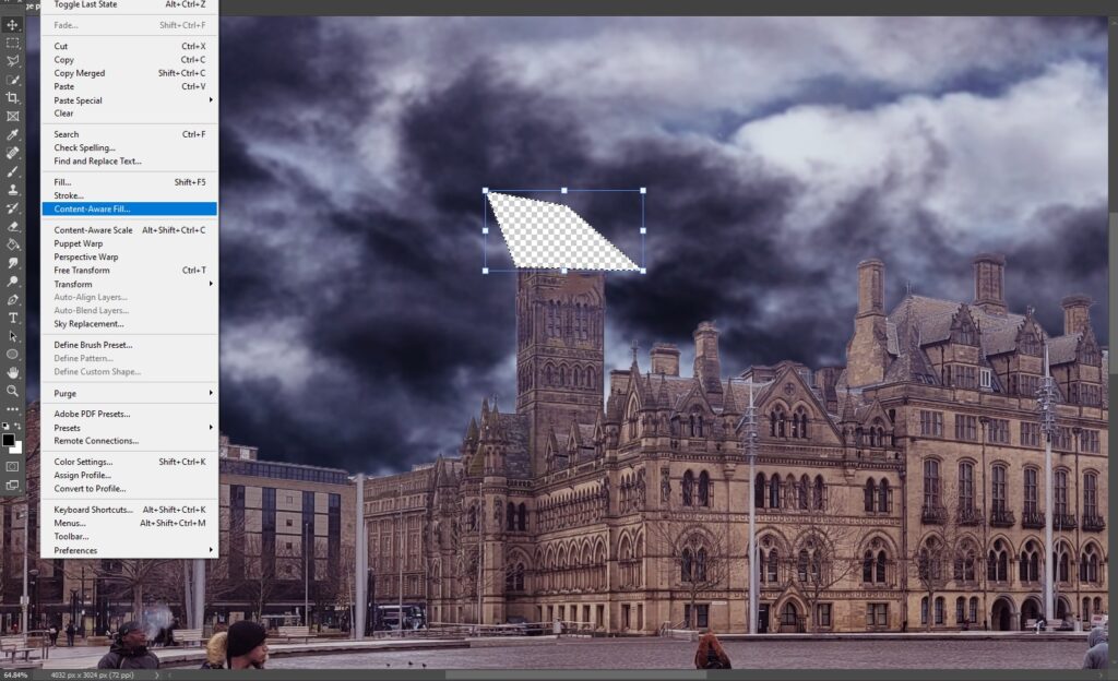
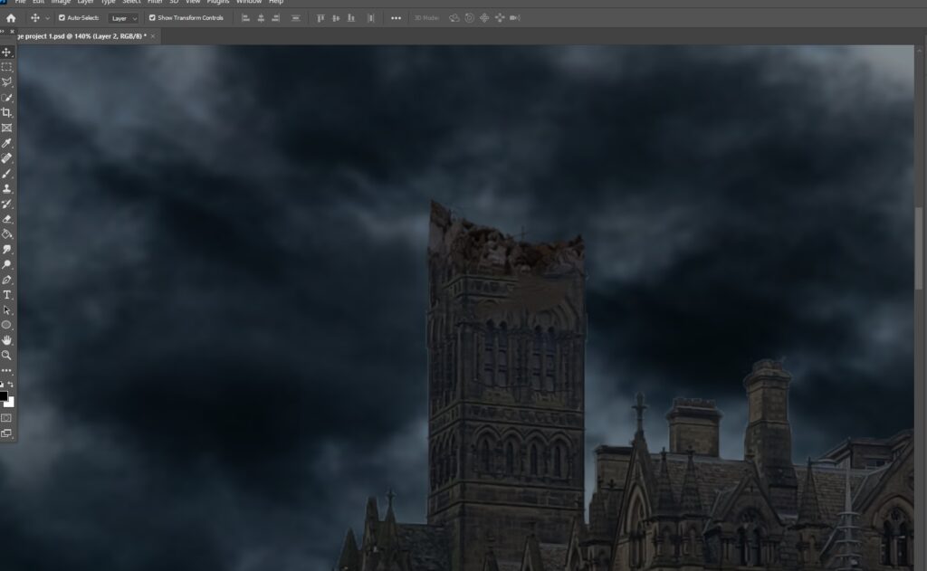
During this time, I had also cut the top of the clock tower to give the effect that it was destroyed/missing, the way I created this effect was by first, using the polygonal lasso tool and cutting away the top of the tower however, this leaves a large transparent hole in the image, the way I troubleshooted this issue was with the ‘content aware fill tool’ which uses other local elements of the image to fill the blank space, all I had to do was drag my mouse into the blank space and the content aware fill then filled the hole with the stormy sky that I had previously added into my image:
To further the effect of the clock tower being destroyed, I decided to add some rubble on the top of the remaining structure, finding a suitable asset was actually quite difficult and took me around 40 minutes, below is the asset that I decided to use:
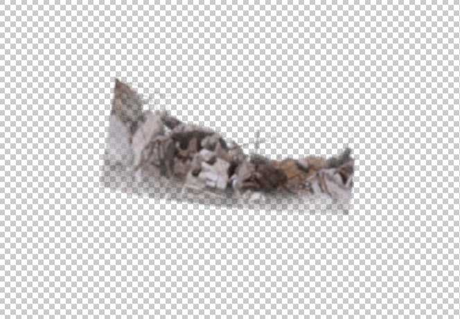
This asset fits perfectly on top of the clock tower in my image and only needed slightly re-scaling however, I did have to adjust the opacity of the image to make it blend slightly better, unfortunately, the image still does not blend seamlessly and still needs some more adjustment if possible, the concept is good though and considering this is my first ever image manipulation piece I still believe I am doing well, below is what the rubble looks like when placed atop the destroyed clock tower:
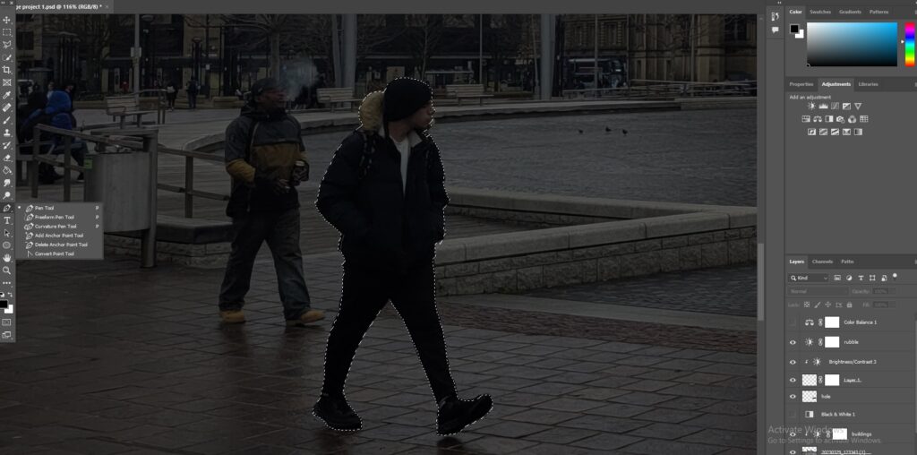
Next, I set out to remove the main standing people from my image, I had trialed this way before my production had started and used a very fast and lazy method, this time however, I was going to use a more in depth and detailed method to make sure I achieved a believable result that didn’t make my image a complete mess, for this new method, I used a tool that I had never used before called the ‘clone stamp tool’, the rest of the method was the same as before which was to use the pen tool to outline the person, make a selection and then use the “content aware fill” to remove the subject, this however, uses assets from anywhere in the image to fill the gap where the subject used to be but with the ‘clone stamp tool’ I was able to select an aspect of the image for myself and manually blend the gap to look realistic, here is a visual representation of everything I have discussed:
“How to Remove People from photo with Photoshop 2023 – YouTube.” N.p., n.d. Web. 29 Mar. 2023 https://www.youtube.com/watch?v=lU2SQ5qSQ0s
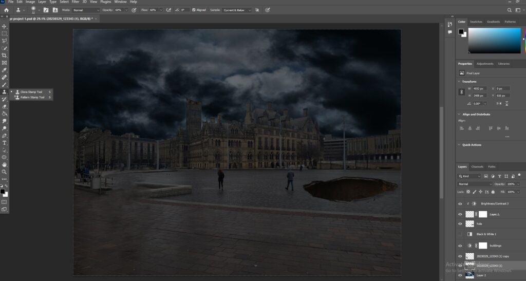
As you can see, I am able to make the area where the subject was located nearly seamless but as this was my first attempt I still have learning to do in order to make the edit cleaner, I then proceeded to do this with every other noticeable standing subject in my image, here was the final result, this screenshot was captured after I had made other edits as well:
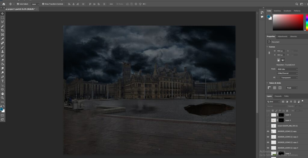
this is the best I could do at present, like I have stated above I am still in need of more practice to perfect this method, the dark spots on the ground are not from this method and are instead from assets that I have hidden in order to capture this image.
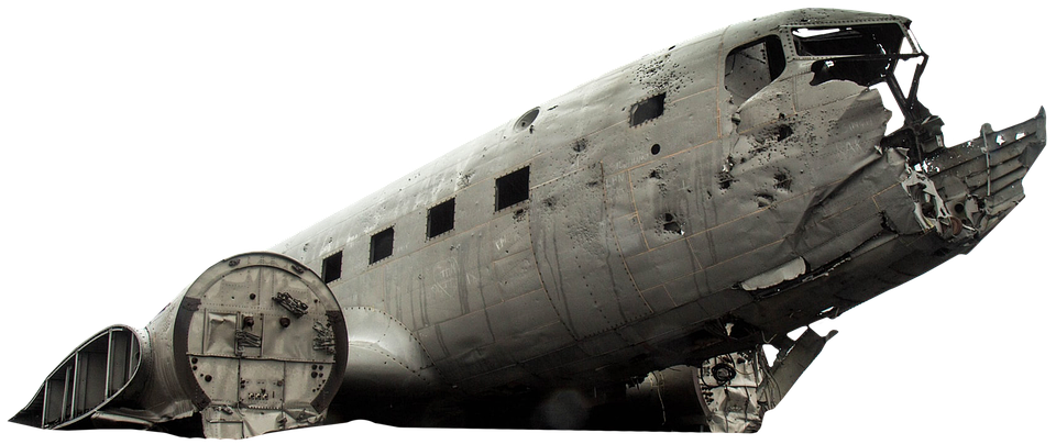
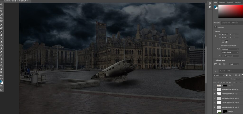
The next thing I decided to add to my image was a downed and destroyed plane in the fountains area, for this to work I had to find an asset that would fit the image both in the context of scale and lighting, here is the asset I decided to use:
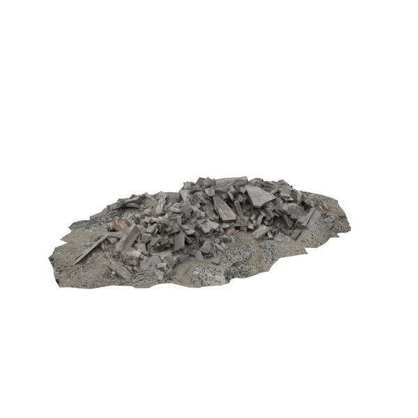
I then chose a spot to add the image that would make sense and began blending it into my background, the first thing i did was add some rubble around it using a texture I had sourced from google and used the layer masking tool to blend the two assets together to give the effect that the plane had caused the ground to break, here is the rubble asset and the images being blended:
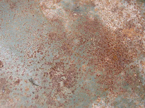
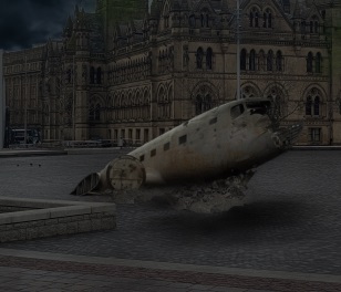
After adding the rubble and shadows to the plane I decided it was still not complete, my next edit was to add a rusted effect to the plane to give the effect that it had been crashed for a long period of time, I did this using the ‘layer mask’ tool which can be seen below:
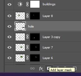
The way that the layer mask works is that it hides the image that is above the layer you desire to work on and lets you manually add aspects of the image wherever you want using the white paint brush, in this instance I have softened the brush and reduced its opacity while using an image of some rust to brush over the plane, below is the asset I used and the final result as well as the video that helped me:
Creating a crashed plane using photo manipulation speed art | photoshop tutorial (2023a) YouTube. Available at: https://www.youtube.com/watch?v=4RoUlT311iA&list=LL&index=1 (Accessed: 05 May 2023).
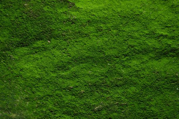
The final addition that I made to my image was also with the ‘layer mask’ tool as I decided to add some moss to the tops of the buildings and clock tower, this was again to present the idea that Bradford has become mostly desolate, the method was exactly the same as it was for the plane, using a black layer mask and paining in the desired amount of the moss across the buildings below is another layer mask screenshot and the asset I used for the moss:

After careful deliberation I also decided to add a small amount of moss on the ground as I believed that it growing on buildings would be more believable if it wasn’t isolated and was growing elsewhere, below is the final result of me adding the moss on both the ground and the building/s:
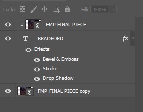
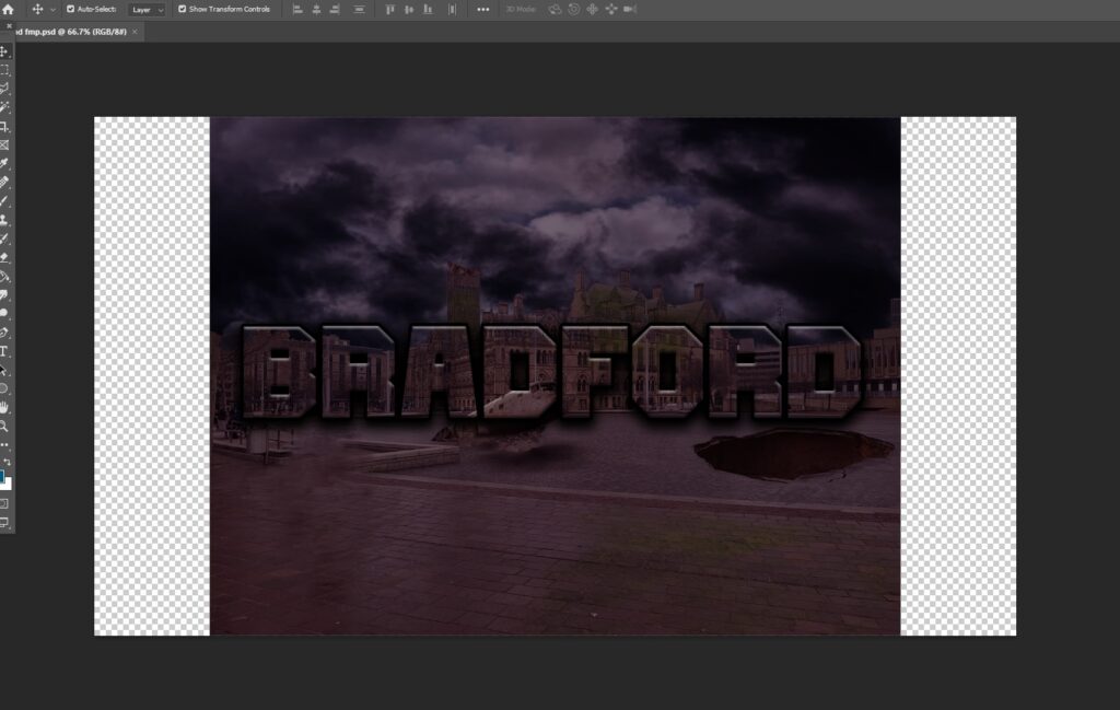
After finishing my main final piece, I decided to create an alternate variation using some typography, again the method I used to do this was using the layer mask tool to mask text on to the image, I then added some shadows, a bevel and a slight stroke around the edge of the text to achieve the final product, both the method and the piece itself are presented below: