Couldn’t Chair Less (Second Year Project)
Level Basis
The level we created was an office for our game we are currently working on which would serve as the main level the player would play in. This page should highlight the steps in creating our level, how we gathered references, how it was drawn up, and finally how it was detailed and finalised.
Theme
We went with a low-poly theme as we thought it would be suitable for a wacky simulator type of game where you play as a chair trying to complete tasks without being spotted, assets like the walls and doors are modular which means we can easily put them together and create levels quickly by using the range of Unity tools.
Some assets were made by us (e.g. the phone and the elevator) while the others were imported from this unity package due to time limitations. Some of the assets had to be modified by Mark so they can meet not just the requirements but our own standards too. For example the windows were not see-through and also not the right size so Mark was tasked to create new windows and modify the current ones we had.
Level Plan & Sketch
We then worked on drawing up a rough, top-down sketch of the level that we then put into Photoshop and expanded on by using using shapes to make the level design more professional and interpretable, the end product will most probably not look like this but it is a basis we would use to make the level and modify where we see fit.
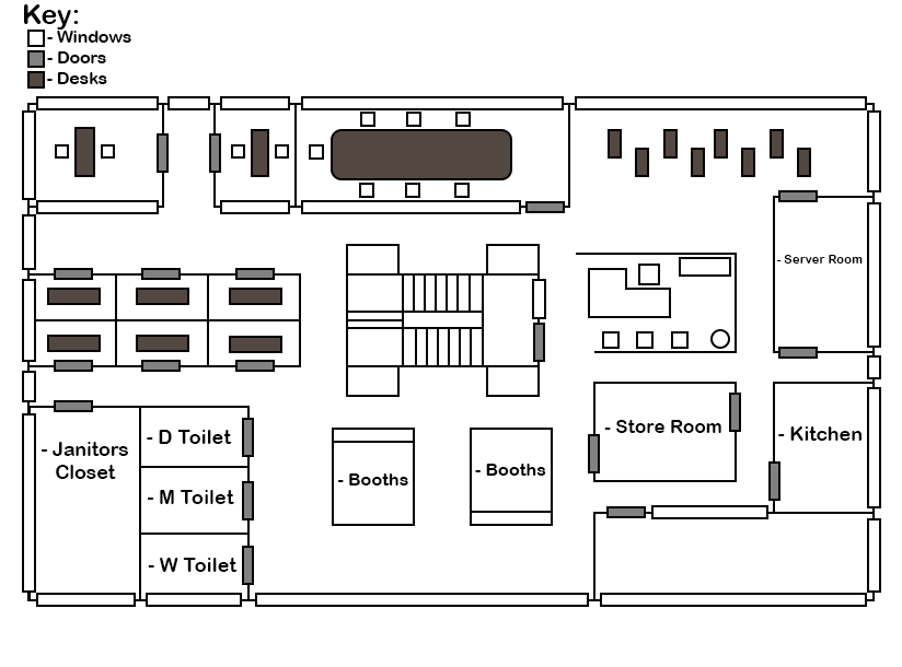

Level Design
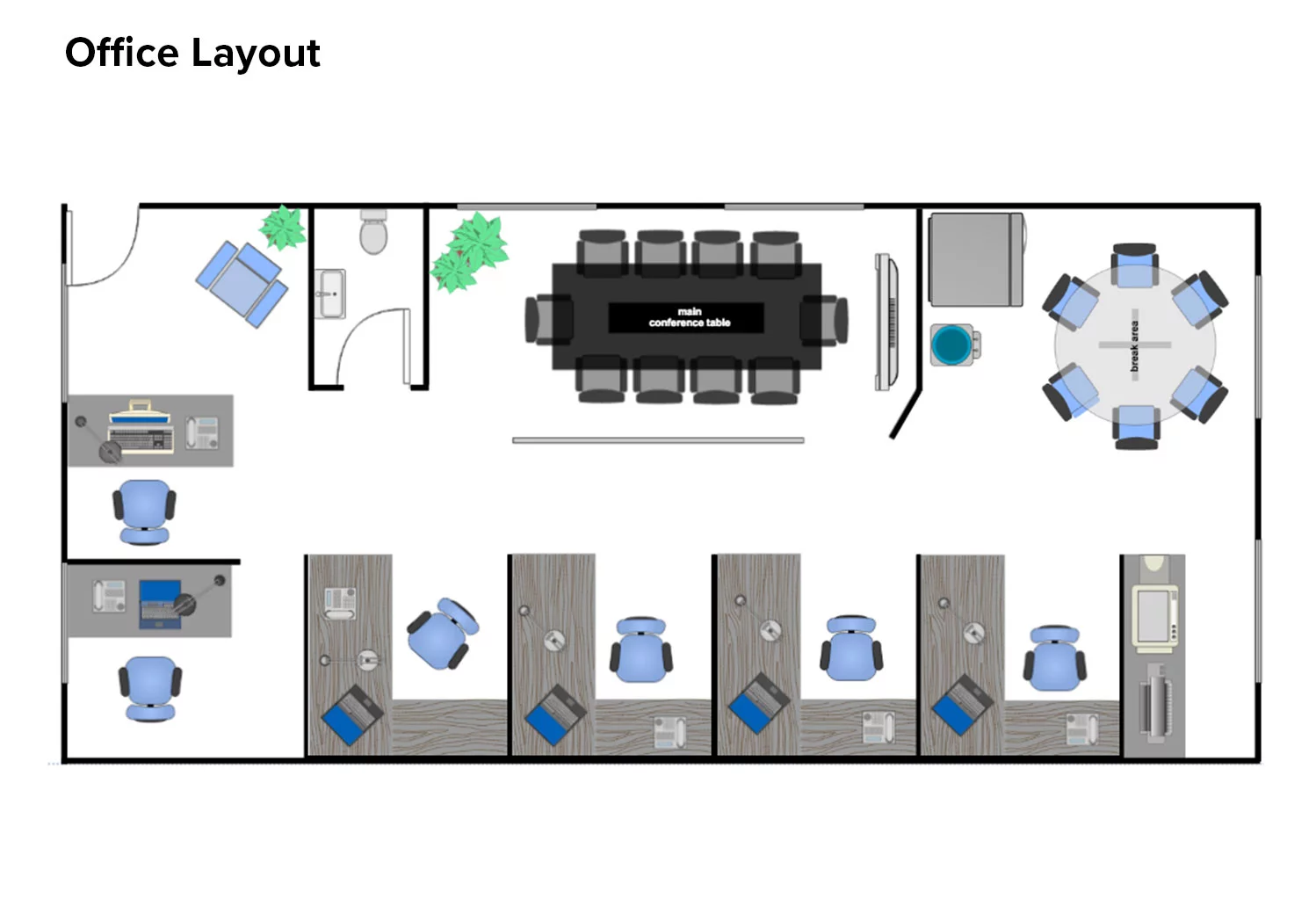
To get the design of the level we found inspiration by looking at offices in real life and by researching technical drawings and floor plans of offices. We also looked at real life references to find the recurring things in offices that make them look like an office. We then found this website which helped us create a floor plan using their ‘Floor Plan Maker’
Menu Design
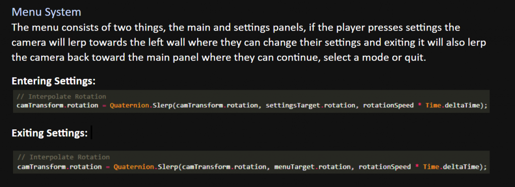
For the menu concept, we settled on the idea of it being in 3D space where the camera would smoothly pan between walls to show the correct menu, as shown in the video below.
The image below shows the logic and code behind how we achieved the smooth result, by using the Slerp method and passing in the rotation of the menu we intended to rotate towards. This script would then sit on the canvas which would be set to render in “World Space”, we could then tweak variables like rotation speed and camera height.
Physics & Interaction
To make certain objects in the level react with physics and can be interacted with, they should contain a Rigidbody, a collider and a custom made Interaction script which handles how the player interacts with that object, e.g picking up/throwing.
Lighting
Because the scene is indoors, we need the lighting to be scattered, this can be achieved by placing roof tiles and attaching one or more spotlights to them in each room, the lights can be tinted a certain colour to give different artistic effects e.g. yellow for warm, blue for cool.
Conclusion
In conclusion the level is still in its early stages, so it just needs a bit more decorating and tweaking here or there to be complete. But the general layout and props are close to what you would see in the end product.
The video below showcases the scene/level design by panning and moving around in the Unity Engine. (This is an old video but the level is more or less the same)
Gloom (First Year Project)
About
Gloom was a game I had participated in making in my first year of college, we were restricted to making a 2D game, however we quickly overcame this and began conceptualising on what we wanted to create. Eventually, we settled on the idea of a story driven game with the protagonist being a schizophrenic detective trying to piece together a case, using clues hidden in gameplay.
Creating the Character
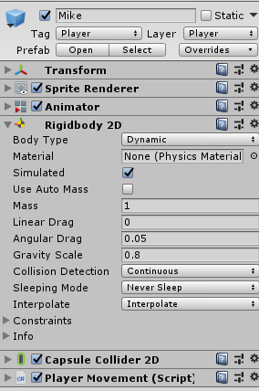
After the sprite for the character had been made, I could then begin piecing him [Mike] together in the engine. To make him move, I used this script provided in a platformer tutorial provided by Unity, which I then later edited thoroughly to better suit what we had planned.
I also added other important components such as a Collider, Animator and Rigidbody. We could then modify the parameters of these components at runtime to control how the player interacts, collides, animates and more.
Main Menu
For the main menu, we discussed on various ideas and ended up agreeing on the idea of it being parallax, where the foreground would be static and would contain the buttons, while the background would have dynamic elements such as weather, moving cars and a day/night cycle to make the player feel like they are in the game, or at least know where the game is set before playing.
This didn’t really work out too well as I was given one PNG instead of separate elements, but to make up for it I made sure the rain was scaled and positioned to always stay on the left, making sure the immersion would not be broken. To give a cosy, immersive feel, the sub menus were made semi-transparent so you could always see the background and music was added which fits the theme of the game.
Pause Menu
Concepting the pause menu was probably one of the easier tasks, we all agreed it would be on the left side and would appear when pressing the Escape button.
I quickly made a rough menu to begin coding the mechanics with until the final design was ready, however one was never finalised and so I had to do the best I could with a UI enhancement package known as TextMeshPro.
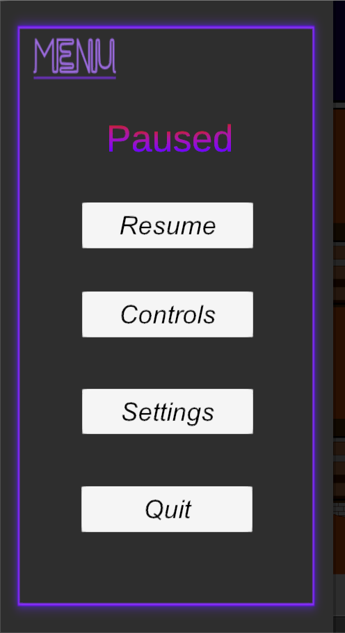
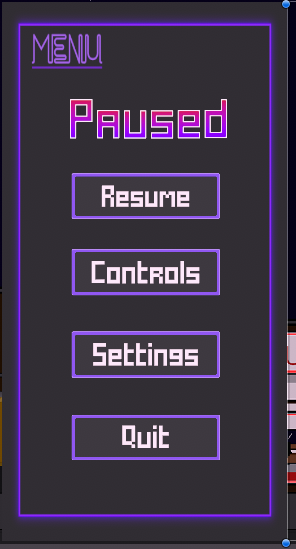
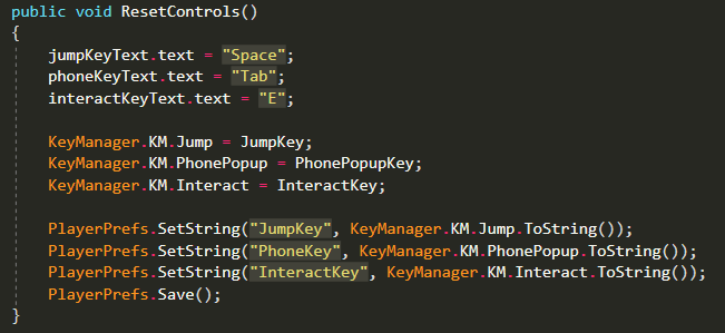
We thought a good addition to the pause menu would be a controls sub-menu where the player could change keybinds to their liking. The way I went about doing this was creating a KeyManager script which would contain and handle information about different keybinds such as Jump, Interact and Phone. A separate script was then added to each keybind (button) in the controls menu which would change the text and also save the new keybind by setting the old corresponding property in PlayerPrefs to the inputted one. An example can be seen below.
A benefit of having a KeyManager script is that it can be used elsewhere, for example loading scenes when interacting with doors.

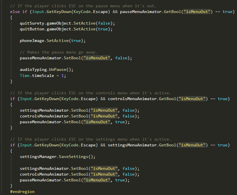
Because our pause menu looked very static and underwhelming, I thought a sliding animation would be a nice touch, by giving the main menu and each sub-menu an animator, I could control a custom boolean which played an animation depending on it’s state.
Phone
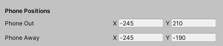
It was decided upon that a phone would play an important role in the story (by using the call and notes apps) and so I decided to use Photoshop to draw a mock-up sprite which would later be made into a cleaner, more professional version by Mark (a graphic designer on my team).

We also wanted it to be fully usable outside of the story, which is why we took inspiration from GTA 5 and made it pop up at any time using a keybind, from there you could play games, browse the web, take pictures, customise the phone and much more.
To achieve this, I did the following:
– Imported the phone sprite and set it’s compression to ‘None’
– Created a new canvas in the hierarchy, with both ‘Pixel Perfect’ and ‘Scale With Screen Size’ enabled.
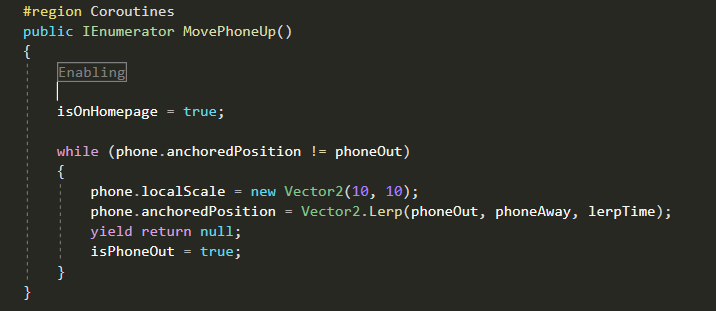
– Anchored it to the bottom right and attached a script which handled how it would slide in and out of view similar to the pause menu except it would use a simple lerp method without the extra Animator component. (Shown below)
Other Work
I also have other work such as documents, film projects, 3D models and more which can be accessed here.