Below is the progress of our artwork for our EP.
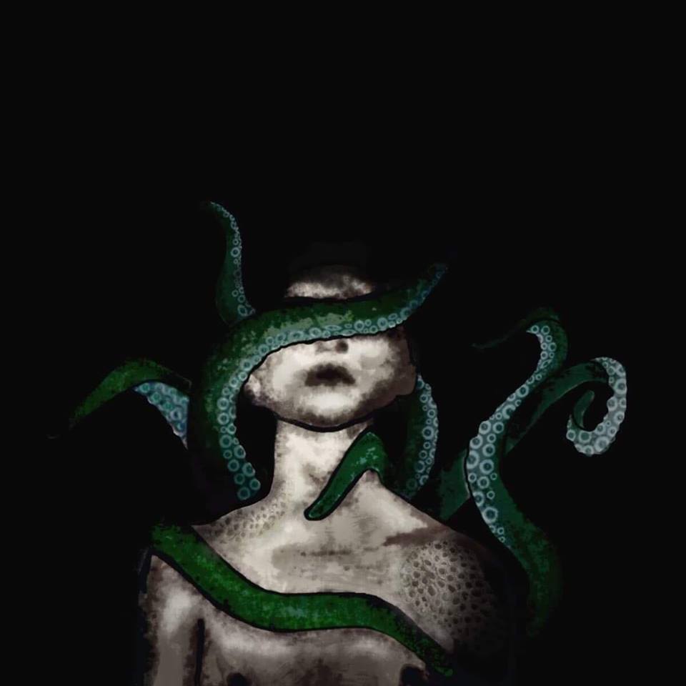
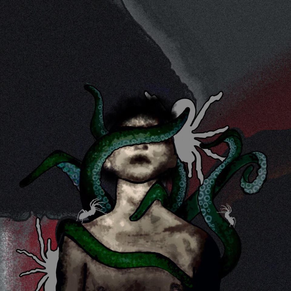
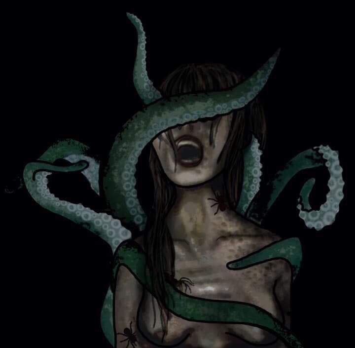
The first artist we got in contact with is a freelance artist who is also a close friend of mine, Charlie Webb. Charlie has always had a good eye for art and I have been a fan of her work since we became friends. Because of this, we decided she would be the first artist to work on our EP cover. As a band, we gave Charlie a general direction, saying we wanted it to be dark and sinister, have some aspect of octopuses/tentacles (as our logo is an octopus) and have a person, blindfolded in the foreground. We then instructed Charlie to design as she saw fit, to capture her vibe as an artist. These are the results:
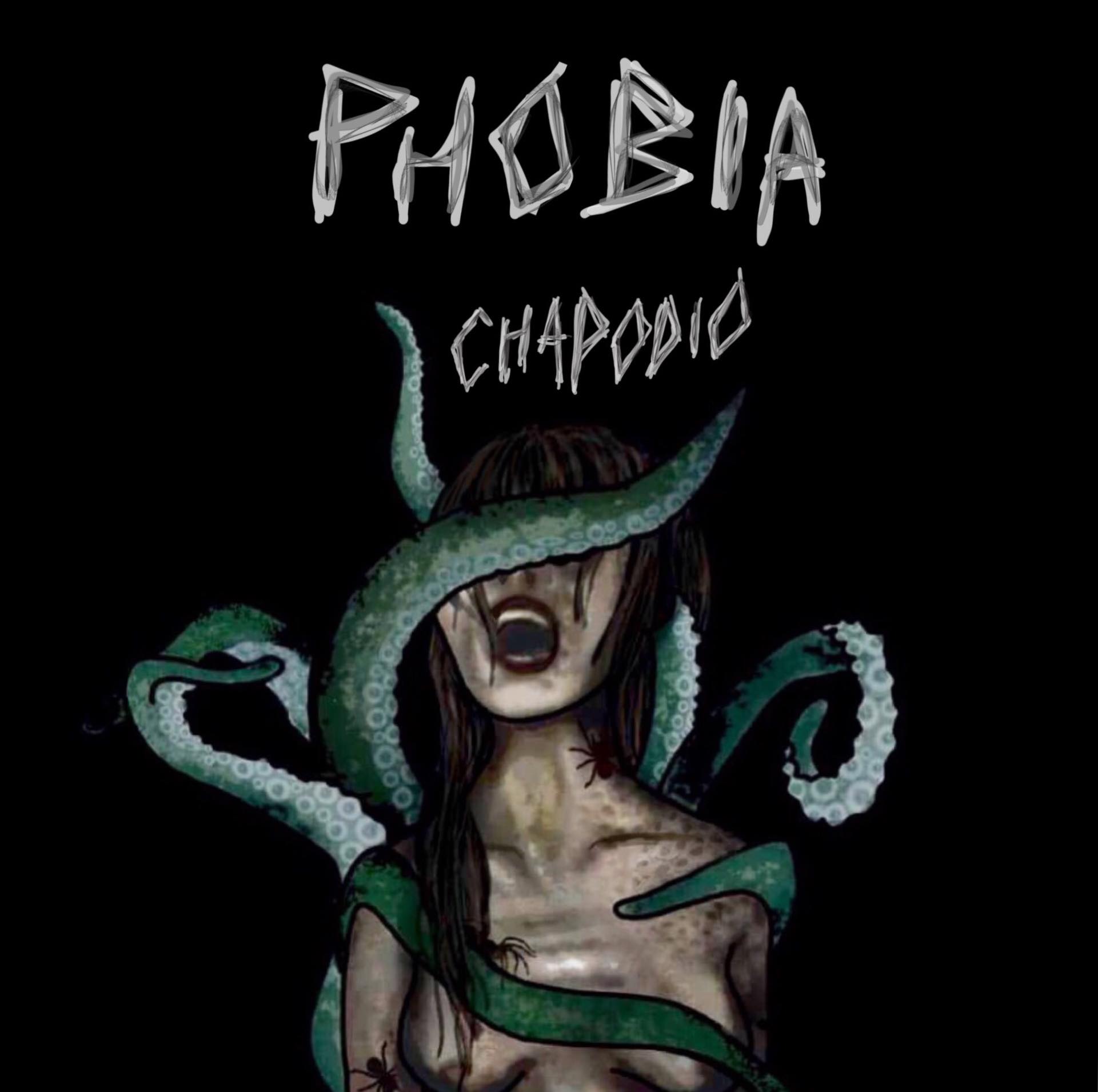
The image above is from when this project was called the phobia project.
All of these designs we really liked and they are great pieces of art. Charlie did a great job at talking the specifics that we wanted and making it her own. We were especially fond of the one containing the woman as it is perfectly sinister and dark, which is how our music has gone for this EP, especially lyrically. However, some things that we would’ve changed was that there is a lot going on in the foreground, but since the background is black it made it feel empty and as though there was a lot of wasted space. Also, the writing that she used for our name wasn’t what we had hoped as the grey and the rough lines made it look unprofessional in our eyes. Because of these factors, we decided to get a fresh perspective from another artist.
Below are the designs from the other artist that we worked with, Sadie Birchall. 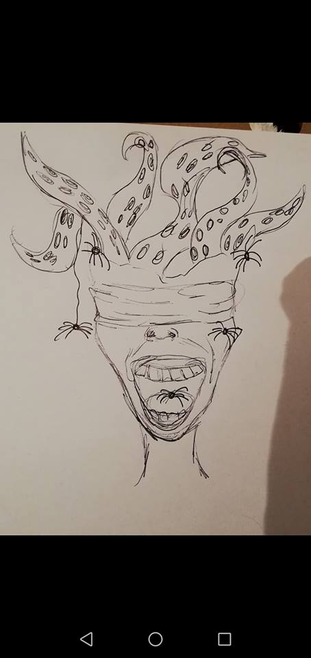
The photo above was the first design that she got back to us with. We were happy with this design as it made the person look insane and gave a horror aspect to the artwork. The pointers that we gave to Sadie were that we wanted blood in the drawing and didn’t want there to be a lot of bright colours. This was to make the blood pop more and be more prominent to make it more gruesome.
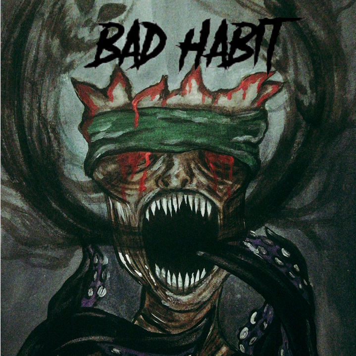
Above is the final drawing that Sadie produced for us. We collectively thought that this design was exactly what we were hoping for. The heavy use of green gave it a dark vibe and allowed the red of the blood to stand out massively. This art also had a much more supernatural vibe than what Charlie had designed for us. The one thing that we were unhappy with was the fact that you could still see the pencil lines. Even though this is almost unavoidable when drawing something by hand, which is what Sadie did, we still didn’t want it to look like a sheet of paper. A lesson that we learned from this was that next time we should probably go to a graphic designer to get a digital image made so that we would be completely happy with it. Overall, we are very happy with this design.
The way that we got around the problem of the design having pencil marks was to cartoonify it. There are many websites online that will do this and I luckily found one that did the job to make the design look that little bit more professional. 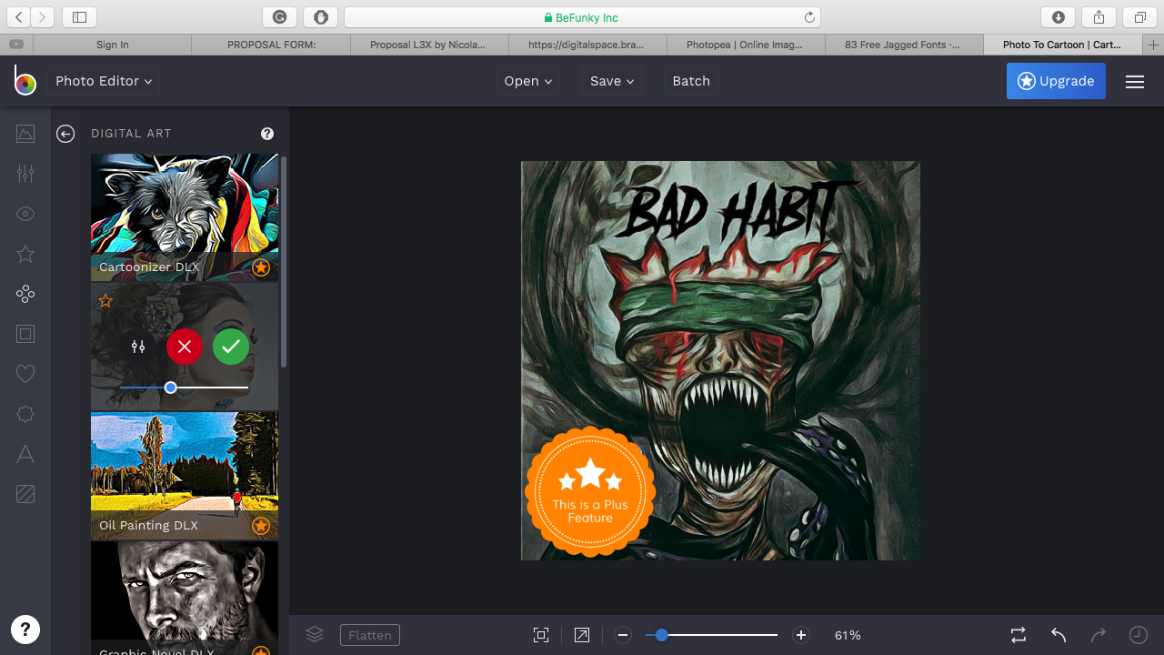
Above is a screenshot of the service that I used to make this drawing look more like a cartoon. As you can see, there are plenty of options designed to make a picture look like a cartoon and I managed to find one that worked perfectly. However, this was a trial to a service and you had to pay to download your image and get the full range of tools to edit your picture with. Below is a screenshot of just the EP art after being cartoonified. Obviously, we couldn’t use this as our album art due to the massive watermark in the corner that this service uses to prevent people from editing their images for free.
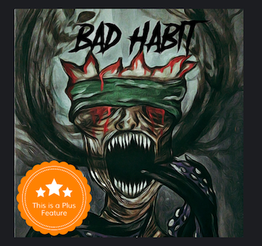
Luckily, we have some money from the concert we played at the underground supporting high priestess and cities of mars. This allowed me to buy a subscription to this service and get the full image downloaded ready to use. Below is the actual image we will be using for our EP
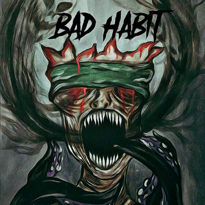
We think this looks a lot more professional and cover art worthy as it is essentially a full digital image now. We are all now completely happy with the cover art and are ready to use it for when our EP is released.
Some things that I learned from this process is that it is valuable to see what kind of directions different artists will take your idea. We gave both artists the same criteria and they came up with very different designs. I will remember this in the future to cast as wide a net as possible and not cement myself to one artist as there may be ones better suited out there. However, I will also look at getting digital artists to create art for me in the future as converting Sadie’s design into a digital image could’ve been avoided if we went with a graphic designer who could’ve started with that. Overall, I think that this process was successful.
