This project tracker and review is an updated version with everything I have done to date. The project tracker also includes what tasks I need to complete and also my personal thoughts about the project and how I feel the project is going. Not only this but I also colour coordinated the tasks to ensure that I do not get side tracked and to also show the tasks that are complete and the tasks that need to be completed.
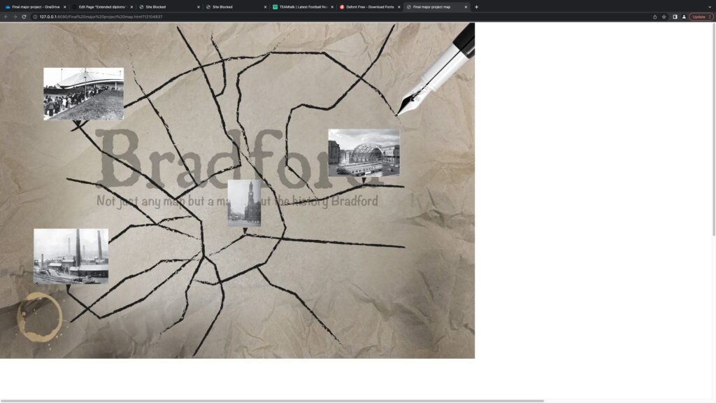
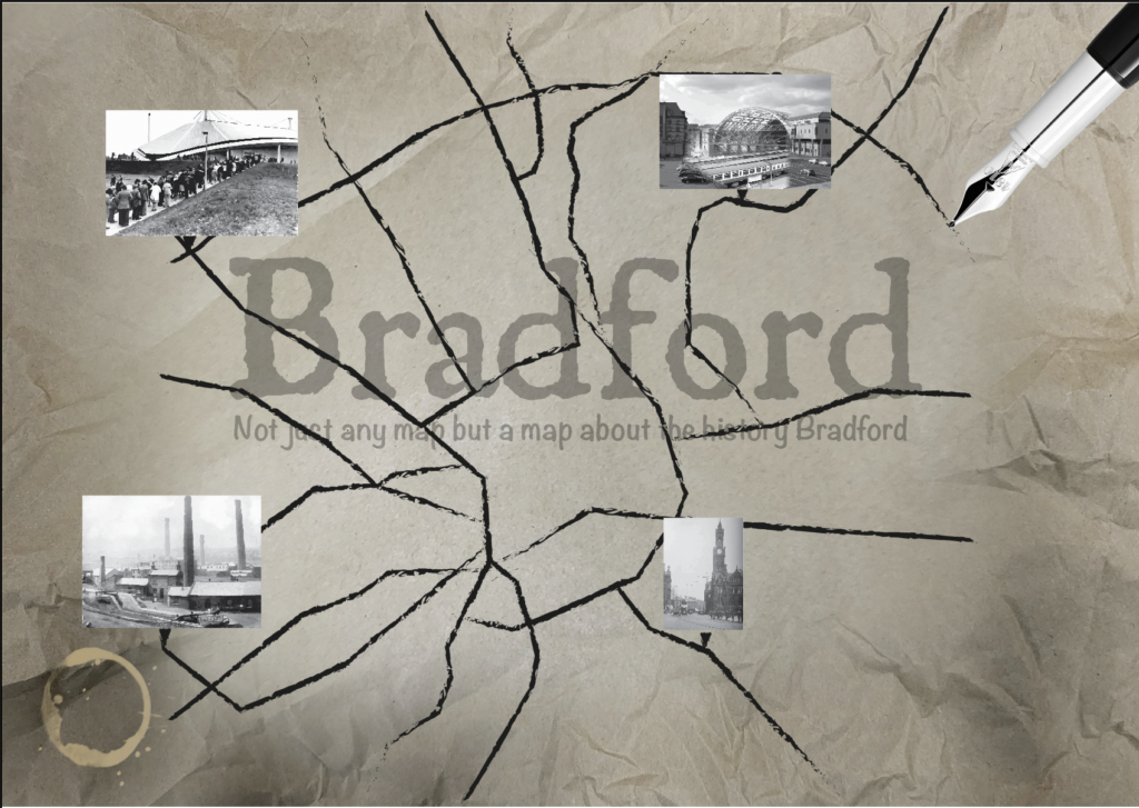
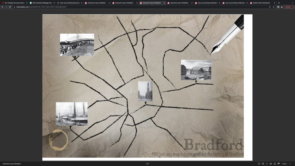
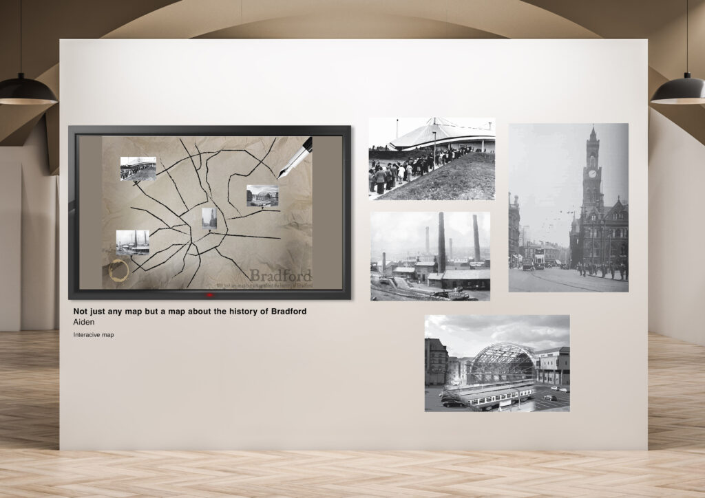
https://indd.adobe.com/view/d487475f-7b4f-4d42-8552-f3a02db24531 This link will take you to my final design of my interactive map.
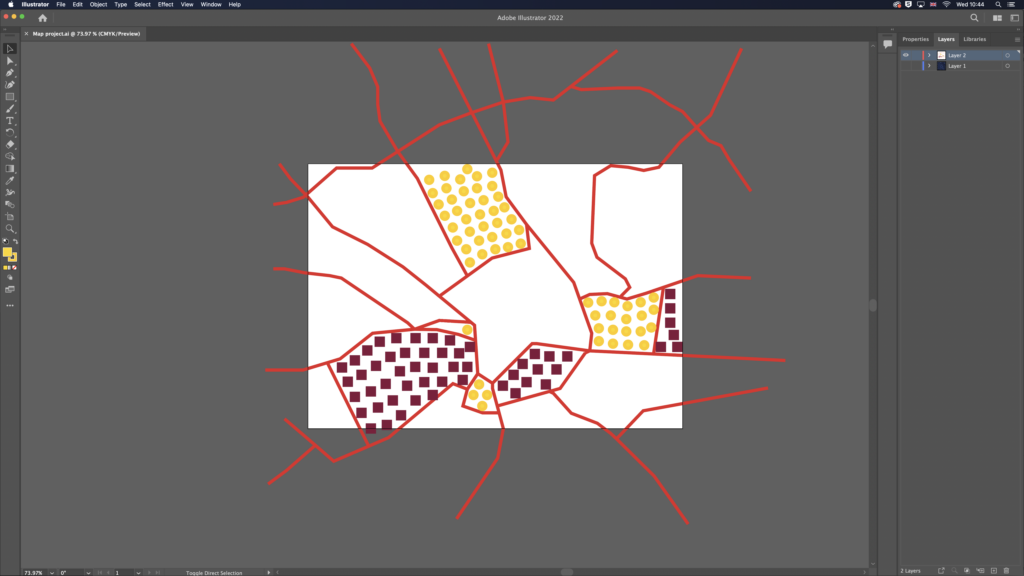
Final major project analysis second design, positives: The positives from the second design of the project compared to the first is that there is text that informs the audience about what the map is about as well as a tagline to let them know what theme of the map is. Not only this, but the font that I have chosen for the title as well as tagline fit the theme as well I.e. avoiding making it look cliche and cheesy. Another positive from my project is that I was able to change the scale of the map to a bigger scale this is a positive because it is more eligible for the audience to be able to read the information off of the map.
https://indd.adobe.com/view/4d3ca9bd-f860-4cd1-92f0-cc476d880c3b This link will take you to my animated map.
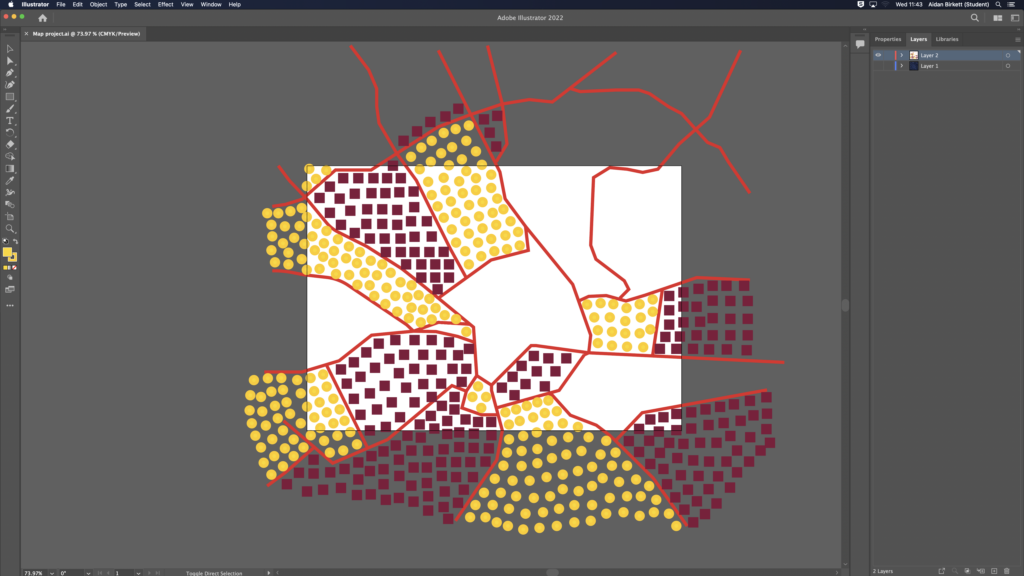
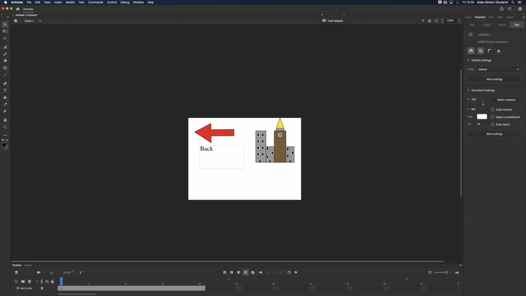
Final major project analysis positives: The positive of my final major project is that the images all correspond to the correct image this is a positive because I am not having the wrong button linked with the wrong location. In addition to this, another positive of my project is that I picked reliable information that was correct and not made up. This is a positive because I have ensured that there is no misinformation by using reliable sources and not sources such as wikipedia for my information I have also referenced them to show where the information I have acquired has come from. Furthermore, the theme of the map design is a positive as well this is because it doesn’t look too cliché/cheesy as I have gone for a map that looks old and matches to the theme which is about history.
Final major project analysis negatives: The project also had some negatives as well firstly what the map is showing on screen this is a negative as some people who look at my map may not know what it is about to overcome this I am making an improved version of the map that has the title of what it is as well as a tagline so that people understand what the map is about. Another negative about my project, is the size of the map after exporting it this is because there is a lot of free space once the map goes to full screen to overcome this issue and to improve it I will do research into the resolution of my screen and change it to the correct format E.g. 1080p x 720p.
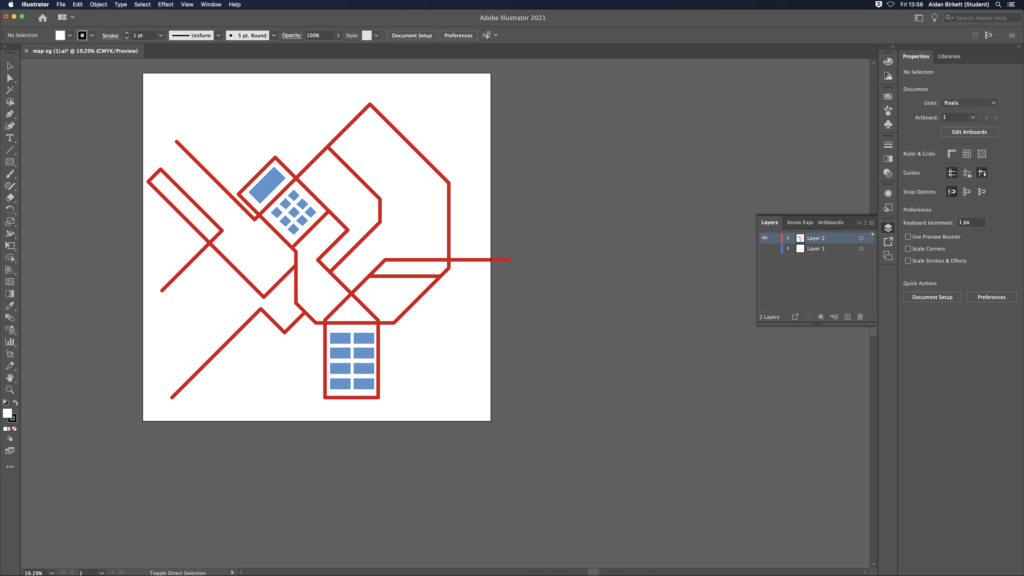
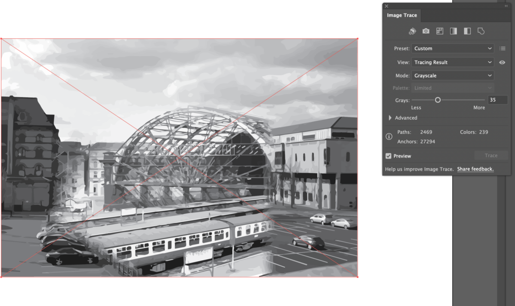
https://www.youtube.com/embed/LbfTCxkDtz8?feature=oembedThis screen recording is me experimenting with the size of the canvas/project. This is also showing my understanding of Adobe Indesign and how understand how much of an impact changing the canvas size has on my project. In the industry they would experiment with applications that they are unfamiliar with to understand how the application functions and the limitations of the application.
Edit”Extended diploma’ Project 4 – Task 3 research”