This, I felt was super important to me. Getting myself a logo for people to recognise me by is the first step in building a reputable and easy to remember brand. For me, it needed to fit into the trends of my genre, but still stand out. I always had an idea for this, ever since I first thought up my stage name last year.
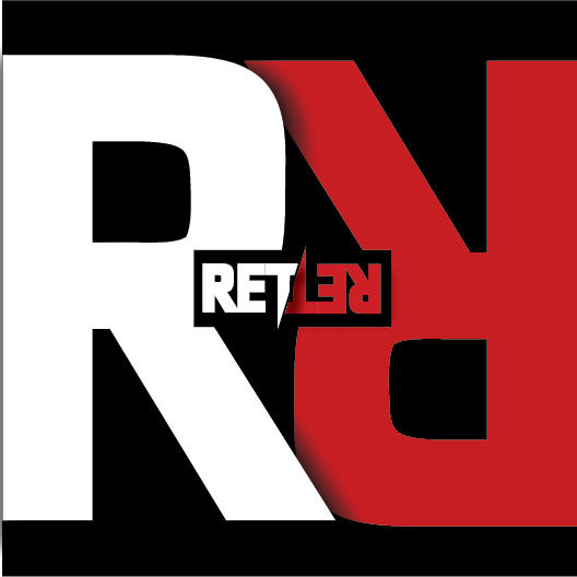
I wanted it to be sharp, angular, and reversible, like a mirror image. What I mean by this is, my stage name is a palindrome, a word that is spelled the backwards as it is normally. This, I think, is unique, at least within my own genre anyway. And I thought that, because my setup at home is black and red, my theme colours should be the same as that. Like I said when talking about building a brand, consistency is key.
When I met up with the graphics designer, I had a little sketch of how I wanted the logo to look, and I explained my colour schemes and basic ideas behind the logo, it took around 5 minutes and then that was it for 2 weeks. She contacted me regularly to ask me about little things, such as the shades of red, shadows, etc. and then she came back to me more than just a logo, but an EP cover as well, which was more than I could’ve asked for. Here’s the final results;
![]()