Introduction
Artwork is a huge part of a bands representation both in online promotion and physical promotion such as posters and flyers. Having artwork that balances good representation of a band and exciting intrigue is a hard prospect to hit and therefore I will be looking at a range of similar bands and musicians to myself and Mother Fungus in an attempt to find the perfect inspiration.
Band Art Work
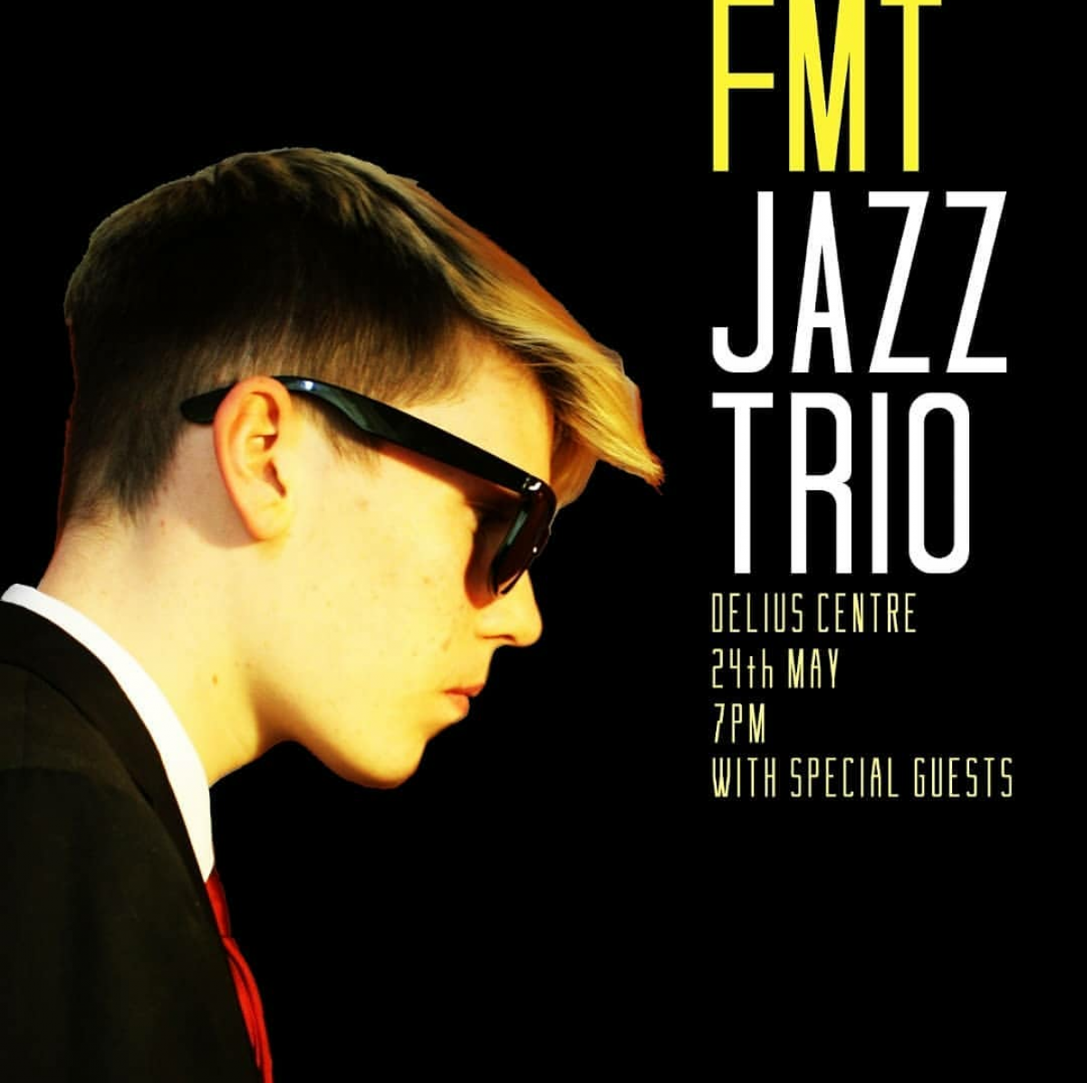
On Tuesday 2nd April, I had the pleasure of being reunited with Baldev the incredible designer who created the poster for the FMT jazz trio last year. To remind you what the flyers looked like, here they are.
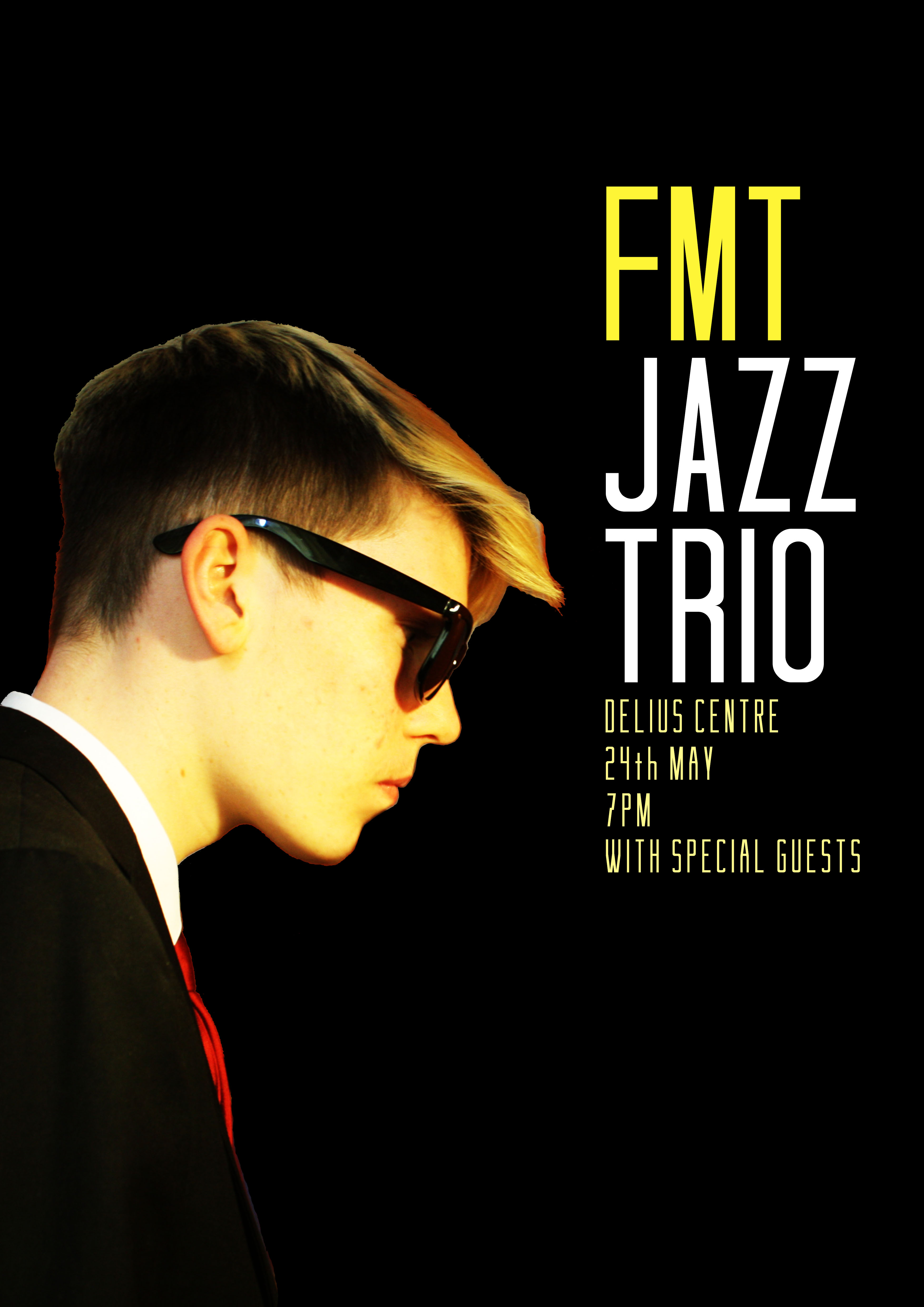
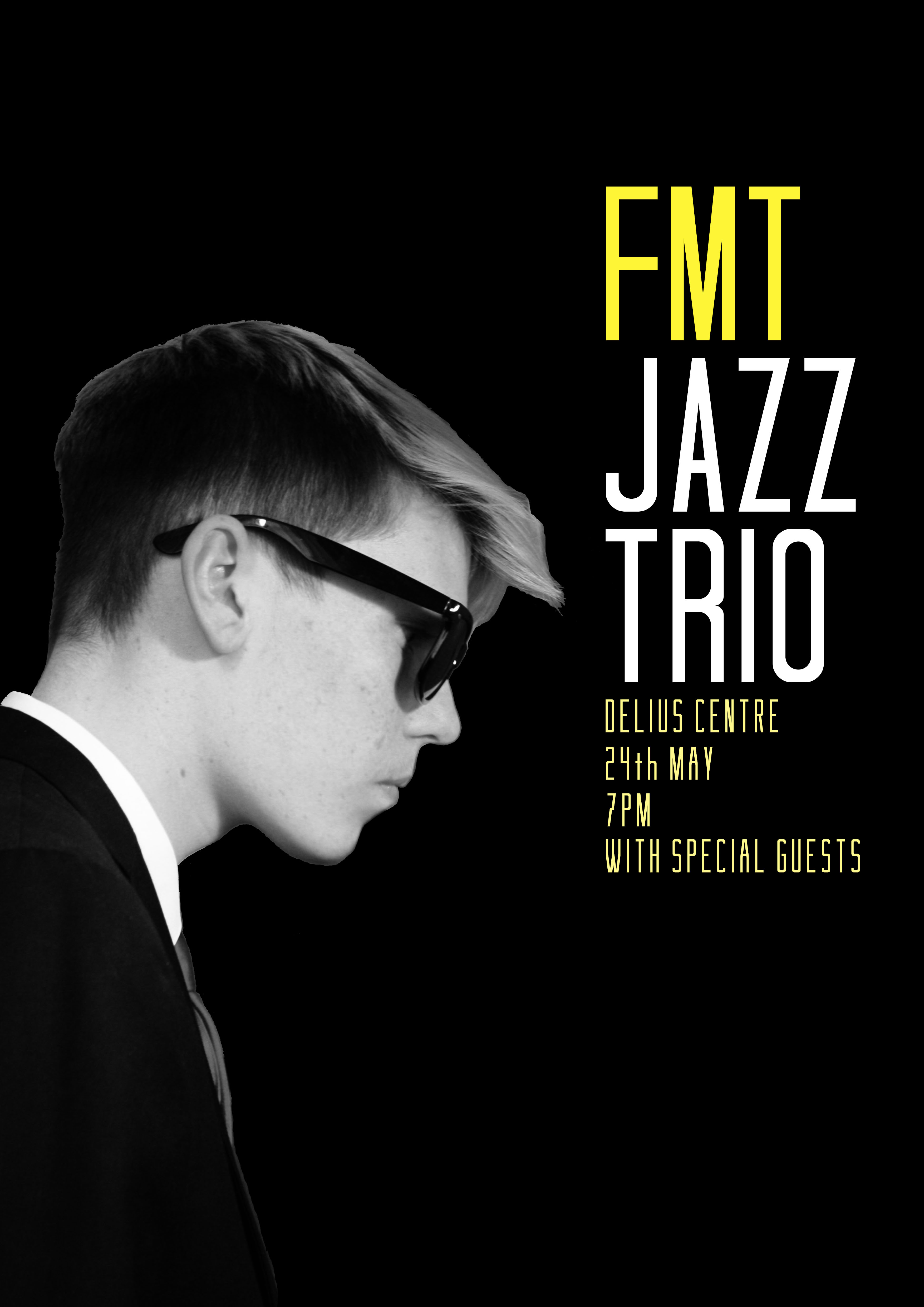
In the end, I used the first design as my main promotion for last years final performance and it was a really exciting part of the process.
This time, although it is still very much jazz centred, I will be playing with a completely different band with a different image and style. Below are some of the images that inspired me in terms of band logo and flyers.
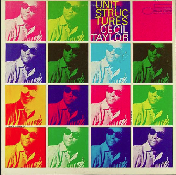
This is a album cover by Cecil Taylor that I found online. I thought it was a really cool design and that as there were quite a few members it would be great if we could do something like this featuring all the band members on.
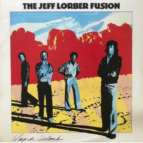
Something like this with the full band in some sort of mythical mother fungus land could also have been really cool, but when I went to see the graphic designer, we hadn’t taken a full band photograph.
I wanted there to be a distinctive band logo to set us out from other similar bands and make us look more professional, it would also mean that we could start developing our band image from that foundation as well as begin to look at creating things like a banner, a website and band merchandise.
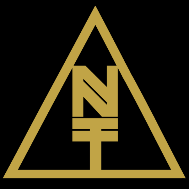
Nubiyan twist are from a very similar scene that we are trying to model our band on. Above is their band logo which is the main image that you associate with the band.
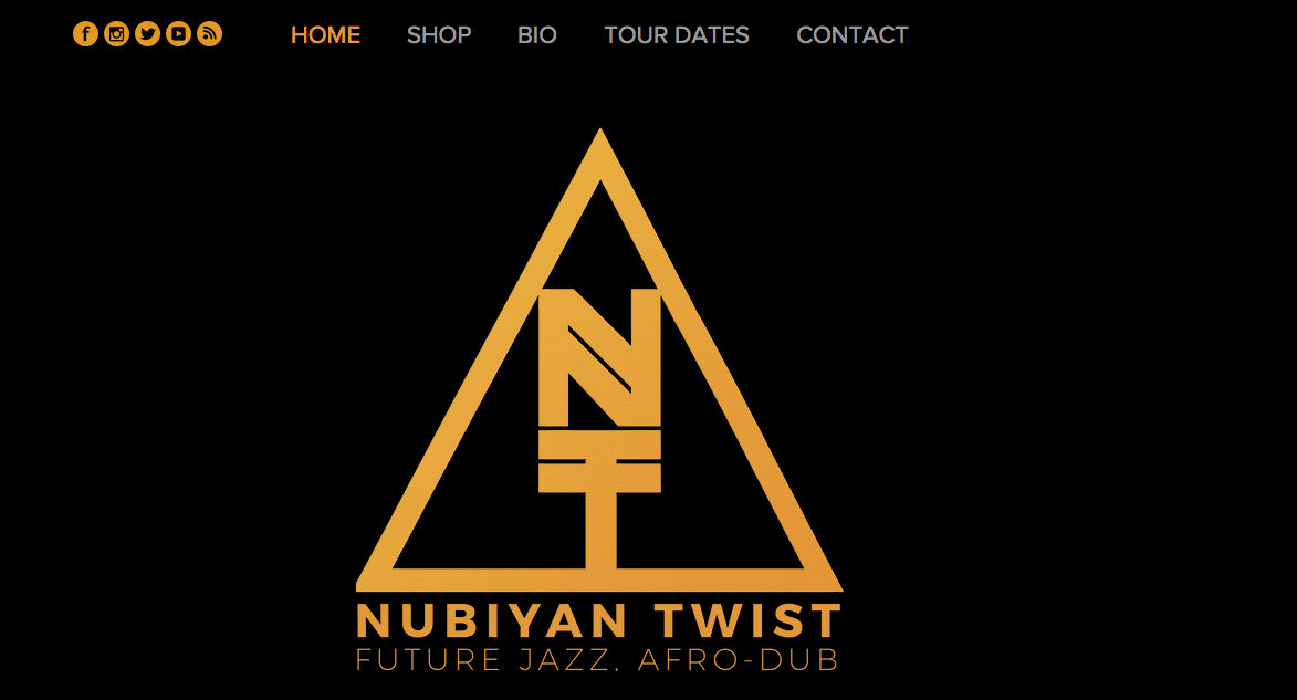
As you can see the design was the basis for their website and also appears on most of their flyers and promotional posters. Having one stand out logo allows the band to consistently promote around one image and therefore when fans or potential fans see that logo they instantly know the bands name and where to look in the future.
Our band was built around the idea of a mother fungus which is an icon that for me has connotations of being very strange and growing uncontrollably. I therefore wanted our artwork to slightly reflect this weirdness by being a bit different, however I still wanted to create a solid image so as to be able to build up a consistent band image.
Draft Ideas With Baldev
The meeting with Baldev was very productive and he produced some great ideas which can be seen below.
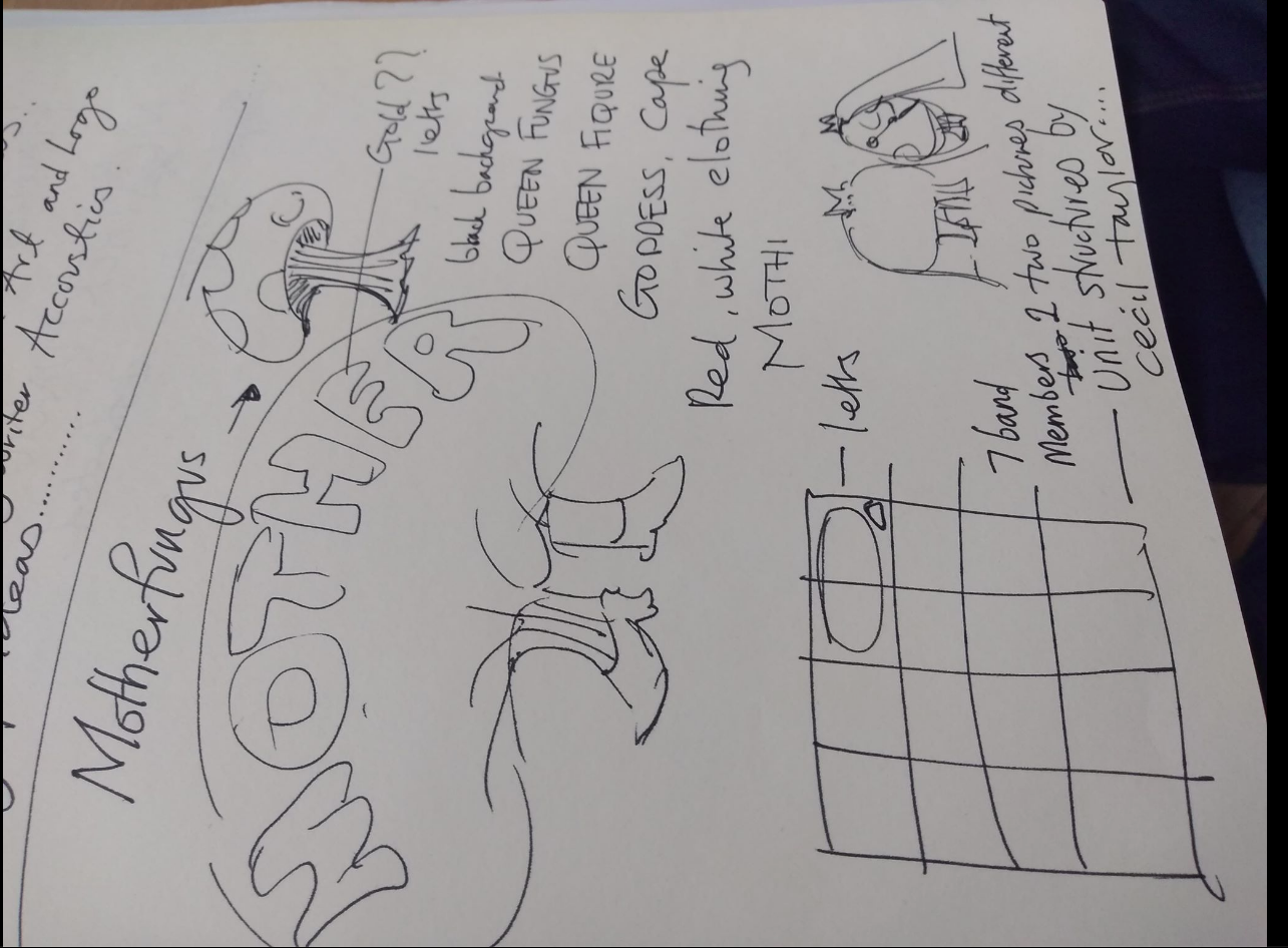
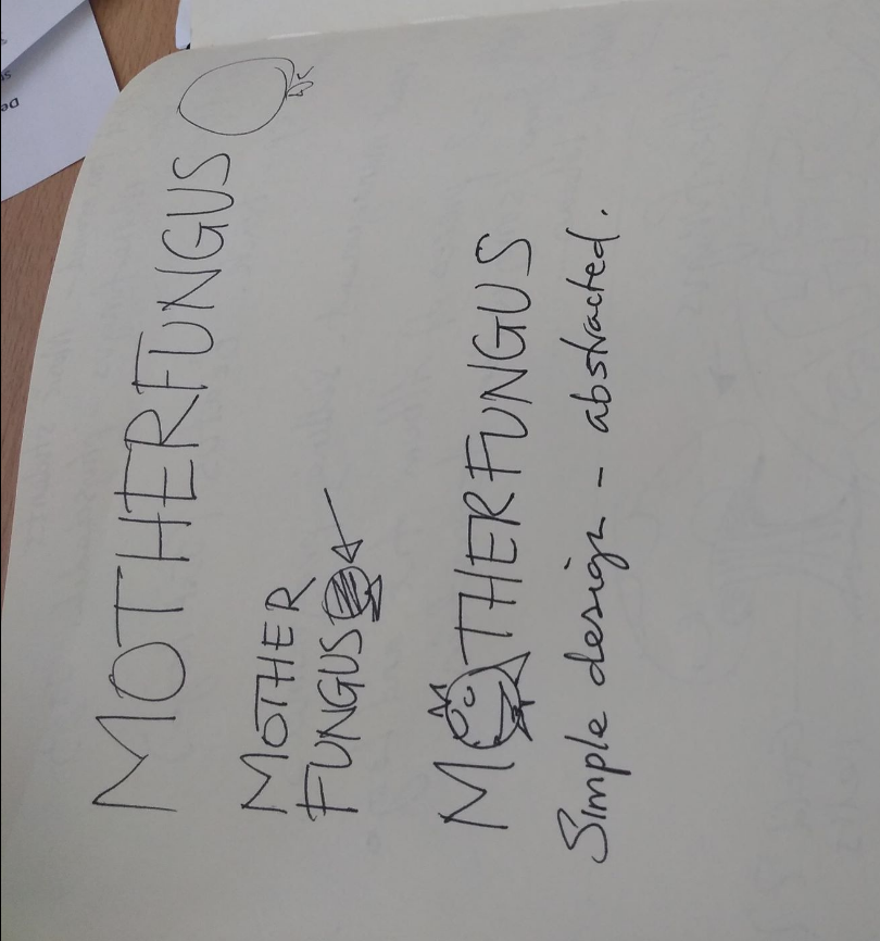
The idea was for Baldev to create a band logo and the final poster design. The poster idea was heavily based around Cecil Taylor’s album cover, Unit Structures and the draft idea for that can be seen on the right hand side of the first picture. Baldev also came up with some interesting ideas for a potential logo and mascot icon for the band and we kept in touch over email throughout the project in order to discuss ongoing developments. The final imagery will be posted further down this page.
Charlie’s Design
I had also gotten in touch with a designer friend of mine who had created for mages for other local bands including Chapodio. I told her about the idea behind the band and that I would like a band logo that we could use for online promotion. I suggested that it should focus around the fungus idea and she agreed to experiment with some designs and get back to me in a couple of weeks.
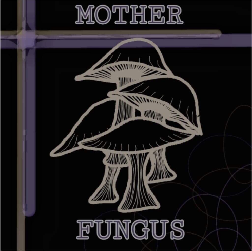
Here is a picture of Charlie’s initial idea for Mother Fungus. My initial reaction was that the design of the mushrooms was amazing and really well done, however it would be nice to see some red and white in there, so as to look more like a stereotypical mushroom.
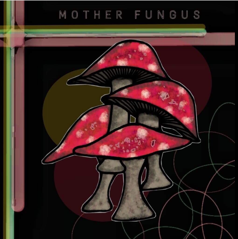
Here’s a picture of Charlie’s design with the added colour that she sent me. To me this image had a lot more character than the first draft , however I requested for the background to be changed to black and for the writing to be added in white.
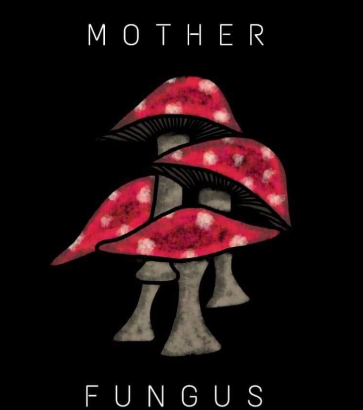
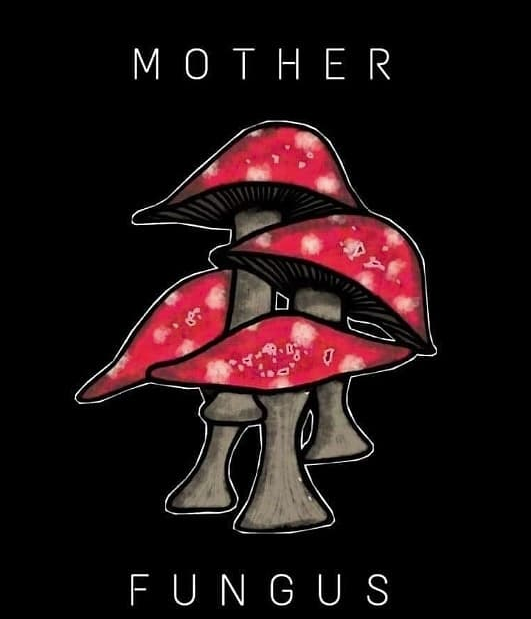
Charlie got back to me with these two designs which were both amazing! I preferred the second one, however I decided to put it to the band before committing to using one of them as the promotional photo.
After a bit of discussion, we decided to use the second picture and I felt really excited as I felt that it solidified our image as an established band.
Promotional Art Work
For the mock gig on the 26th April, I decided to do my own band poster in order to use for promotion of the event. I googled free poster creation and began to work on adobe to create a decent looking poster with the vital information on it.
These are the three designs that I came up with.
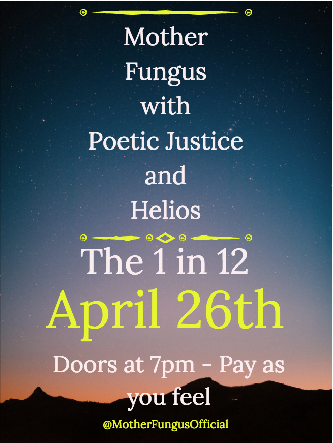
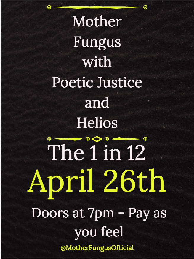
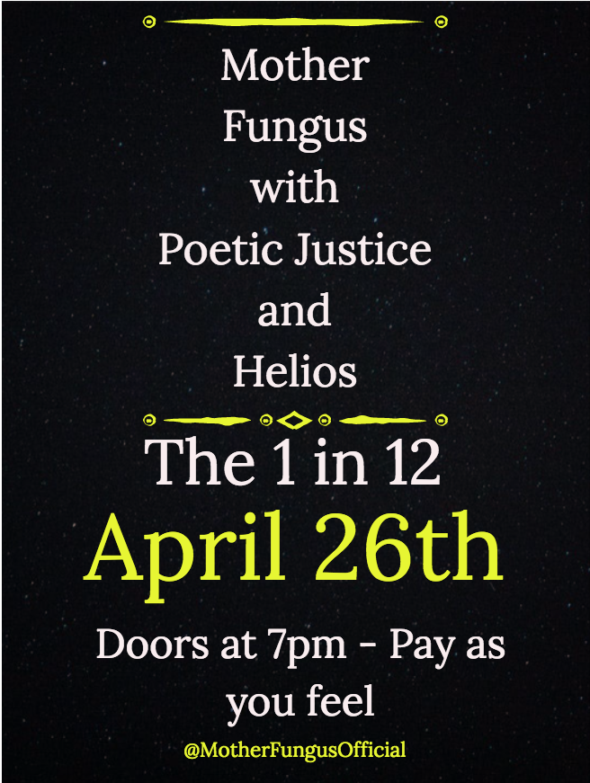
As you can see both poster two and three are very similar, however I quite liked the contrast of the first one. I was amazed to see how easy it is to create a good standard poster and although it’s not super fancy, it will do the job.
Final Performance Poster
The poster for our final performance was created by Baldev and was heavily based off of Cecil Taylor’s Unit Structures, as we had already had a great logo created for us by Charlie, Baldev’s main focus was on the poster for our final performance. This was mainly down to Baldev’s workload which was very heavy as he is third year University student so the fact that he did some artwork for me is amazing.
Here is the final poster.
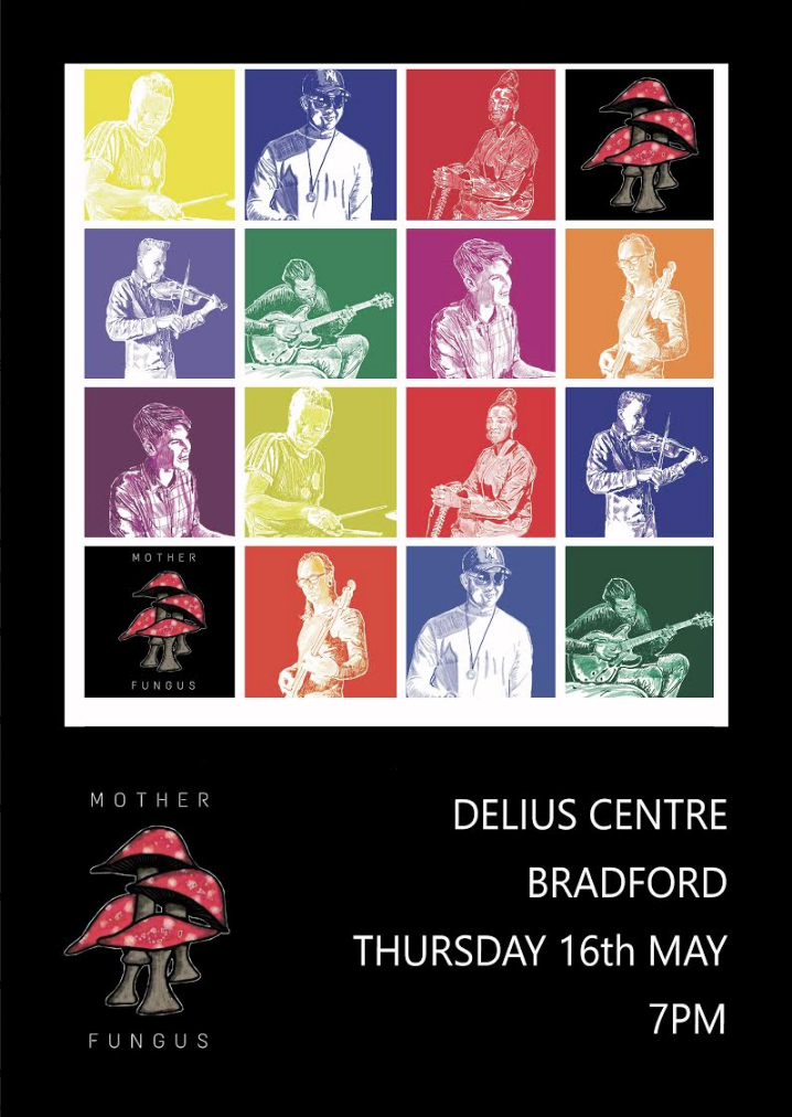
Overall, I think that this poster is incredible and it really boosted my confidence and excitement for our final performance. The fact that Baldev drew the pictures of us from the photos that I provided of us is amazing and it shows how talented he is. It is a very professional looking poster and one that I am extremely proud to show off in promotion for our final event.
