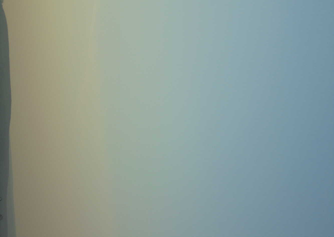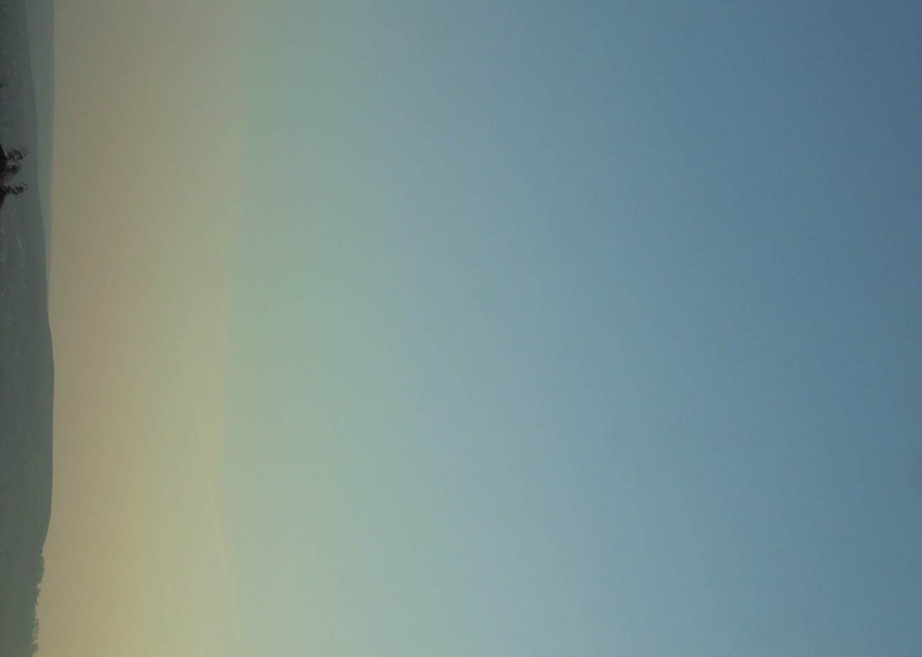
Original Image:
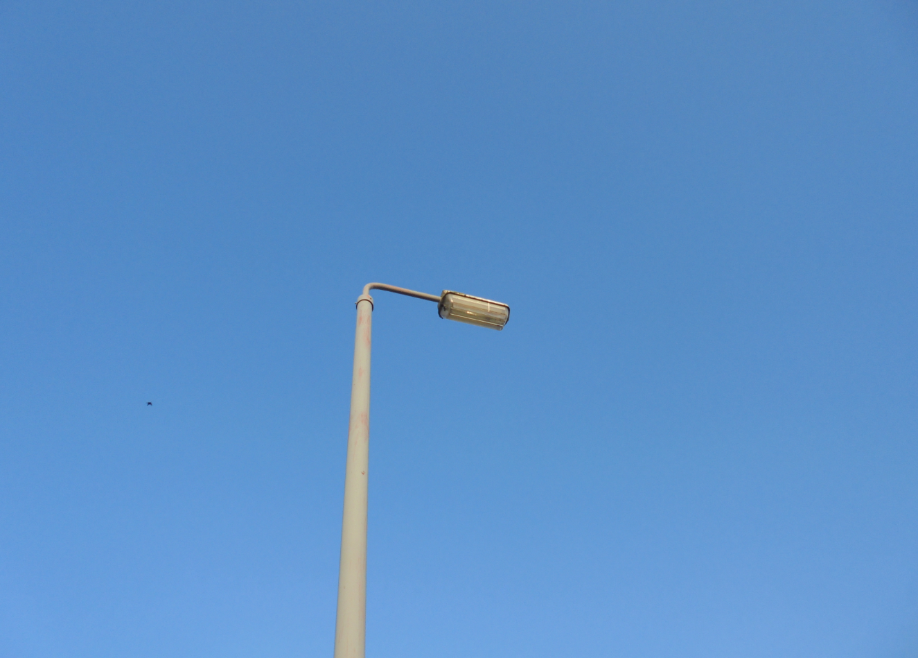
I used a lampost as inspiration due to my song being called City of Street Lights. I therefore took various images of a single street light. I wanted the photography to be minimalistic so that I could edit and manipulate it easier and make it exactly what I envisioned. As you can see there is a bird in the left hand side of the photo, I didn’t notice the bird until halfway through edit 2. I therefore edited out. I also used tools such as: exposure, shadows and fill light to enhance the image. After this I tinted the full photo to a pink hue to fit into the theme (as seen below).
Edit 1:
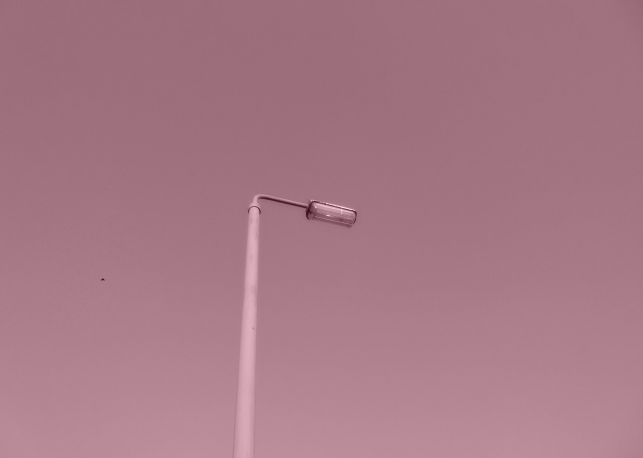
In this image I simply added a pink tint to turn the image pink after editing the original photo to enhance the lampost. I liked the simplicity of the photo as it was simply a pink photo that included a lampost (until I noticed the bird).
Edit 2:
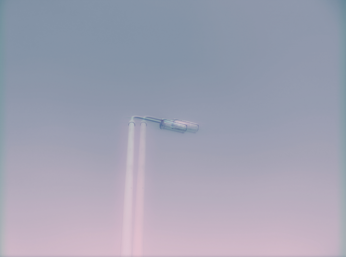
In this photo I added an effect to the photo which doubled the lampost, I also added a blue tint alongside a pink tint and also brought the brightness up a lot. This transformed the image massively, and from this I had the idea of layering.
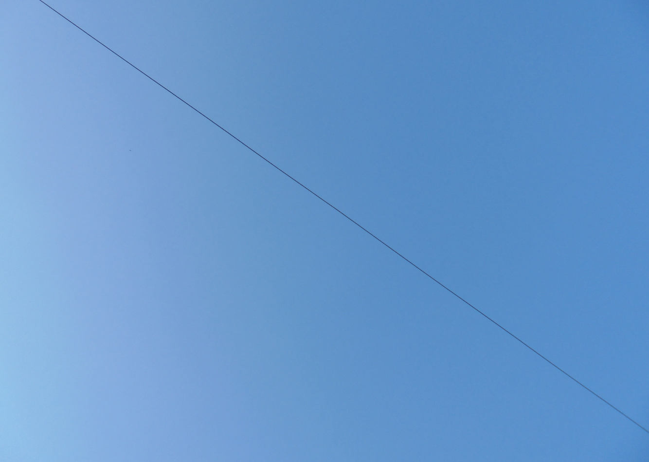
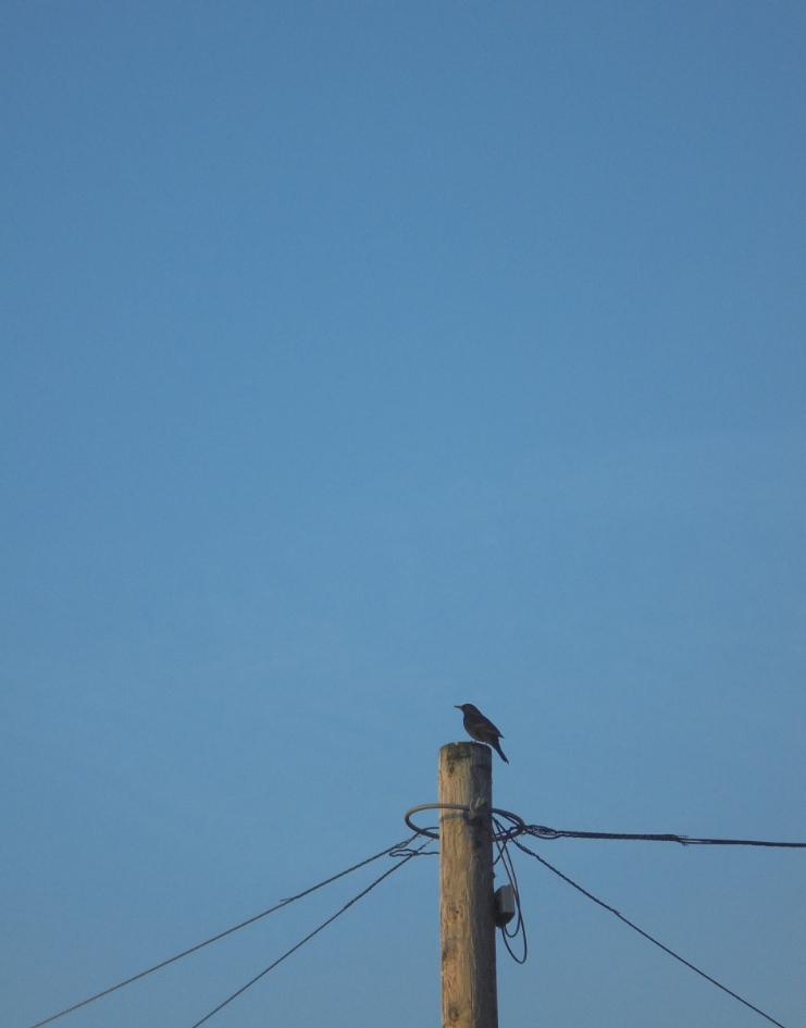
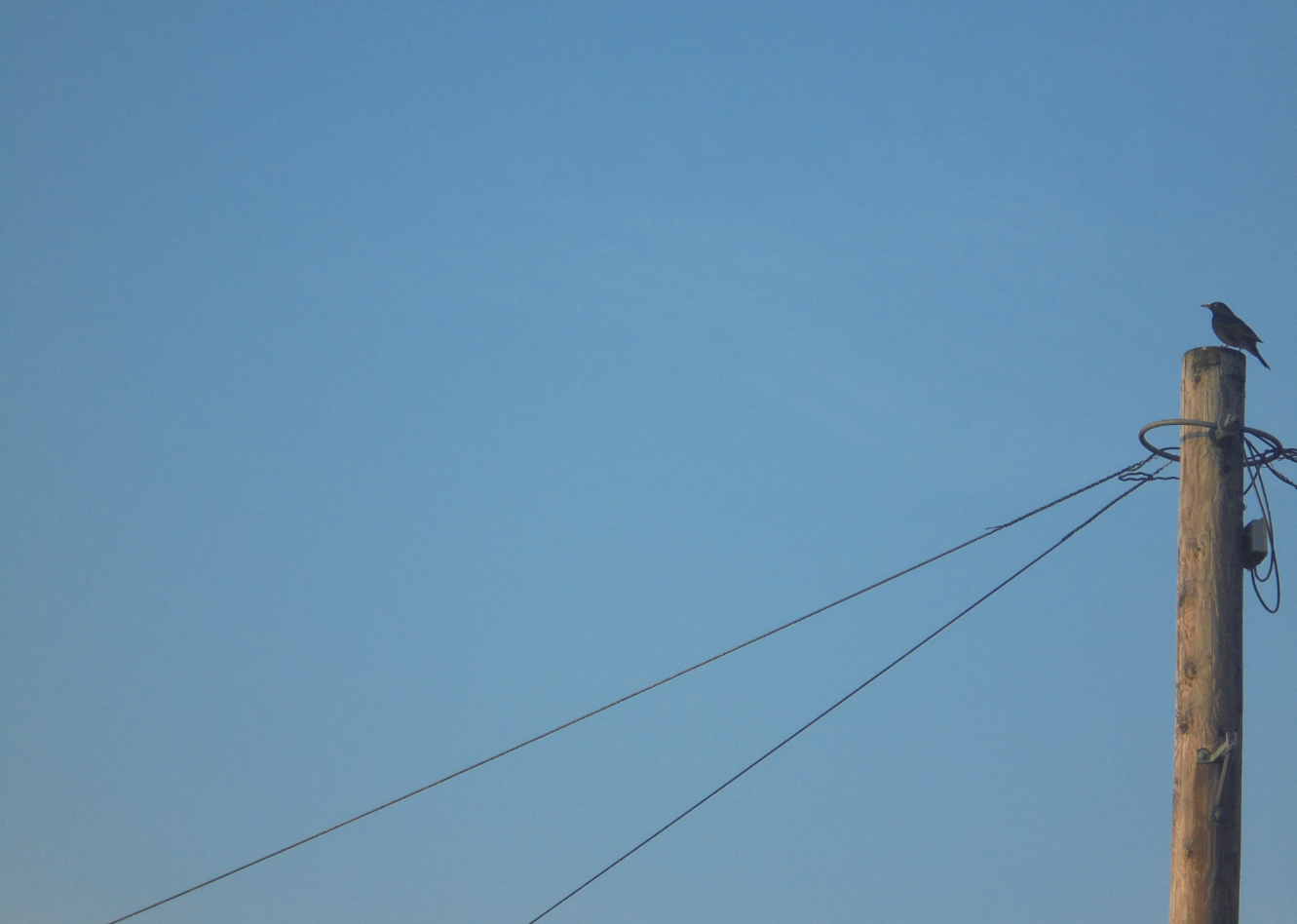
I then layered images on top of each other to create interesting edits. I therefore used some of the other images i had taken, these are the original photos:
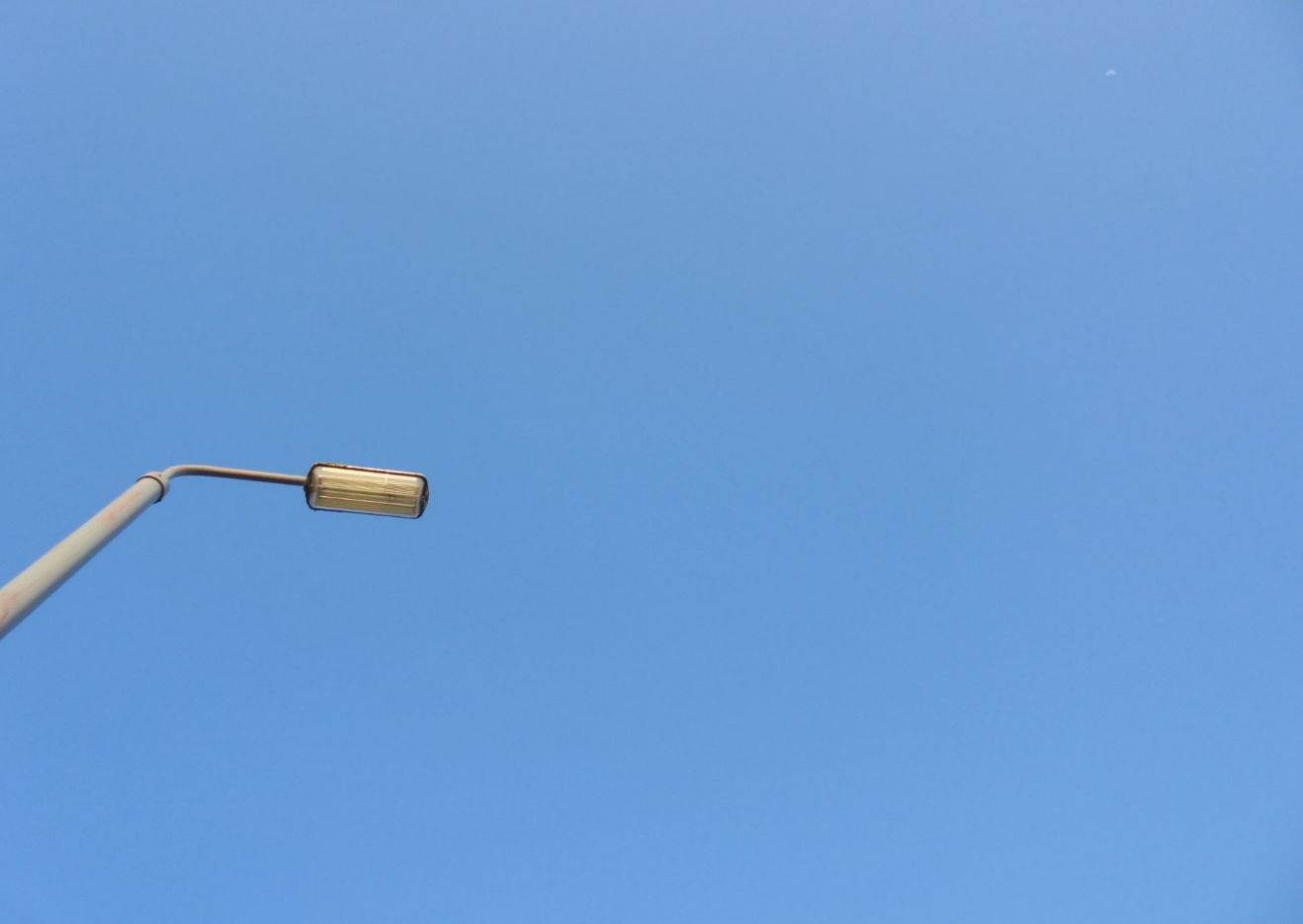
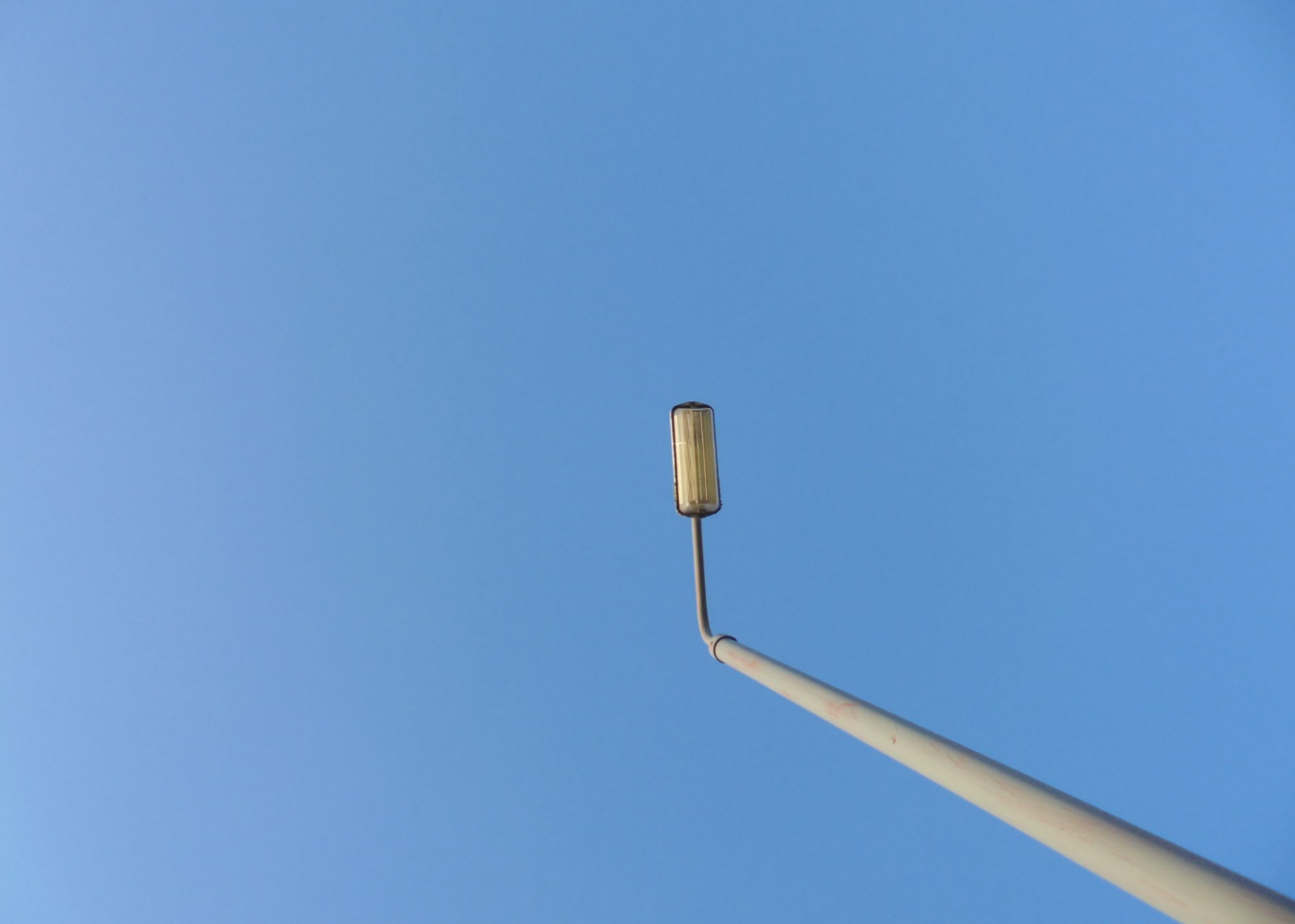
This is the first Edit I did where I included layering:
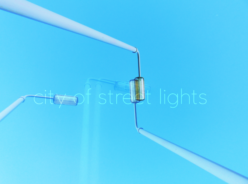
In this image I played around with layering and added roughly three images on top of the original image. This created the effect of City of Street Lights. I would have liked this edit better with the pink and blue hue as it would have fitted in with my other edits as a more cohesive piece. However i enjoyed experimenting with layering and created unique edits. This then made me realise that I needed to take more of a minimalistic approach, like the original photo was in the beginning. I didn’t want to overpower the actual image, therefore i just layered one photo on top of the other to get the image below:
Edit 2 of layering, I also added a font and played around with various fonts until I found a font which suited the image best:
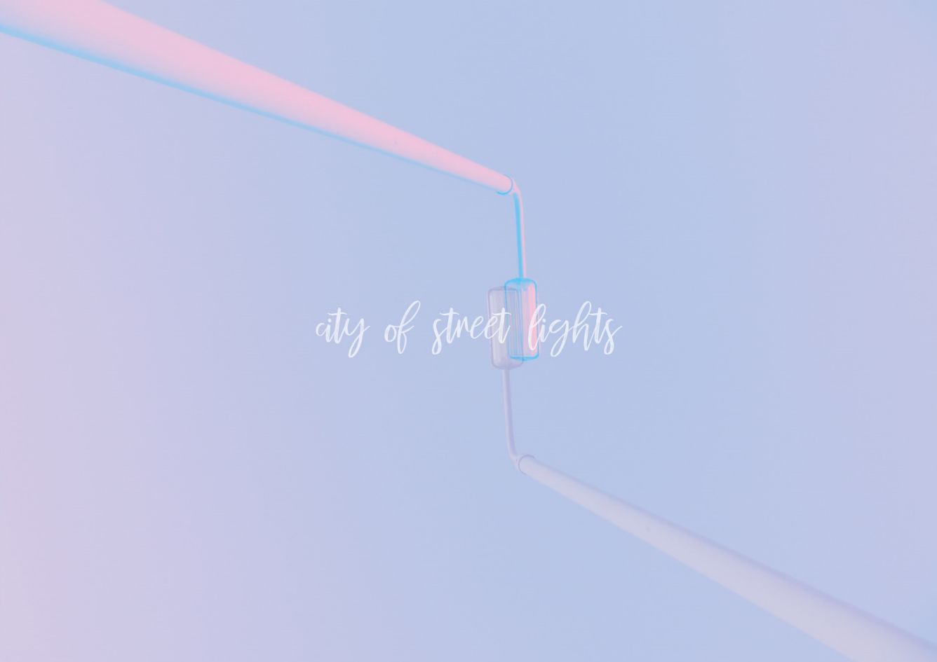
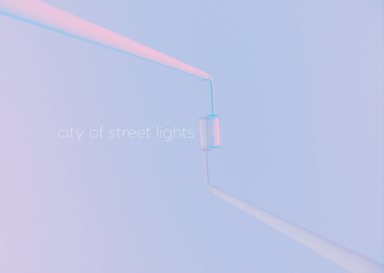
It took me a while to determine which font I should use, after also selecting the position of where the font should go, this was my final edit:
FINAL:
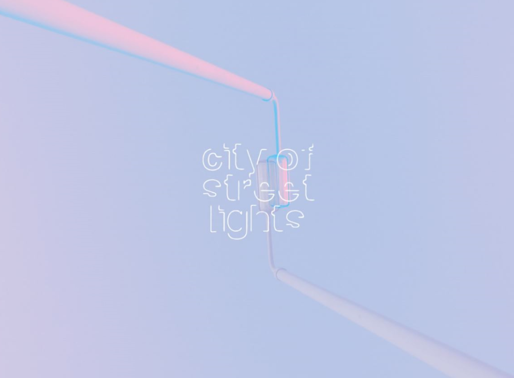
I chose this edit due to the pink and blue hues within the photo. I also appreciate the composition of the lampposts coming from either corner of the photo, this draws the attention of the photo to the centre where the lampposts meet. I also chose this font because of its minimalistic approach to the photo, it doesn’t add too much to the photo, but it shows enough that it tells you the song title but doesn’t hide the street light behind it. I also think that the slight offset of the lampposts behind the text makes the image more compositional and dimensional due to its different angles and offset.
photography

wire
bird
sunset
