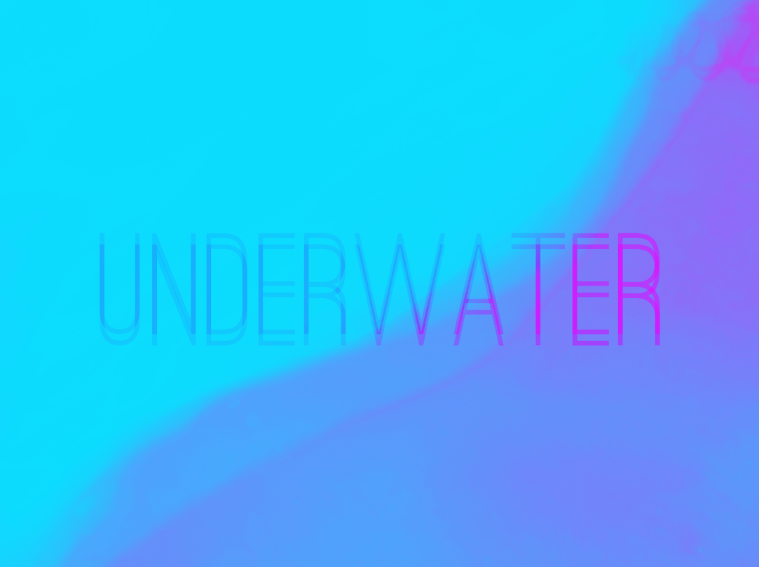
these are the edits for promotion and other artwork that I have created
[all photos taken by myself]
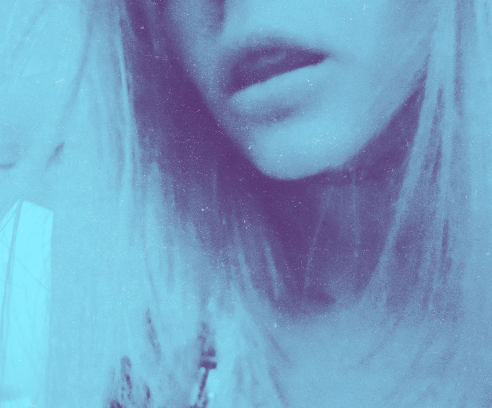
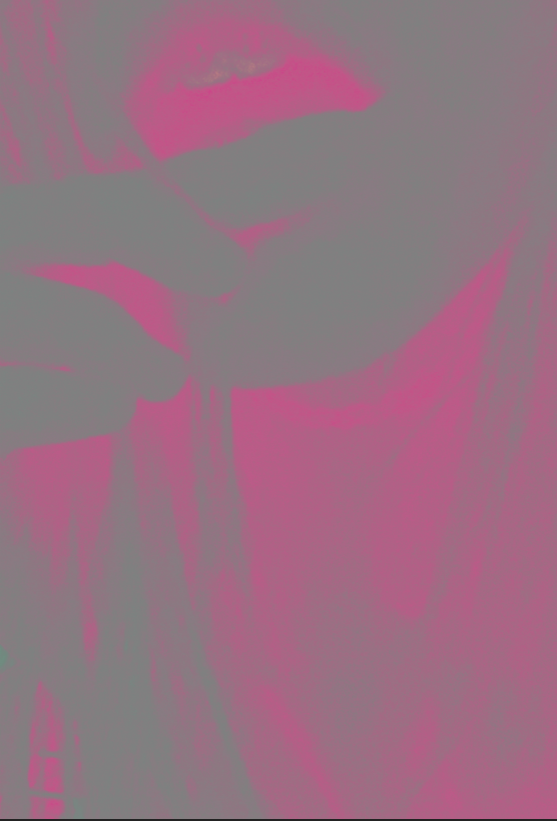
EP ARTWORK
original ideas
To edit these I painting the different colours on top and added various filters to add a purple hue. I finally added a text which I layed and changed the opacity of one of the layers to create the second photo. I liked the colour scheme of this, and I decided to try and edit more using this colour scheme, however my final project was less vibrant than this colour scheme.
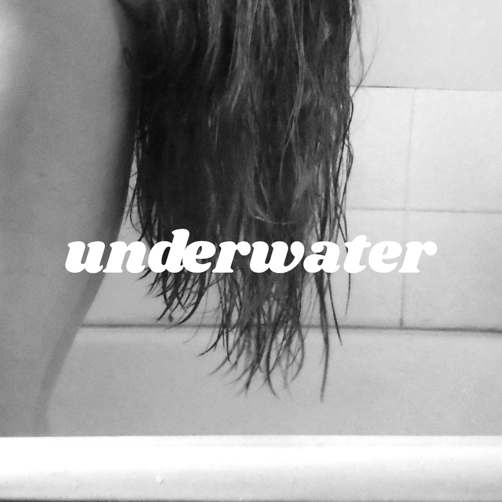
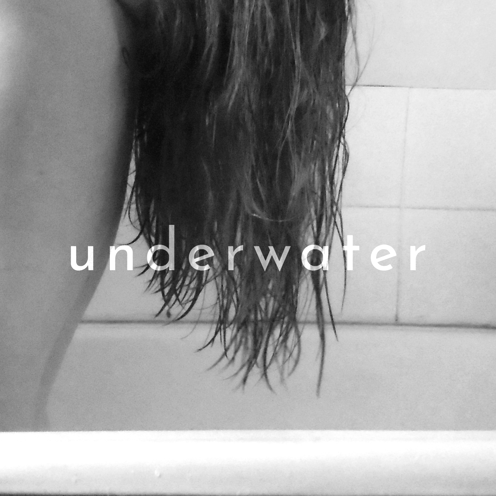
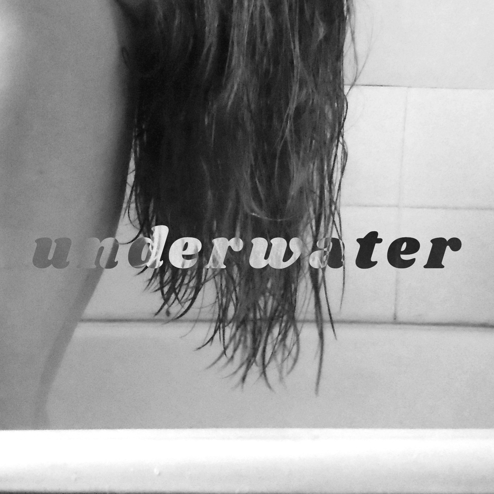
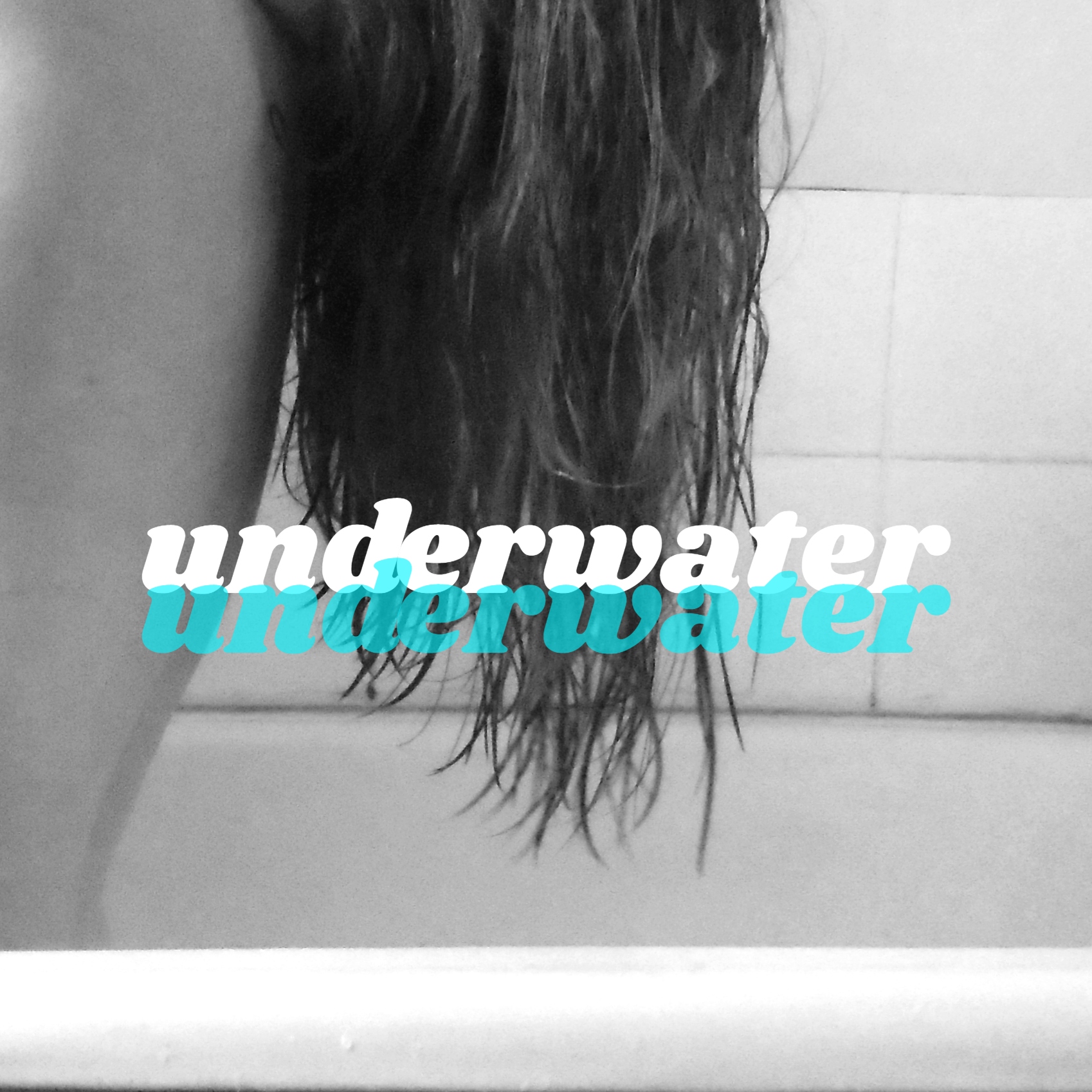
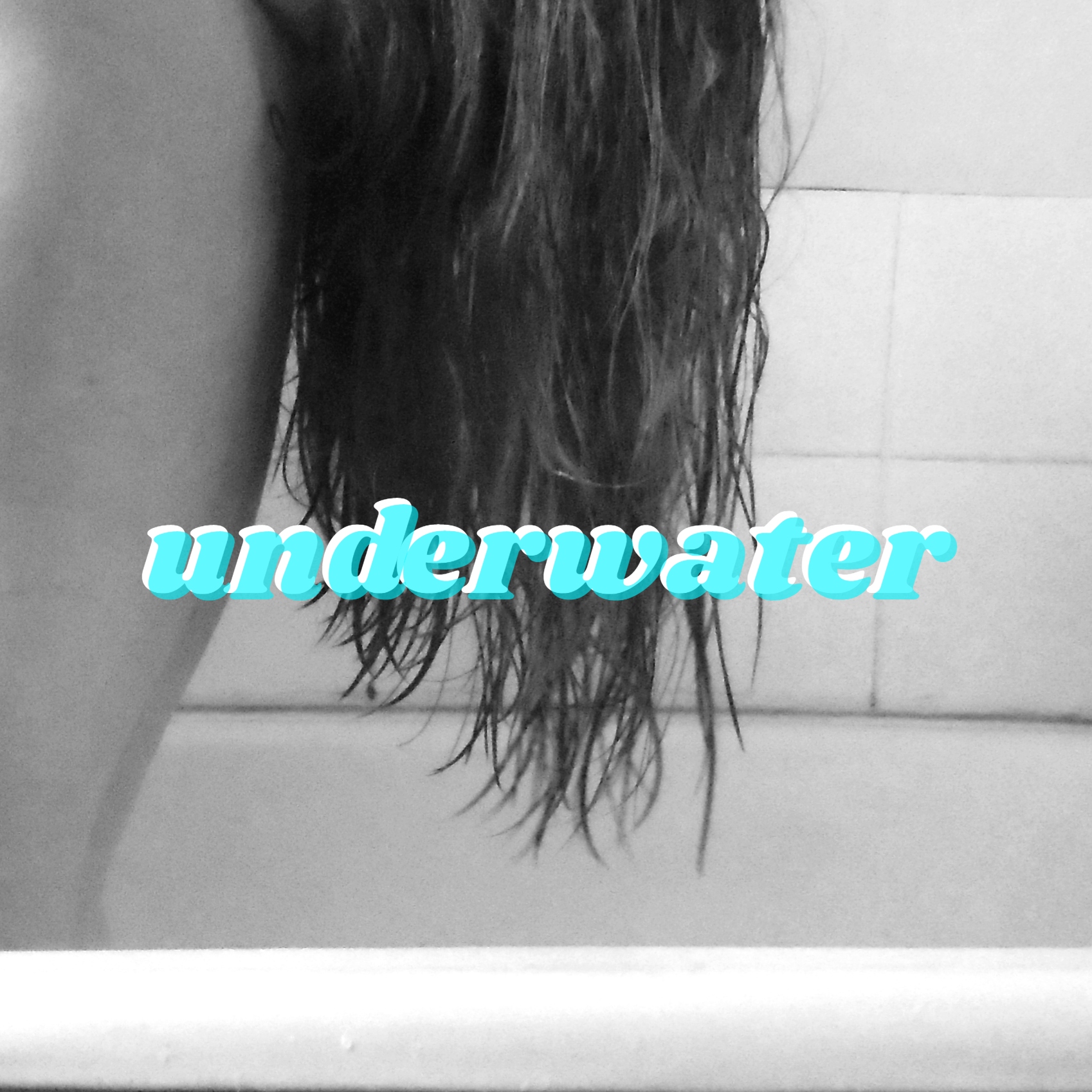
These next ideas were using the same background but changing the text to different fonts and variations. I tried some with colour and some monochrome. I personally prefer the coloured fonts as it makes it a little more different than the original photo and adds a pop of colour. I also prefer the bolder font as it makes it look like it's relating to Underwater more.
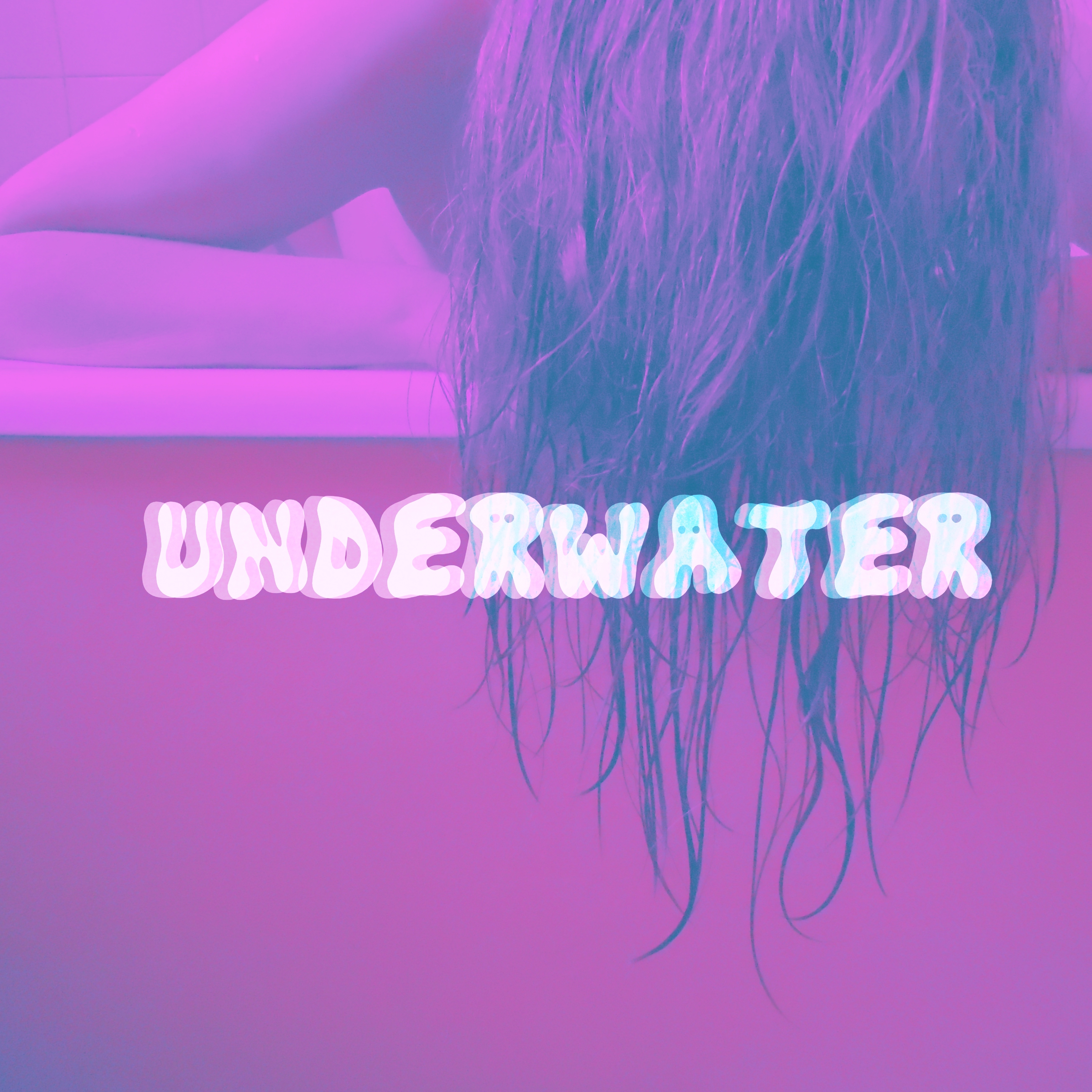
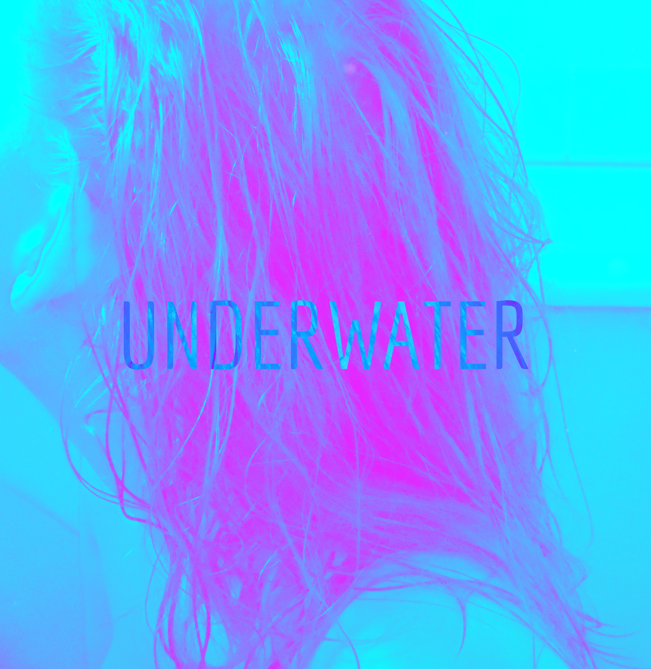
Both of these photos above are using the original colour scheme and I like the brightness of these photos as it makes the EP cover stand out. However I felt like this didn't best reflect my style of music. However I did like the original photos that I took of these as they showed more of who I am.
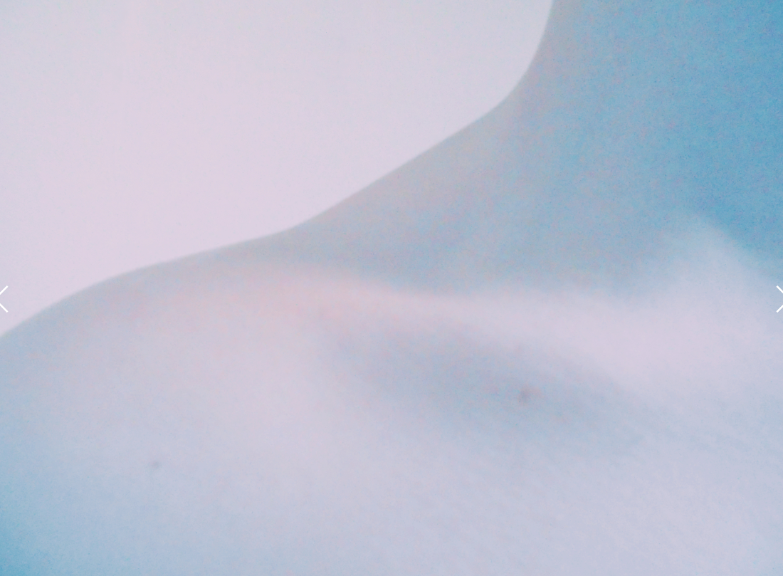
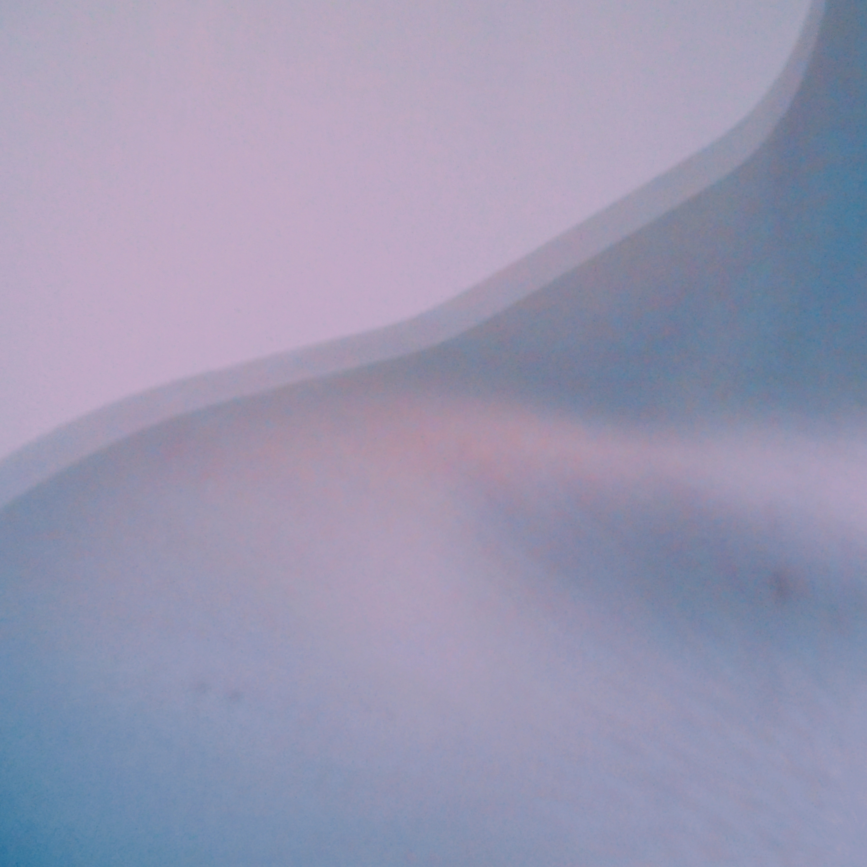
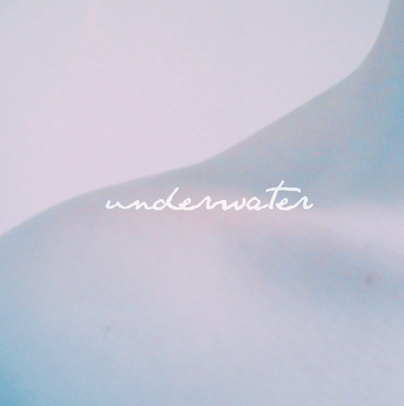
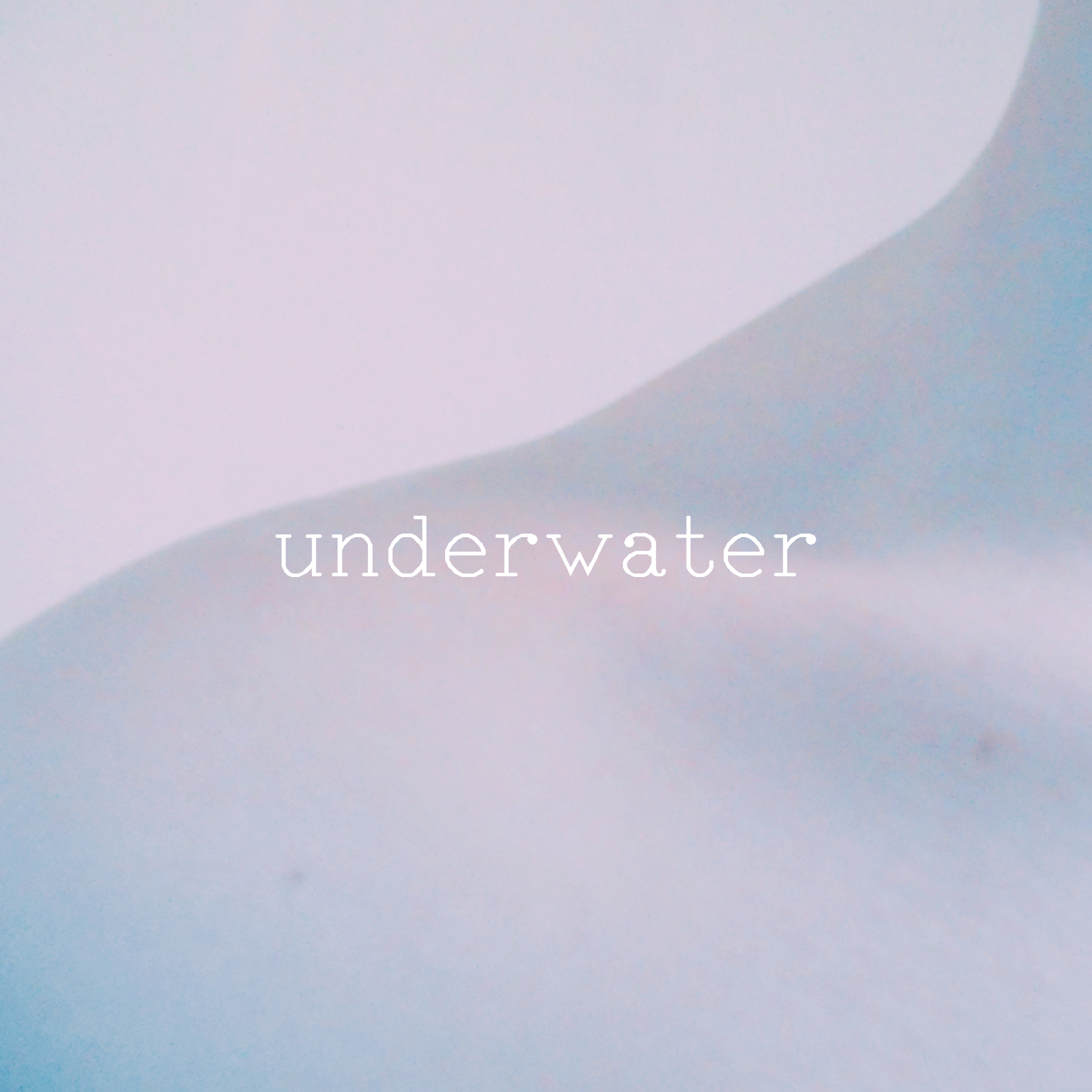
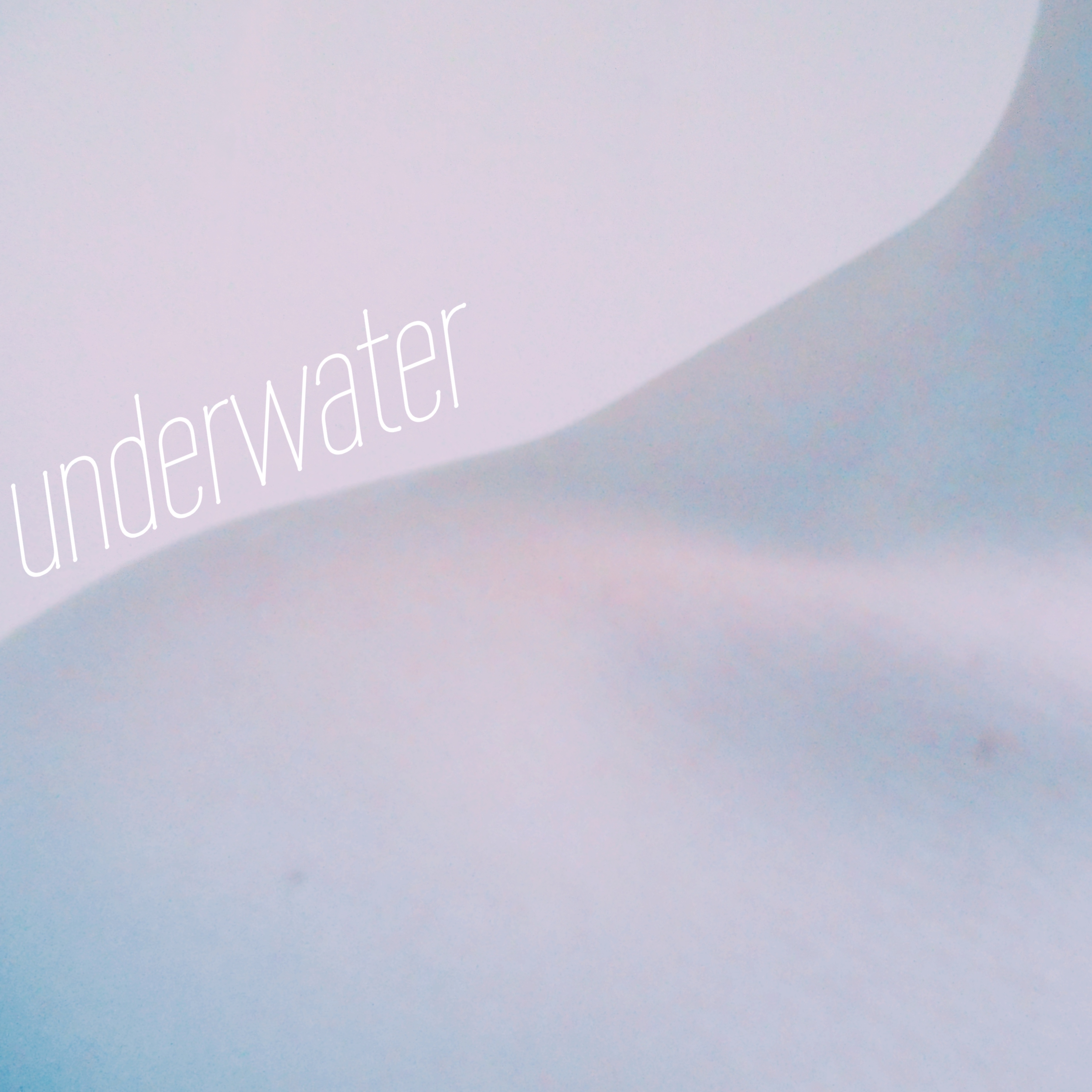
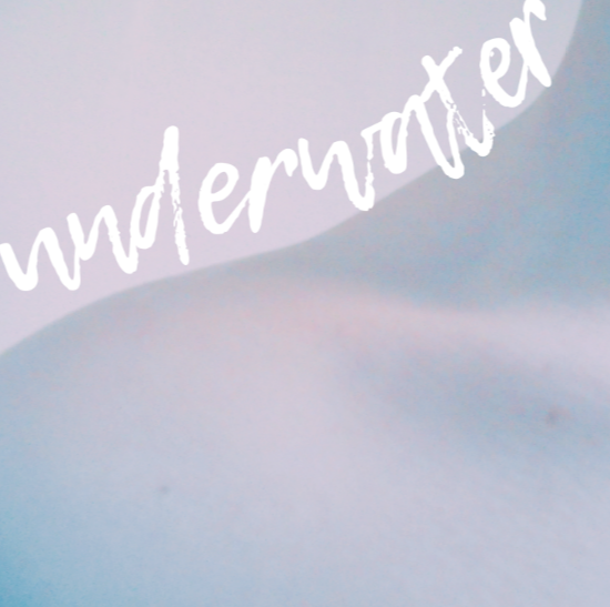
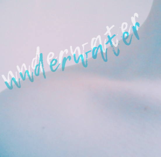
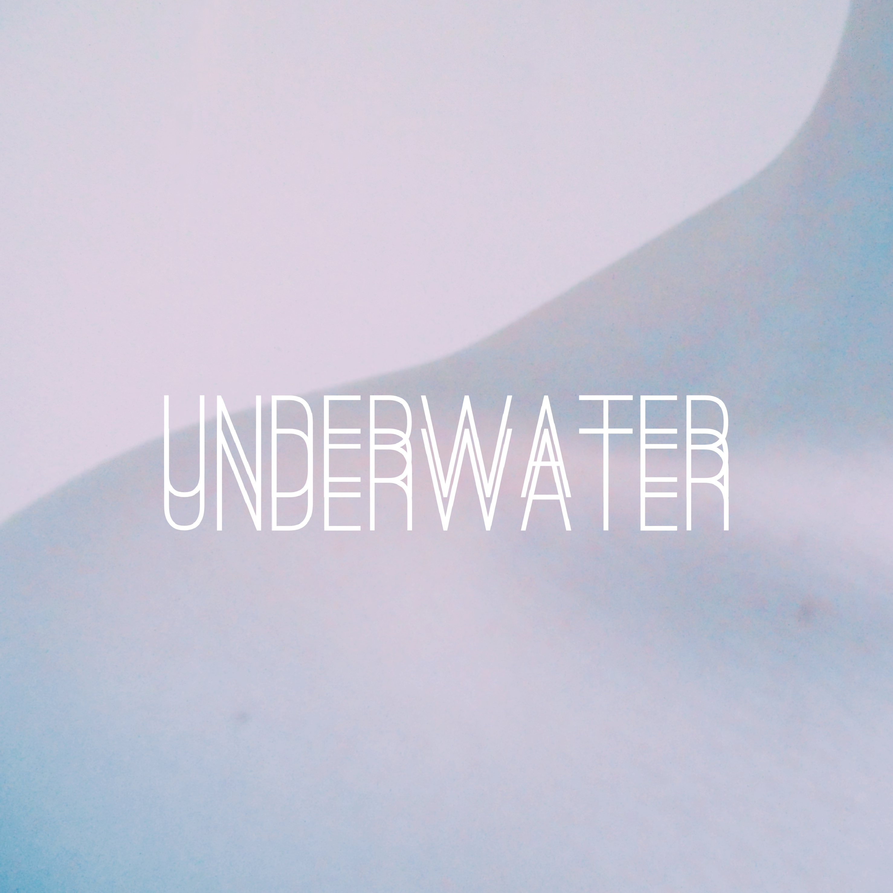
These last ideas are developed from the original ideas, they use the same photo of my shoulder with water on it. I took this photo inspired by a pinterest picture, and it makes it seem like I have just come out of the water. Which represents the whole EP of stepping out of fear and happiness and being the person I am today. These ideas present different fonts and filters. Some fonts are curved around my shoulder and in a brush font and some are block fonts. I tried to make some delicate and some harsh to give contrast so that I had plenty of ideas to choose from.
final product
This is the final product. I like this idea as it shows how I have developed my ideas from the original photo to developing all my ideas together to create this piece. As you can see, from the first photos I edited, I used layering to make it look like my shoulder is moving in some way. I also used a completely different font, however this is also the same font as I used for the promotion of City of Street Lights.

